
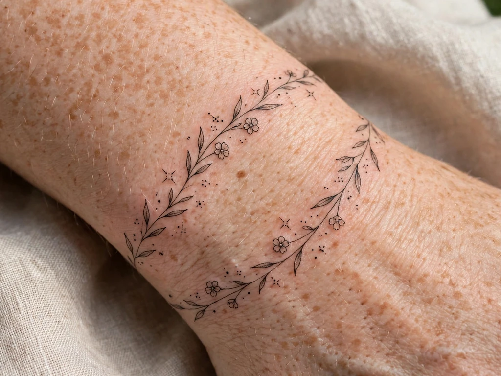
A dainty tattoo is defined not by size but by handling: a fine line instead of a bold one, a sprig instead of a bouquet, sparkles where another tattoo would put a filled shape — delicate, feminine, fine-detail work that sits on the skin the way jewellery sits, noticed at conversational distance and discovered properly only up close. A dainty tattoo can be two centimetres long. It can also run a forearm’s length, if every line keeps the same light touch. What it can never be is careless, because delicacy is the least forgiving register in tattooing: no heavy outline to hide behind, no packed colour to carry a weak drawing.
You will find 25 original dainty tattoo ideas here — tiny flowers, fine-line sprigs, micro hearts and moons, sparkle clusters, ankle and wrist pieces drawn like chains and charms — every one inside the placements that suit delicate work. But you will also find the section most dainty galleries skip: an honest account of how delicate work ages. Dainty tattoos soften faster than any other kind. That is not a warning against them; it is the price tag, printed here on the front of the box so you can choose yours knowingly, the way everyone who still loves theirs at year ten chose.
What Does a Dainty Tattoo Mean?
Start with the word itself, because dainty is an aesthetic, not a measurement — and confusing it with its two neighbours is where most disappointing delicate tattoos begin. Small is a measurement. It describes dimensions and nothing else: a two-centimetre solid black heart is small, and not dainty at all, because nothing about its handling is delicate. A twenty-centimetre fine-line vine, by contrast, is large and completely dainty. Minimalist is a philosophy. Minimalism reduces a subject as an idea — the fewest possible marks, reduction itself as the point. Dainty work is not trying to reduce anything; a dainty sprig can carry buds, leaves, a curl of stem and three sparkle dots, all of it wanted, all of it decorative. Its point is not less-ness. Its point is lightness of touch.
So a dainty tattoo means, first, jewellery, made permanent. The comparison is not a metaphor invented afterwards; it is how these pieces are composed — chains following a wrist or ankle, charms at the end of them, a sprig along a collarbone the way a pendant falls, sparkles scattered the way stones are set. Small jewellery has carried outsized meaning for a long time: the Rijksmuseum’s record of Dutch wartime coin jewellery describes how, in the 1940s, small pieces of jewellery were worn as silent tokens — coins transformed into rings, brooches, pins and bracelets, a portrait worn as a sign of loyalty, pieces used after the liberation to convey messages of hope. A tiny tattoo worn the same way — a birth flower at a wrist, a star kept behind hair — belongs to that same tradition: the smallest wearable thing, carrying a message out of all proportion to its size.
Second, dainty means lace, translated into line: a pattern that is mostly air, held together by the finest possible thread-work. The daintiest designs here are built the same way — the drawing is the minority of the piece and the skin showing through is the majority, which is why the craft section below treats spacing, not line, as the material delicacy is made of.
And third, dainty means chosen softness. Wearers of delicate tattoos are not people who failed to notice bolder options. They wanted the tattoo to behave like the rest of how they present themselves — fine, precise, unforced — and accepted, eyes open, that the softest-looking work is also the fastest-softening. The meanings layered on top — a flower for a birth month, a moon for a phase of life — are personal in the usual way. The daintiness itself is the public part: it says the wearer values the whisper over the announcement.
The Honest Minimum: How Dainty Tattoos Age
Every style of tattooing has a law, and dainty work’s law is the honest minimum: every element is drawn at the boldest weight that still reads delicate — never finer. That sounds like a compromise and is actually the whole craft. Skin is not paper. Ink in skin spreads a fraction as the years pass, the lightest lines fade first, and detail placed close together merges as each line widens into its neighbours. A bold traditional tattoo absorbs all of that invisibly. A dainty tattoo, whose whole effect depends on hairlines and gaps, meets it head-on — and the honest minimum is how good artists design for that meeting in advance.
Detail is budgeted by healed size, not fresh size. The tattoo in the studio photograph is the smallest, sharpest version that will ever exist; the healed, five-year version is the real tattoo — slightly larger, softer and paler in its finest parts. So the rule runs backwards from there: if a petal, a letter counter or a sparkle’s centre will not survive being a fraction wider and lighter, it does not go in the drawing at all. That is why the designs below are specified as they are — five petals, not nine; three sparkles, not seven; one word, not a sentence.
Spacing is what delicacy is made of. Look closely at any dainty tattoo that has aged beautifully and most of it is skin. The lines are the frame; the gaps are the picture. Lace-makers have always known this — the Cleveland Museum of Art’s account of its early Italian lace collection describes needle lace as constructed stitch by stitch with a needle and thread, and cutwork lace as a pattern fabricated by removing threads, the design created by the holes as much as by what remains. A dainty tattoo is composed identically: the artist designs the empty skin between the lines at least as carefully as the lines, because in ten years that empty skin is what will still be separating one element from the next. Crowded delicacy is a contradiction time exposes; spaced delicacy lasts.
The true-size test is non-negotiable. Screens lie about dainty designs, enlarging a two-centimetre sprig into a detailed botanical plate. The test that tells the truth: print the design at its final, actual size, tape it to the exact placement, and wear the paper for a full day — look at it in mirrors, in daylight, at the distance other people will actually see it. If it reads as a pleasant wisp and you love it as a wisp, it passes. If you keep holding your wrist closer to your face, it fails, and the fix is always the same: a little larger, a little simpler, or both.
Touch-ups are priced in from the start. For the finest pieces here — the micro symbols, the behind-ear star, above all the side-of-finger design — a touch-up is not a repair for something going wrong; it is scheduled maintenance for something going exactly as predicted. The lightest lines will want strengthening in the first few years, and finger work regularly across its life. Choose dainty work the way you would choose silk over denim: not for durability, but because you have decided the delicacy is worth the upkeep. Wearers who budget touch-ups in advance are never disappointed; wearers promised permanent delicacy always are.
One placement honesty belongs here, before the designs: dainty pieces are often shown on the sternum in galleries, and this guide deliberately keeps to placements that age and heal the way this section describes — wrists, ankles, forearms, upper arms, shoulders, shoulder blades, calves, the outer edge of the collarbone, and, once each, behind the ear and the side of a finger, both with their fading stated plainly on the design.
Dainty Tattoo Styles and How They Age
Dainty is one aesthetic with several techniques inside it, and each technique strikes its own bargain with time. The site’s wider fine line tattoo ideas guide covers the single-needle style in full; the table below is the dainty-specific summary — how each approach is drawn, and what it looks like when it has lived on skin for years.
| Style | How it is drawn | How it ages |
|---|---|---|
| Fine-line floral | A single fine line weight for stems and petals, tiny dot centres, no fill | Softens evenly into a pressed-flower softness; survives where petals are few, open and spaced |
| Micro symbol | One tiny shape — heart, star, moon — drawn bold for its size, centre left open or fully simple | The boldest-per-millimetre dainty work; holds its read for years if the silhouette is simple |
| Sparkle and dotwork | Four-point sparkles and single dots scattered like set stones, mostly skin between | Dots and points thicken slightly; generous spacing keeps the cluster airy instead of speckled |
| Lace-like line | Open, looping line patterns inspired by lace and filigree, built from gaps | The most spacing-dependent style of all; open loops stay lace, tight loops close into web |
| Jewellery chain | A fine chain line following a wrist or ankle, with one small charm as the focal | Chain links must be drawn open; reads as a permanent bracelet or anklet, charm ages best |
| Tiny lettering | A single word or initial in an open, airy hand at honest size | Ages like all fine script: joins and counters soften first, so it starts airier than feels necessary |
A note on colour: most designs below are specified in black and grey, deliberately. Delicacy in a single soft black reads at the greatest distance and ages most predictably. A single accent can be lovely, but colour-first dainty work fades fastest of all and is a choice to make with the honest section fresh in mind.
Dainty Tattoo Ideas at a Glance
| # | Design | Style notes | Best placement |
|---|---|---|---|
| 1 | The Single Tiny Flower | Fine line bloom, five open petals | Forearm |
| 2 | Fine-Line Lavender Sprig | Buds up a single stem | Upper arm |
| 3 | The Tiny Birth Flower | Your month’s bloom, micro scale | Wrist (inner) |
| 4 | The Daisy Micro | Open ring of petals, dot centre | Ankle |
| 5 | Fine-Line Vine Fragment | One curling stem, three leaves | Forearm |
| 6 | Micro Heart Outline | One bold-for-size line | Wrist (inner) |
| 7 | Tiny Crescent Moon | Clean crescent, one dot star | Ankle |
| 8 | Sparkle Cluster | Three four-point sparkles, dots | Wrist |
| 9 | Micro Butterfly | Open wings, minimal veins | Shoulder blade |
| 10 | The Tiny Bow | Two loops, knot, short ribbon ends | Wrist (side) |
| 11 | Ankle Chain with Charm | Fine chain line, one tiny charm | Ankle |
| 12 | Wrist Chain with Star Charm | Bracelet line, single star drop | Wrist |
| 13 | Collarbone-Edge Sprig | Stem following the bone’s edge | Collarbone (outer edge) |
| 14 | Lace-Edge Fragment | Open loops, scalloped edge | Forearm |
| 15 | One Small Word | Airy script, single word | Wrist (inner) |
| 16 | Behind-Ear Micro Star | One bold tiny star | Behind ear |
| 17 | Side-of-Finger Micro Heart | Boldest possible micro line | Finger (side) |
| 18 | Tiny Star Trail | Three stars, descending sizes | Forearm |
| 19 | Fine-Line Stem on a Calf | Long stem, two leaves, one bud | Calf |
| 20 | Shoulder-Edge Floral Spray | Three small blooms on one stem | Shoulder |
| 21 | Tiny Wildflower Cluster | Three mixed micro blooms | Upper arm |
| 22 | Pearl-Dot Arc | A curve of graduated dots | Shoulder blade |
| 23 | Calf Fern Fragment | Open frond, wide-spaced leaflets | Calf |
| 24 | Moon and Sparkles | Crescent with sparkle scatter | Shoulder blade |
| 25 | Small Rose on a Fine Stem | Open spiral bloom, long stem | Forearm |
25 Dainty Tattoo Ideas
1. The Single Tiny Flower
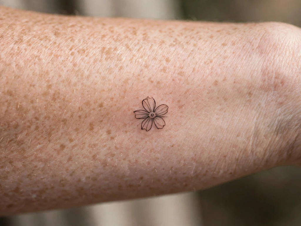
Begin with the dainty tattoo in its purest form: one flower in fine line, nothing else — five open petals around a dot centre, a short stem with a single leaf, at three to four centimetres on the forearm. It is the design equivalent of a single stud earring: complete at its size, asking for nothing beside it. Wearers choose it as a first tattoo more than any other here, because it teaches you, at the lowest possible stakes, how fine line heals on your own skin.
The craft is in the petals. Five, not eight: each petal its own closed curve with clear skin between it and the next, because petals drawn touching become one soft blob as the lines settle. The centre is dots, not a filled circle — dots hold their character as they soften, where a tiny solid centre becomes a blot. Drawn at that discipline, this flower is still unmistakably a flower at year ten.
Best placement: Forearm, the bloom toward the elbow and the stem running toward the wrist; it sits equally well small on an upper arm.
Best for / know before you book: Count the petals on the stencil and check the gaps between them — if you cannot see skin between the petals at true size, there are too many petals.
2. Fine-Line Lavender Sprig
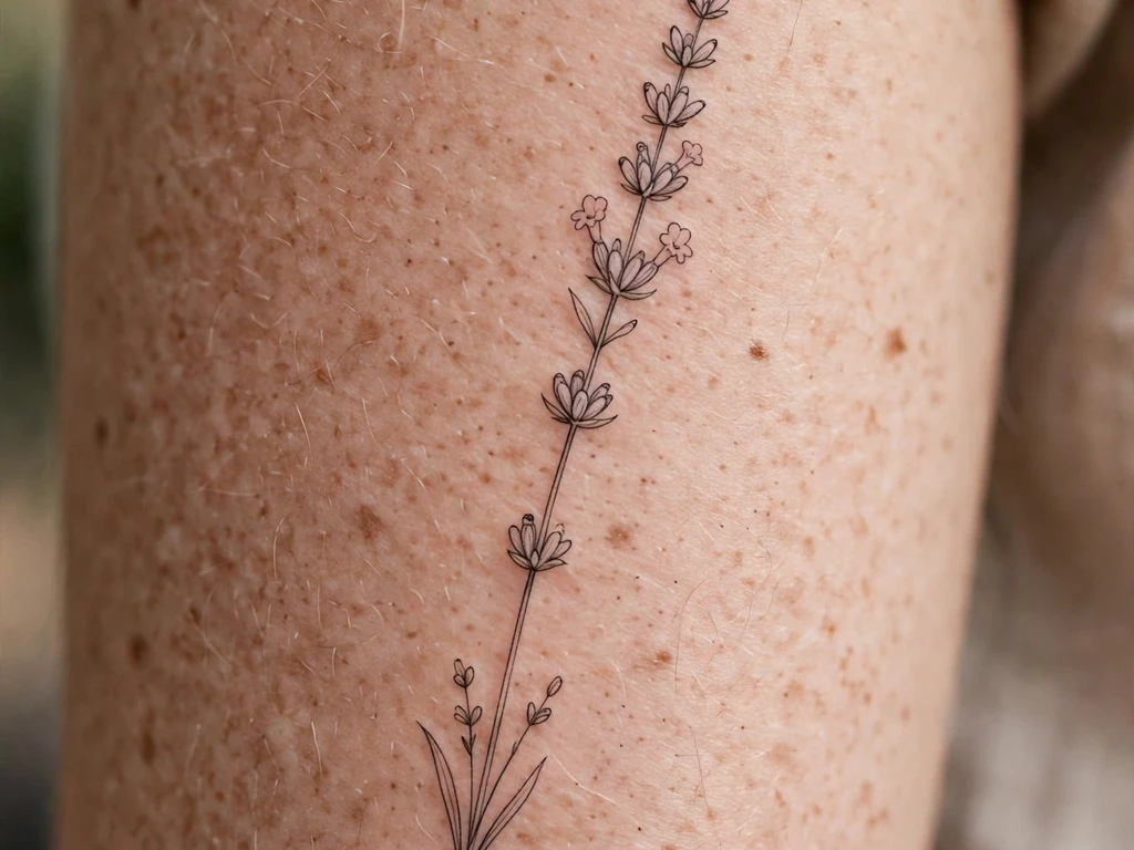
A lavender sprig is a dainty design that draws itself: a slender curving stem with small buds stepping up it in pairs, thinning toward the tip — a flower already mostly stem and air. At upper-arm scale it reads like something pressed between the pages of a book and then, instead, kept on the body. It is one of the most forgiving fine-line florals there is, because its structure is a rhythm of separate buds rather than one detailed bloom.
That rhythm is also its ageing plan. Each bud is a separate shape with skin around it, so even as every line softens, the pattern — bud, gap, bud, gap, up a stem — survives intact. The two ways to ruin it are crowding the buds at the tip, and drawing the stem hairline-thin: the stem is the spine and gets the honest minimum weight, a fraction bolder than the buds.
Best placement: Upper arm, the sprig running vertically with the arm’s line; a longer sprig follows a calf beautifully.
Best for / know before you book: Ask for the buds to stay the same spacing all the way up — a sprig that gets busier at the top will get muddier at the top, first.
3. The Tiny Birth Flower
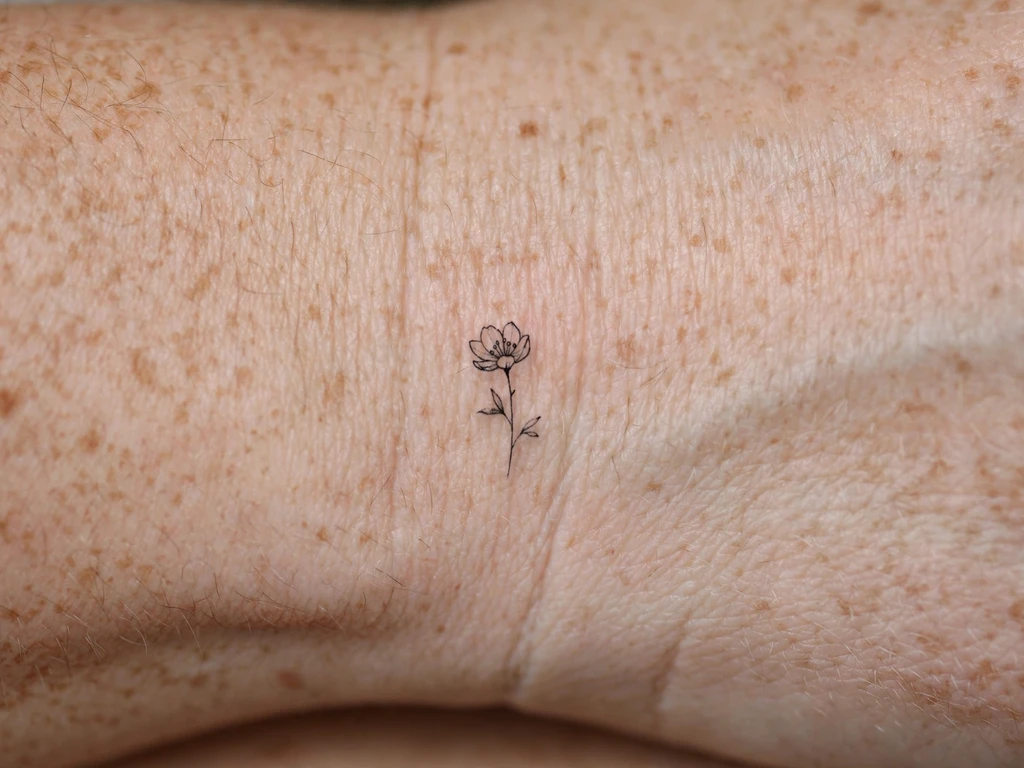
Your birth month’s flower, drawn tiny: the most personal of the micro florals, because the subject chooses itself — the bloom assigned to your month, your child’s month, your mother’s. A daisy for April, a lily for May, a rose for June, each reduced to its dainty essentials: the recognisable silhouette of the flower, a short stem, one leaf, at two to three centimetres on the inner wrist. The full calendar of month flowers and their meanings lives in our birth flower tattoo ideas guide; this design is one month of it, worn like a charm.
Reduction is the craft, and it is flower-specific: the artist keeps the one feature that makes the bloom itself — the daisy’s ring of petals, the lily’s trumpet curve — and lets everything else go. At wrist size a birth flower is an emblem, not a botanical study, and the wearers who love theirs longest let it be an emblem. If your month’s flower is a complicated one, the honest route is a touch larger on the forearm rather than a touch more detailed on the wrist.
Best placement: Inner wrist, just above the crease, where it is seen every time the hand turns; a forearm takes a larger month flower at the same lightness.
Best for / know before you book: Bring the flower’s name, not a photograph of someone else’s tattoo — a good artist draws your month’s bloom in their own line, and original line ages better than traced line.
4. The Daisy Micro
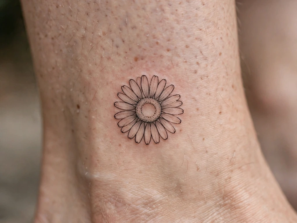
The daisy reduced to its geometry: a ring of open petals around a dotted centre, at two to three centimetres above an ankle — the friendliest flower in tattooing at its daintiest scale. This is the one design in the guide built on the ring law in its full form: a daisy’s white petals are not ink at all. They are your skin, held inside a fine line, petal-shaped gaps of nothing that the outline gives a name to. Drawn that way, a micro daisy is the purest demonstration in this article that a dainty design is mostly skin.
The whole family of daisy designs, at every size and in every register, is gathered in our daisy tattoo ideas guide; this micro is its smallest member, and its rules are the strictest. The petal ring must be drawn with fewer, wider petals than feels generous — eight open petals heal into a daisy, fourteen narrow ones heal into a sun — and the centre stays dots. Above the ankle it gets the ankle’s one mercy and its one tax: the placement is flat and still, and shoes and straps will rub it, so healing week wants open footwear.
Best placement: Above the ankle, on the flat outside the ankle bone; the same micro sits sweetly at a wrist.
Best for / know before you book: Check the petal count at true printed size — the daisy you can count the petals of fresh is the daisy you will still be able to count healed.
5. Fine-Line Vine Fragment
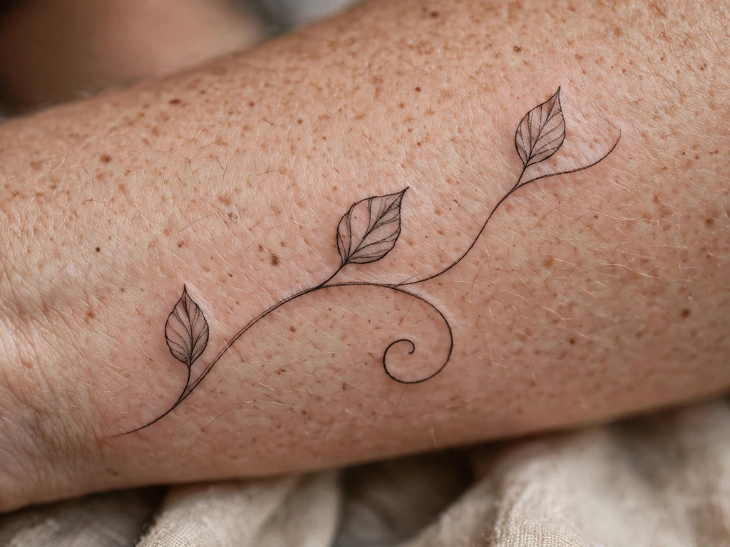
Not a vine tattoo — a fragment of one: a single curling stem, three leaves spaced along it, one tendril ending in a spiral, as if a longer vine exists somewhere and this is the piece of it you chose to keep. The fragment is a genuinely dainty idea rather than a small version of a big one, because its charm is that it does not wrap, climb or cover; it rests. The full wrapping compositions and their craft law live in our vine tattoo ideas guide; this design takes the same vocabulary at keepsake scale.
Three leaves is a discipline, not a shortage. Each leaf gets a full breath of skin around it, the stem’s curl is drawn open — a spiral whose turns will still be separate curves in ten years — and the fragment is sized so its longest line can be drawn at honest weight. It is also the most extendable design here: a second fragment, added years later a few centimetres along, turns two dainty pieces into a vine that grew at the speed of your life.
Best placement: Forearm, the stem running lengthwise with a gentle curl; a shorter fragment curves over a shoulder’s edge.
Best for / know before you book: Resist adding leaves at the stencil stage — the fragment’s emptiness is the design, and every leaf added fresh is a leaf time would have added by merging anyway.
6. Micro Heart Outline
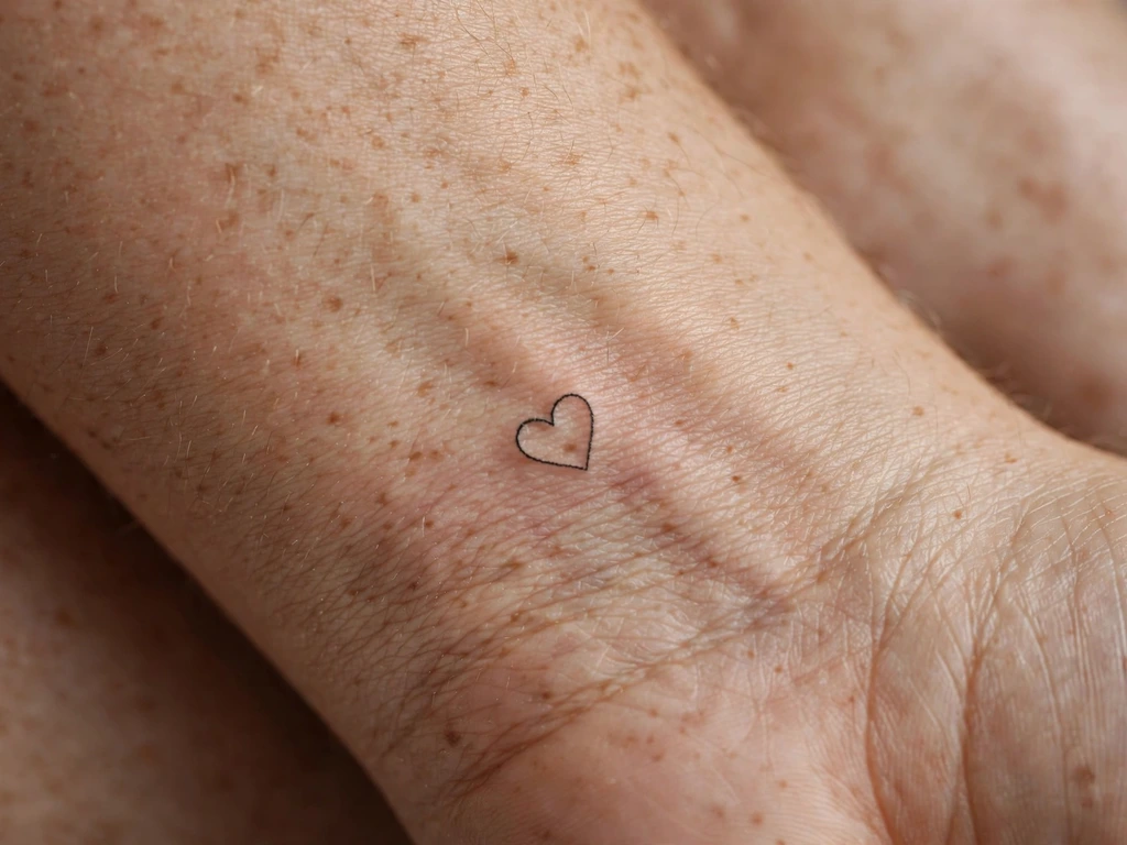
A heart drawn in one line, under two centimetres, on the inner wrist — the smallest complete sentence in this guide. It says the oldest thing tattoos say, in the quietest available voice: a margin-note heart, the kind drawn in pen beside a name. As a first dainty piece it is nearly perfect, because its simplicity is total: there is no detail in it to lose, so its whole ageing future is one line slowly softening, which a heart outline survives more gracefully than almost any shape in tattooing.
Nearly perfect is not perfect, and the failure mode is famous: a tiny heart drawn with a pinched, pointed top closes up as the line thickens slightly, and within a few years reads as a small dark droplet. The fix is drawn in from the start — lobes openly curved, the dip at the top shallow and wide, the line at honest minimum weight rather than a hairline. Drawn that way, this heart is still a heart at year fifteen.
Best placement: Inner wrist, centred just above the crease; it is also the classic first-piece test of how fine line heals on you personally.
Best for / know before you book: Print it at final size and look at the top dip — if the two lobes nearly touch on paper, they will touch in skin, and the heart becomes a blob on schedule.
7. Tiny Crescent Moon
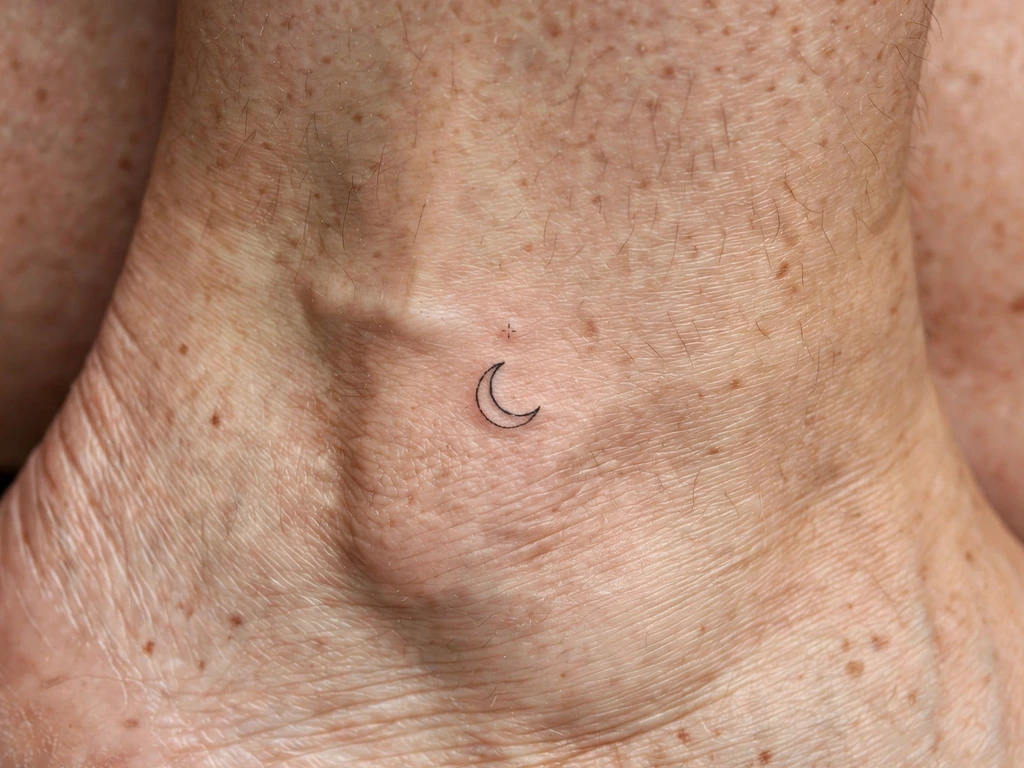
A crescent moon at two to three centimetres, drawn as one clean curve of a shape with a single dot of a star in its open arms, above an ankle. The crescent is one of the few symbols that gains by being dainty: a bold moon is a logo, but a fine-line crescent is a phase — partial, in progress, the moon as it actually spends most of its month. Wearers take it for cycles, for beginnings, for the part of life that is still waxing, and at this scale it reads like a note rather than a declaration.
The crescent’s craft is its inner curve. The shape is two arcs, and the space between them — the moon’s thickness — must be drawn wider than instinct suggests, because that sliver of dark is what the eye reads, and slivers narrow as lines spread. Keep the horns tapered but not needle-pointed, and let the star be a dot or a four-point sparkle, never a detailed five-point star at this scale: the moon is the design, the star is punctuation.
Best placement: Above the ankle, the crescent upright with its horns pointing up the leg; it also tucks neatly at a wrist’s side.
Best for / know before you book: Ask to see the stencil at true size in a mirror at standing distance — a crescent that reads across a room at two centimetres is drawn right; one that needs squinting is drawn too thin.
8. Sparkle Cluster
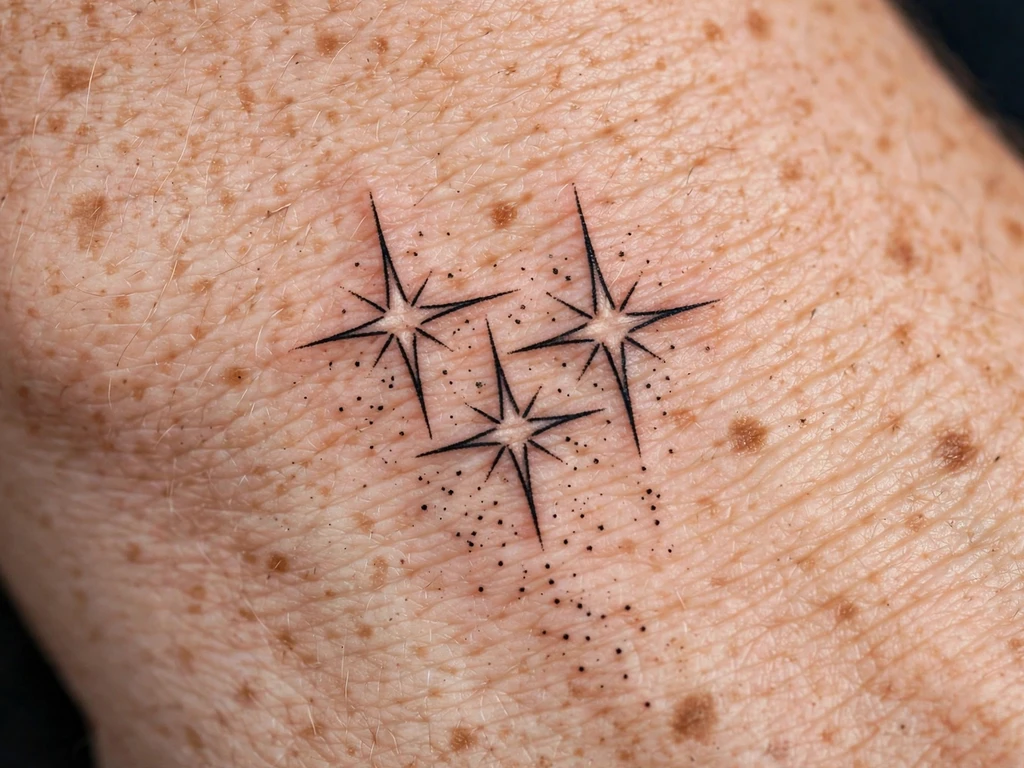
Three four-pointed sparkles and a scatter of dots across a wrist: no subject, only shine. Sparkle clusters are the purest jewellery in this guide — they imitate nothing in nature and everything in a jeweller’s window, the glint of stones catching light — and wearers take them as ornament in the honest, undefended sense: because they are pretty, because the wrist looks dressed with them, because a permanent glint is a cheerful thing to carry. There is no rule that a tattoo must be a symbol, and this is the design that proves it most gracefully.
A sparkle is nothing but points and gaps, so spacing is its entire craft. Each four-point star must keep real skin at its centre — points drawn open like a compass rose, not closed like an asterisk — or the points thicken into each other and the sparkle becomes a speck. Compose the cluster loosely, largest sparkle off-centre, dots genuinely separate and few: a constellation feels designed, twenty dots feel like static.
Best placement: Wrist, the cluster drifting across the back or side where a bracelet’s charms would catch light; the same cluster punctuates an ankle.
Best for / know before you book: Approve the cluster at printed true size, never zoomed — sparkles are the design screens lie about most kindly, and the paper version is the tattoo’s honest preview.
9. Micro Butterfly
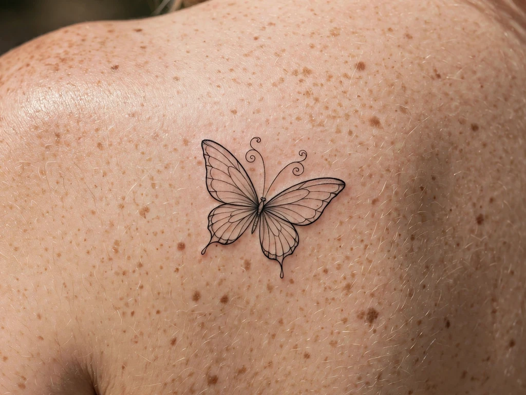
A butterfly at four to five centimetres on a shoulder blade, wings open, drawn in fine line with the wing detail edited down to two veins a side and a dusting of dots — the change-and-remaking symbol at its most wearable scale. The shoulder blade is this design’s kindest home: a flat, calm, mostly covered field where fine line keeps its edges longest, and where a butterfly can be a private thing, shown by a neckline rather than announced by a placement.
Butterflies test dainty craft harder than any flower, twice over. Symmetry is the first test: the wings must match, checked standing, in a mirror, at the stencil stage, because a slightly lopsided butterfly reads as injured rather than delicate. Detail discipline is the second: wing lace and patterned edges close up at this size, and the micro butterfly that survives is the one whose wings are mostly open skin with a confident outline — a butterfly shape, not a butterfly diagram.
Best placement: Shoulder blade, centred on the flat with wings spread horizontally; a smaller version sits on an upper arm.
Best for / know before you book: Judge it as a silhouette at arm’s length first — if the shape alone reads as a butterfly, the fine detail is a bonus it can afford to soften.
10. The Tiny Bow
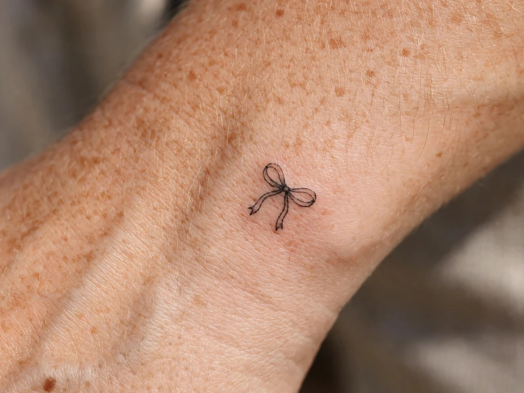
One tiny bow, on the side of the wrist: two loops, a knot, two short ribbon ends — the hair ribbon, the gift-wrap bow, drawn in fine line at three centimetres. The bow is the most unapologetically feminine motif in this guide and wears its meanings lightly — a gift, a keepsake, something tied so it is not lost — and at the wrist’s side it behaves exactly like the clasp of a bracelet: the small finished detail an outfit, or a wrist, is completed by. This guide keeps the bow to this one design deliberately; it is a jewel of a motif, and jewels are not improved by being repeated down a list.
The craft appointment is symmetry in miniature. The loops must match, the knot must sit at the true centre, and the V-cuts in the ribbon ends must be cut wide — a fine V in fine line closes into a plain notch within a few years, and a bow whose ends have lost their cuts reads as a knot with wings. Stencil it with the hand in its natural rest, because the wrist’s side twists, and a bow aligned to a flattened wrist sits crooked on a living one.
Best placement: Side of the wrist, the bow sitting on the wrist’s flat edge; it ties just as neatly above an ankle.
Best for / know before you book: Mirror-check the stencil twice — you will see this tattoo in mirrors more than directly, and a bow is the design where a half-millimetre of lopsidedness shows forever.
11. Ankle Chain with Charm
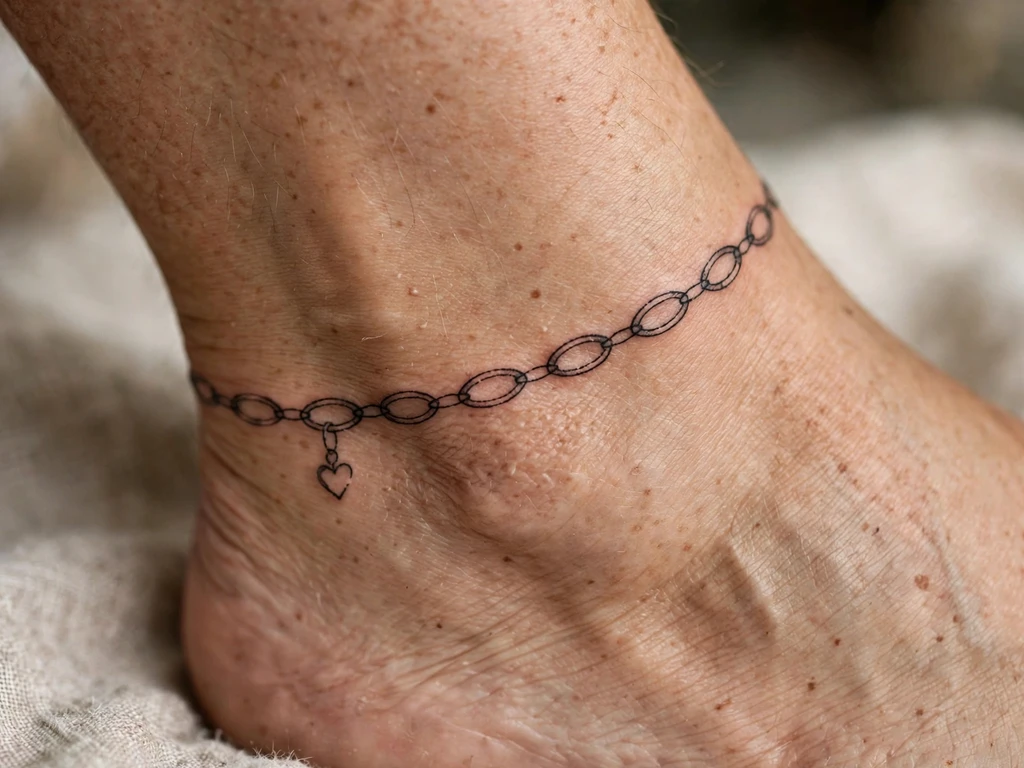
A permanent anklet: a fine chain line around the ankle, its links left open as small ovals and dots, with one tiny charm — a heart, a star, a small moon — hanging at the outside of the ankle where a real anklet’s charm would fall. This is the jewellery idea taken literally, and one of the most requested dainty placements there is, because it does what jewellery does with none of jewellery’s chores: it never needs fastening, and turns sandals into a styled outfit by itself.
The chain is the craft, and its law is openness. Each link must be a genuinely open oval with skin inside it; a chain drawn as touching dots heals into a plain dotted line — still pretty, but a different tattoo. The charm, by contrast, is drawn bold for its size, because the charm is the sentence and the chain is only how it is hung. Expect the stencil to be checked on the standing ankle from every side: ankles taper, and a level-looking stencil can spiral.
Best placement: Ankle, the chain circling just above the ankle bone with the charm at the outer side; keep it clear of the shoe line where you can.
Best for / know before you book: Wear your usual shoes to the consultation and mark where straps and collars rub — a chain placed a centimetre above the rub line ages like a different, luckier tattoo.
12. Wrist Chain with Star Charm
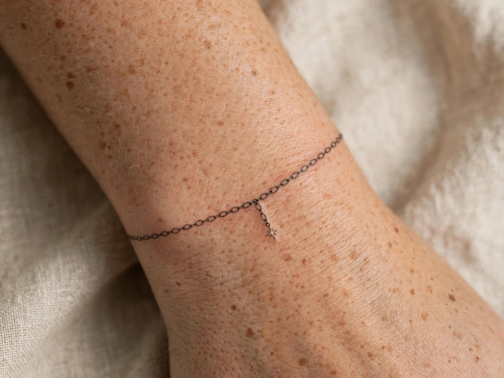
The anklet’s sister, moved to the wrist: a fine chain circling the wrist like a bracelet, with a single tiny star dropped from it at the wrist’s back — where it shows when the hand rests palm-down, which is how the world mostly sees your hands. Where an ankle chain is a summer tattoo, a wrist chain is an everyday one, sitting alongside watches and real bracelets without competing with either.
It shares the chain law with Design 11 — open links, skin inside every oval, charm drawn boldest — and adds a wrist problem: the wrist flexes and creases constantly, and the underside works any line hard. The solution is to let the chain sit slightly higher than a real bracelet rides, just above the main crease, with the charm on the back or side rather than underneath. Drawn there, a wrist chain keeps its read crisp for years.
Best placement: Wrist, circling just above the crease, star charm at the back or outer side; measure it against your watch or usual bracelet so the two sit as a set.
Best for / know before you book: Flex your hand through its full range over the stencil — a chain that stays a true circle in motion is placed right; one that kinks at the crease will soften there first.
13. Collarbone-Edge Sprig
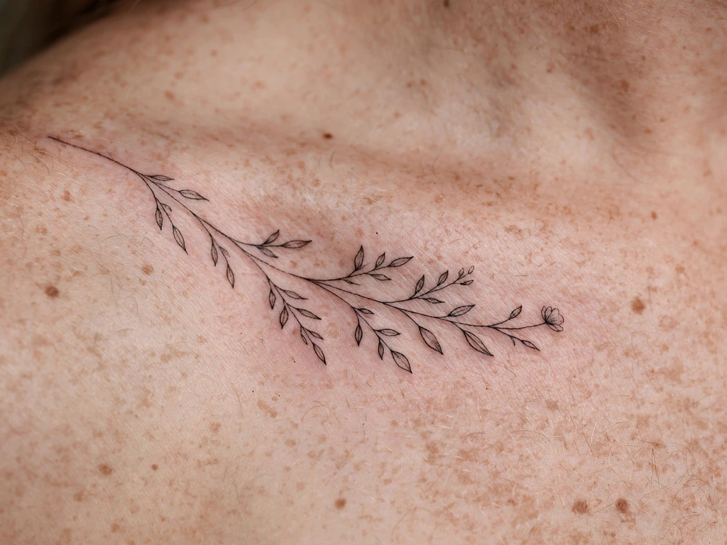
A sprig laid along the outer edge of a collarbone: a fine stem following the bone’s own curve, small leaves alternating along it, one tiny bloom at the shoulder end — the pendant-necklace idea expressed as a plant. The collarbone is a natural frame and this design respects the frame’s terms: it runs along the bone’s outer edge, on the flatter skin just outside the ridge, rather than across the centre of the chest, and it moves with the shoulder instead of fighting it. In a neckline it reads as the topmost detail of the outfit, which is exactly the register dainty work wants.
The placement’s movement is the planning problem. Shoulders roll, lift and shrug through every hour, so the sprig’s elements are spaced for a moving canvas: leaves genuinely separate, no bud touching the bloom, the stem in one confident curve. Size helps too — this design earns an extra centimetre happily, because length is what lets its spacing stay honest.
Best placement: Outer edge of the collarbone, stem following the bone and the bloom toward the shoulder; the same sprig runs down a forearm with the bloom opening upward.
Best for / know before you book: Shrug, lift and roll your shoulder in front of the mirror with the stencil on — the sprig should look composed in every position, not just in the one it was drawn in.
14. Lace-Edge Fragment
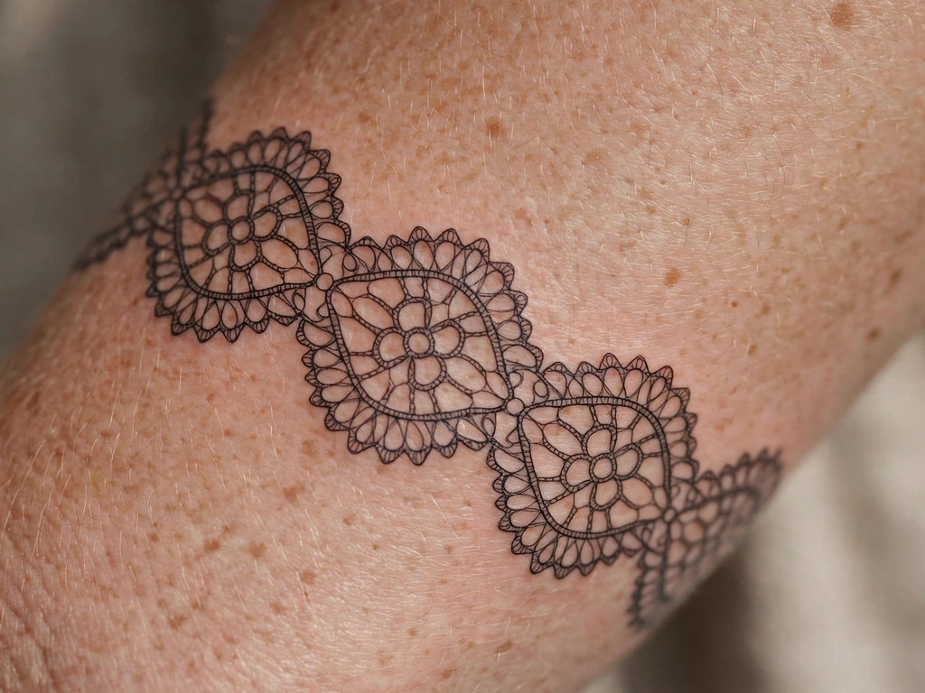
A fragment of lace, drawn in line: a scalloped edge of open loops, small eyelets of bare skin ringed by fine line, a row of tiny dots where the lace’s heading would run — worn across a forearm like the cuff of a sleeve that exists only as its trim. This is the dainty aesthetic at its most literal, a tattoo whose entire pattern is made of holes and the thread-lines between them, and it suits wearers who love vintage textiles, heirloom handkerchiefs, a grandmother’s table linen: the whole world of beautiful things that are mostly air.
It is also the most spacing-dependent design in this guide, and the craft section’s lace lesson applies at full strength: lace holds together because its gaps are structural, and so does this. The loops must be drawn larger and rounder than a textile reference suggests — skin is a softer loom than linen — and the eyelets must keep their skin centres wide open. A lace fragment drawn at true textile scale closes into a web within a few years; drawn at the honest minimum, it stays lace for decades.
Best placement: Forearm, the scalloped edge running across or lengthwise with the edge as the focal; it wraps a wrist like a cuff equally well.
Best for / know before you book: Choose the artist by their healed fine line, not their lace enthusiasm — this design is a healed-spacing examination wearing a pretty dress.
15. One Small Word
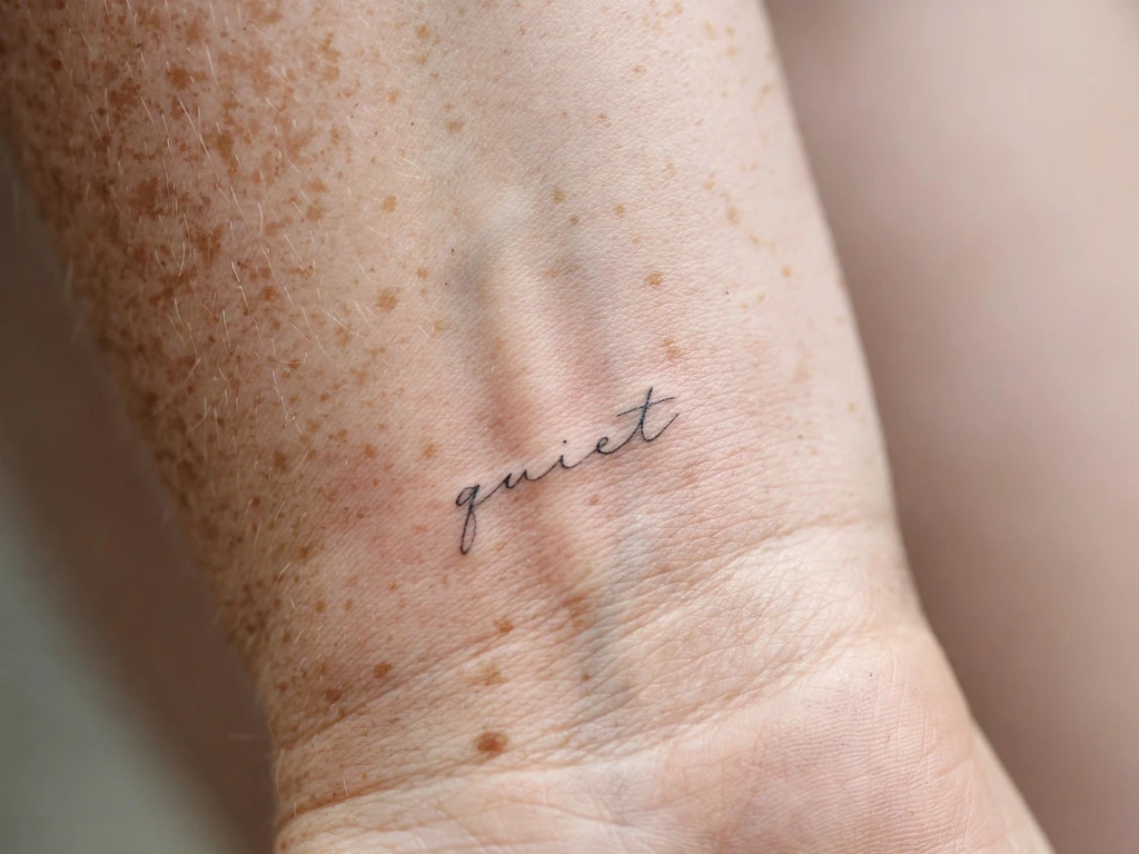
One word. That is the whole design: a single small word in an open, airy hand along an inner wrist — a name reduced to its first letter’s worth of company, a verb, a promise, breathe, enough, still. This guide allows itself exactly one lettering design and keeps it to one word deliberately, because lettering is a craft of its own with its own full guide: the hand styles, spacing law and size rules live in our script tattoo ideas guide, and this design is that craft at its daintiest extreme rather than a summary of it.
Dainty script obeys script’s oldest rule at double strength: the letters’ counters — the enclosed spaces in an a, an e, an o — close first as ink settles, and at wrist size fastest of all. So the word is chosen short, the hand chosen open, the letters spaced a breath wider than the reference looks, and the whole word printed at true size and worn as paper for a day before it is worn as ink for decades. A word that survives that test as a whisper will still be whispering, legibly, in ten years.
Best placement: Inner wrist, the word running along the wrist’s length just above the crease; a longer word belongs on the inner forearm instead.
Best for / know before you book: Write the word in the chosen hand yourself, at size, on your own wrist in pen, and live with it a full day — dainty lettering is judged at true scale or not at all.
16. Behind-Ear Micro Star
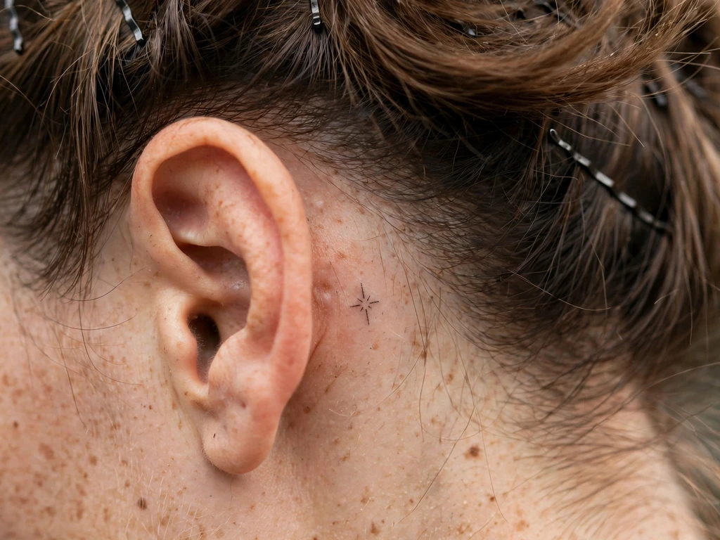
This guide’s one behind-ear design, kept to the single most durable shape the placement can hold: one small star, drawn bold for its size, tucked onto the flat of skin behind the ear — hidden by hair in every formal room, revealed by a tucked strand like a secret that was always in plain sight. A star needs no explanation and gets none at this scale: luck, ambition, a person who is a star to you, worn where only the chosen notice it. At one to one and a half centimetres it is the daintiest complete statement in the article.
The honesty for this placement is specific: behind-ear skin is thin, a little oily, rubbed by hair, shampoo and sunglass arms, and it settles delicate work softly and a touch fast. So the star is drawn a fraction larger and bolder than the reference photo suggests — points short and sturdy, the centre left open or made fully simple, never half-detailed — and a touch-up across its life is part of the bargain, stated here rather than discovered later. Drawn at that honesty, it stays a star; drawn as a hairline whisper, it becomes a rumour of one.
Best placement: Behind the ear, centred on the flat beneath the cartilage fold, sized to your own ear rather than any template.
Best for / know before you book: Hold the printed design behind your ear in a mirror at true size — behind-ear tattoos are the ones you will mostly meet in mirrors, so the mirror is the honest fitting room.
17. Side-of-Finger Micro Heart
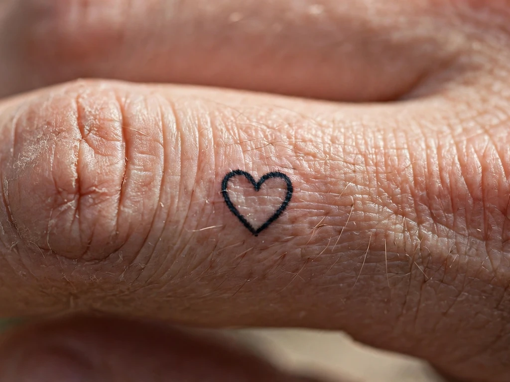
The smallest design in the guide, offered with the fullest honesty, because this placement fades faster than any other in tattooing — and dainty line on a finger is the fastest-fading combination of all. Finger skin regenerates quickly, flexes constantly, washes, rubs and sheds ink at a rate no other placement matches. So it is said plainly, in the series’ established words for this placement: this heart will fade, sooner than any other design here, and will need touch-ups across its life to stay a heart rather than a rumour of one. Wearers choose it anyway — as a charm with a maintenance schedule, a small bright thing that asks to be renewed, like the feeling it usually stands for.
What can be done is done at the drawing board. The heart is drawn as boldly as a finger allows — a real line at the honest minimum’s bold end, never a hairline — its lobes openly curved so the shape survives softening, at the largest size the finger’s flat takes. And it sits on the side of the finger, not the palm side or the top, because side skin holds ink slightly better and it is the best bargain this placement offers. Priced with its touch-ups from the start, it is a legitimate, knowing choice; sold as permanent delicacy, it would be a lie, and this guide does not sell it that way.
Best placement: Side of the finger, where the line can run unbroken and the skin keeps ink longest of anywhere on a finger.
Best for / know before you book: Price the touch-ups before you fall for the charm — if re-inking a small heart every year or two would annoy you, Design 6’s wrist heart carries the same meaning on skin that keeps it far longer.
18. Tiny Star Trail
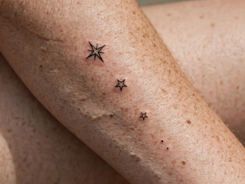
Three stars in descending sizes drifting down a forearm with a dot or two between them — a small piece of night sky, privately owned. Star trails are milestones made visible: wearers add the reading themselves, a star for a year, a person, a place, a thing survived, and the descending sizes give the trail its grammar, biggest for the biggest thing. It is also one of the most gracefully extendable designs in this guide; a fourth star, added years later at the trail’s end, looks like the design continuing rather than a new tattoo starting an argument with an old one.
The craft is rhythm. The gaps between stars matter more than the stars — uneven, breathing spacing reads as a drift of sky, while mechanically even spacing reads as a diagram — and each star keeps Design 16’s micro-symbol discipline: short sturdy points, open or simply filled centres, bold for size. Keep the smallest star honest but not microscopic; the trail’s last star is the first element time will test.
Best placement: Forearm, the trail running lengthwise and drifting slightly as it descends; it also falls prettily from a shoulder blade’s edge.
Best for / know before you book: Decide the milestone rule before the first star — trails grow by their own logic afterwards, and a rule chosen early keeps a sky from becoming a crowd.
19. Fine-Line Stem on a Calf
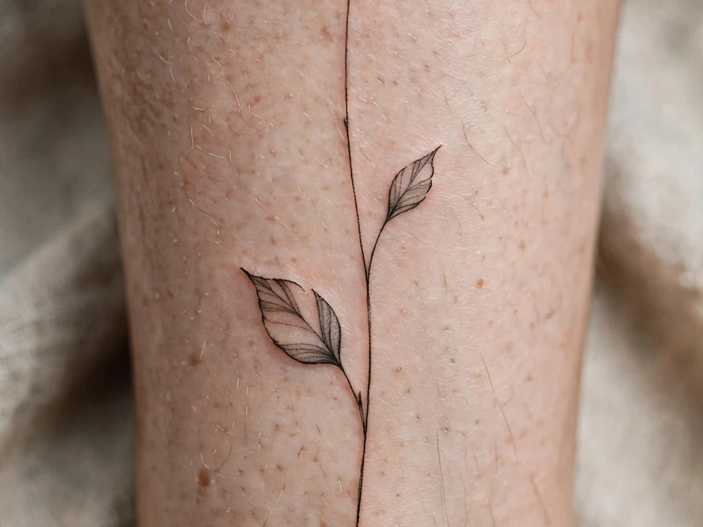
One long stem up a calf: a fine line climbing from ankle toward knee, two leaves spaced along it, one small closed bud near the top — dainty scale stretched to a placement’s full length, and the proof of this guide’s opening claim that dainty is a handling, not a size. At twenty centimetres this is one of the largest tattoos in the article, and it is also one of the daintiest, because nothing in it is anything but stem, air and two leaves. The calf flatters it completely: a long, calm muscle that shows a vertical line the way a vase shows a single stem.
Length brings one craft demand a short sprig escapes: the line must be one confident gesture, because a long fine line built from corrected segments shows every join when it softens. Artists pull it in long strokes, checking the curve standing — calves change shape between standing and sitting, and a stem elegant standing and kinked sitting was stencilled in the wrong position. Leaves stay few and large-gapped, however much empty stem tempts additions.
Best placement: Calf, the stem running up the muscle’s centre or just inside it, bud toward the knee.
Best for / know before you book: Have the stencil checked standing, walking and sitting — you are buying the standing version, but you will live with all three.
20. Shoulder-Edge Floral Spray
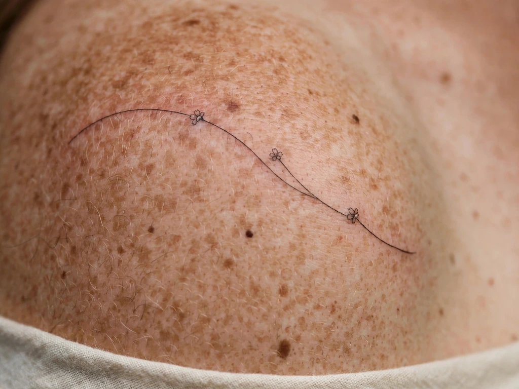
Three small blooms on one curving stem, laid over a shoulder’s edge so the spray follows the shoulder’s own turn — part jewellery, part garland, sitting where a dress strap or a neckline ends and skin begins. The shoulder edge is a showcase placement for dainty work: visible in summer necklines, covered by almost everything else, on skin that stays calm and keeps fine line well. A spray suits it because a spray is already composed as an arc, and the shoulder provides the arc’s curve for free.
Composition is the craft here: the three blooms are graded — fullest at the centre of the curve, smallest toward the collarbone end — so the spray reads as growing along its stem rather than pasted onto it. Between each bloom, a leaf or a breath of bare stem, never bloom touching bloom. Check it in a mirror from front and side both, because a shoulder design lives a double life: the wearer sees its edge, the world sees its face.
Best placement: Shoulder, the spray curving over the edge with the main bloom on top of the shoulder’s turn.
Best for / know before you book: Try the stencil under your most-worn neckline — a spray that argues with your favourite strap line will annoy you daily, and a centimetre’s move settles the argument permanently.
21. Tiny Wildflower Cluster
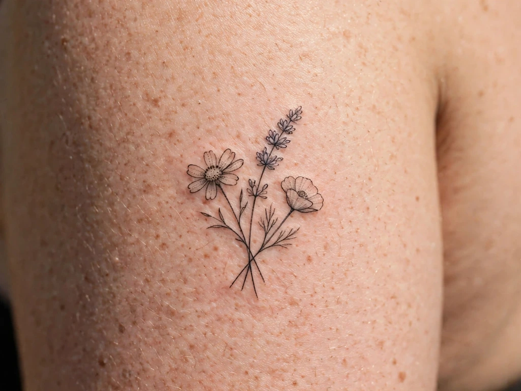
A posy of three different wildflowers at upper-arm scale — a daisy-form, a bell-form and a simple five-petal bloom, their slender stems gathered as if just picked — the cottage-garden end of dainty. Mixed clusters carry a meaning single flowers cannot: not one month, one person or one symbol, but a gathered handful, the tattoo equivalent of walking a hedgerow and coming back with whatever was blooming. Wearers take them for summers, for places, for grandmothers’ gardens, and the informality is the point — a posy is not arranged, it is found.
Found still needs drawing, and the discipline is variety without crowding: three blooms of genuinely different silhouettes, each simplified to its recognisable outline, stems crossing once at the gather point and nowhere else. The temptation to add a fourth and fifth flower is the design’s one enemy; a posy of three reads as a posy forever, while a posy of seven reads, in ten years, as a shrub.
Best placement: Upper arm, the posy upright on the flat; a forearm takes the same cluster lengthwise at a touch larger.
Best for / know before you book: Name your three flowers before the consultation — an artist drawing three specific blooms simplifies each one faithfully, while a generic posy simplifies into no flower in particular.
22. Pearl-Dot Arc
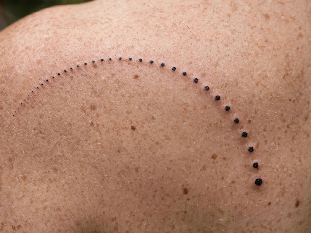
No line at all: a curve of dots, graduated from larger at the centre to smaller at the ends, laid across a shoulder blade like a string of pearls photographed mid-swing — or the dotted half of a necklace, worn without its chain. The pearl-dot arc is the most jewellery-like design in this guide precisely because it imitates the one jewellery form that is itself mostly spacing: beads on an invisible thread. On a blade it is a formal, almost evening tattoo, the one in this list that looks most at home with a backless dress and least like it is trying to be noticed.
Dots age by their own friendly law: each dot is a separate, stable deposit that softens at its edges while holding its place, so a dot design mellows rather than dissolves — provided the dots begin genuinely separate. Graduation is the discipline: size steps between neighbouring dots visible but gentle, and the smallest end dots still real dots, not pinpricks, or the arc’s ends vanish first and shorten the necklace year by year.
Best placement: Shoulder blade, the arc following the blade’s upper curve; a smaller arc curves at a collarbone’s outer edge like a necklace’s fall.
Best for / know before you book: Count the dots on the stencil and measure the gaps — in a design with no line and no subject, spacing is not a detail, it is the entire tattoo.
23. Calf Fern Fragment
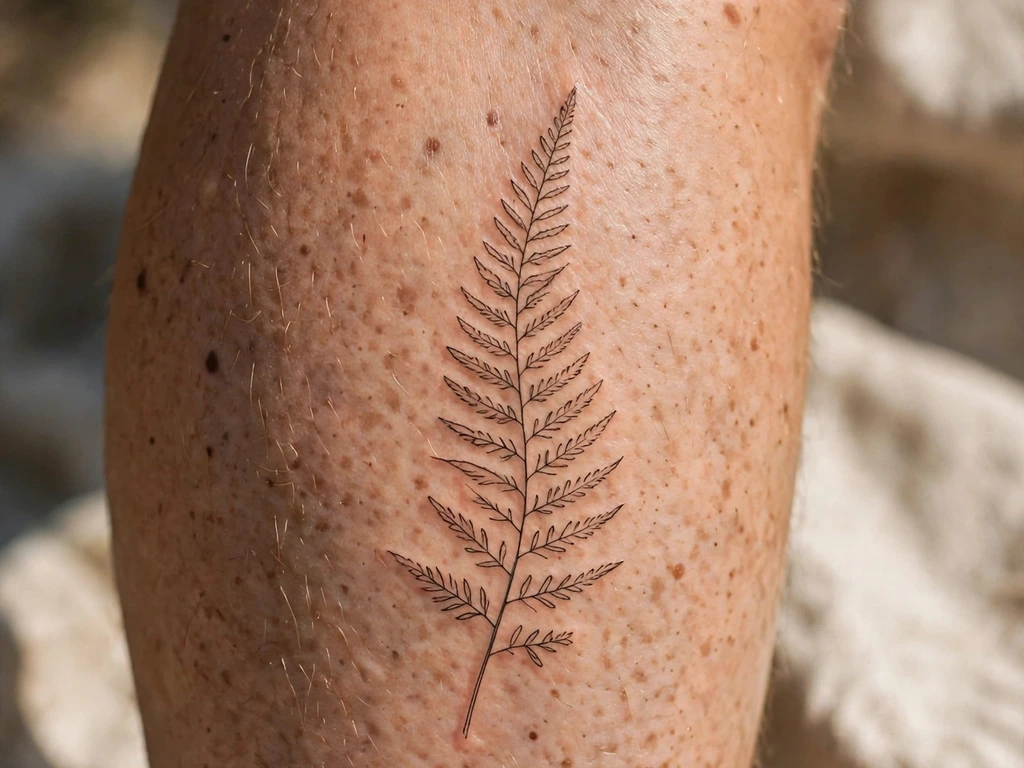
A fern frond, or rather the top two-thirds of one: a central stem curving gently up a calf, leaflets stepping off it in pairs, each leaflet a single fine line with its own small divisions implied by two or three strokes and no more — the woodland version of Design 5’s vine fragment, kept as a found piece of fern rather than the whole plant. Ferns read as quiet, old, unbothered growth, and wearers take them for exactly that temperament: the plant that thrives in shade, asking for nothing, outlasting the garden’s louder flowers.
The frond’s craft risk is its leaflets’ inner divisions, the finest parallel lines in this guide — and parallel lines at close quarters are where settling ink merges first. The honest drawing therefore spaces the leaflets wider than a real fern grows them and keeps each leaflet’s strokes to the minimum that says fern: the silhouette carries the identification, not the botany. Drawn so, a frond softens into a slightly dreamier frond. Drawn true to nature’s density, it softens into a smudge with a stem.
Best placement: Calf, the frond curving up the muscle with the tip toward the knee; a forearm takes a shorter frond lengthwise.
Best for / know before you book: Ask the artist to show you the drawing with half the leaflet strokes removed, and compare honestly — the sparser version is almost always the one that will still be a fern in fifteen years.
24. Moon and Sparkles
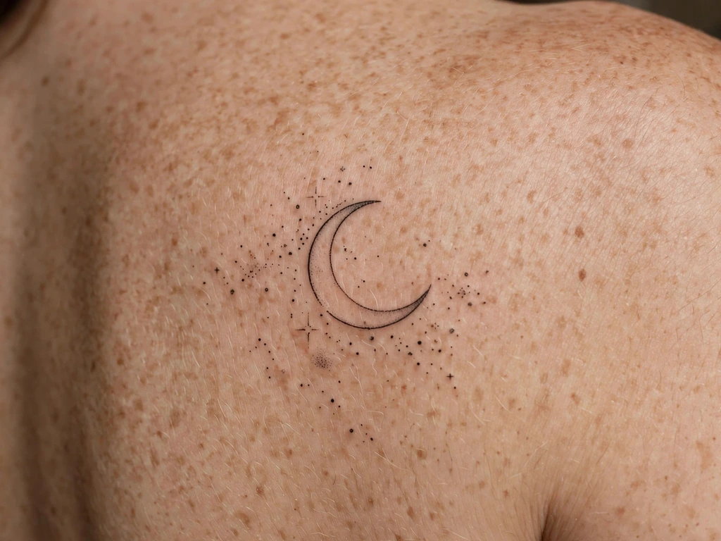
A crescent moon keeping company: the fine-line crescent of Design 7, enlarged to shoulder-blade scale and given a small court of sparkles and dots around it — the night sky composed as jewellery, a moon with its stones set loose. On a blade the composition gets room the ankle version cannot offer, and changes character with the space: less a symbol, more a scene — the moment in a storybook where the night is at its most decorative. Wearers take it for the same cycles-and-beginnings meanings as the tiny crescent, in a register that is pure ornament besides.
Scale buys detail, and this design spends the allowance carefully: the crescent can carry one gentle inner line, the largest sparkle can be a true four-point star with an open centre, and the scatter can afford a dozen elements — as long as every element keeps its own clear field of skin. The composition rule is constellation logic: cluster a little near the moon, thin out with distance, and end the scatter decisively, because a scatter that fades reads as unfinished while a scatter that ends reads as designed.
Best placement: Shoulder blade, the crescent on the blade’s flat with the scatter drifting toward the spine or shoulder edge.
Best for / know before you book: Approve the scatter from two metres away first — a night sky is judged the way real ones are, at a distance, by whether the arrangement feels inevitable.
25. Small Rose on a Fine Stem
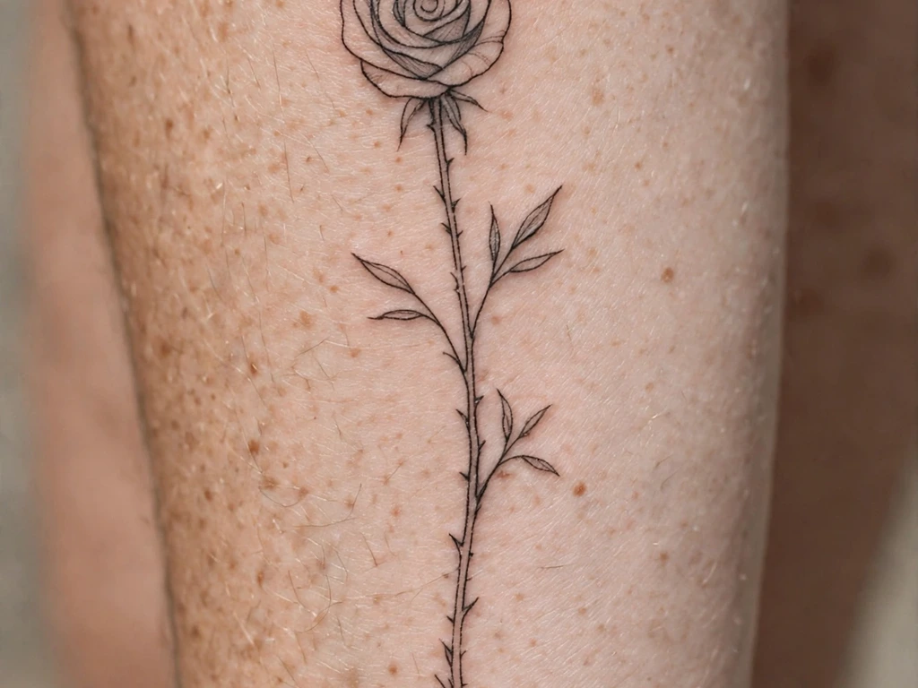
Close the guide with tattooing’s most-drawn flower at its daintiest honest scale: a small rose, bloom at the top, drawn as an open spiral in fine line, its long stem running down a forearm with two leaves and one thorn. A rose is a spiral before it is anything else, and fine line finds that spiral naturally — no fill, no colour, the bloom built from a few confident curves with skin between every turn. At five to seven centimetres it is the largest single flower in this guide, and deliberately so: a rose is the one bloom that should not be asked to go smaller and stay a rose.
The petal discipline is the rose’s whole law, stated the way artists state it to each other: count the turns. The spiral must be drawn with countable, separated curves — if you cannot follow the line from centre outward on the stencil, neither will your eye in ten years, when each curve has widened toward its neighbour. Two leaves, openly drawn; one thorn, bold, as the single sharp note. Kept at that discipline, this rose settles into the softest version of itself — a rose remembered rather than a rose photographed, which most wearers will tell you was the intention all along.
Best placement: Forearm, bloom toward the elbow and stem running to the wrist; the same composition climbs a calf elegantly.
Best for / know before you book: Trace the spiral on the printed stencil with one finger, centre to edge, without lifting — a rose line you can trace is a rose that will survive its own softening.
Dainty Tattoo Placement by Size
| Size | Typical dimensions | Best placements | Good to know |
|---|---|---|---|
| Micro | 1–2.5 cm | Behind ear, side of finger, inner wrist | One bold-for-size shape only — a star, a heart; behind-ear work settles softly and finger work fades fastest of all, with touch-ups priced in from the start |
| Small | 2.5–6 cm | Wrists, ankles, collarbone edge, upper arms | Tiny florals, sparkles, chains and the single word live here — simple silhouettes, open spacing, the ideal scale for a first dainty piece |
| Medium | 6–14 cm | Forearms, shoulders, shoulder blades | Most of this guide lives here: sprigs, sprays, clusters and the moon-and-sparkles composition at honest line weight with room to breathe |
| Large-but-dainty | 14–22 cm | Calves, forearms, shoulder blades | The long calf stem and fern fragment — proof that dainty is a handling, not a measurement; length buys spacing, which is what delicacy is made of |
A dainty tattoo’s placement is also a rubbing-and-sun decision: the same design keeps its finest lines years longer on calm, covered skin than on skin that flexes, rubs straps or lives outdoors. Shoulder blades and upper arms are delicacy’s archive; wrists and ankles are its shop window — shown more, serviced sooner. Choose for the five-year version, not the first-week photograph.
How to Choose Your Dainty Tattoo (and What to Know Before You Book)
Run the true-size test before anything else. Print the design at its final, actual size, tape it to the placement and wear the paper for a full day. Screens enlarge dainty work into a lie of detail; paper at true size tells the truth about what the tattoo will actually be — a wisp, a glint, a small clear shape. If the paper delights you at arm’s length and in mirrors, book it. If you keep bringing it closer to your face, the design wants to be larger or simpler, and it is telling you at the cheapest possible moment.
Interrogate the spacing, not the line. Consultations about dainty work go wrong when they admire the drawing’s fineness. Ask instead: where will this soften first, what will touch what as the lines widen slightly, and what was left out to buy the gaps? An artist who answers by pointing at the empty skin is the artist this style exists for. An artist who promises permanent hairlines forever is selling the fresh photograph, and the fresh photograph lasts a fortnight.
Judge artists on healed delicate work. This is the search that matters: healed fine-line and micro work, a year old at least, ideally on a placement like yours. Look at three things — are the lines still lines rather than blurs, is the design’s empty skin still empty, and do the tiniest elements still read as what they were? Fresh dainty work always looks exquisite. Healed dainty work is the portfolio of the artist you are actually hiring.
Budget the touch-up at booking, not as a surprise. For micro symbols, chains and the behind-ear piece, expect the lightest lines to want strengthening in the early years; for the side-of-finger design, expect it regularly for life. Ask at the consultation what the studio’s touch-up policy is and what a refresh of your piece would cost later. None of this is a defect — it is dainty work’s known running cost, and the wearers who priced it in advance are the ones still recommending the style at year ten.
Keep the first piece honest-sized. If this is your first tattoo, the kindest designs here are the small ones on calm skin — the single flower, the micro heart, the daisy — because they teach you how your own skin holds fine line before you commit a forearm or a calf to it. Two people’s identical sprigs can settle noticeably differently, and a first small piece is evidence about your skin that no gallery can give you.
Say no to the sternum shortcut, if it comes up. Galleries will show you delicate centre-chest pieces constantly. This guide has deliberately kept to placements that heal and age the way its craft section describes, and your artist should be able to explain, placement by placement, how softening changes with the skin a design sits on.
Key points to remember:
- Dainty is an aesthetic — delicate handling, fine detail, jewellery-like composition — not a size: small is a measurement, minimalist is a philosophy, dainty is a touch
- The honest minimum rules every element: drawn at the boldest weight that still reads delicate, with detail budgeted by healed size, not fresh size
- Spacing is what delicacy is made of — a dainty design is mostly skin, and the gaps are what will still be separating the elements in ten years
- Always run the true-size test: print at final size, wear the paper a full day, and judge it at the distance other people will actually see it
- Touch-ups are priced in from the start for the finest pieces — micro symbols, chains, the behind-ear star, and above all the side-of-finger design, which fades fastest of all
- Judge artists on healed dainty work — lines still lines, gaps still gaps — and treat any promise of permanent hairline detail as a sales pitch, not a forecast
Frequently Asked Questions
What is the difference between a dainty tattoo, a small tattoo and a minimalist tattoo?
They describe three different things. Small is a measurement — dimensions only, nothing about handling, so a tiny solid-black heart is small without being dainty, and a long fine-line vine is dainty without being small. Minimalist is a philosophy — reduction as the point, the fewest marks a subject can survive. Dainty is an aesthetic of touch: delicate line weight, fine detail, generous spacing and a jewellery-like composition, at whatever size the placement suits. A design can be all three at once — a two-centimetre sprig usually is — but the daintiness is the handling, and it decides how the tattoo must be drawn and how it will age.
Do dainty tattoos fade faster than other tattoos?
Yes — softening faster is the style’s known trade, and this guide states it rather than softening it. Delicate work holds less ink per line than bold work, and the lightest lines lighten and spread first, which is why dainty designs are drawn at the honest minimum, with detail budgeted by healed size and spacing treated as the design’s main material. On calm, covered placements a well-spaced dainty tattoo stays lovely for many years, mellowing rather than failing. On high-friction placements it fades sooner, and on the side of a finger fastest of all, needing regular touch-ups to keep its shape. Sun protection on healed work slows the whole process more than any other single habit.
How small can a dainty tattoo be?
Smaller than most people fear and larger than most galleries pretend. A single bold-for-size shape — a heart, a star, a moon — holds together at one to two and a half centimetres if its silhouette is simple and its line honestly weighted. Anything with inner detail needs more room: a flower wants three centimetres or more so its petals keep skin between them, a word wants length so its letter counters stay open, and a lace-like pattern wants the most room of all, because its gaps are its structure. The test that settles every argument is the true-size test — the design printed at final size and worn as paper for a day. If it reads at that size, it is big enough; if it only reads zoomed, it is not.
Where is the best placement for a dainty tattoo?
Where the skin is calm. Shoulder blades and upper arms keep fine line sharpest longest — they move little, rub little and stay covered from the sun; forearms are the showcase placement, on a slightly faster clock. Wrists and ankles are the jewellery placements — chains, charms, sparkles and micro florals live there naturally — and accept more softening and earlier touch-ups as the cost of being seen. The collarbone’s outer edge suits a single sprig along the bone. Behind the ear is a lovely hidden placement whose thin skin settles work softly, and the side of a finger is the honest exception to everything: the fastest-fading placement in tattooing, chosen knowingly, with touch-ups as a permanent part of the arrangement.
How much does a dainty tattoo cost, and what about touch-ups?
Studios usually price small work by the piece or by a minimum charge rather than by the hour, and a dainty design’s price reflects the artist’s skill more than its size — a perfect two-centimetre sprig is harder to execute than a mediocre twenty-centimetre one. Ask two money questions at the consultation: what the studio’s touch-up policy covers in the first months, and what a refresh of your specific piece is likely to cost in a few years. For most placements a refresh is occasional and minor; for the finest micro work it is a predictable maintenance cost, and for finger work a recurring one — budget it as part of the design, the way this guide prices it in from the start.
Final Thoughts
A dainty tattoo is a small act of precision in a loud medium: a sprig instead of a sleeve, a glint instead of a statement, ink worn the way jewellery is worn — close, chosen, and meant to be discovered rather than announced. The wearers who love theirs longest are not the ones who found the finest artist or the tiniest design. They are the ones who understood the bargain at the start: that delicacy in skin is made of spacing, drawn at the honest minimum, tested at true size, and maintained like any other fine thing a person owns.
So choose the design whose empty skin you love as much as its lines, book the artist whose healed dainty work keeps its gaps, and wear the paper version for a day before you wear the ink for decades. Given that honesty, a dainty tattoo gives back the most wearable beauty tattooing has — a whisper, in ink, that stays a whisper.