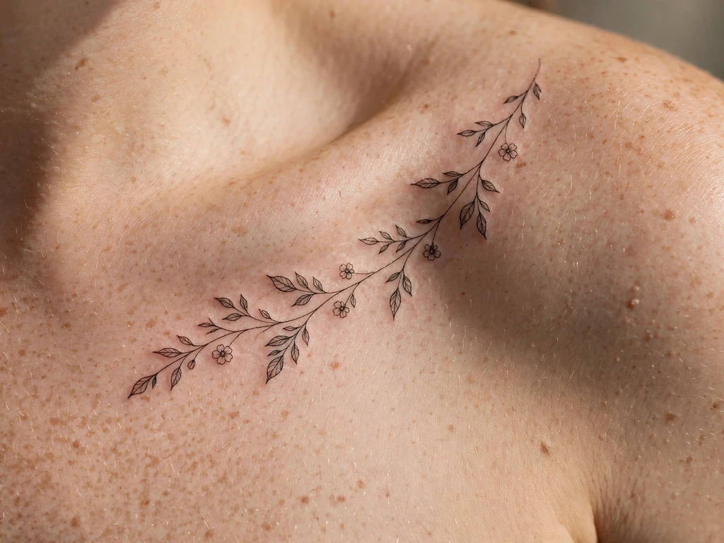
A collarbone tattoo is the closest thing tattooing has to jewellery you never take off. It sits where a necklace sits — along the clavicle, the one bone in the body that runs horizontally and shows itself through the skin along its whole length — and it is chosen, more than almost any other tattoo, to be seen: framing the neck, edging a neckline, catching the eye the way a collar necklace has caught it for centuries. That visibility is the design’s glory and its discipline. The collarbone is thin-skinned, bony, mobile and crossed daily by straps and seatbelts, and a tattoo that ignores any of that will tell you so within a year.
You will find 25 original collarbone tattoo ideas here — floral vines that run the bone’s full length, mirrored pairs fitted separately to each side, fine-line branches, swallows, moon phases, a snake, a single script line and a blackwork band. Most of them are drawn in the register this placement made famous — fine line, whose full design family and honest ageing account live in our fine line tattoo ideas guide. But read the honest section first. The question everyone actually types into the search box about this placement is not “which design” — it is “does it hurt”, and the pages that rank for this keyword mostly skip the real answer. This guide does not: the pain, the healing and the strap problem are answered in full before a single design appears, because on this placement the placement is the tattoo.
Every design below is built on one named discipline — the Bone Line rules — because the clavicle is not a flat canvas that happens to be near the neck. It is a curved, S-shaped bone with skin stretched directly over it, and the designs that survive here are the ones drawn for that anatomy rather than pasted onto it.
What Does a Collarbone Tattoo Mean?
Because a collarbone tattoo is a placement before it is a subject, its meanings begin with the placement itself. Visibility is the first meaning. Most tattoos are chosen for the wearer and revealed by choice; a collarbone tattoo is worn the way jewellery is worn — at the frame of the face, in the open, part of how you present yourself to a room. Wearers who choose it are usually choosing display: the wish for the tattoo to be a feature, not a secret. Framing follows: the two collarbones are the body’s own picture rail, the line where neck becomes shoulder and chest, and a design laid along them reads as an adornment of the whole upper body — the reason necklace language (collar, drape, pendant) maps onto this placement so naturally. Jewellery history underlines the point: as the antique-jewellery house M.S. Rau’s history of necklace styles sets out, the collar-length necklace — the 15-to-16-inch strand that “fit around the base of the neck” — has been worn for centuries precisely because it rests against the collarbones and is meant to be seen, from medieval livery collars that advertised status to the chokers ancient Egyptians wore close above the bone. A collarbone tattoo is that same decision, made permanent.
The subjects then carry their own readings, held as personal and cultural symbolism rather than fact. Floral vines and branches — the rising search in this topic, and the majority of this guide — read as growth following a line the body drew first; the vine as a subject in its own right, across every placement it climbs, is gathered in our vine tattoo guide. Mirrored pairs read as balance: two halves, one statement, the body’s symmetry made deliberate. Birds along the bone read as lightness at the body’s highest display shelf. Moon phases read as cycles — change that returns. And script along the bone is the placement’s most intimate register: a line worn where a necklace pendant would hang, close to the throat, meant to be read by people standing near. None of these readings is a fact about the design; they are what wearers bring to it, and the honest artist’s job is the part that is fact — whether the drawing will still say it in ten years.
One discipline note before the designs: this guide keeps every design on the bone line itself — along the clavicle, just above it, or draping its outer edge. The centre-chest and sternum pieces that fill collarbone galleries are a different placement with different rules, and they are not smuggled in here.
Is a Collarbone Tattoo Painful? The Honest Answer
Yes — more than an arm, less than the internet’s horror stories, and the honest answer is a map rather than a number. Artists who work this placement daily give the same account, and it follows directly from the anatomy, so here it is in full.
Why it feels the way it feels. The clavicle is, as the anatomy reference Kenhub’s clavicle article puts it, “an elongated, S-shaped bone” that lies just under the skin — in the shoulder-girdle anatomy it is described as palpable along its entire length, meaning there is almost no padding between the skin’s surface and the bone anywhere along it. A tattoo needle working over a padded muscle works over a cushion; over the clavicle it works over a drum. The sensation wearers report most is not sharper pain so much as vibration: the needle’s buzz travels into the bone and hums along it, sometimes felt up into the jaw or across the shoulder. It is an odd feeling more than an unbearable one, but it surprises everyone who was only warned about “pain”.
Why it varies along the bone. The collarbone is not one uniform strip. Directly on the ridge — the bone’s top edge — the skin is thinnest and the vibration strongest; most wearers rate this the sharpest part of the session. Just above the bone, where the skin dips toward the neck, the ground softens slightly and the work feels closer to an ordinary tattoo. Just below it, toward the upper chest, there is a little more tissue and the sensation eases again — which is why so many designs in this guide sit a few millimetres off the ridge rather than on it, a choice made for comfort as much as for ageing. The inner end near the throat is more sensitive for most people than the outer end near the shoulder, and the bone’s S-curve means a long design crosses all of these zones in one sitting: a vine that starts gentle at the shoulder can be noticeably sharper by the time it reaches mid-bone.
How long it actually lasts. Here the placement repays you. Collarbone designs are long and low — they are lines, not filled panels — so sessions are usually short: a fine-line vine or branch is often under an hour, and even a detailed mirrored pair rarely runs like a large arm piece. The sharpest zone is a strip a centimetre wide, crossed in passes, not camped on. Most wearers describe the experience as intense in moments, entirely manageable overall — a 6 or 7 out of 10 at the ridge, a 3 or 4 just off it, in the informal ratings clients give their artists afterwards.
Healing behaviour. Collarbone skin is thin and it moves: every arm raise, every head turn, every shrug travels through it. Expect the usual first-days tenderness plus a placement-specific stiffness — reaching overhead and carrying a bag on that shoulder will remind you it is there for the first week. Thin skin over bone also scabs lightly and can look healed before it is; the full settle takes the normal few weeks, and the line that looks perfect at day five should still be treated as fresh. A small amount of line softening in the first year is normal here — the ridge is the fastest-settling ground on the placement, which is why the craft section insists detail lives off it.
Aftercare is a strap problem. This is the part the ranking pages skip, and it is the part that decides how your tattoo heals. The collarbone is crossed by: bra straps, which sit almost exactly on the bone’s outer third; bag and backpack straps, which press and drag across it; seatbelts, whose diagonal crosses the collarbone directly; and high necklines and collars, which rub the inner end. For the first two weeks: choose strapless or wide-strap tops where you can, carry bags on the other shoulder, pad the seatbelt or adjust its height so the belt’s edge is not sawing the fresh line when you drive, and sleep on your back or the opposite side — the placement is almost impossible to sleep on directly, which is the one mercy. None of this is medical advice; it is the standard practical counsel artists give for this exact placement, and following it is the difference between a line that heals once and a line that gets rubbed back to raw and heals twice.
The honest summary. A collarbone tattoo is a moderately painful, mercifully short tattoo whose real cost is not the session but the fortnight of strap management afterwards. If that trade sounds fair, the designs below are drawn for you. If you want this look with less of both, Design 3’s off-ridge branch and the smaller outer-edge designs are where to start.
The Bone Line: How a Collarbone Tattoo Is Built
Everything in this guide follows five rules. They are not style notes; they are how the placement works, and a design that breaks them is a design that will visibly age badly.
1. Long, low compositions only. The collarbone is a horizontal line and every good design here is horizontal too. Ignore the temptation to stack motifs vertically; a tall design over the bone fights the line under it and ends up looking pasted on.
2. Follow the bone’s S-curve, never fight it. A straight vine laid across a curving bone strains at the ends; the drawings that sit right are made to flex with the clavicle’s own bend.
3. Keep the detail off the ridge. The bone’s top edge is the fastest-softening ground on the body, so the design carries its intent and weight in the area beside the ridge, not on it, and the line its edge.
4. Larger spacing on tiny marks. Every tiny mark is spaced generously so the design survives years of spread; the placement’s small scale is an illusion — the drawings are airy at the skin, so they still read as fine at ten paces.
5. One anchor per side, and never a centre crossing. Designs end at the inner notch or before it; nothing crosses the centre-line, because the body’s symmetry reads as intrusion when a design bulldozes across it. A mirror reads as designed. A design that tramples the centre reads as an accident.
Collarbone Tattoo Styles and How They Age
Ageing is where collarbone advice usually ends with a shrug. Here is the honest table, because the style you choose decides what you will see in five years far more than the subject. All seven styles appear in this guide, and the table is the reason some designs are drawn the way they are.
| Style | At year one | At year five | What saves it |
|---|---|---|---|
| Fine-line floral vine | Settles cleanly, edges crisp | Fades slightly and softens; if lines are kept well apart, still crisp at normal distance | Spacing, not size |
| Blackwork band and dotwork | Solid and bold | Fades back a degree and settles into the skin’s depth | Weight balance (the band is broad, the dotwork weight is light) |
| Script line | Delicate and precise | Tends to thicken slightly as the line settles into thinner skin, losing the sharpest hairlines | Scale (the lettering is cut large and spaced) and the lightest weight line |
| Watercolour wash | Colour washes beautifully — soft pink and faded greens | Washed mottled; pigment was designed to soften and the style expects it | Soft shading carries the wash; there is no line to hold it |
| Minimalist single line | Crisp and airy | Fades fastest of the styles here and softens first at the edges | It uses the lightest possible line and accepts the ageing as part of the design |
| Dotwork mandala | Reads as intricate blackwork | Tends to read more as a shaded field than as individual dots | The dots are set at a readable scale and the mandala is geometric, not detailed |
| Blackwork snake | Solid, glossy black | Holds black well — opaque lines dominate here | Opaque black line, broad bands, no hairline dependence |
Read the table as a warning and a promise. The designs here are not drawn to look perfect on the day; they are drawn to still read in five years, which is why the fine lines are spaced, the scripts are large, and the only style that truly leans on hairline detail is the one that expects to lose it.
Collarbone Tattoo Ideas at a Glance
| # | Design | Style | Best position on the bone |
|---|---|---|---|
| 1 | Floral vine along the bone | Fine-line floral vine | Along the full bone |
| 2 | Mirrored floral vines | Fine-line floral vine | Along both bones, fitted separately |
| 3 | Delicate branch above the bone | Fine-line floral vine | Just above the ridge |
| 4 | Lavender sprig | Fine line, dotwork accents | Outer edge of the bone |
| 5 | Swallows in flight | Fine line | Following the bone’s curve |
| 6 | Butterfly resting on the bone | Fine line, dotwork | Centre of the bone |
| 7 | Peony in bloom | Fine line with watercolour wash | Outer edge of the bone |
| 8 | Moon phases along the bone | Minimalist single line | Along the full bone |
| 9 | Tiny stars and dots | Dotwork | Along the bone, evenly spaced |
| 10 | Floral branch and a bird | Fine line | Following the bone’s curve |
| 11 | Sun and moon, one per side | Fine line, dotwork | One on each bone |
| 12 | Leafy vine and seed pods | Fine-line floral vine | Along the full bone |
| 13 | Falling blossom petals | Fine line, dotwork | Outer edge, trailing downward |
| 14 | Rose with fine-line stem | Fine line | Centre of the bone |
| 15 | Feather laid across the bone | Fine line | Across the bone’s outer third |
| 16 | Script line along the bone | Script | Following the bone’s curve |
| 17 | Blackwork band | Blackwork | Along the full bone |
| 18 | Cherry blossom branch | Fine line with watercolour wash | Just above the ridge |
| 19 | Dandelion seeds drifting | Fine line | Outer edge, trailing upward |
| 20 | Mandala set into the bone’s curve | Dotwork mandala | Over the bone’s outer curve |
| 21 | Snake curves along the bone | Blackwork snake | Following the bone’s curve |
| 22 | Half-blossom, half-leaf vine | Fine line | Along the full bone |
| 23 | Falling fern frond | Fine line | From the ridge, trailing inward |
| 24 | Bird and branch, one per side | Fine line | One on each bone |
| 25 | Tiny sprig and dot accents | Fine line, dotwork | Outer edge of the bone |
25 Collarbone Tattoo Ideas
1. Floral Vine Along the Bone
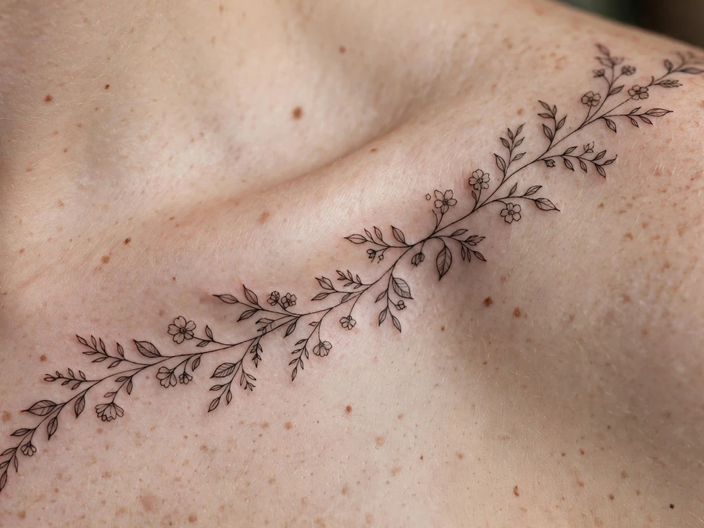
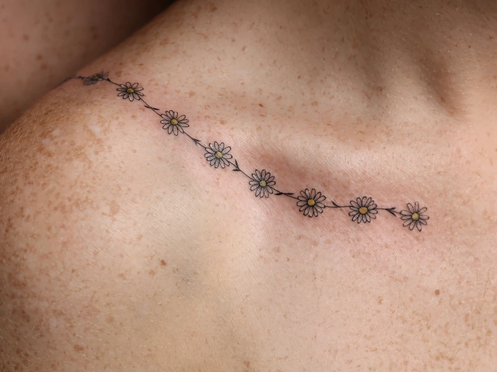
A single fine-line vine carries the whole placement on its back — small blossoms and leaves threaded along the stem, the vine itself following the bone’s S-curve rather than fighting it. Because the stem is the drawing, this design reads as one continuous gesture rather than a scattering of motifs, and the bone’s length becomes its frame.
It lasts because the weight is held in the leaves and the stem’s line stays clean, with nothing on the ridge itself to soften first. The vine’s spacing is deliberately wide: the gaps between blossoms are as much a part of the design as the blossoms, and wide gaps are what stop a fine line from closing into a blur as it ages.
Best placement: along the full bone, starting two centimetres short of the inner notch and running to where the bone ends at the shoulder.
Best for: a first collarbone piece — the classic choice, and the one most wearers mean when they say they want this placement.
2. Mirrored Floral Vines
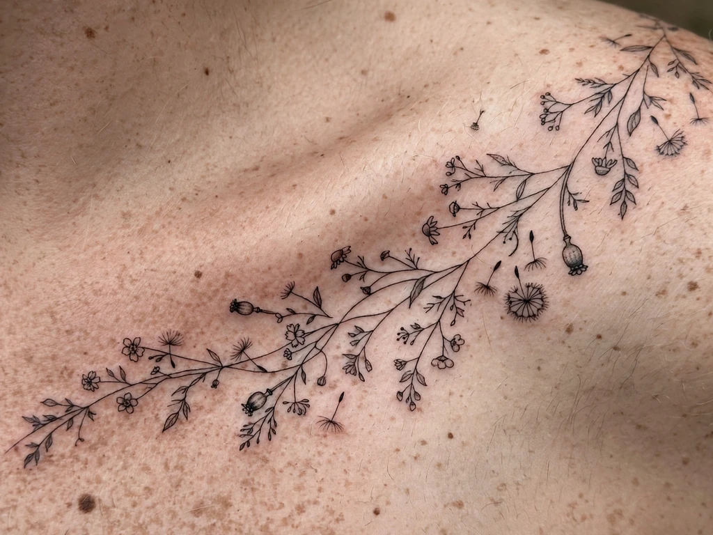
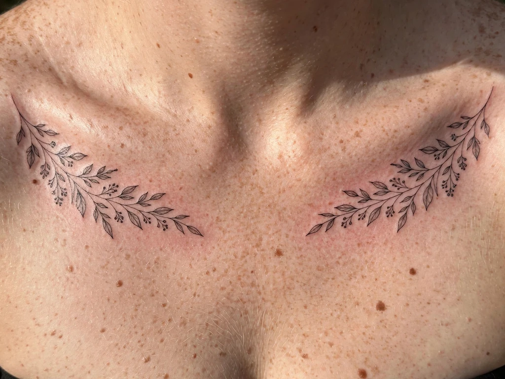
Two vines — one per collarbone, fitted separately to each side so the mirror is real, not a copy pasted across the body. The mirror is the design’s discipline: each vine follows its bone’s own curve rather than demanding the two sides match through the centre-line, which they never quite do in a living body.
Keep them slightly apart, with the gap between the two vines and the anchor point at each inner notch held tight — the anchor point is what makes a mirror read as designed, and a pair that drifts out of alignment reads as two separate tattoos that happened to be similar.
Best placement: along both bones, each vine fitted to its own bone and ending before the centre-line.
Best for: balance seekers — anyone who wants the placement’s framing power doubled.
3. Delicate Branch Above the Bone
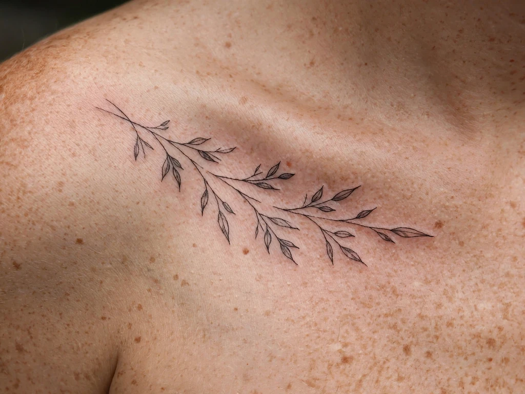
A thin branch with sparse leaves held a few millimetres above the ridge, in the softer ground where the skin dips toward the neck. It is the gentlest session in this guide — the ridge is crossed only by air, never by needle — and the one artists recommend for a first piece by someone who knows their pain tolerance is low, or for anyone whose collarbone is especially prominent.
The design’s airiness is the point. The leaves are small because the ground is thin; keep the stems light and the spacing wide, and the branch survives years of spread better than a dense arrangement on the same ground would.
Best placement: just above the ridge, the stem’s line tracing the bone’s curve from a hair’s breadth away.
Best for: a first collarbone tattoo, and for prominent collarbones.
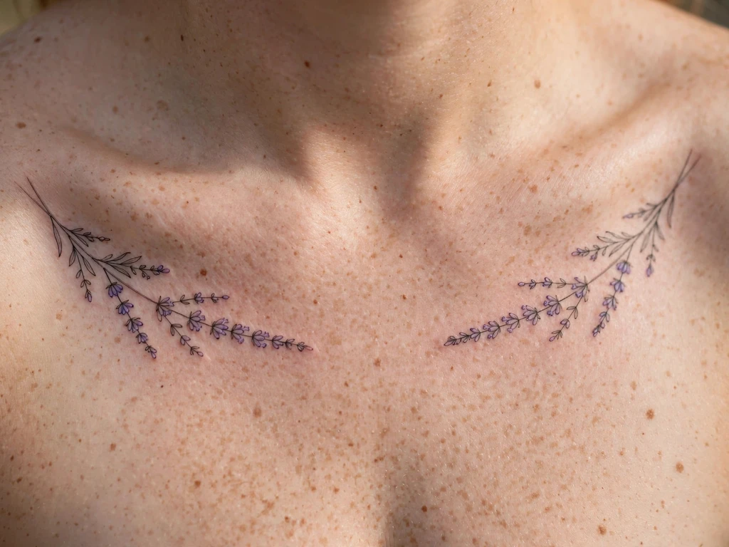
4. Lavender Sprig
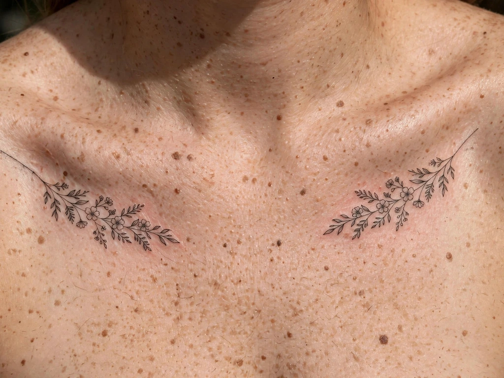
Lavender is engineered for small scale: a single stem, buds packed along one side, everything about it legible at three centimetres long. It is the placement’s quiet option — it looks like a sprig laid on the skin rather than a tattoo drawn there — and the reason lavender appears in collarbone galleries more than any other single flower, more so even than roses.
Dot the buds tightly enough to read as lavender and not as a fern, and keep the stem’s line fine — the stem’s fineness is what tells the eye this is a sprig, not a branch.
Best placement: outer edge of the bone, the sprig’s tip tracking the bone’s end toward the shoulder.
Best for: minimalists who want a design that reads as a sprig, not a statement.
5. Swallows in Flight
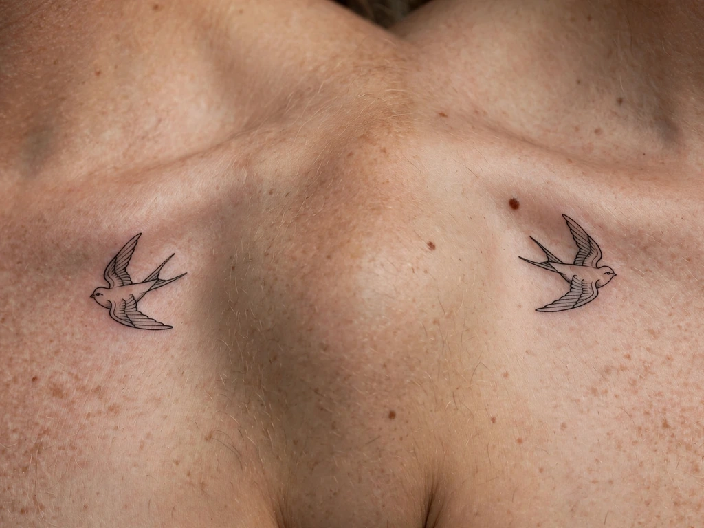
Two swallows, swept along the bone’s curve as if the bone were the wind line they are riding. The birds’ movement is what the design is for: placed along a curved line, still wings look like flight, while still wings placed flat look like pinned specimens — and a swallow pinned to a board is a sad tattoo.
Keep the birds’ spacing airy and let the bone’s S-bend do the choreography; the curve is the wind, the birds are the weather, and the design reads as motion because the ground is curved.
Best placement: following the bone’s curve, the lead bird higher than the trailing one.
Best for: romantics — freedom and movement made visible at the neckline.
6. Butterfly Resting on the Bone
A butterfly parked at the centre of the bone — the one moment of stillness in a guide full of vines, and the one design whose subject does not move. The butterfly sits the way a real one would, wings folded above the bone line, and the stillness is the image: the wearer is the garden, the butterfly is resting, and the design is a held moment.
Keep the wings’ detail light and the antennae fine — heavy antennae are the give-away that this is a drawing, not a visitor.
Best placement: centre of the bone, wings above the ridge.
Best for: a quiet statement piece — small, still and read by everyone.
7. Peony in Bloom
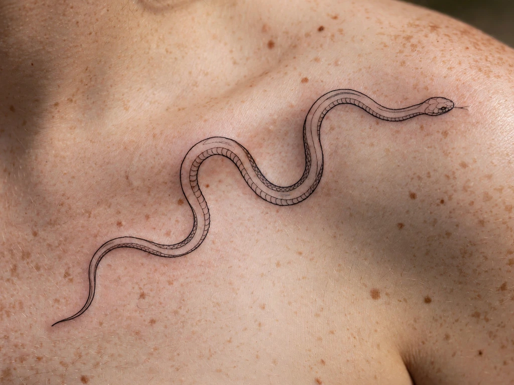
The peony is the guide’s largest flower and its softest register — petals layered with a watercolour wash that softens the design’s edges rather than hardening them, a choice that suits the placement because the collarbone’s skin is thin and a heavy black outline would look cut into it. The peony in bloom is the flower at its most open, and the wash treatment is the only way the placement can carry a flower this size without it looking stamped.
The watercolour wash is doing the ageing work here: soft washes mottle into the skin rather than holding a hard edge, so the design’s ageing is its softening rather than its loss — it washes rather than fades, and a design that expects to soften ages better than one that expects to stay.
Best placement: outer edge of the bone, the bloom floating just off the ridge.
Best for: the romantic register — soft colour at the neckline, and the largest floral piece in this guide.
8. Moon Phases Along the Bone
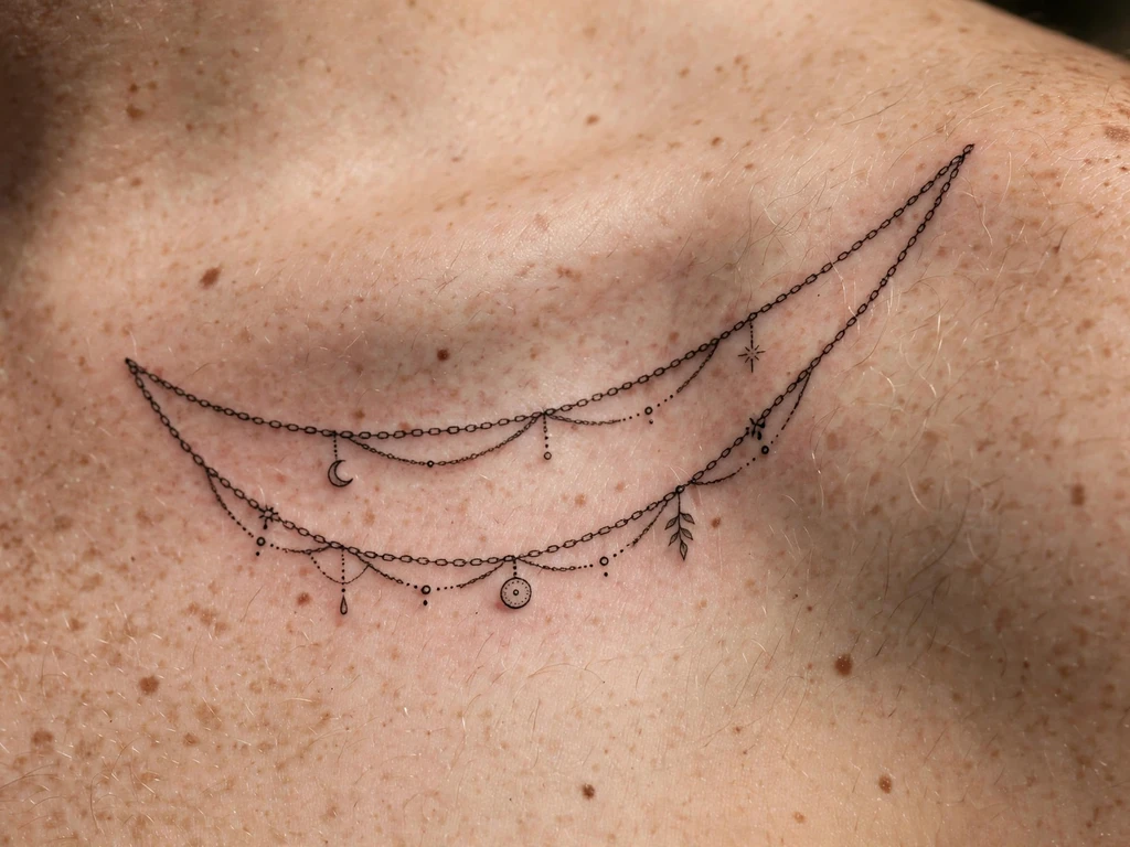
A row of moons in their phases, spaced along the bone the way the moon is spaced across the night sky — each moon a single line, the sequence read by the time it takes the eye to travel the bone. The moon phases along the bone are the placement’s most minimalist design, and the one that most directly trades subject for sequence: a single phase is a symbol; the sequence is a story.
Keep the moons’ scale even and the gaps even; the power of the sequence is its regularity, and an irregular sequence reads as a mistake rather than a choice. The crescents should be thin — the crescent is a hairline, and a thick crescent is a crescent drawn by someone who has never looked at the sky.
Best placement: along the full bone, moons spaced evenly from inner notch to shoulder.
Best for: minimalists who want a sequence rather than a subject.
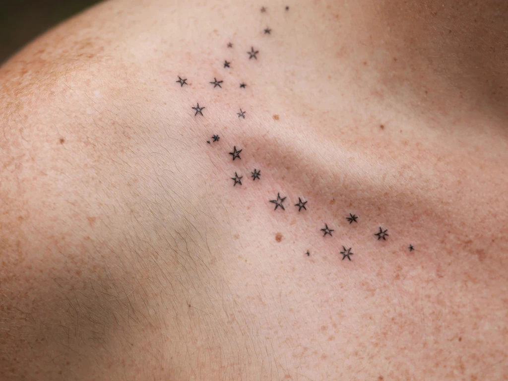
9. Tiny Stars and Dots
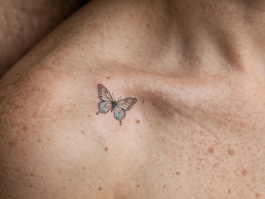
A constellation of fine-line stars and dots threaded along the bone — the guide’s smallest-scale design, and the one that most explicitly uses the rule about larger spacing on tiny marks. The dots are the design’s skeleton, the stars its punctuation, and the spacing between them is the measure of the artist: spread them too wide and they read as a scattering; too tight and they merge into a line as the skin ages.
Keep the stars’ points crisp and the dots generously spaced — the design works because each mark is a mark, not a smudge, and the gaps between the dots are the design’s breathing room.
Best placement: along the bone, marks evenly spaced from the inner notch outward.
Best for: the smallest possible piece — a constellation that reads as a constellation.
10. Floral Branch and a Bird
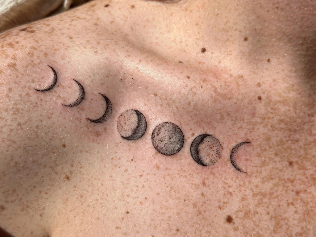
A flowering branch with a bird perched where the blossoms are thickest — the guide’s only design that pairs the two, and the one that most rewards a wide reading: the bird is the branch’s reason, the branch is the bird’s perch, and the bone is the stage they share.
Keep the bird’s detail sparse — a perched bird drawn in outline is a bird at rest; fill it in and it becomes a weight on the branch rather than a visitor to it.
Best placement: following the bone’s curve, the bird at the inner third where the blossoms are densest.
Best for: storytellers — a design with two subjects that still reads as one.
11. Sun and Moon, One Per Side
A sun on one collarbone and a moon on the other — the guide’s most portable pair, and the only one that can be read as a matched set or as two separate tattoos depending on the neckline. The pair’s power is the contrast: the sun’s radiating lines against the moon’s quiet crescent, the day’s heat against the night’s calm, and the collarbone is the line they are balanced across.
Keep the sun’s rays the lighter weight and the moon’s crescent the heavier line — the two marks need to balance each other at a glance, and if one dominates the pair reads as a sun tattoo with a moon beside it rather than a pair.
Best placement: one on each bone, the sun on the wearer’s right and the moon on the left.
Best for: couples and symbol collectors — duality made wearable.
12. Leafy Vine and Seed Pods
A vine that has grown past flowering — its blossoms spent, its leaves full, its seed pods carried to the bone’s end where the vine stops and the body continues. It is the most botanical entry in this guide, and the one that most rewards an artist patient enough to draw seed pods that are individually legible at a few millimetres across.
The pods are the detail to watch: draw them as pods, not as berries, and the vine reads as a plant in its late season rather than a plant in the wrong season.
Best placement: along the full bone, pods clustered toward the outer end.
Best for: botanical realists — a vine with a life cycle, not just a pretty stem.
13. Falling Blossom Petals
Petals caught mid-fall from a branch that is itself mostly out of frame — the design’s anchor is invisible, and the petals are the evidence. It is the guide’s most suggestive design: a branch you cannot see, petals you can, the inference left to the viewer — and suggestion is a braver choice than display, because it trusts the viewer’s eye to finish the drawing.
Keep the petals’ spacing scattered, not evenly marched; a fall is irregular, and an even row of petals is a row, not a fall.
Best placement: outer edge, petals trailing downward from the bone’s end.
Best for: minimalists who like suggestion more than statement.
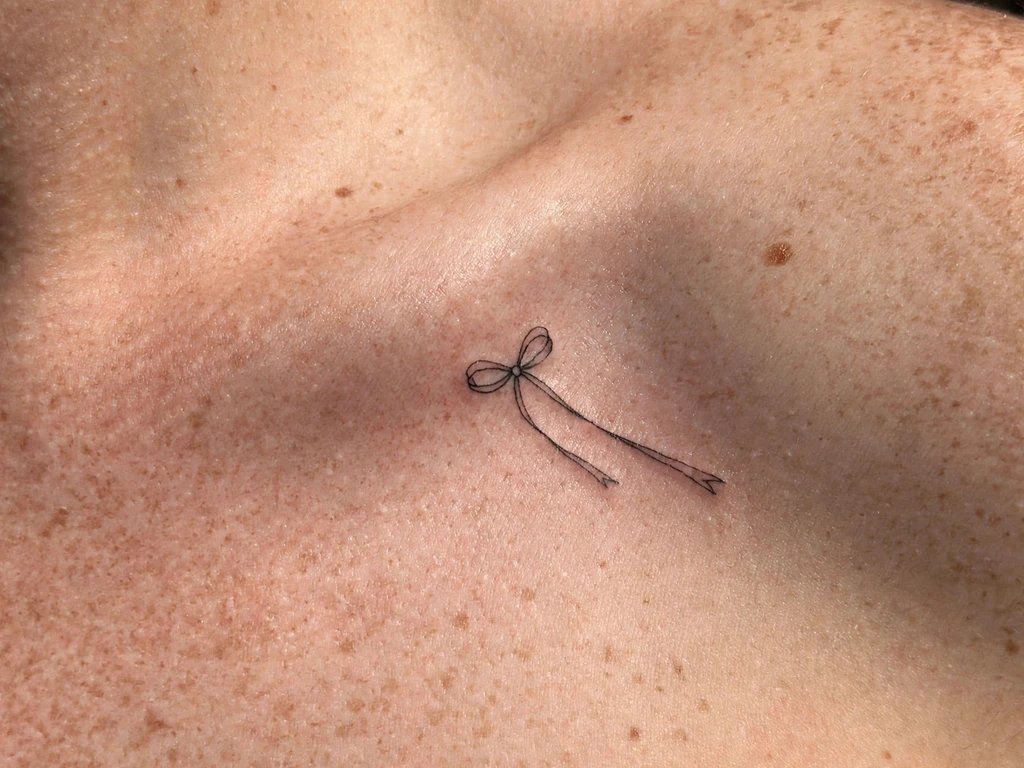
14. Rose with Fine-Line Stem
A rose drawn in fine line, its stem traced in the lightest line in this guide — the rose is a classical subject, but the drawing’s discipline is modern: the stem is fine, the leaves are few, and the bloom is the only thing with any weight in it. The rose is the flower everyone knows, drawn the way no one would expect it: a line drawing of a rose, not a rose tattoo.
Keep the rose’s shading to a single tone and let the line do the work — a rose with two tones of shading is a colour piece, and this design is a drawing.
Best placement: centre of the bone, the bloom just above the ridge.
Best for: classical tastes, drawn with modern restraint.
15. Feather Laid Across the Bone
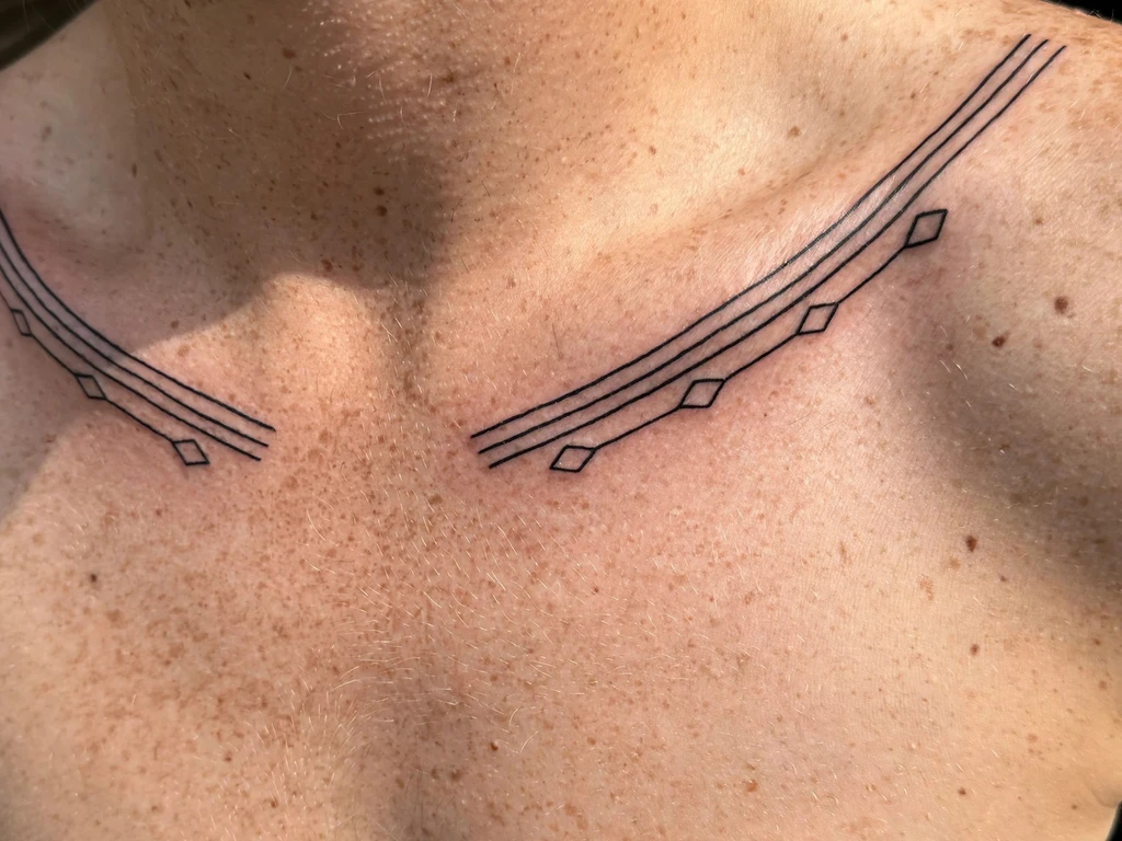
A feather laid across the bone, its barbs drawn in fine line and its spine following the bone’s outer third. The feather is the weight of the design’s scale: its barbs are the fine-line test — any two that cross read as a mistake — and the feather laid across the bone reads as a thing that landed, not a thing that was drawn, which is the entire charm of it.
Keep the feather’s spine straight and the barbs evenly spaced; the test of a feather is its uniformity, and a feather with uneven barbs is a feather in the wind, not a feather at rest.
Best placement: across the bone’s outer third, the feather’s quill toward the shoulder.
Best for: fine-line enthusiasts — the most demanding small piece here.
16. Script Line Along the Bone
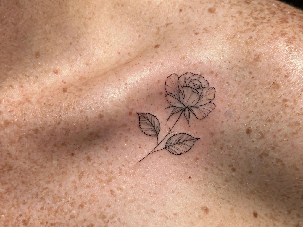
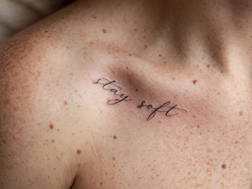
A single line of script following the bone’s curve, cut large enough to survive the placement and spaced widely enough to breathe. The script line is the guide’s most personal design — a word, a date, a name — and the one that most rewards the discipline in the ageing table: the lettering is large, the spacing is wide, and the line is the lightest weight in this guide because script that thickens in the skin is script that becomes illegible.
Choose the script for the bone, not for the sentiment: a script that is too fine will thicken and blur, and the line that reads beautifully on paper at three millimetres tall will be a smeared ribbon in five years. Cut it large, keep the letters apart, and the words you wear will still be words when they matter.
Best placement: following the bone’s curve, the script cut large.
Best for: words worth wearing — names, dates and a line that means something.
17. Blackwork Band
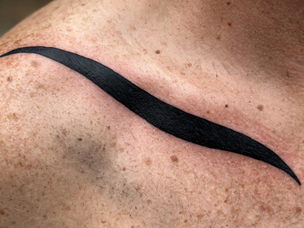
The guide’s boldest entry — a blackwork band in solid black, a line drawn in the most permanent register tattooing has. The band is the design’s refusal to be subtle: a solid black band across the bone reads as a collar worn in ink, and the band’s width is its voice — a narrow band is a ribbon, a wide band is a collar, and the choice between them is the choice between a whisper and a statement.
Hold the band’s edges perfectly straight: any waver in a solid black band is visible at ten paces, and a blackwork band that wanders is a mistake you can only cover, not fix.
Best placement: along the full bone, in a single clean pass.
Best for: maximalists and collectors of solid black — the boldest choice in this guide.
18. Cherry Blossom Branch
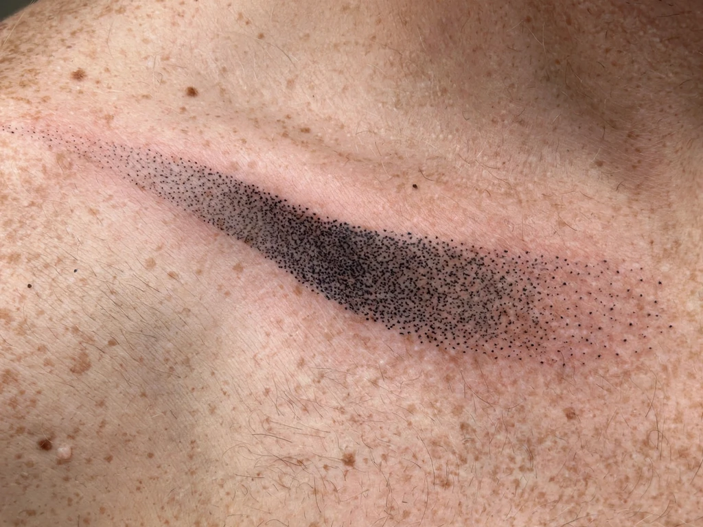
A cherry-blossom branch running just above the ridge, flowers washed with the softest pink in this guide — the blossoms’ colour carries the design’s softness, the branch’s line its discipline, and the watercolour wash’s mottled ageing suits a subject that is itself transient: cherry blossom is the most time-bound flower in this guide, and a design that expects to soften suits a subject that means the passing of seasons.
Keep the wash’s pink lighter than the blossoms’ outlines and let the blossoms’ edges stay soft — a hard edge on a cherry blossom is a snowflake, and a soft edge is a petal.
Best placement: just above the ridge, blossoms trailing toward the outer end.
Best for: the softest floral entry — pink and fine line together at the neckline.
19. Dandelion Seeds Drifting
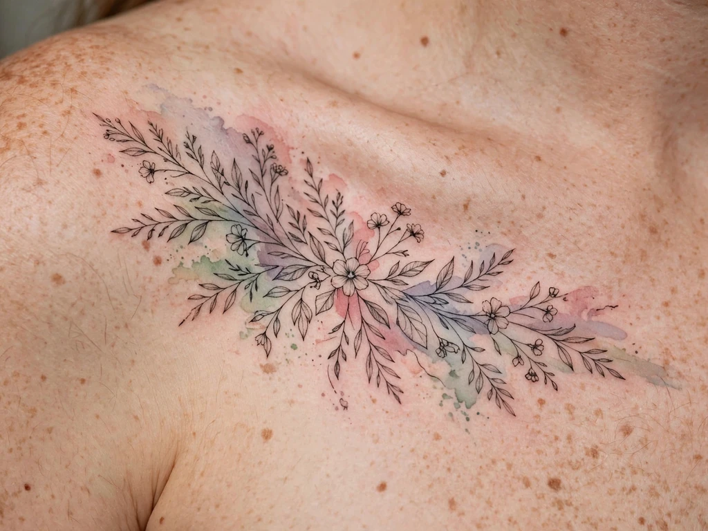
A dandelion head dispersing its seeds upward from the bone’s outer edge — the guide’s lightest subject, and the one that most rewards a steady hand: each seed is a single line with a dot at its end, and the design’s lightness is the point — a dandelion is a wish made visible, and a wish drawn heavy is no longer a wish at all.
Keep the seeds’ lines even and the heads’ spacing airy; the design is a breath, not a bouquet, and the spacing between the seeds is the air they are drifting through.
Best placement: outer edge, trailing upward.
Best for: wish-makers — the lightest subject in this guide.
20. Mandala Set into the Bone’s Curve
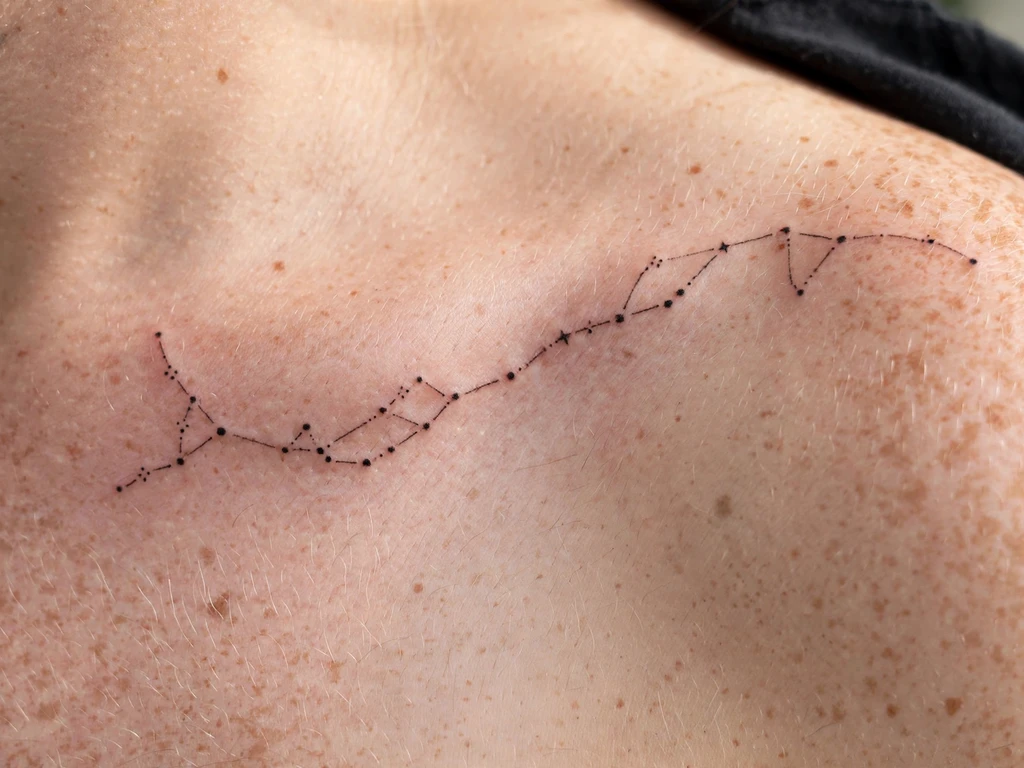
A dotwork mandala seated into the bone’s outer curve — the guide’s only fully geometric design, and the one that most directly uses the bone’s shape as its frame: the mandala is circular, the bone is curved, and the circle sits inside the curve the way a coin sits in a palm, held by the body’s own geometry.
Keep the mandala’s symmetry true and its dots evenly graduated — a mandala that is lopsided is the most visible failure in tattooing, and the dotwork mandala depends on the dots’ even spacing for its entire effect, which is also why the ageing table warns it will settle into a shaded field.
Best placement: over the bone’s outer curve, the mandala centred on the bend.
Best for: the geometric register — symmetry and patience made visible.
21. Snake Curves Along the Bone
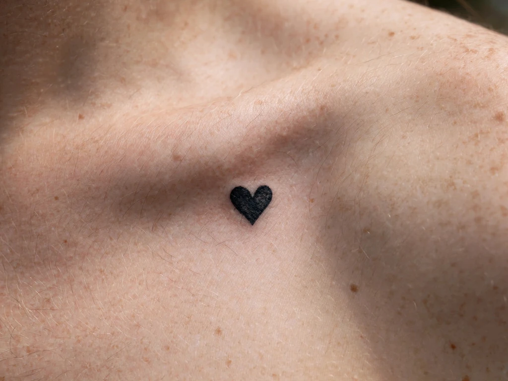
A snake drawn in blackwork, its body following the bone’s S-curve as if the curve had been drawn for it — and in a sense it was, because the snake is the only subject in this guide whose body is the line the placement wants. The snake is the design’s answer to the bone’s shape: it does not sit on the line, it is the line, coiled around it.
Keep the snake’s scales simple and its body thick — a thin snake across a curved bone is a worm, and a snake drawn as a ribbon is a snake with no body. The blackwork treatment is the only honest choice here: the snake’s lines are solid, and a fine-line snake across a bone is a snake that fades into a thread.
Best placement: following the bone’s curve, the snake’s head toward the inner end.
Best for: dramatic statements — the most serpentine design in this guide.
22. Half-Blossom, Half-Leaf Vine
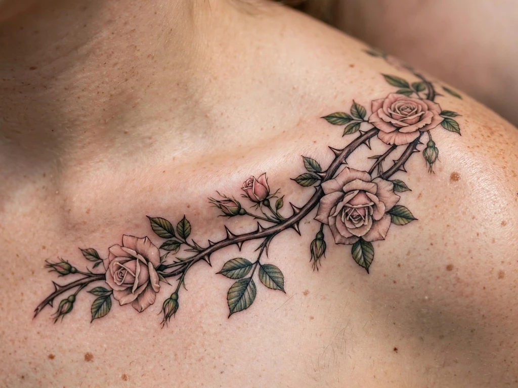
A vine that is blossom at one end and leaf at the other — the guide’s most deliberate study in balance, and the one that most rewards a viewer who reads the whole bone: blossom at the inner end, leaf at the outer, the vine’s transition made visible as the eye travels the bone’s length.
Make the transition gradual, not abrupt — a vine that changes at a single point is a vine with two halves glued together, and a vine that changes gradually is a vine that grew that way.
Best placement: along the full bone, blossoms toward the inner end, leaves toward the shoulder.
Best for: transitional moods — a design that changes as it moves.
23. Falling Fern Frond
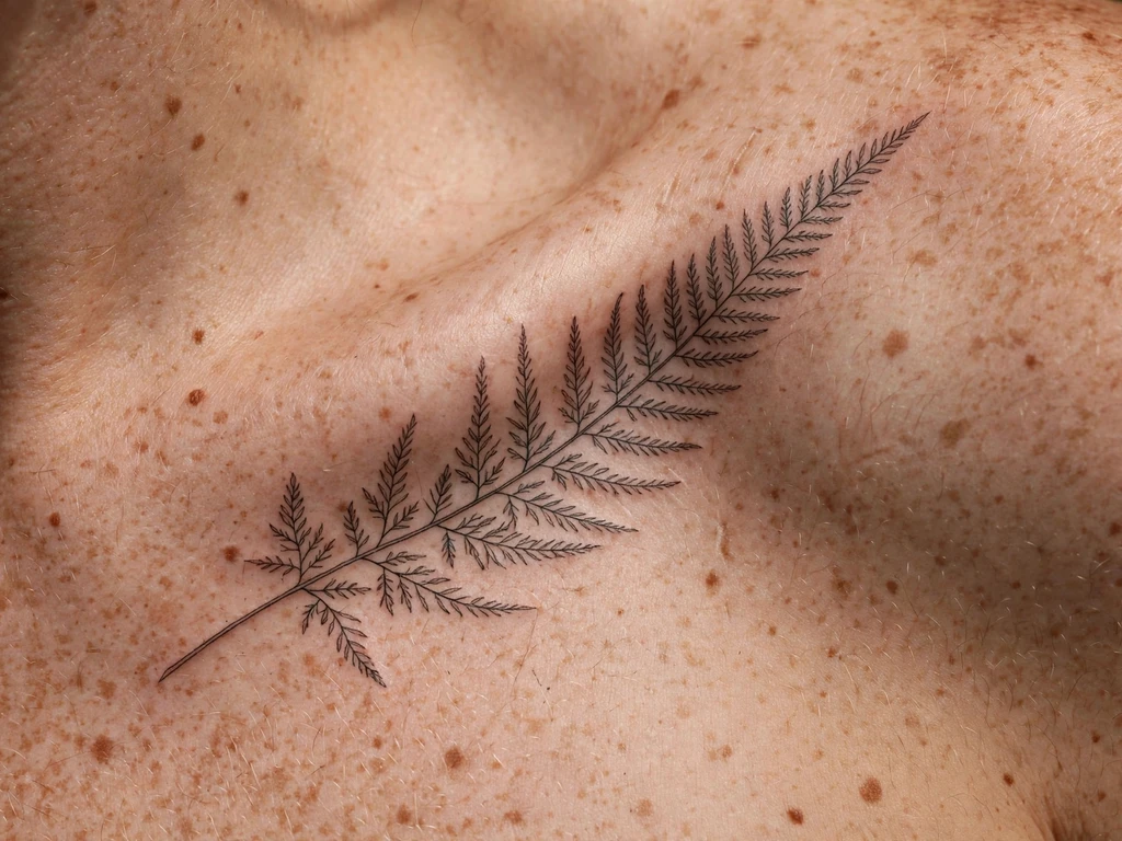
A fern frond falling from the ridge, its leaflets trailing inward toward the throat — the guide’s most delicate foliage, and the one that most directly tests the rule about larger spacing on tiny marks: the leaflets are the smallest marks in this guide, and the frond survives because the leaflets are spaced wide apart and the bone’s curve carries them downward like water.
Keep the leaflets’ spacing wide and the frond’s spine fine; the frond’s delicacy is its measure, and a frond drawn tight is a fern drawn by a machine rather than a hand.
Best placement: from the ridge, trailing inward toward the throat.
Best for: delicate foliage — the most finely drawn piece in this guide.
24. Bird and Branch, One Per Side
A bird and a branch on each side — two small paired designs that can be read as a matched set or as two separate tattoos depending on the neckline, and the guide’s most versatile mirror: each side is complete on its own, and the pair is complete together, which means the design can be worn with a wide neckline that shows both or a narrow one that shows one, and either way it reads as intended.
Match the two sides’ weights, not their details — the balance that matters is the balance of weight at a glance, and a pair whose weights are equal reads as a pair even when their details differ.
Best placement: one on each bone, bird and branch together on each side.
Best for: mirrored pairs worn as two separate designs.
25. Tiny Sprig and Dot Accents
A tiny sprig with dot accents at the bone’s outer edge — the guide’s smallest design, and the one that most explicitly uses the rule about larger spacing on tiny marks: the sprig is the subject, the dots are the punctuation, and the spacing between them is the measure of the artist, because a tiny sprig drawn tight to its dots is a smudge waiting to happen.
Keep the sprig’s stem fine and the dots’ spacing generous — the design’s airiness is its charm, and a sprig crowded by its own accents is a sprig lost in punctuation.
Best placement: outer edge of the bone, the sprig’s tip toward the shoulder.
Best for: the smallest and subtlest entry — a whisper at the neckline.
Collarbone Tattoo Placement by Size
| Size | Typical length | Best placement on the bone | Notes |
|---|---|---|---|
| Tiny | 1.5–3 cm | Outer edge, trailing downward | Lavender sprig (4), dandelion (19), tiny sprig (25) |
| Small | 3–6 cm | Centre of the bone, just off the ridge | Butterfly (6), rose (14), feather (15), moon phases (8) |
| Medium | 6–12 cm | Along the full bone | Floral vine (1), lavender (4), cherry blossom (18), mandala (20) |
| Long | 12–20 cm | Along the full bone | Floral vine (1), branch (3), script (16), snake (21) |
| Mirrored | 2 × 6–12 cm | One on each bone | Mirrored vines (2), sun and moon (11), bird and branch (24) |
Every design in this guide is, by the Bone Line rules, a horizontal line along the bone — the table measures that line’s length, not its height, because the placement is a line and the designs that survive here are the ones that respect it.
How to Choose Your Collarbone Tattoo (and What to Know Before You Book)
Choosing a collarbone tattoo is a matter of trade-offs, and each trade is named here in full. Read this section with the pain map and the ageing table beside it, because a design you love on the day and love in five years is the one whose trade-offs you accepted deliberately.
On visible versus covered: you can only choose one visibility profile at a time — a design that frames the neckline is a design that is seen, and no high collar or necklace will hide it entirely. Choose it for the neckline you actually wear, not the one you wish you wore.
Size and the bone’s length: the bone is long and narrow, and the designs that age well on it are the ones whose scale matches its length — a vine that runs the bone’s whole length ages better than a motif crammed into its centre, and a tiny sprig at the bone’s outer edge ages better than a tiny motif set mid-bone, because mid-bone the skin is thinnest and the marks will soften fastest. Choose scale from the table above, not from the size of the image on your screen.
Style and ageing: fine line is the placement’s natural register, but it is not the only one that survives — blackwork is the most permanence the placement offers in the style palette, and watercolour is the most honest about its own softening. Choose by the ageing table, not by the photograph.
Mirrored versus single: a mirror is a statement about symmetry and a single design is a statement about the bone itself — the mirror carries twice the session time and twice the strap management, and the single piece carries none of either, but the mirror is the design that frames the neckline from both sides. Choose the pair for the neckline you wear most, not the one you imagine.
Pain tolerance and session length: sessions are short but sharp — a fine-line vine is often under an hour — so the real question is not how much pain you can take but how much sharpness you can take in a short burst, and the answer is usually more than expected. Choose the off-ridge designs if you want less of both.
Your artist’s speciality: a collarbone tattoo is a line drawing over a drum, and an artist who works this placement daily will tell you the same thing this guide does — the design is built for the bone, not pasted on it — and will draw the design to your bone rather than tracing a stencil. Choose an artist whose portfolio shows collarbone work on bodies like yours, and show them this guide’s rules — they will recognise them as their own.
Key points to remember:
- Long, low compositions only; the collarbone is a horizontal line.
- Follow the bone’s S-curve; never fight it.
- Keep the detail off the ridge — the fastest-softening ground on the body.
- Space tiny marks generously so they survive years of spread.
- One anchor per side, and never a centre crossing.
- Plan two weeks of strap management before you book — bra, bag and seatbelt.
Frequently Asked Questions
Does a collarbone tattoo hurt more than other placements?
More than an arm, less than the horror stories — the bone’s top edge is the sharpest zone at 6 or 7 out of 10, just off the ridge it is a 3 or 4, and the sensation is vibration as much as pain. Sessions are short, so the sharpness is brief and the trade is a fortnight of strap management afterwards.
Do collarbone tattoos age well?
They age as well as their style and spacing allow. Fine line softens slightly and still reads at normal distance when lines are spaced wide; script thickens slightly and stays legible when cut large; blackwork holds its weight. The ageing table above gives the honest year-one and year-five account for each style in this guide.
Can I wear a bra after getting a collarbone tattoo?
Not comfortably for the first two weeks, because bra straps sit on the bone’s outer third. The practical counsel artists give is to wear strapless or wide-strap tops while the fresh line heals, and to keep straps from pressing or dragging across the tattoo throughout the first fortnight.
Which side should I get a collarbone tattoo on?
Either side reads the same, and the choice is usually one of habit — dominant-side shoulders carry bags, so a design on the non-carrying side heals with less strap interference. Mirrored pairs remove the question entirely.
Will a collarbone tattoo stretch or distort with weight change?
Large weight changes move skin everywhere, but the collarbone’s skin is thin and directly over bone, and a line that follows it tends to hold its shape well — the design moves with the bone, and the bone does not move. Moderate changes are not expected to move a line on the collarbone; very large changes could, and this is a conversation worth having with the artist at the consultation.
Final Thoughts
The collarbone is the most honest placement in tattooing: it shows its bone through the skin, it tells you where the detail will not survive, and it rewards the artist who listens. The 25 ideas here are drawn for that anatomy, and the section that precedes them is the real content — the pain map, the strap problem, the Bone Line rules, the ageing table — because a design chosen with those in mind has a chance of looking as good in ten years as it looks on the day.
Choose the design whose trade-offs you have accepted, find an artist who works this placement daily, and plan two weeks of strap management before you book. If you want the same fine-line discipline on another placement, the guides that carry it are our fine line tattoo ideas, vine tattoo and flower tattoo designs guides — and if you want to see which collarbone placements wearers rate the least, the honest answer is the one the pain map gives: on the ridge, directly. Everything else is a gentler session, and none of it stops the tattoo from looking, in this placement, like the jewellery it was always meant to be. That is the whole guide, and the whole point of it: not just a design, but a design that knows where it lives.