Blackwork is the style readers describe with a shrug that turns into a stare: just black ink — how much can you do with that? The answer fills this page. One ink, pushed through every technique tattooing owns — solid black packed to velvet, dotwork gradients built dot by dot, lines hatched the way engravers hatched copper three centuries ago, whole limbs surrendered to blackout — produces the widest design family in modern tattooing, and arguably the most honest one. There is no colour to hide behind: a blackwork tattoo shows exactly what the artist could draw and exactly how well they could pack it.
You will find 25 original blackwork tattoo ideas here — silhouettes, geometry, etched animals, illustrative botanicals, blackout work and one fine-line exception — every one in black ink alone. Read the explainer and the craft section first: blackwork is failed by one misunderstanding — that black is simple. Black is the least forgiving ink there is. Packed badly it heals grey and cloudy; spaced badly it swallows its own detail as it ages. The designs below are specified the way the style actually works — saturation first, separation always.
What Is a Blackwork Tattoo?
A blackwork tattoo is any tattoo done entirely in black ink — one ink, every technique. That single sentence holds the whole family. At one end, solid black: silhouettes, shapes and blackout areas packed to an even, saturated black with no grey in them at all. Then dotwork, where tone is built from the density of individual dots — sparse for pale grey, crowded for near-black. Then linework in the etching and engraving manner: form modelled with parallel hatching and crosshatching, the way printmakers modelled it in line alone. Then illustrative blackwork, which borrows illustration’s drawing freedom — characterised animals, botanicals, scenes — and renders it in black only. And at the far end, blackout: large areas of a limb given over to solid black, sometimes as a design in itself, sometimes as a cover-up’s answer. If a tattoo uses nothing but black ink, it is blackwork, whichever technique built it — many pieces use three at once.
The name is older than tattooing’s use of it, and the older craft explains the newer one’s instincts. Blackwork was first an embroidery technique: as the Embroiderers’ Guild of America sets out, it is a counted-thread embroidery “traditionally stitched using black silk thread on a white or off-white evenweave linen”, already old when Chaucer mentioned a smock “embroidered at the collar all about with coal-black silk” in the 1380s. Its method was an outline first, then the shape filled with repeated geometric patterns — and its modern form shades “by altering stitch density”, producing pieces that look “almost like a stitched form of ink drawing”. Swap thread for ink and that is this article in one line: blackwork tattooing, too, outlines first, fills with pattern, and shades by density.
Three neighbours need separating plainly, because the words are used loosely everywhere else. Tribal is not a technique but a heritage: the tattooing traditions of specific cultures, with their own designs, meanings and protocols, carried in bold black. Blackwork borrows tribal’s boldness and nothing else — its designs come from the general vocabulary of shape and animal, not from any people’s heritage work. (This site’s tribal guide is a separate article in its own right.) Ornamental is a family of decorative styles — lace-like pattern, filigree, jewellery-inspired composition — which very often uses blackwork technique, because ornament reads beautifully in black alone; but ornamental is defined by its decoration, blackwork by its ink, and a coloured ornamental piece is still ornamental while an unornamented blackwork piece is still blackwork. Fine line is a technique defined by thin lines and a light touch; blackwork can include fine line — one design below does — but a fine-line tattoo in colour is not blackwork, and a blackwork tattoo can be as bold and heavy as a door. The definition never lives in the line weight. It lives in the single black ink.
That discipline has an opposite pole on this site, and the comparison sharpens both: our red ink tattoo ideas guide builds 25 designs from one red ink and nothing else — no black anchor anywhere. Blackwork is the same wager at the other end of the shelf: one ink, and the drawing carrying everything the palette refuses to.
What Does a Blackwork Tattoo Mean?
Blackwork meanings are carried by subject and by the black itself, in roughly equal shares. The black is a statement before any subject is read: permanence, contrast, refusal of decoration for its own sake. Wearers describe choosing it the way they choose black clothing — not as an absence of colour but as the strongest colour decision available. And where colour tattoos can feel like illustrations on the body, a saturated black piece feels like part of the body’s own architecture, which is why blackwork suits wearers who want the tattoo to read as structure rather than picture. The raven carries intelligence, memory and the border between the living world and whatever lies past it in the folklore of half the North. The skull is tattooing’s memento mori, drawn plainly here, without gore, as it has been drawn for centuries. The snake is rebirth, the animal that sheds its skin whole and starts again. The moth is the creature that flies at the light it cannot have — longing, night, transformation. The solid heart reduces love’s oldest symbol to its silhouette, all statement and no ornament. The eye is watchfulness: the gaze that watches back. None of these readings is a fact about the world; each is a meaning the wearer loads into a shape the culture already recognises.
One honest note belongs here: because blackwork is bold and often large, it is also the style most often chosen to end an argument with an old tattoo — covered, blacked out, replaced by weight, a use covered factually in the blackout passage below. It is a legitimate reason — simply not the only one; most designs below are chosen first, not as corrections.
Saturation and Separation: How Blackwork Is Built
Every rule in this section follows from one fact: black ink in skin is not finished when it looks black in the studio. Healed black tells the truth — about how evenly it was packed, how honestly its shapes were spaced, and whether the artist was drawing for the tattoo’s tenth year or its first photograph. Blackwork’s craft spine has two halves, and every design below is specified by both.
Saturation: solid black must be packed to a true, even black. A solid area is not coloured in; it is saturated — ink worked into the skin evenly, pass by pass, until the field holds one uniform depth with no pale holidays in it. Rushed or timid packing heals exactly the way it was done: patchy, grey and cloudy, a black that apologises. This is why the style’s first artist test is healed solid work: in a healed silhouette or blackout area you are looking at packing quality itself, and it cannot be faked in a fresh photograph.
Separation: black shapes are held apart by skin, and the skin gaps must be drawn wide. Blackwork’s detail is negative space — the lines of bare skin between black shapes that let each shape read. Those gaps are the design’s perishable part. Ink settles and spreads a fraction over the years, black most visibly of all, because the eye reads black’s edge against skin at maximum contrast. A gap drawn at a hair’s width closes; a gap drawn generously narrows into a clean line and holds for decades. Every separation below — between coils, feathers, petals, facets — is specified at healed width, not at the prettier fresh width.
Dotwork gradients are built from density, and density has a floor. A dotwork tone is dots per area: sparse reads pale, crowded reads dark, and the gradient between them is the technique’s whole beauty. But dots are small black deposits, and deposits settle outward — crowd them past a point and neighbouring dots merge into unintended solid, turning the gradient’s dark end to mush. Good dotwork keeps its darkest passages just short of merging, which is why its deepest tone is a very dark stipple rather than true black, and why designs needing a genuine black anchor pair dotwork with a solid element that carries it.
Etching-style blackwork builds tone from line, and line obeys the same law. The crosshatched animals below are drawn the way the printmakers drew: the National Galleries of Scotland describes etching as a technique that uses “incised lines on a metal plate to hold the ink”, where lines bitten longer and deeper “will contain more ink and will come out darkest in the print”, and contrasts engraving’s “angular cuts and crisp edges” with etching’s freer line. On skin, depth is replaced by density — closer hatching, darker tone — and the spacing law applies twice over, because hatched lines drawn too close do not merely darken; they fuse into the solid hatching was invented to avoid.
Bold will hold — and movement is a design material. Large black areas on skin that stretches, twists and flexes — forearms in rotation, calves in stride, shoulder blades in reach — must be composed for that movement: silhouettes checked in motion, shapes kept clear of the worst crease lines, long fields following the muscle’s direction. One comparison is worth making: the boldest colour style on this site builds the same way. Our neo traditional tattoo ideas guide rests its whole method on black architecture doing the structural work while colour decorates — blackwork simply dismisses the colour and asks the architecture to be the entire building.
A necessary passage on blackout. Blackout work — a limb section, or a whole limb, tattooed solid black — is blackwork at its maximum, and it is also used to cover old tattoos completely, which no other technique can promise. Choose it knowingly, on three facts. It is a major commitment of skin: large saturated areas take long sessions, often several, and heal like the large tattoos they are. It is effectively permanent in a way other tattoos are not: laser removal of a fully saturated black field is extremely difficult, slow and often incomplete, so blackout should be chosen as a destination, not a pause. And its edges are the design: a blackout area reads by its border — a clean straight cuff, a shaped organic edge, a fade into dotwork — so the border deserves the design time the field does not need. Chosen on those terms, blackout is one of the strongest statements in tattooing; chosen casually, it is the hardest tattoo in this article to revise.
Blackwork Tattoo Styles and How They Age
All blackwork ages by the spine above: edges soften, black lightens. A healed blackwork tattoo keeps its depth for years, then trades deep black toward dark grey as sun and time do their ordinary work — sun exposure accelerates that lightening, and a touch-up can re-saturate a piece that has quietened. What differs by variant is where the ageing shows first.
| Style | How it is drawn | How it ages |
|---|---|---|
| Solid blackwork | Shapes and silhouettes packed to one even, saturated black, detail carried by the outline | The benchmark: edges soften slightly, the field lightens evenly; patchy packing is exposed mercilessly, good packing barely shows |
| Dotwork | Tone built from dot density — sparse for pale grey, crowded for dark | The gentlest ageing of all: dots soften into their tone; gradients survive if the dark end was kept short of merging |
| Etching / engraving style | Form modelled with parallel hatching and crosshatching, no wash | Survives exactly as well as its spacing: lines drawn apart stay lines; tight hatching fuses toward solid at the dark end |
| Geometric blackwork | Facets, tessellation and symmetry in bold black shapes separated by skin | Geometry is unforgiving and therefore durable: symmetry errors show forever, but well-drawn facets barely move |
| Illustrative blackwork | Characterised subjects — animals, botanicals, scenes — drawn freely, rendered in black only | Ages like its components: solid parts hold, hatched and fine parts soften first, boldest drawings last longest |
| Blackout | Whole areas given to solid black, the border as the design | The field lightens evenly over years and can be re-saturated; the border’s edge softens, so borders are drawn bold and simple |
One honesty belongs here: blackwork photographs lie in the flattering direction. Fresh black is at maximum contrast against reddened skin, and studio photographs show a depth no healed tattoo keeps. Every design below is described at its healed reality — a deep, even dark grey-black with softened edges — and artists should be judged on healed black, never on the day-one photograph.
Blackwork Tattoo Ideas at a Glance
| # | Design | Style notes | Best placement |
|---|---|---|---|
| 1 | The Solid Cat | Silhouette, one packed shape, tail as the line | Forearm |
| 2 | The Geometric Panel | Facets and tessellation, bold symmetry | Forearm |
| 3 | The Dotwork Geometry | Concentric dotwork pattern, no sacred motif | Shoulder blade |
| 4 | The Etched Fox | Crosshatched animal, engraving manner | Upper arm |
| 5 | The Illustrative Botanical | Free-drawn leaves and seed heads, black only | Forearm |
| 6 | The Blackwork Snake | Bold coils, pattern not texture | Calf |
| 7 | The Ornamental Piece | Lace-like pattern in blackwork technique | Shoulder |
| 8 | The Blackout Band | Solid cuff of black, clean borders | Forearm |
| 9 | The Half-Blackout | Solid field ending in dotwork fade | Upper arm |
| 10 | The Solid Heart | Love’s symbol as pure silhouette | Wrist (inner) |
| 11 | The Blackwork Moth | Patterned wings, stippled body | Upper arm |
| 12 | The Fine-Line Sprig | The fine-line crossover, honestly drawn | Forearm |
| 13 | The Bold Black Rose | Petals as separated black shapes | Shoulder |
| 14 | The Watching Eye | Symbol piece, radiating lines, no lettering | Forearm |
| 15 | The Dotwork Mountains | Landscape built from dot gradient | Calf |
| 16 | The Raven | Solid bird, hatched wing detail | Shoulder blade |
| 17 | The Blackwork Skull | Memento mori, plain and gore-free | Upper arm |
| 18 | The Negative-Space Rose | Skin forms the flower inside solid black | Forearm |
| 19 | The Stag Beetle | Insect armour in facets and hatch | Thigh |
| 20 | The Whip-Shaded Peony | Stippled gradients, bold petal shapes | Shoulder blade |
| 21 | The Bold Wave | One black curl, skin as the foam | Calf |
| 22 | The Faceted Wolf | Geometric animal, bold facet shapes | Upper arm |
| 23 | The Great Stag | The large piece, antlers as architecture | Shoulder blade |
| 24 | The Tiny Solid Star | One small packed shape, bold for size | Behind ear |
| 25 | The Solid Diamond | Small solid black symbol, finger honesty | Finger (side) |
25 Blackwork Tattoo Ideas
1. The Solid Cat
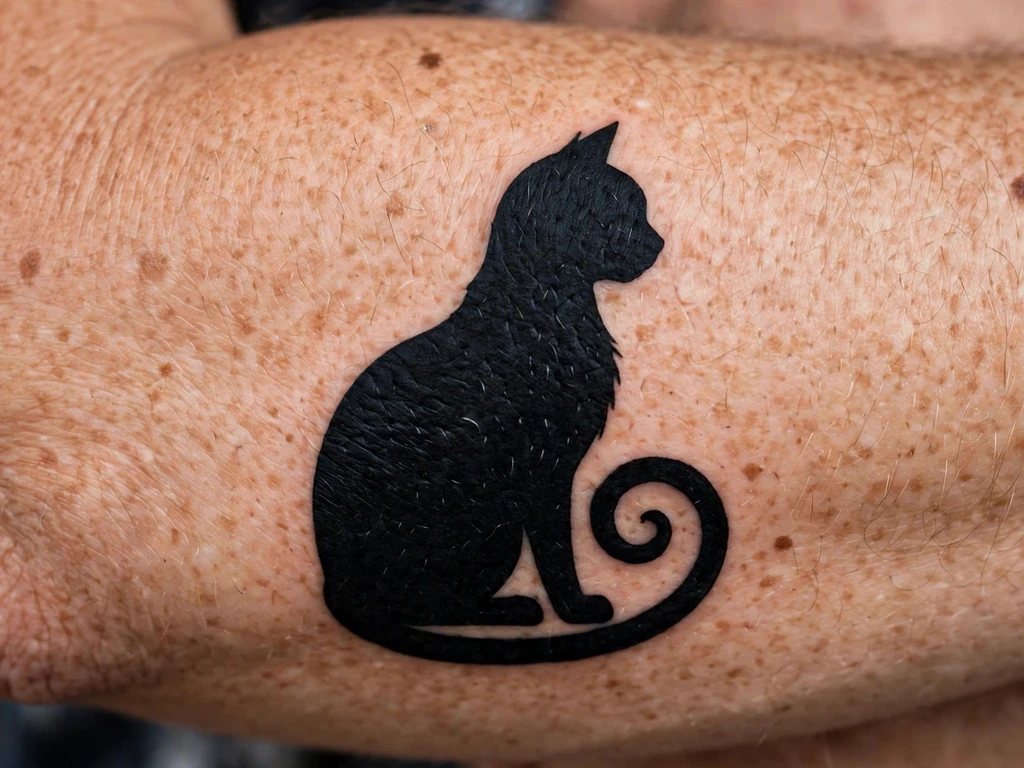
Blackwork’s purest test, and the design to open with: a cat drawn as one single shape of packed black — sitting, tail curled around its feet — with no interior detail. Everything is the silhouette. The ears’ points, the chest’s curve, the tail’s long line: get those right and the design is unmistakable across a street; get them wrong and no added detail would have saved it.
The craft is all saturation. One shape means one uninterrupted field to pack, and the field will show every pale patch the artist leaves — a silhouette is a packing examination with a cat drawn around it. The tail is the design’s one line, drawn bold: at hairline weight it breaks up as it settles; at honest weight it stays a line for decades.
Best placement: Forearm, the cat sitting upright along the arm’s length; the silhouette also stamps beautifully on a calf.
Best for / know before you book: Judge this artist on one thing — a healed solid shape from their portfolio, checked for evenness.
2. The Geometric Panel
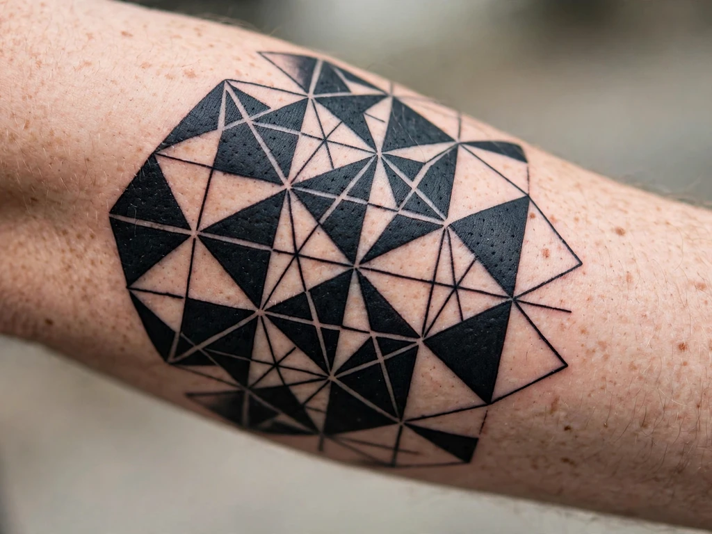
Geometry is where search interest in this style is climbing fastest: a panel of bold black facets — triangles, chevrons and tessellated shapes separated by exact lines of skin — reads as architecture on the arm. This design is a composed panel rather than a symbol: a central diamond, facets stepping outward in strict symmetry, the whole thing drawn with a ruler’s discipline and packed like a silhouette in pieces. Wearers take it as pure form — the tattoo as pattern, meaning carried by precision itself.
The site’s wider geometry coverage lives in our geometric tattoo ideas guide; this panel is specifically geometry under blackwork law — every facet a saturated shape, every skin line between facets drawn at healed width. That width is the whole craft: tessellation tempts artists to butt shapes edge-to-edge, and butted black shapes merge into one field as the ink settles, deleting the pattern. Drawn with its skin lines intact, a geometric panel barely ages at all — there is nothing in it fine enough to lose.
Best placement: Forearm, the panel running the arm’s length, centre diamond on the flat; it wraps a calf equally well.
Best for / know before you book: Measure the skin gaps on the stencil with your own eye — if two black shapes touch on paper, they are one shape in skin within five years.
3. The Dotwork Geometry
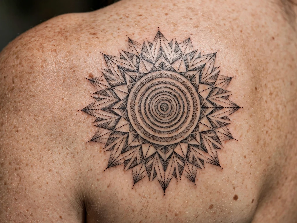
A large circular pattern built entirely from dots: concentric rings, radiating spokes of stipple, tones that deepen from a pale grey centre outward to a near-black rim — geometry drawn the slow way, one dot at a time. Pieces like this are often called mandalas by their wearers, and the distinction matters enough to state in the design itself: a mandala is a sacred diagram with a religious tradition behind it, and this design is not one — it is a geometric dotwork pattern, drawn as pattern, borrowing the circle’s calm and the radiating composition without borrowing the sacred content.
The craft is the density floor from the craft section, at full scale. The rim’s near-black is a stipple kept just short of merging — thousands of dots holding their separateness by a discipline the artist maintains for hours — and the centre’s pale grey is the same dots given room. Symmetry is checked standing, on the blade, because a radiating pattern amplifies a millimetre’s drift into a visible wobble.
Best placement: Shoulder blade, centred on the flat at full width; the pattern needs the blade’s calm, broad canvas.
Best for / know before you book: Ask to see healed dotwork at a year old — you are checking one thing: whether the dark passages are still dots, or have become the solid they were meant never to reach.
4. The Etched Fox
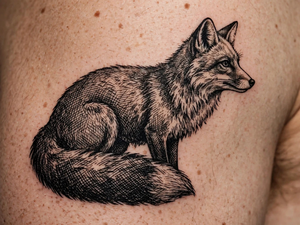
A fox drawn the way the old printmakers drew animals: no wash, no grey ink, nothing but line — the body modelled in parallel hatching, the shadows deepened by crosshatching, the chest and tail-tip left as bare skin, so the whole animal is built from the density of black strokes on white ground. It is the etching manner carried onto skin: a fox with the quality of an illustration from a serious old book, worn. The tail carries the design’s one boldness — a deep hatched mass — against the body’s lighter line work.
Hatching obeys the separation law twice over. Each hatched line must keep its own skin channel: lines drawn at print density fuse on skin into unintended solid, and the fox’s modelling becomes a black patch with ears. The build that survives spaces the hatching wider than the reference engraving, and deepens tone by adding a second direction of hatch rather than by crowding the first.
Best placement: Upper arm, the fox sitting or standing in profile along the arm; a calf takes a leaping version.
Best for / know before you book: This is a specialist’s design — choose an artist whose healed etched work you have seen, because fresh crosshatching always looks finer than it heals.
5. The Illustrative Botanical
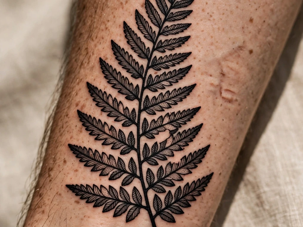
The fastest-rising branch of the family, drawn at its best: a botanical arrangement — long leaves, a stem with seed heads, a single dark flower — drawn freely, as a pen-and-ink botanical plate would be, then rendered entirely in black. Illustrative blackwork is where the style meets contemporary drawing: compositions sprawl and breathe, and the techniques mix inside one piece — solid leaves beside hatched stems beside dotwork shadows. Wearers take botanicals for growth, for gardens and grandmothers — the plant world drawn with a heavier hand than fine line allows.
The craft is assigning each element its technique and holding the contrast: everything hatched is a grey drawing, everything solid a stencil. The living version assigns: leaves solid or boldly veined, seed heads dotted, stems clean line, one element — the flower — darkest of all, so the eye has a hierarchy to read. Veins inside solid leaves are skin lines at healed width, or left out.
Best placement: Forearm, the arrangement climbing the arm’s length; the sprawl also suits a calf or the shoulder’s curve.
Best for / know before you book: Bring the artist a drawing you love and ask them to assign each element its technique aloud — the answer tells you whether the piece has hierarchy or just ingredients.
6. The Blackwork Snake
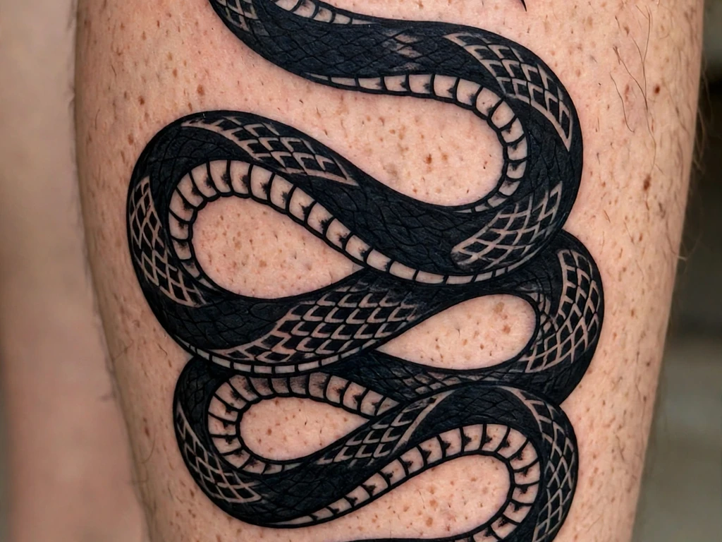
The snake as blackwork draws it: a long body in bold coils down the calf, the scales rendered as pattern — bold bands and diamonds repeated along the body — the head a clean dark shape with a skin-line eye and a forked tongue as two bold strokes. The full snake family’s range lives in our snake tattoo ideas guide; this design is the snake under this article’s discipline — saturation and separation, pattern instead of texture, nothing ageing can spend.
The coils’ spacing is the design’s arithmetic: coils that nearly touch fresh will kiss healed, merging the S into a stack. Keep clear skin between every coil — the calf’s length exists to buy exactly that room. The scale pattern obeys the same rule as the fox’s fur: a repeated bold motif says “snake” for decades; a thousand fine scale cells say it for one summer, then say “mesh”.
Best placement: Calf, the coils running the muscle’s full length from below the knee toward the ankle; the composition also climbs a forearm.
Best for / know before you book: Trace the coil gaps on the stencil with a fingertip — you should be able to run a finger between coils everywhere without touching black on either side.
7. The Ornamental Piece
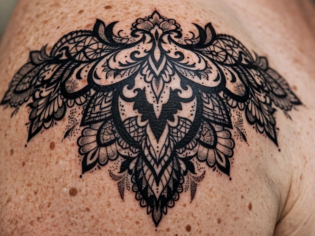
Ornament executed in blackwork technique: a shoulder piece of lace-like pattern — filigree curls, scalloped edges, dotted borders, small solid accents set like stones — black ink serving a decorative composition. This is the overlap of the two families drawn deliberately: the design language is ornamental, all pattern, symmetry and jewellery logic; the execution is pure blackwork — saturated shapes, stipple, skin lines doing the openwork. Wearers take it as the decorative end of black — a piece that is frankly jewellery, permanent and unlosable.
Lace is a spacing examination, and this design is the guide’s hardest. Every curl must keep its skin channel open at healed width, every scallop stay separate from its neighbour, and the border dots be spaced as dots, not as a dotted line waiting to merge. The honest build draws the whole pattern a size larger than the wearer first imagines — ornament in black survives at the scale where its holes stay holes.
Best placement: Shoulder, the pattern spreading over the cap and following its curve; it also crowns the top of an upper arm.
Best for / know before you book: Judge the artist on healed ornamental blackwork specifically — fresh lace always looks delicate; healed lace is where the spacing decisions present their bill.
8. The Blackout Band
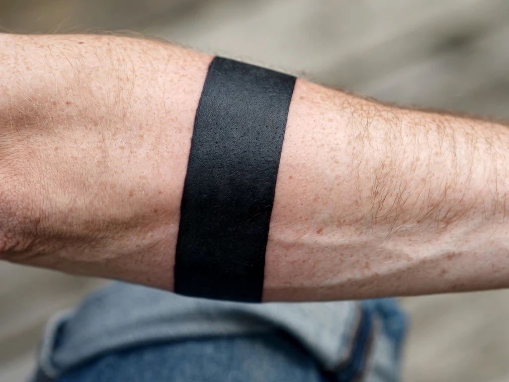
A cuff of pure black around the forearm: no subject, no pattern, just a wide band of saturated black with two clean borders — the blackout idea at its most wearable scale. Wearers choose it as pure form, as a full stop between pieces above and below it, and sometimes as the complete cover of something small. It also teaches the blackout passage’s lesson at a forgiving size: the band is its packing and its borders, and there is nothing else to look at.
Both are examinable before you book. The packing must be the artist’s best — a band shows patchiness the way a white shirt shows coffee — and the borders must be drawn as the design: straight, level, checked on the standing arm in rotation, because a forearm twists and a border level on the table can spiral on the limb.
Best placement: Forearm, the band placed clear of the wrist and elbow creases; width is a real decision — wider reads bolder and heals more evenly than a thin ring.
Best for / know before you book: Ask the artist how many passes their solid work usually takes and whether a second saturation session is included — honest blackout artists build the touch-up pass into the plan.
9. The Half-Blackout
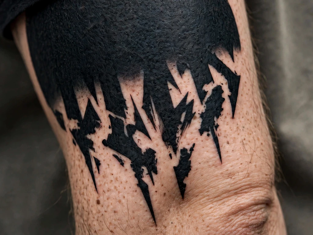
Half a field of solid black, ending not in a border but in a dissolution: the packed black breaks into heavy dotwork, the dots thin and scatter, and the design evaporates into bare skin down the arm. It is blackout with a horizon — worn as a sleeve’s foundation, as dark ground for a future negative-space piece, or as the most dramatic gradient the black family owns. The composition is one decision executed perfectly: where the solid ends and how fast it lets go.
The craft is the transition’s honesty. The fade must be built — solid, then dots at near-merging density, then honest dotwork, then scatter — in bands planned on the stencil, because an improvised fade heals in visible steps. The solid portion carries the blackout passage’s full weight: as permanent as any black field, its removal as difficult.
Best placement: Upper arm, solid at the shoulder end dissolving downward; the reverse — solid low, fading up — suits a forearm.
Best for / know before you book: Have the artist draw the fade in bands on paper and count them — four or five distinct densities is a gradient; two is a border with stubble.
10. The Solid Heart
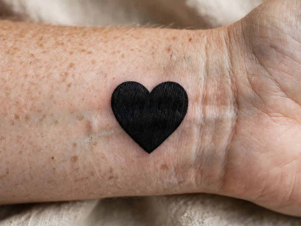
Love’s oldest symbol reduced to its heaviest form: a heart as one shape of saturated black on the inner wrist — no outline games, no banner, no name, the silhouette saying everything. It is the solid cat’s lesson at charm scale: a shape so familiar that a millimetre’s error is visible, packed so evenly that the shape is the whole tattoo. Wearers take it plain for the people they love, for themselves, for the heart as an organ that kept going — the reading is the wearer’s, the black is the emphasis.
The geometry is the craft: the two lobes mirror-matched, the dip at the top open and shallow, the bottom point true but not needle-fine — points are where solid shapes soften first, and a heart whose point has rounded reads as a spade. Drawn at honest size for the wrist, it is among the longest-lived small tattoos there are: one bold shape, nothing fine in it to lose.
Best placement: Inner wrist, centred above the crease; the same silhouette sits squarely on an ankle or above a collarbone’s outer edge.
Best for / know before you book: Print it at final size and fold the paper down its centre — if the two halves do not match, the stencil will not either, and a heart shows asymmetry before anything else does.
11. The Blackwork Moth
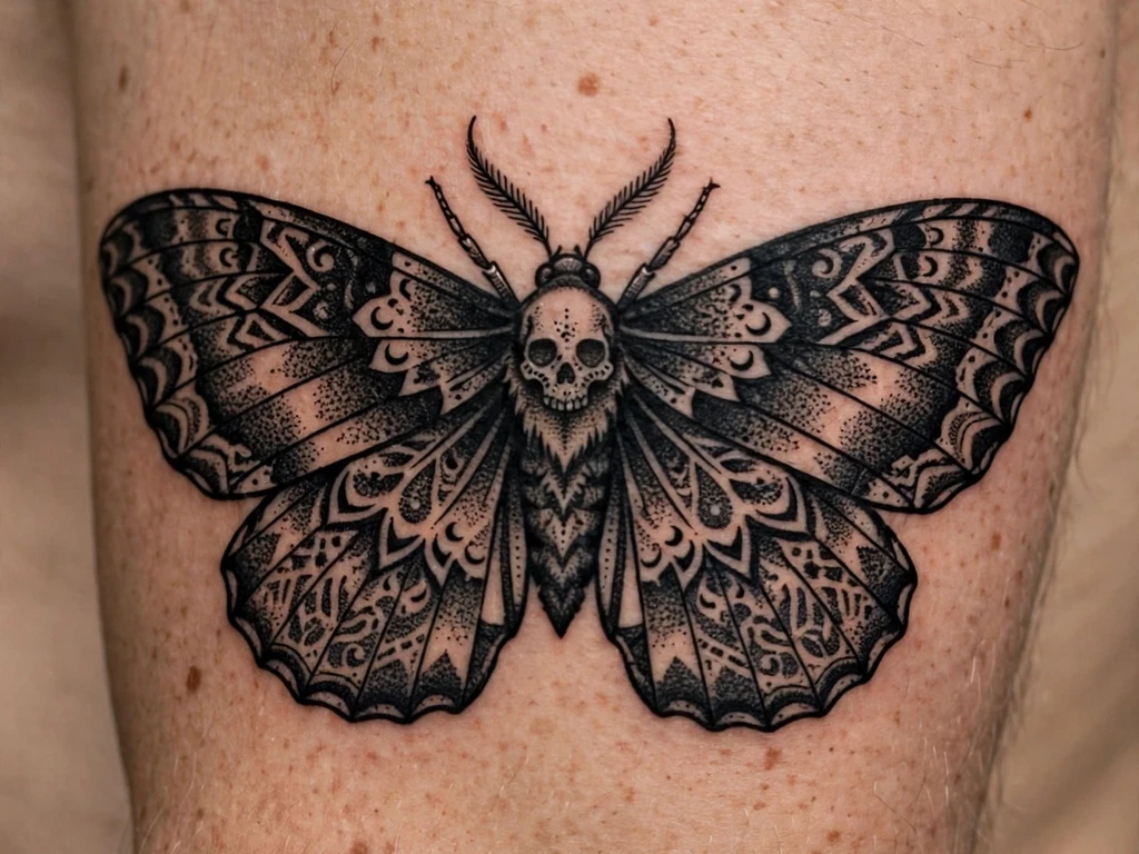
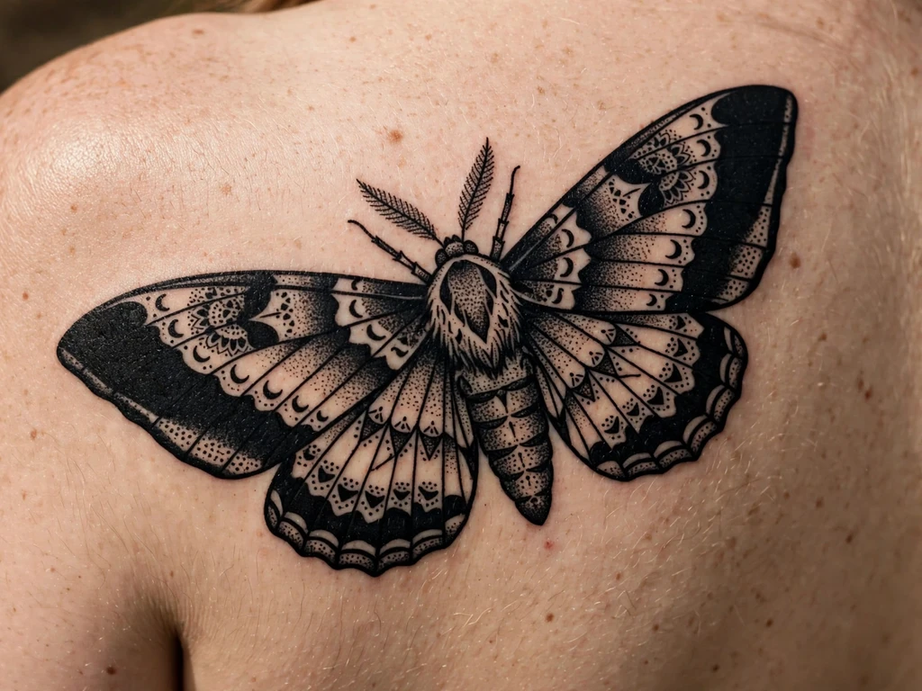
The moth at blackwork weight: wings spread in bold symmetry, their patterning drawn as a textile would be drawn — bands, eye spots and scalloped edges in solid black and reserved skin — the body a dense stipple, antennae as two confident strokes. The moth family’s full range lives in our moth tattoo ideas guide; this design is the moth as this family builds it, pattern instead of texture, every wing marking a separate shape with skin around it. It carries the moth’s meanings — the night flyer, the creature drawn to light, transformation’s quieter cousin — in the heaviest register the subject can wear.
Symmetry is the whole appointment, doubled as it always is with moths: the wings must match as drawings and as density, because a moth whose left wing is packed darker than its right reads as injured rather than decorative.
Best placement: Upper arm, wings spread across the outer arm; the design also sits magnificently centred on a shoulder blade.
Best for / know before you book: Approve the stencil by silhouette and banding alone, squinting from two metres — if the squint shows a bold patterned moth, the detail is free to be as rich as the artist dares.
12. The Fine-Line Sprig
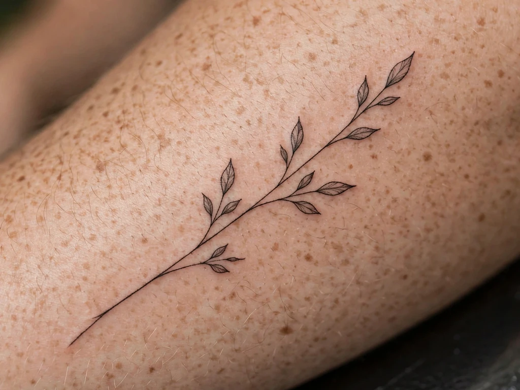
The guide’s one deliberate crossover, included so the boundary is drawn by example: a single fine-line sprig — one slender stem, a few small leaves — drawn in black ink alone at a light line weight. It is blackwork by the definition, because the ink is only black; it is also the frailest thing in this article, because fine line is the technique ageing spends fastest, and this design does not pretend otherwise. It is here for the wearer who wants blackwork’s single-ink purity at a whisper’s weight, chosen with the same honesty this guide gives its finger design: delicacy, priced.
The drawing discipline is what rescues it. The stem is one unbroken line at the boldest weight that still reads fine — never a hairline — the leaves are separate simple shapes with skin between them, and nothing in the sprig depends on a detail smaller than a grain of rice.
Best placement: Forearm, the stem running lengthwise; the same sprig follows a calf’s line beautifully.
Best for / know before you book: Compare this honestly with Design 5’s botanical before choosing — if you love the subject but fear the softening, the illustrative version carries the same plant at three times the lifespan.
13. The Bold Black Rose
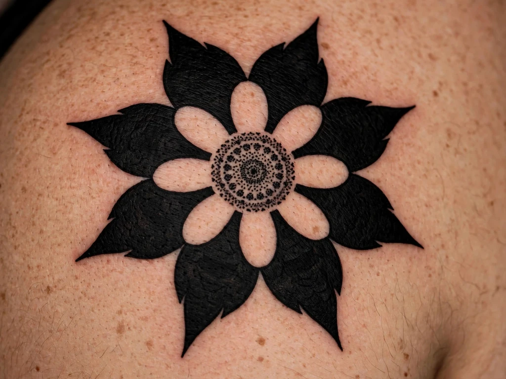
The rose rebuilt in black alone: a full bloom whose petals are not shaded but built — each petal a separate black shape, laid against the next with a line of skin or a wedge of stipple between them, so the flower reads as architecture rather than as a dark blob with ambitions. It is the correct blackwork answer to tattooing’s most-drawn flower, and the difference from a black-and-grey rose is the whole point: no grey wash anywhere, the bloom’s modelling done by the shapes themselves, the way a woodcut models a rose.
The petal discipline is countable, as it is in every rose that survives: each petal its own closed shape, the spiral readable from centre to edge by following shapes rather than shading. Petals drawn as nested swirls merge as the edges soften; petals drawn as separated shapes stay a rose at year twenty, a little softer at the borders and unmistakably itself.
Best placement: Shoulder, the bloom centred on the cap; a forearm takes it upright at slightly smaller scale.
Best for / know before you book: Count the petals on the stencil and trace the spiral — a rose you cannot take apart with your eye fresh is a rose that will not survive being softened.
14. The Watching Eye
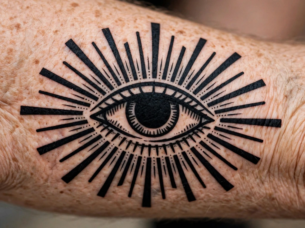
A single eye, open and level, drawn in black alone: the iris a ring of hatching around a pupil of genuine solid black, lashes reduced to a few bold strokes, rays radiating behind the eye in alternating long and short lines. No lettering, no banner — the symbol piece in its purest blackwork form. The watching eye is among the oldest protective marks worn on skin, the gaze that watches back, and wearers take it for protection, for a watch kept over someone, or for the wish to see clearly. In black it loses every trace of ornament and becomes what it claims to be: an eye, keeping watch.
The iris is the craft. The pupil must be packed to true black — a grey pupil makes a tired eye — and the iris’s hatched ring must be drawn wide enough that its lines stay lines, because an iris whose hatching fuses becomes a black coin with a dot in it. The rays obey the geometric rule: struck from a true centre at even intervals, or the eye reads as startled rather than watchful.
Best placement: Forearm, the eye centred on the inner forearm where the gaze meets the world; it also sits squarely on a shoulder blade.
Best for / know before you book: Print it at final size and check from arm’s length that the gaze reads as calm — an eye is read emotionally before it is read technically.
15. The Dotwork Mountains
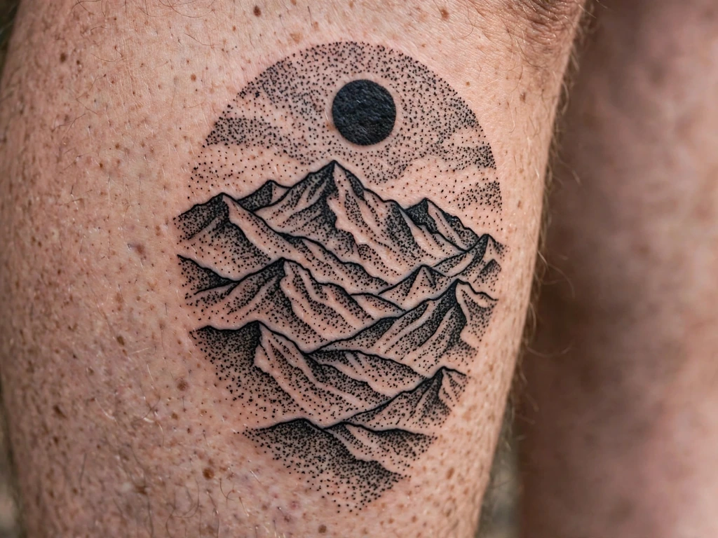
A mountain range built from nothing but dots: near-black ridges in dense stipple, valleys lightening through thinning dotwork, a sky of scattered single dots above the highest peak, and one solid black sun or moon — the design’s single saturated shape — to anchor the gradient. It is dotwork’s landscape showcase, the technique doing with density what painters do with tone, and it carries the mountains’ settled meanings: endurance, the climbed thing, the view earned. Wearers take it for a range they have walked, or for the calm of a horizon that asks nothing.
The craft is the gradient’s patience. Each ridge’s density must step down in planned bands — the artist works from a tonal map, not from feel — because a dotwork gradient improvised at the machine heals in visible terraces. The ridges’ edges are the design’s one line: drawn as a clean contour against the lighter tone behind. Snow, where wanted, is bare skin left on the peaks — never white ink.
Best placement: Calf, the range running around or down the muscle with the horizon following its length; a forearm takes a narrower range.
Best for / know before you book: Ask to see the tonal sketch, not just the outline — in a dotwork landscape the densities are the drawing, and approving the outline alone is approving half a tattoo.
16. The Raven
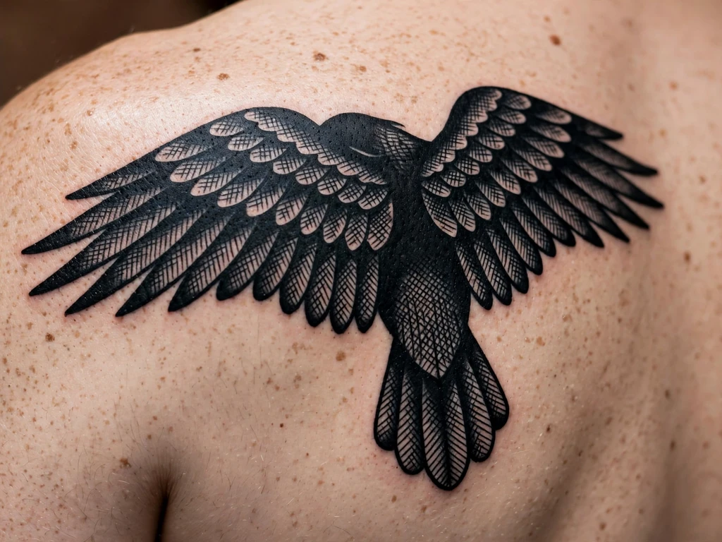
The bird this style was born to draw: a raven in saturated black, perched or with wings half-spread, its form carried by the silhouette and by hatched feather passages across the wing — the one bird whose real plumage is already the tattoo’s palette. Where other animals must be rendered in black, the raven simply has to be drawn in it accurately, and the result is the most naturalistic solid tattoo there is: a black bird, black. Its folklore comes with it — intelligence, memory, messages carried between worlds — stated as the tradition it is.
Black-on-black is the design’s discipline, as it is for every black animal: the raven’s forms must be carved from its own darkness by reserved skin — the highlight slash along the wing’s edge, the skin line that separates beak from head, the eye left as a point of skin inside the black. An all-black bird drawn without those separations heals into a bird-shaped shadow; drawn with them, it keeps its anatomy for decades.
Best placement: Shoulder blade, the raven centred on the flat with room for the tail; a forearm takes a perched, upright version.
Best for / know before you book: Approve the design as a pure silhouette first — cover the hatching in the reference and check the shape alone reads as a raven, beak, tail and all.
17. The Blackwork Skull
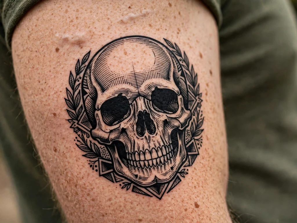
A skull drawn plainly and without a single horror effect: cranium modelled in bold hatching, eye sockets packed to true black, the teeth drawn as a few strong separations, the whole thing presented the way the memento mori tradition presents it — remember you must die, therefore live deliberately. Blackwork skulls belong to that tradition and to the decorated-skull folk customs that treat death as a fact to be faced calmly; this design wears no gore, no cracks-for-effect, no menace, and is the more powerful for its restraint.
The sockets are the craft examination. They must be packed to an even, genuine black — grey sockets make a skull read as tired rather than grave — and their edges drawn clean against the cranium’s hatched bone, because that contrast is the skull’s entire expression. The teeth obey the counting rule: a few bold separations read as teeth for decades; a full dental row merges into a zip within five years. The cranium’s highlight is reserved skin, planned in the drawing, since no highlight can be added once the hatching is laid.
Best placement: Upper arm, the skull at the arm’s full width; a shoulder takes it at slightly smaller scale with the same discipline.
Best for / know before you book: Approve the skull in its line drawing before any shading is discussed — the bone structure and socket placement must carry the design unaided.
18. The Negative-Space Rose
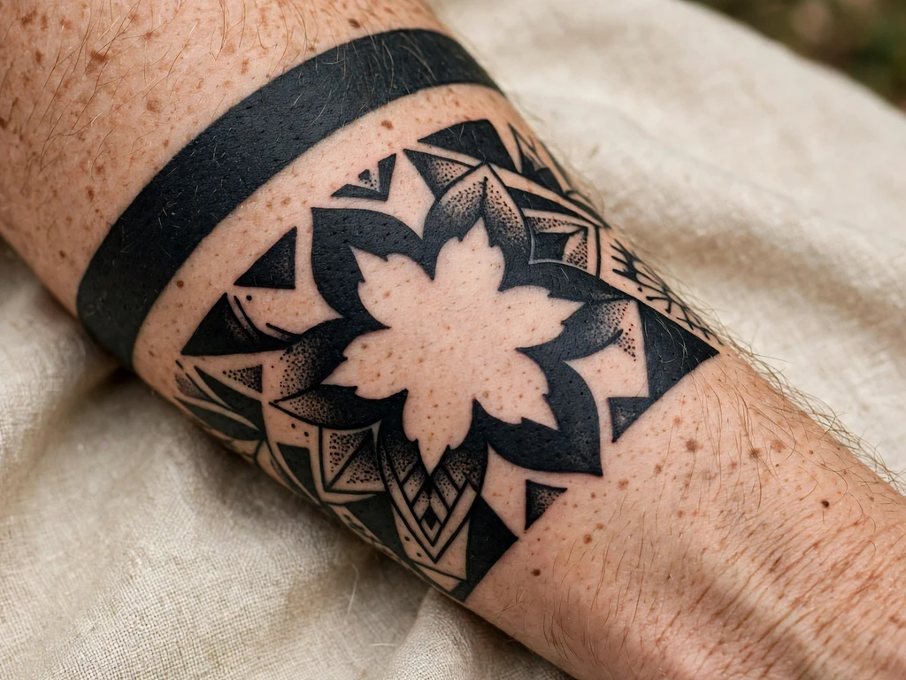
The family’s cleverest construction: a solid black disc or panel, packed to full saturation — and inside it, left entirely un-inked, the shape of a rose. The flower is skin. The tattoo around it is the black. It is the separation principle turned into the subject itself: a rose that can never fade in the ordinary way, because the part carrying the flower has no ink in it. Wearers take it for that wit and for its graphic force: a black coin with a rose glowing out of it reads from across a room.
The craft is the reverse of everything else in this guide, and harder than it looks. The black field must be packed flawlessly right up to the rose’s edges — every pale holiday in the field is a bite out of the flower’s silhouette — and the rose’s internal separations are skin lines drawn wider than usual, because here the black is what spreads, narrowing the petals from outside. Small features fail first: keep the rose bold, its spiral built from a few large shapes, and the field’s outer border simple.
Best placement: Forearm, the disc centred on the flat at a size that lets the rose breathe; it stamps equally well on a shoulder blade.
Best for / know before you book: This is the design to choose after you have seen a healed solid field and a healed negative-space piece from the same artist — it is the design where the empty part is the examination.
19. The Stag Beetle
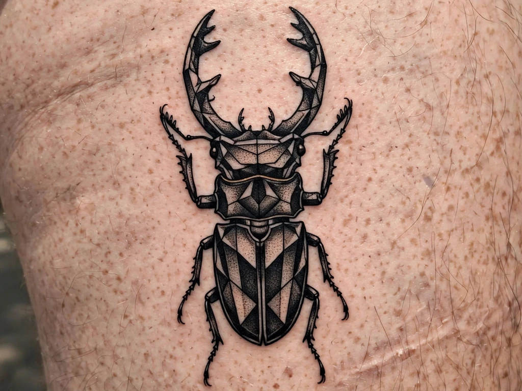
An insect drawn as armour: a stag beetle at large scale, its wing cases built from bold faceted shapes with skin lines between the plates, legs jointed in strong black segments, and the great antler jaws — the stag beetle’s signature — spread wide at the head. Insects are blackwork’s natural subjects because their bodies are already architecture: plates, joints and symmetry, with no fur or feather to soften them. Wearers take beetles for resilience, for armour carried quietly, and for the strange beauty of the overlooked.
The plates’ separations are the craft. Each wing case and body segment must keep its skin channel at healed width — a beetle whose plates fuse becomes a black oval with legs — and the legs are drawn bolder than nature, because thin jointed legs are the first thing a large insect design loses.
Best placement: Thigh, the beetle at full width with the jaws toward the knee; a shoulder blade takes it at the same grand scale.
Best for / know before you book: Count the leg segments on the stencil — six legs, each visibly jointed and separated, or the drawing goes back.
20. The Whip-Shaded Peony
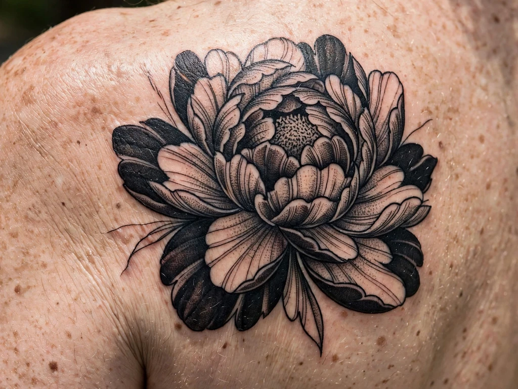
A peony built from blackwork’s softest weapon: whip shading, the stippled flick of dots and short strokes that grades a petal from a deep black base to a bare-skin edge without a single wash. The bloom is large, its outer petals drawn as bold dark shapes, its inner petals lightening by stipple density until the flower’s heart is its darkest point — a full tonal range achieved with the same two tools, dots and solid, that this whole article runs on. Wearers take the peony for its settled readings — prosperity, honour, a full and fortunate life — and for the sight of the heaviest ink doing the softest work.
The gradient is the craft, and it must be drawn, not hoped for: the artist maps where each petal’s density steps down, because whip shading improvised petal by petal heals unevenly. Petal separations stay skin lines at healed width even where the shading is lightest — a peony whose petals touch in the pale passages melts at exactly those passages first.
Best placement: Shoulder blade, the bloom spread across the flat; a shoulder takes a slightly smaller, tighter version.
Best for / know before you book: Ask the artist to shade one test petal’s gradient on paper with a pen — whip shading is a hand skill before it is a machine setting, and the hand shows in thirty seconds.
21. The Bold Wave
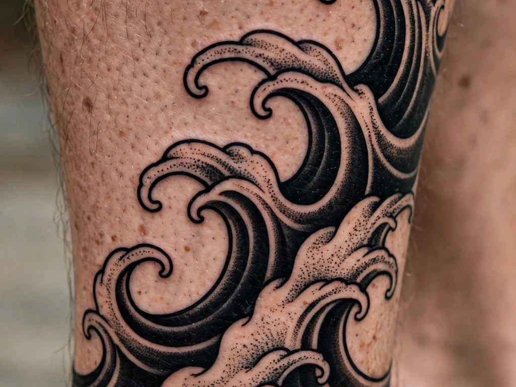
A single great wave reduced to blackwork’s essentials: one curling barrel of saturated black, its lip breaking into a few bold claws of foam drawn as reserved skin, a small field of stipple beneath it for the water’s weight. No blue, no grey wash — the wave as a woodcut prints it, all mass and motion in two tones. It is the quickest read at distance in this guide: a black curl on a calf is understood from across a beach. Its meanings are the wave’s own — power, rhythm, the thing that keeps coming back — carried entirely by the silhouette.
The curl is the craft: one continuous, confident curve that must not wobble, thicken unevenly or break, because a wave reduced to a single gesture has nowhere to hide a hesitation. The foam claws are drawn as skin shapes inside the black’s edge — few, large and separated — and the stipple beneath is kept short of the curl’s underside by a clean skin gap, so the barrel reads as a shape above water, not a smudge on it.
Best placement: Calf, the wave curling down the muscle with its lip toward the ankle; the same gesture wraps a forearm at smaller scale.
Best for / know before you book: Judge the stencil by its silhouette at three metres — a wave that needs its stipple explained to read as a wave is a wave drawn too small or too busy.
22. The Faceted Wolf
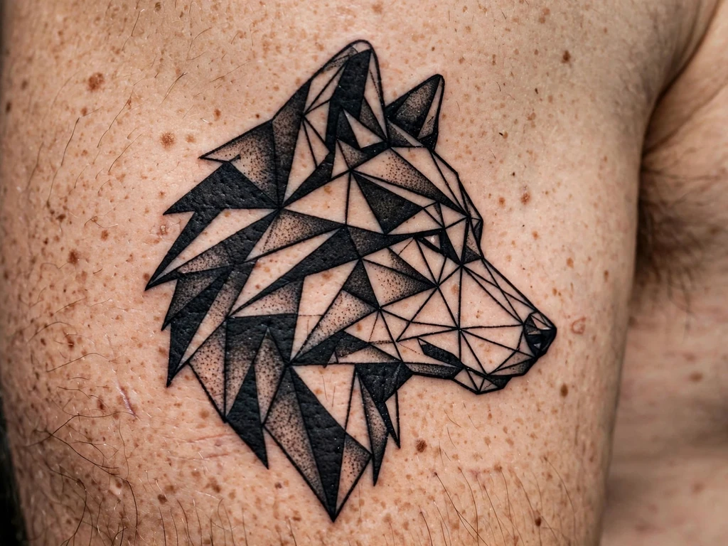
The geometric animal, the second of this guide’s rising-query designs: a wolf’s head built entirely from facets — the skull, ears, muzzle and brow constructed as bold triangular black shapes fitted against skin and against stippled grey facets, so the animal seems carved from black stone. No fur texture, no line detail: the wolf is recognised from the arrangement of its planes, the way a cut gem is recognised. Wearers take it for the wolf’s own readings — loyalty, the pack, the wild kept close — in blackwork’s most contemporary dialect.
Facet discipline is the craft, and it is strict. Each facet must be a complete shape with a clean skin border or a clean tone step against its neighbour — facets that share a ragged edge merge into one plane and the carving collapses. The eyes carry the whole expression and are drawn as two small, exact skin shapes inside the darkest facets: a faceted wolf whose eyes are an afterthought reads as a mountain range.
Best placement: Upper arm, the head at the arm’s full width; a shoulder blade hosts the truly monumental versions.
Best for / know before you book: Approve the head with the stippled facets covered — the black facets and skin alone should already read as a wolf’s skull; the grey planes are enrichment, not structure.
23. The Great Stag
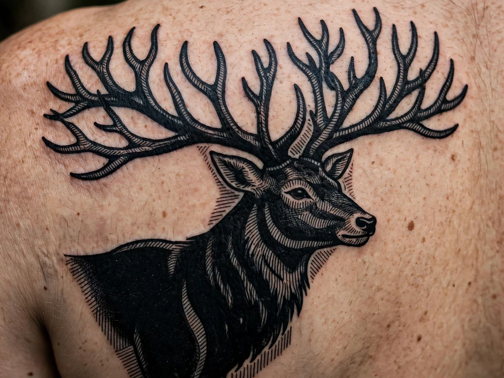
The guide’s large piece, given the shoulder blade’s full stage: a stag in profile, body packed in deep black with hatched modelling along the neck and flank, and above it the antlers — spread wide, branched, drawn as bold architecture that fills the blade’s upper half like a crown or a winter tree. The stag carries the oldest animal meanings in the Northern tradition: renewal (the antlers are shed and regrown each year), nobility, the wild wood’s sovereignty — stated as the traditions they are.
Scale is the first craft decision and it is not negotiable: the antlers’ branches need their separations at healed width across a dozen forks, which sets the design’s minimum size at most of the shoulder blade. Antler tips taper but never to needle points — points are where black softens first, and a stag whose antlers have blunted has lost its crown’s silhouette. The body’s packing is the blackout discipline at design scale: long sittings, even saturation, the healed result checked across the whole field.
Best placement: Shoulder blade, at the blade’s full width with the antlers spread across both blades’ inner edges if the wearer wants the grandest version.
Best for / know before you book: Book this as the multi-session work it is — drawing approved first as silhouette, then as the full hatched design, sittings planned with healing weeks between them.
24. The Tiny Solid Star
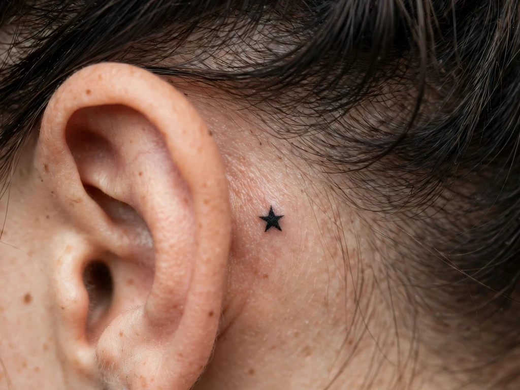
The guide’s one behind-ear design, and the smallest complete statement blackwork can make: a single star, packed solid, at a centimetre or so on the flat behind the ear — hidden by hair in formal rooms, revealed by a tucked strand. A star needs no explanation and gets none at this scale: luck, ambition, a person who is a star to you. What it needs is the placement’s honesty: behind-ear skin is thin, a little oily, rubbed by hair and sunglass arms, and it settles work softly and a touch fast.
So the star is drawn a fraction larger and bolder than the reference suggests — five short, sturdy points, not needle spikes, because points are what softening eats first — and a touch-up across its life is part of the bargain, named here rather than discovered. Drawn at that honesty it stays a star for decades; drawn as a miniature of a larger star, it becomes a blackberry.
Best placement: Behind the ear, centred on the flat beneath the cartilage fold, sized to the wearer’s own ear rather than any template.
Best for / know before you book: Hold the printed star behind your ear in a mirror at true size — behind-ear tattoos are met in mirrors all their lives, so the mirror is the honest fitting room.
25. The Solid Diamond
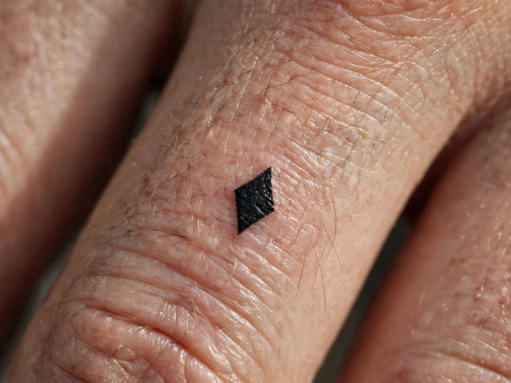
Close with the family’s smallest possible unit — one tiny solid black diamond on the side of a finger, a small solid black symbol worn like a ring that cannot be lost — and give it the fullest honesty in this article, because this placement fades faster than any other in tattooing, and that truth is part of the design. Finger skin regenerates quickly, flexes constantly, washes, rubs and sheds ink. So say it plainly: this diamond will fade and soften sooner than any other design here, its sharp corners first, and it will need touch-ups across its life to stay a diamond rather than a rumour of one. Wearers choose it anyway — a charm with a maintenance schedule.
What can be done is done at the drawing board. The diamond is drawn as boldly as a finger allows — a genuinely saturated little field, never an outline hoping to look solid — its points honest rather than needle-sharp, at the largest size the finger’s flat takes. And it sits on the side of the finger, not the palm side or the top, because side skin holds ink slightly better — the best bargain this placement offers.
Best placement: Side of the finger, where the shape can sit unbroken on the flat and the skin keeps ink longest of anywhere on a finger.
Best for / know before you book: Price the touch-ups before you fall for the charm — if re-inking a small diamond every year or two would annoy you, Design 10’s wrist heart carries the same solid-black statement on skin that keeps it far longer.
Blackwork Tattoo Placement by Size
| Size | Typical dimensions | Best placements | Good to know |
|---|---|---|---|
| Tiny | 1–3 cm | Behind ear, side of finger | One bold solid shape only — a star, a diamond; behind-ear work settles softly and finger work fades fastest of all, with touch-ups priced in from the start |
| Small | 3–8 cm | Wrists, ankles, collarbone edge | Solid hearts and small symbols live here — simple silhouettes, packed evenly, the ideal first blackwork piece |
| Medium | 8–18 cm | Forearms, calves, shoulders, upper arms, thigh | The family’s home: snakes, etched animals, botanicals and geometric panels with their spacing fully intact |
| Large | 18–30 cm | Shoulder blades, upper arms, thigh | Dotwork geometry, ravens, the great stag and half-blackout fields — the scale where saturation and symmetry can both be served |
Say the honest thing plainly, because this style’s galleries will not: blackwork rewards size and punishes crowding at every size. Its two materials — saturated black and the skin gaps that separate it — both need room, and a design squeezed below its honest scale does not become a smaller version of itself; it becomes a merged version.
How to Choose Your Blackwork Tattoo (and What to Know Before You Book)
Start from the healed black. Whatever design you choose, judge every artist on healed solid black first — a silhouette, a blackout edge, a packed socket, a year old at least. Saturation is this style’s foundation skill, it is invisible in fresh photographs, and an artist who shows healed black gladly is showing you the actual product. If their portfolio is all day-one contrast, you are looking at advertising, not evidence.
Interrogate the gaps, not the black. At the consultation, ask the spacing questions: where will this design’s skin lines narrow as the ink settles, which separations did the artist widen for healing, and what did they simplify to buy that width? An artist who answers by pointing at the empty skin understands the style. An artist who promises fine separations will stay exactly as drawn is selling the first photograph.
Match the technique to the temperament. Solid work is the boldest and the most permanent-feeling; dotwork is the gentlest ageing and the slowest sitting; etching style is the most literary and the most spacing-sensitive; blackout is the maximum commitment and should be chosen like one. The wearers happiest with blackwork chose the technique whose ageing behaviour they liked, not merely whose fresh look they liked.
Run the silhouette test on animals and symbols. Print the design at final size and check from across the room that the subject reads instantly — cat, raven, wolf, wave. Blackwork’s subjects are read by shape before they are read by detail, and a shape that needs explaining at three metres will not be rescued by hatching at thirty centimetres.
Take blackout seriously in both directions. If you are considering blackout — a band, a half-field, a cover-up — apply the craft section’s three facts: it is a major commitment of skin and sittings, its removal is extremely difficult and often incomplete, and its border is its design. None of that argues against it; the blackout designs here are among the guide’s strongest. It argues for choosing it as a destination, with an artist whose healed fields you have inspected.
Budget the touch-up as maintenance, not failure. Black lightens slowly toward dark grey over the years, faster in sun. A re-saturation pass on a large solid piece after some years is this style’s normal servicing — ask at the consultation what it would cost for your design. For the finger design, budget the touch-ups as recurring from the start; for everything else, sun protection is the habit that most delays the appointment.
Key points to remember:
- Blackwork = any tattoo done entirely in black ink — solid black, dotwork, etching-style linework, illustrative drawing and blackout are one family, defined by the ink, not the technique
- Saturation is the foundation: solid black must be packed evenly to a true black, because patchy packing heals grey and cloudy and cannot be hidden
- Separation is the survival plan: black shapes are held apart by skin lines drawn at healed width, because black spreads slightly and narrow gaps close
- Dotwork shades by density and etched work shades by hatch spacing — both fuse if crowded, so their darkest tones stop just short of solid
- Blackout is a destination, not a pause: a major commitment of skin, extremely difficult to remove, and designed by its borders
- Black ages by softening at the edges and lightening toward dark grey — sun accelerates it, and a touch-up can re-saturate what time has quietened
Frequently Asked Questions
What is a blackwork tattoo?
A blackwork tattoo is any tattoo done entirely in black ink. The name covers every technique that single ink can perform: solid black shapes and silhouettes packed to a saturated black, dotwork whose tones are built from dot density, linework in the etching and engraving manner that models form with hatching, illustrative drawing of animals, plants and scenes rendered in black alone, and blackout — whole areas of skin given to solid black. A piece may use several of those techniques at once. What defines the family is never the line weight or the subject; it is the ink.
What is the difference between blackwork, tribal and ornamental tattoos?
Tribal refers to the tattooing heritage of specific cultures — their own designs, meanings and protocols, carried in bold black — and it is a tradition, not a technique; blackwork borrows tribal’s boldness but makes no claim on its heritage designs. Ornamental is a family of decorative styles — lace-like pattern, filigree, jewellery-like composition — defined by ornament; it often uses blackwork technique, but a coloured ornamental piece is still ornamental. Blackwork is defined only by its ink: any tattoo, of any subject or technique, done entirely in black. A design can be two of these at once — an ornamental piece executed in black alone is both ornamental in language and blackwork in technique — but the words are not interchangeable.
Do blackwork tattoos age well?
They are among the best-ageing tattoos there are, built by the style’s own rules: black holds contrast longer than any colour, and the designs are carried by saturated shapes with nothing fine to lose. The ageing that does happen is honest and predictable: edges soften slightly, and deep black lightens toward dark grey over the years, faster with sun exposure. What fails is not the ink but the spacing — separations drawn too narrow close as the black settles, and detail crowds into mush. A blackwork tattoo whose gaps were drawn at healed width, and whose solid areas were packed evenly, will read clearly for decades, and a touch-up can re-saturate it if its black has quietened more than you like.
Is a blackout tattoo a good idea?
It can be a superb one, chosen on the facts. Blackout — a band, a field, or a whole limb in solid black — is the strongest graphic statement in tattooing and the only complete cover-up for an old tattoo you want ended. The facts to choose it on: it is a major commitment of skin, usually several long sittings for a large field, healing like the large tattoo it is; it is effectively the most permanent work in this article, because laser removal of a fully saturated black field is extremely difficult, slow and often incomplete; and it is designed by its borders — a clean cuff, a shaped edge, a dotwork fade — far more than by its field. Chosen as a destination with an artist whose healed solid work you have inspected, it is one of the great tattoos.
How do I choose an artist for a blackwork tattoo?
Choose on healed evidence of the exact skill your design spends most. For solid and blackout work, healed fields — even, deep, no pale holidays — at a year old or more. For dotwork, healed gradients whose dark ends are still visibly dots. For etching-style work, healed hatching whose lines stayed lines. For any design, ask the spacing question — what did you widen for healing, and why — and weigh the answer heavily: an artist who talks about the skin gaps unprompted is an artist who draws for the healed tattoo.
Final Thoughts
Blackwork is best understood as tattooing with its excuses removed. One ink means the drawing cannot hide behind a palette, the packing cannot hide behind detail, and the spacing cannot hide behind the fresh photograph — everything the artist knows is on the surface, in black and skin, from the first day to the thirtieth year. That is why the style keeps outliving its fashion cycles: silhouettes, geometry, etched animals and fields of pure black were strong before they were trends and will be strong after, because they are built from the two materials that never date — a true black, honestly packed, and the bare skin that gives it shape.
So choose the design whose silhouette you would love with every detail deleted, fix its gaps at the width the healed tattoo needs, and book the artist whose healed black you have inspected. Do that, and one ink is not a limitation you accepted. It is the whole point, worn at full strength.