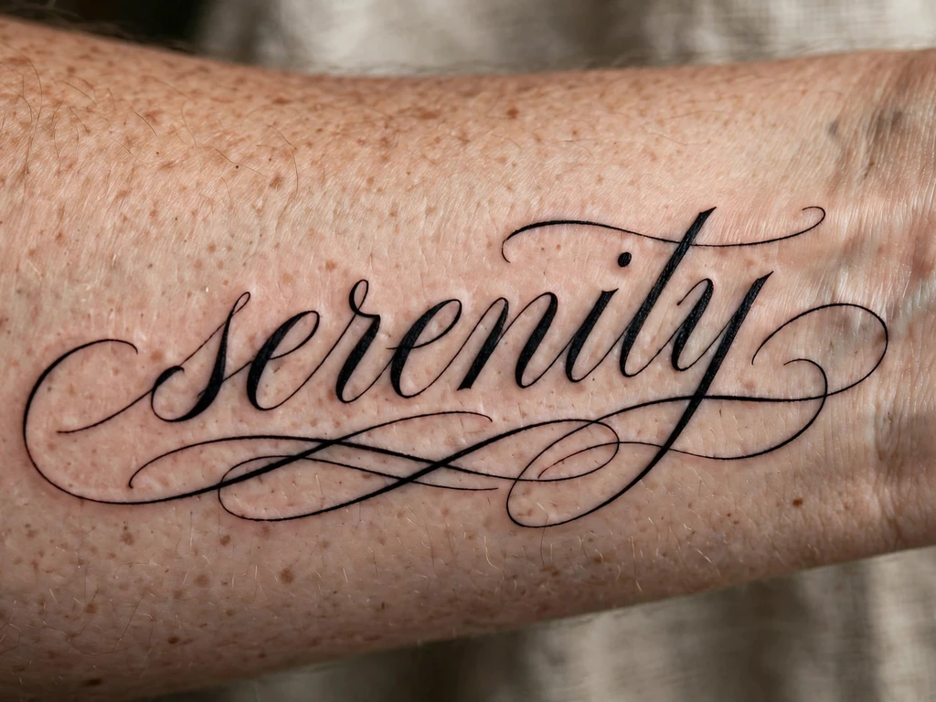
A script tattoo is the most personal tattoo there is, and the least forgiving. A picture can be misread and still be beautiful; a word cannot. Every script tattoo is a sentence passed on its own spelling — the name of a child, the last line of a letter, a word you say to yourself in hard weeks — written in ink that will sit on your skin for decades. Get it right and it is the tattoo people lean in to read, the one whose meaning is carried in the letters themselves. Get it wrong — too small, too tight, too clever a font — and it spends those same decades slowly closing into a smudge that used to say something.
You will find 25 original script tattoo ideas here: flowing cursive names, fine-line single words, calligraphy quotes that run the length of a forearm, typewriter lines, a loved one’s actual handwriting copied stroke for stroke, blackletter, brush script and two honest miniatures. But you will also find the conversation most script galleries skip entirely, and it is the conversation that decides whether any of these is still readable in fifteen years: the lettering law. Script lives or dies on the air inside its letters, and this guide gives you the rules — counter space, letter height, join discipline, the true-size print test, and the translation warning that has saved more travellers than any other sentence in tattooing — before it shows you a single design. Read those sections first, and every design below becomes easy to judge.
What Does a Script Tattoo Mean?
A script tattoo means exactly what it says — that is the first and strangest of its meanings. A rose can stand for love, loss or nothing in particular; a name in cursive stands for that person, in that hand, and no one else. The reading is not symbolic but literal, which is why script is the tattoo of record: the one people choose when the meaning is too specific for any picture to carry.
The wearers’ reasons gather around a handful of centres. Names are the largest: children, partners, parents — the people a wearer wants written on the body the way they are written into the life. Words come next: one-word instructions to the self — breathe, endure, enough — worn where the wearer’s own eye falls daily, which is why so many of them live on the inner wrist and forearm, read by the wearer rather than the world. Quotes and lines carry other people’s sentences that have become the wearer’s own: a line of poetry, a song lyric, the sentence a grandmother said so often it became family law. Dates mark the days a life turned — written out in words or numerals, they are the archive worn on skin. And handwriting is the most intimate reading of all: a script tattoo copied from a real person’s real hand — a signature, a note, the way your father actually wrote your name — carries not just the words but the hand that wrote them, which is why handwriting replicas are the design families ask for after a loss, and the one this guide treats with the most care (Design 5).
There is a lineage under all of this, and it is worth knowing, because script tattooing is not a trend but the modern end of a five-hundred-year craft. From the 1500s onward, writing masters across Europe published copy-books and writing manuals — model alphabets and instruction books from which ordinary people learned beautiful hands. Harvard’s Houghton Library holds one of the great collections of them, its writing books collection tracing handwriting’s evolution across Italy, France, Spain, England, the Netherlands and America, built around masters such as Arrighi and Palatino, whose engraved alphabets ordinary readers copied letter by letter. A script tattoo chosen from a font menu today is doing what a clerk with a copy-book did in 1600: taking a master’s letterforms and making them your own hand. The tattoo version simply skips the years of practice — which is exactly why the rules in the next section matter.
The Lettering Law: Why Script Ages by Air, Not Ink
Every other tattoo subject has a craft law; script’s law is the strictest of all, because lettering is made of the smallest repeated shapes tattooing uses. Here it is, whole: a letter is read by the spaces inside it, and those spaces close first. Ink settles and spreads slightly as it ages — a fraction of a millimetre a year, in every direction. On a picture, that softening blurs an edge. On a letter, it fills a hole. The enclosed spaces of letters — the counter of an a, the eye of an e, the loops of an o, p and g — are the smallest holes in the whole design, and they are where spreading ink arrives first. A script tattoo does not fade from the outside in; it fills from the inside out, and the word dies letter by letter, counter by counter, while the outlines still look fine. Everything below is tactics for that one fact.
Give every letter air. The counters must be drawn open — visibly, almost excessively open at stencil stage. A fine cursive e whose eye is a slit on paper is a closed blob in skin by year five. The working check is brutal and simple: squint at the design from two metres. Letters that still separate into letters at squint distance have air; letters that melt into a ribbon do not, and no artist’s confidence changes the arithmetic.
Letter height is the real measurement. Forget the tattoo’s total length — a quote can be 14 cm long and still be doomed if its letters are 4 mm tall. What governs survival is the height of the lower-case body (the x-height, in the lettering trade’s own term) and the width of the counters inside it. As a floor: lower-case letters below roughly 5 mm of body height are living on borrowed time in flowing script, and below 3 mm in any style they are a countdown, not a tattoo. Connected cursive needs more, not less, because of the next law.
Every join is a merge point. Cursive’s beauty is its connections — and each connection is a place where two strokes meet at an angle, pool ink, and thicken together as they settle. A word of eight letters has seven or more joins, each one a future thickening. This is why printed (unconnected) lettering outlives script at the same size, why the flowing designs in this guide are all sized generously, and why an honest lettering artist will sometimes talk you out of a join — lifting the pen between two letters is not a failure of cursive; it is the design choosing its tenth year over its first photograph.
Spacing is a feature, not a waste. Letters in a tattoo need more air between them than letters on paper — tracking, the lettering trade calls it — because each letter spreads towards its neighbours. Script set at book spacing reads beautifully for a year and then begins to kiss. The designs below are all described at healed spacing: slightly loose, slightly open, faintly old-fashioned to a fresh eye — and legible at year fifteen.
Test at true size, or do not book. Print the exact words, in the exact font, at the exact size they will be tattooed. Tape the printout where the tattoo will live. Read it at arm’s length, in a mirror, in ordinary light — not zoomed, not squinting, not “it will be darker in ink”. If any word needs a second look on paper, it will need a magnifying glass in skin. This test takes ninety seconds and is the single most-skipped step in all of script tattooing.
Judge fonts by healed letters, never fresh ones. A fresh script tattoo is a lie told well: hairlines at full contrast, counters wide, joins crisp. Ask any lettering artist for healed script — a year old at least — and read the counters. What you are buying is not the font on the screen; it is that font after a decade of your skin’s arithmetic.
A handwriting replica needs an honest original. Copying a loved one’s handwriting (Design 5) obeys all the laws above plus one of its own: the original sample must be enlarged truthfully. Real handwriting is written at 3–5 mm letter height — far below tattooable size as-is — so the artist scales it up and, in scaling, must open its counters and loosen its joins while keeping the hand’s character: the slant, the rhythm, the signature quirks. A traced copy at original size is a fading letter; a redrawn enlargement is a tattoo.
And the law that stands outside craft entirely, because its failures are not gradual but instant and permanent: never wear words you cannot read, checked only by the internet. The classic failure is famous because it is real — a phrase run through a translation app or copied from a chart, tattooed proudly, and found later to say something else entirely, or nothing, or the right words in the wrong grammar. Scripts are not decoration: every letterform in another language is a claim you are making in public, forever. If the words are not in a language you read, have them checked by a native speaker who reads and writes it — in person, on the exact final text, character by character — and have your artist work only from that checked text. Design 12 returns to this; it cannot be said too plainly, so this guide says it twice.
Choosing a Script Style: Fonts, Generators and the Artist’s Redraw
Searches for tattoo font generators and script fonts are among the fastest-rising in this whole subject, and the instinct behind them is sound — you want to see your words in candidate hands before committing. Used rightly, a generator is a sketchbook. Used wrongly, it is a stencil factory for tattoos that were never drawn to live in skin. Here is the honest workflow, the one lettering specialists actually run.
Generate widely, choose slowly. Run your words through several styles — flowing cursive, calligraphy, typewriter, fine-line print — and notice what the exercise is really for: discovering which family your words belong in. The same word is a different tattoo in each hand: a name in pointed-pen calligraphy is ceremonial; in typewriter capitals it is documentary; in fine print it is a whisper. Choose the family by the reading you want, not by which preview looks prettiest at screen size.
Understand what a generator cannot know. A font is a static system — as San Francisco’s Letterform Archive puts it in its guide to the letter arts, a typeface gives each character a limited set of fixed forms, while calligraphy is written (each stroke a single gesture, its weight given by the tool) and lettering is constructed (built up stroke by stroke for one specific composition). Tattoo script belongs to the second and third of those worlds, not the first. A generator sets your words in a font: identical a’s, identical joins, spacing computed for screens. Skin wants the opposite — letters adjusted to each other, joins placed where the word’s own rhythm wants them, spacing opened for a decade of spread. That adjustment is the artist’s redraw, and it is not optional garnish; it is the difference between type on a body and lettering for one.
Bring the artist three things. The words, exactly spelled, punctuation settled. The family you chose, with two or three generated examples as a dialect reference. And the placement, with its honest size range. Then let the artist draw: a lettering specialist redraws your text by hand — or hand-tunes the font — enlarging counters, loosening joins, setting healed spacing, and fitting the line to the limb’s curve. If an artist proposes to print a generator’s output straight onto a stencil unchanged, that is the consultation’s answer: find a lettering specialist. Script is the one tattoo subject where the specialist/generalist gap is measured in legibility itself.
Decide the reading direction. Script on the inner forearm can read to you or to the world — letters upright when your arm hangs (read by others) or upright when you lift and turn your wrist (read by you). Neither is wrong; wearers of one-word reminders usually choose self-reading, wearers of names usually choose world-reading. But decide before the stencil, and check the stencil in a mirror in the position you chose — script is the design most often discovered, a day late, to be upside down.
Script Tattoo Styles and How They Age
A script tattoo ages by one law above all: its smallest counter sets its lifespan. Every style below is a different treaty with that fact. Typewriter lettering refuses tiny counters altogether. Calligraphy spends its beauty at the joins. Handwriting replicas trade precision for truth.
| Style | How it is drawn | How it ages |
|---|---|---|
| Flowing cursive | Connected letters in one travelling line, even weight, open loops | The classic treaty: gorgeous for decades at honest size — every join thickens slightly, and the counters fill first, so it must start open |
| Fine-line script | A single hairline weight, letters small and delicate | The most fragile treaty; survives only at the top of its size range with wide counters — expect a possible early touch-up |
| Calligraphy / pointed pen | Swelling and narrowing strokes, thick downstrokes, hairline upstrokes | The hairlines are the risk: upstrokes thin as downstrokes hold, so the contrast softens — draw the hairlines one grade heavier than the pen original |
| Typewriter / typeface | Unconnected printed letters, even spacing, no joins | The longevity champion of lettering: no joins to merge, generous counters — reads clearly for decades, and the honest choice for long text |
| Handwriting replica | A real person’s hand, enlarged and redrawn with opened counters | Ages as the style it imitates; the redraw is everything — a traced photocopy fades like one, a hand-redrawn enlargement holds its words |
| Blackletter / gothic | Dense, angular, heavily built letters with thick verticals | Superb ink-holding, terrible legibility at small size: the counters are narrow by design, so it must be BIG — a style that trades reading ease for presence |
| Brush script | Bold, energetic strokes with tapered ends, sign-painter energy | Holds well at statement size; the tapered tips soften first, so ends are drawn blunter than the brush original |
| Red ink script | Any of the above, in red pigment alone | Red softens and fades faster than black and can warm in tone; the lettering must stand on black-ink discipline with none of black’s forgiveness |
The photograph problem: the script tattoos that circulate most are fresh, macro-photographed and tiny — hairline words you need a loupe to read, cursive chains of eight names in 6 cm. Every design here is described at its healed density and honest minimum size: letters with air in them, joins that can thicken without welding, words you can read from across a table. A script tattoo drawn for year ten looks slightly loose and slightly large on day one. That looseness is the design working as intended.
Script Tattoo Ideas at a Glance
| # | Design | Style notes | Best placement |
|---|---|---|---|
| 1 | The Flowing Cursive Name | Connected cursive, open loops | Forearm (inner) |
| 2 | Fine-Line Single Word | Hairline weight, one word | Wrist (inner) |
| 3 | Calligraphy Quote Along the Forearm | Pointed-pen swells, long line | Forearm (inner) |
| 4 | Typewriter Line | Unconnected capitals or lower case | Forearm |
| 5 | A Loved One’s Handwriting | Replica, enlarged and redrawn | Wrist (inner) |
| 6 | Script with a Flower Stem | Cursive word, stem from a letter | Forearm |
| 7 | Script with a Flourish Underline | Cursive, one long swash below | Forearm |
| 8 | Bracelet Script | Fine script circling the wrist | Wrist |
| 9 | Vertical Script Down the Calf | Cursive or print, top to bottom | Calf |
| 10 | Red-Ink Script | Flowing script, red pigment only | Forearm |
| 11 | Blackletter Script | Dense gothic capitals and text | Upper arm |
| 12 | Foreign-Language Script | Any hand, verified text | Forearm |
| 13 | Mirrored Script | Cursive written to read in reflection | Wrist (inner) |
| 14 | Micro-Script Above the Ankle | Printed letters, bold for size | Ankle |
| 15 | A Date in Numerals and Words | Numerals riding a script line | Forearm |
| 16 | A Song Lyric Line | Flowing cursive, one line | Forearm |
| 17 | Single Initial Monogram | One built-up capital letter | Behind ear |
| 18 | Script Along the Collarbone Edge | Fine cursive following the bone | Collarbone (outer edge) |
| 19 | Script Down the Outer Forearm | Cursive running the arm’s edge | Forearm (outer) |
| 20 | Letters Dissolving into Birds | Script tail lifting into silhouettes | Shoulder |
| 21 | Futuristic Chrome Script | Angular constructed lettering | Forearm |
| 22 | A Survivor’s Quote in Fine Script | Fine line, generous spacing | Forearm (inner) |
| 23 | Bold Brush Script | Thick-and-thin statement word | Upper arm |
| 24 | Fine Single-Needle Script Quote | Hairline letters, wide spacing | Shoulder blade |
| 25 | A Tiny Initial on a Finger | One bold capital, silhouette-simple | Finger (side) |
25 Script Tattoo Ideas
1. The Flowing Cursive Name
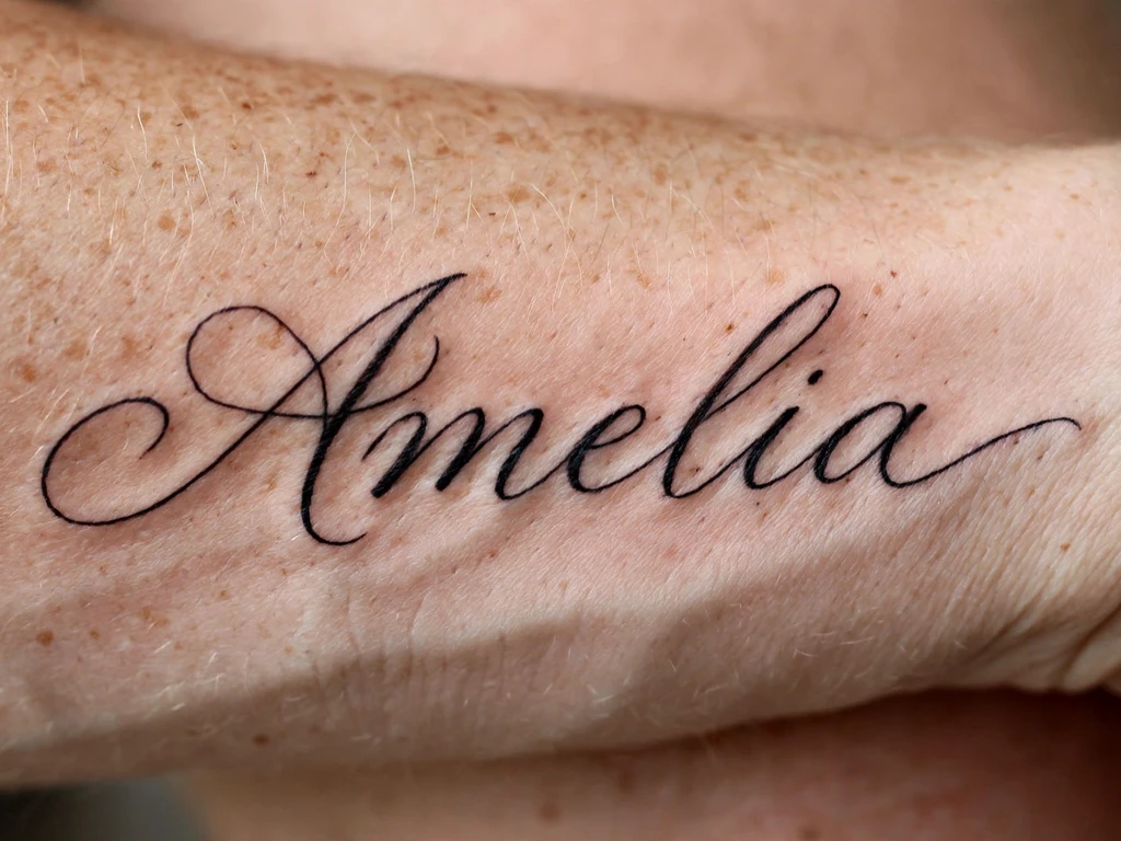
Begin with the archetype, because every other design here is a negotiation with it: one name — a child’s, a partner’s, a parent’s — written in flowing connected cursive along the inner forearm, the line leaving the wrist, travelling in open loops, and closing with a small, unhurried tail. Nothing added, nothing hidden. It is the most requested script tattoo in the world for the plainest of reasons: the person is not symbolised, they are written, and a name in a beautiful hand says it at the size the feeling deserves — this design lives at 9–13 cm, letters never smaller than the lettering law allows.
Draw it by the laws. The counters are opened past what the reference suggests — the a, the e, the looped ascenders all carry real air — and the joins are placed where the name’s own rhythm wants them, which for most names means one or two deliberate pen-lifts that no viewer will ever notice and every year will reward. Have the artist write the name by hand, several times, and choose among real handwriting rather than a font’s identical letters: a name is the most personal text there is, and it should not be set in the same characters as a bus ticket.
Best placement: Inner forearm, the name running along the arm’s length where it lies flat and reads whole; the upper arm takes longer names at the same honesty.
Best for / know before you book: This is the reference design against which lettering artists should be judged — ask to see healed names, a year old or more, and read the counters. If the e is still an e, book.
2. Fine-Line Single Word
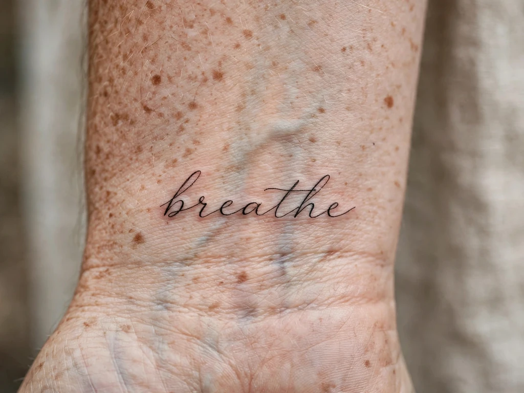
The loop’s smaller cousin and the wrist’s classic: one short word — breathe is the era’s favourite, and the example these prompts use — in a single hairline weight on the inner wrist, written to be read by the wearer. It is a reminder disguised as jewellery: four to seven letters, 4–6 cm, placed where the wearer’s own eye lands a hundred times a day. Of all the designs here it is the one whose meaning is a practice — the word is an instruction, and the wrist is where instructions get read.
Fine line is the most fragile treaty in the styles table, and a word is the design that punishes fragility precisely, so this one is drawn at the treaty terms: letters at the top of fine-line’s honest range, counters wide, one word only — a second word halves the size of both. Expect the possibility of an early touch-up as the honest price of the delicacy, and choose a fine-line specialist: the wrist forgives nothing, and a hairline word is only ever as good as the hand that keeps its weight even from the first letter to the last.
Best placement: Inner wrist, centred on the flat below the crease, reading to the wearer.
Best for / know before you book: Tape the true-size printout on for a day — if the word still reads at a glance in ordinary light, book it; if it only works held close, go one size up to Design 1’s weight.
3. Calligraphy Quote Along the Forearm
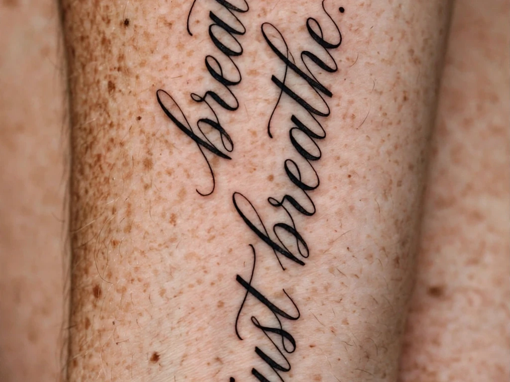
The forearm’s ceremonial form: a full sentence — the line of poetry, the family saying, the vow — written in pointed-pen calligraphy down the inner forearm, the strokes swelling on the downstrokes and narrowing to hairlines on the rises, exactly as a nib writes them. A quote is the longest text skin holds gracefully, and the forearm is its natural page: long, flat, and turned towards the wearer through the day. Readers planning the placement itself will find the canvas treated in full in our forearm tattoo ideas guide; this design’s subject is what the page says.
Calligraphy’s risk is written into the styles table: the hairlines. A pen’s upstroke can be a whisper because paper spreads nothing; skin spreads everything, so the artist redraws the quote with its hairlines one grade heavier than the calligraphic original — a small betrayal of the pen that buys the sentence its decades. Length discipline matters as much: one line, two at the very most. A paragraph at forearm size is a letter-height cut, and letter height is the law.
Best placement: Inner forearm, the line running wrist to elbow with the text sized from the letters up — expect 12–16 cm for a true sentence.
Best for / know before you book: Count the words, then size the arm from the words — never the reverse. If the quote does not fit at honest letter height, the answer is a shorter quote, not smaller letters.
4. Typewriter Line
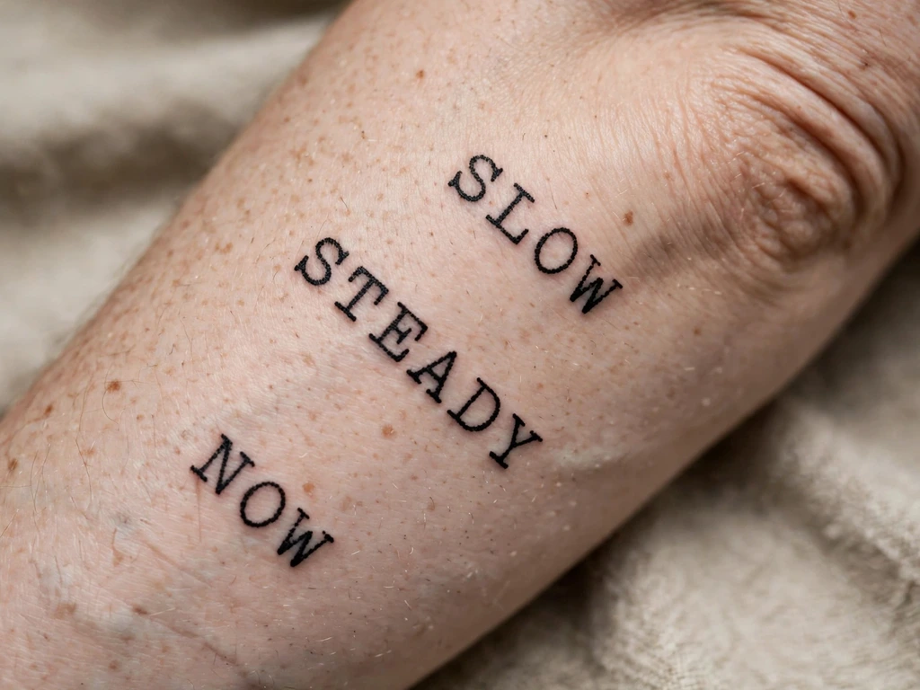
The documentary voice: a short line set in typewriter type — unconnected letters, even spacing, the slight mechanical irregularity of a struck page — worn on the forearm like a sentence typed onto the body. Wearers take it for texts that should feel recorded rather than whispered: a date and a place, a line from a letter, a name and a verdict. Where cursive is a voice, typewriter is a document, and some sentences deserve a document.
Its craft is the happy opposite of cursive’s: no joins, because there are no joins. Typewriter lettering is the longevity champion of the styles table precisely because it refuses every merge point cursive accepts — each letter stands alone with air on both sides, and its counters are the generous, engineered counters of a typeface. The one discipline is fidelity: the charm lives in the even rhythm and the honest little irregularities, so the artist sets it like type, letter by letter, rather than writing it freehand and hoping it looks typed.
Best placement: Forearm, a single straight line along the arm’s flat; a line of capitals also sits superbly across the outer collarbone edge.
Best for / know before you book: Typewriter is the honest choice for longer text — if your sentence keeps failing the cursive size test, this style is not a compromise, it is the correct answer wearing a disguise.
5. A Loved One’s Handwriting
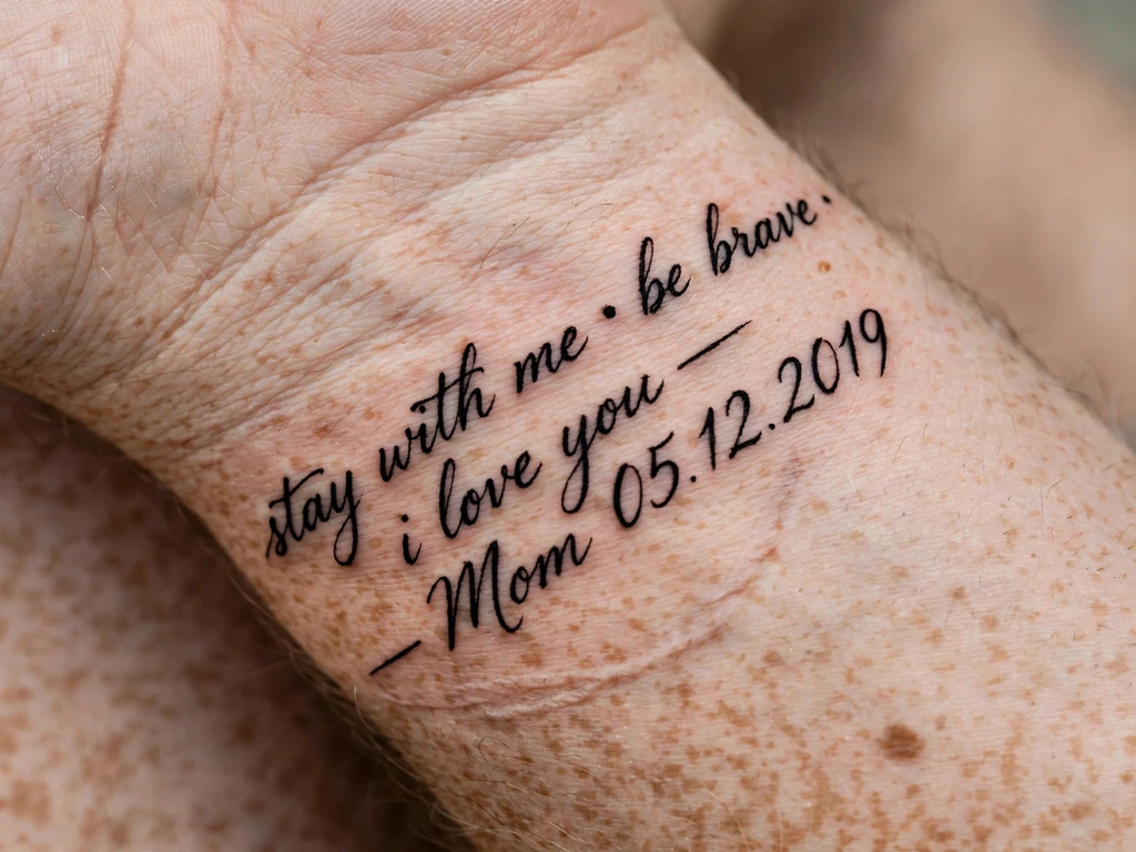
The most intimate design in this guide, and the one readers write to tattooists about in the small hours: a few words in a real person’s actual hand — a mother’s signature from a birthday card, the way a grandfather signed his letters, love you in the hand that wrote it on a hundred notes — copied onto the wrist or forearm. It is the only tattoo that carries two things at once: the words, and the hand. Wearers take it most often after a loss, and everything about its making should be worthy of that.
The method is in the lettering law, and it is the opposite of tracing. Bring the artist the best original you have — a clean, dark sample, photographed flat and straight — and expect them to redraw it at tattoo size, enlarged honestly: the slant kept, the rhythm kept, the beloved quirks kept (the way the t is crossed, the tall l), while the counters are opened and the joins loosened past anything real handwriting allows itself. Real handwriting is written at a size skin cannot keep; the redraw is how the hand survives being made permanent. Approve the redraw by comparing its character to the original, not its measurements: you are checking that it is still them, not that it is a photocopy.
Best placement: Inner wrist for a signature or two words; the inner forearm for a full line in their hand.
Best for / know before you book: Choose the sample for its letterforms, not its sentiment — a clear, complete sample with every letter you need beats a precious fragment the artist must invent half of.
6. Script with a Flower Stem
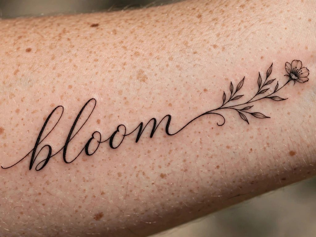
The word that grows: a name or short word in flowing cursive on the forearm, and from the tail of its final letter — or rising through its first — a slender stem travels upward and opens into one small flower. It is the gentlest fusion in this guide, and the fusion obeys the series’ standing discipline: the lettering is the design and the flower is its guest, drawn bold and simple — a handful of large petals, real skin gaps — because a flower squeezed against a word at small scale is the detail that spends the lettering’s budget.
Choose the flower the way wearers of this design usually do, by meaning: a birth flower makes the word a double record — the person named, and the month that names them — and our birth flower tattoo ideas guide gives every month’s flower its own treatment. The stem itself is the craft risk: a hairline stem against hairline letters doubles the fragility, so the stem is drawn one weight bolder than the script and the junction is a genuine merge, planned, not an accidental touching.
Best placement: Forearm, the word horizontal and the stem rising at its end; the design also sits beautifully above an ankle with the flower opening upward.
Best for / know before you book: Approve the word alone first, flower imagined away — then approve the flower as a pure silhouette. Both tests, passed separately, are the booking.
7. Script with a Flourish Underline
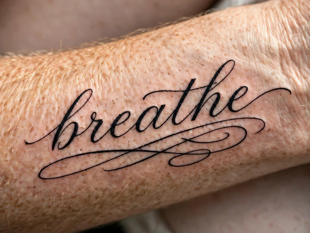
The signature’s full stop: a word or name in flowing cursive, and beneath it a single long flourish — the line sweeping out from the final letter, diving under the whole word and rising at the far end in a loop or a taper. It is how signatures have signed off for centuries, the pen’s way of saying this is mine and it is finished, and as a tattoo it turns a plain word into a sign-off: the difference between writing a name and signing it.
The flourish is also the design’s physics problem. It is the longest unbroken line in the piece, crossing under every letter, and where it passes close beneath a descender the two lines form exactly the kind of near-touch that settling ink welds together. Draw the flourish low — a clear channel of bare skin between the word’s lowest letters and the swash along its whole length — and let its taper end in a point with intent, not a hairline fade. One flourish, one sweep: a second decorative swirl is a second chance to merge.
Best placement: Forearm, with the word sized first and the flourish fitted beneath at the same generous scale; a name-and-flourish also runs well along the calf.
Best for / know before you book: Check the channel on the stencil: daylight between letters and flourish at every point, or the underline becomes an underscore of merged ink by year five.
8. Bracelet Script
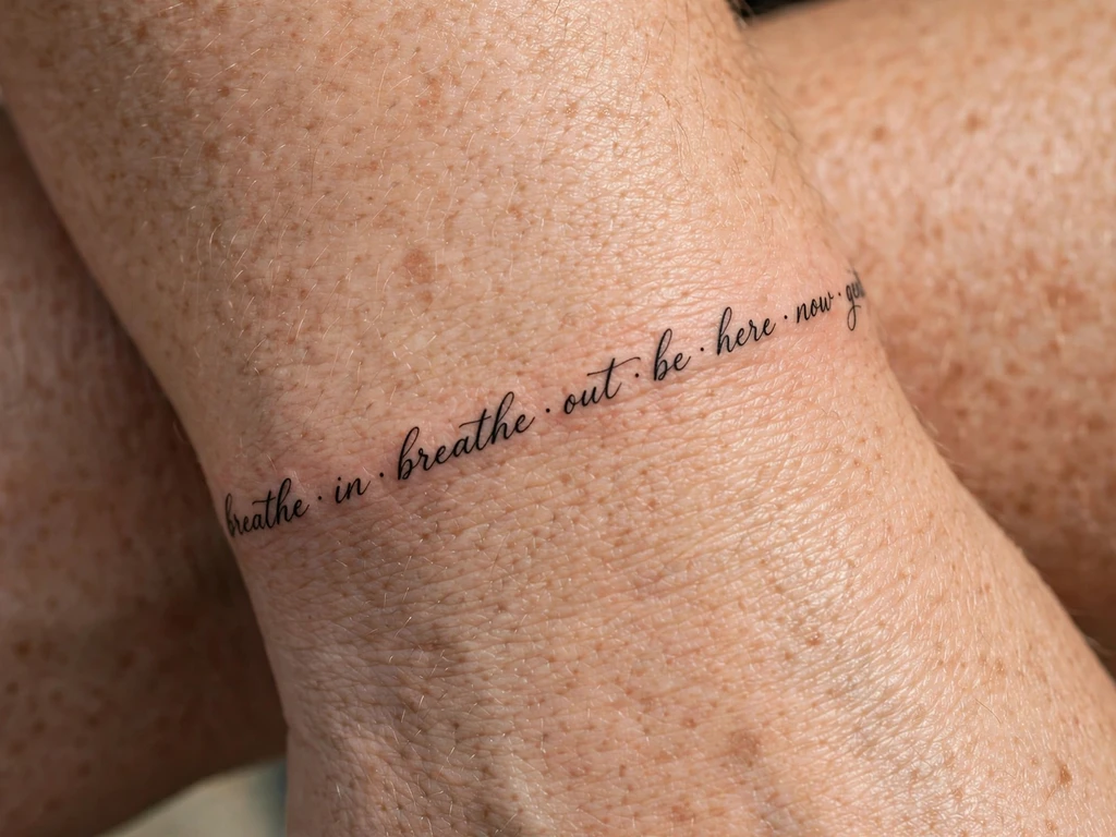
Script worn as jewellery: a word or short phrase in fine connected cursive that travels all the way around the wrist and meets itself — a name, or a phrase whose end joins its beginning by design. Where Design 2’s single word sits on the wrist’s flat, the bracelet uses the whole circumference, and its reading is cyclical: a phrase that comes back to its start is the wrist’s version of a vow. It is among the most requested wrist scripts in studios, and among the most technically exposed.
The band is the discipline, as with any wrap design. The line must travel at an even height and even weight around a wrist that tapers and turns — stencilled with the hand at rest, checked in rotation — because a band that climbs on one side advertises itself with every gesture. The join where the phrase meets itself must be designed: a small flourish, a dot, a deliberate break of clean skin — never two letter-ends left to negotiate their own meeting. Keep the phrase short enough that its letters hold bracelet scale honestly; a sentence around a wrist is a letter-height cut wearing a pretty name.
Best placement: Wrist, the band following the natural circle above the crease, with the phrase’s start placed on the inner flat.
Best for / know before you book: Wear a real bracelet on the spot for a week and note where it sits, slides and catches — the tattooed band must be placed around your own jewellery’s habits, not against them.
9. Vertical Script Down the Calf
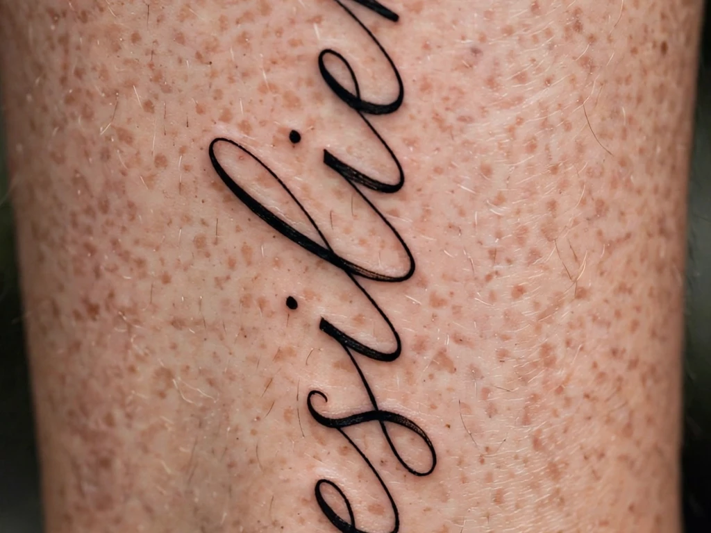
The word stood upright: a single word or short name written vertically down the back of the calf, letters stacked along the leg’s long line, read from top to bottom as the leg itself is read. Vertical script belongs to the calf the way horizontal script belongs to the forearm — it uses the body’s own long axis — and it carries an echo of the vertical calligraphy traditions of East Asia, where a column of characters down a surface is the classic arrangement (worn here, as everywhere in this guide, only in a language the wearer reads — the translation law has no exceptions for beautiful arrangements).
The craft is axis. A vertical line placed with the leg posed will hang crooked in every natural stance, so the stencil is set standing, weight even, checked from behind at two metres — the view the design will actually be judged from, since calf script is read by the world behind you. Letters in a column need slightly more air between them than the same word horizontal, because the calf’s taper narrows the lower letters’ ground; size from the narrowest letter’s counter, not the average.
Best placement: Calf, centred on the back of the muscle, the column clear of the knee’s crease and the ankle’s taper.
Best for / know before you book: Photograph the stencil from behind, standing naturally — vertical designs are judged on axis, and the axis only exists when the leg is at rest.
10. Red-Ink Script
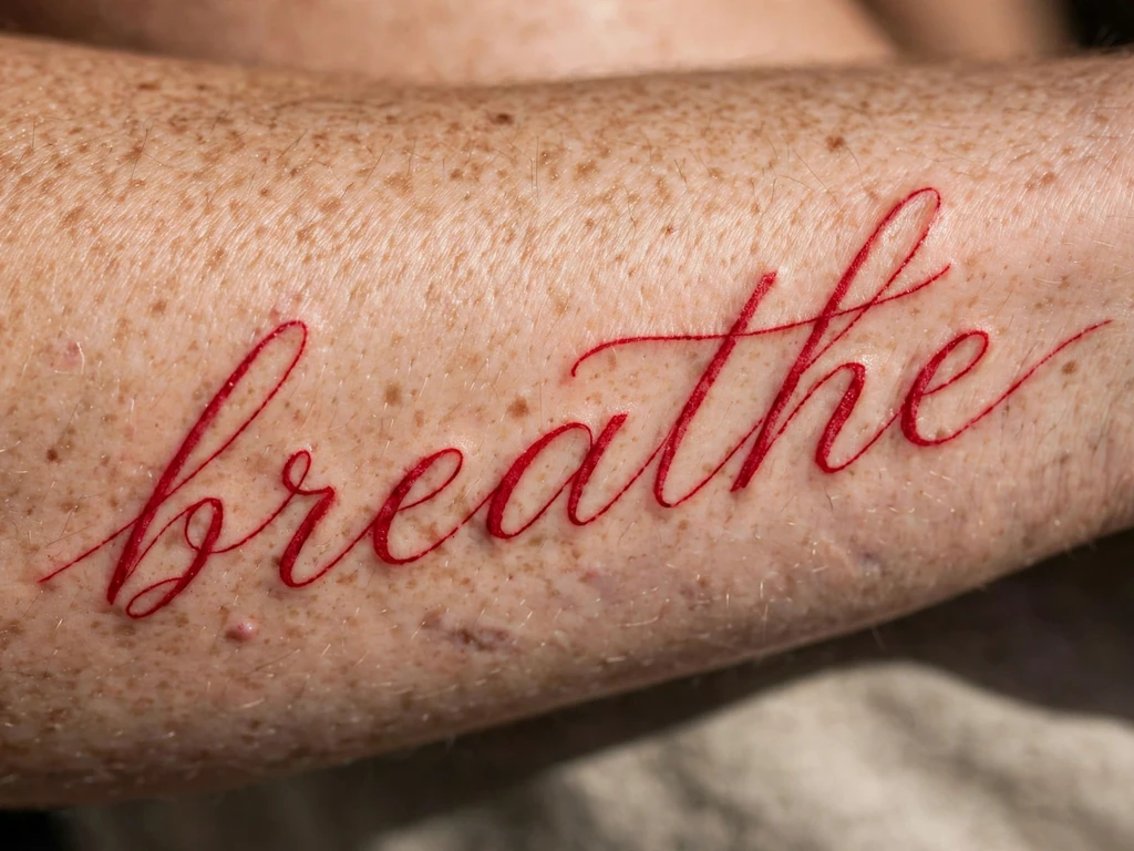
The word in a single colour: a name or short word written in flowing script in red ink alone — no black outline, no black shadow, the letterforms built entirely from the warmest pigment in the studio. Red script has a long life in tattooing, from traditional banner lettering to the fine red words worn like a whispered aside, and its reading is distinct from black’s: black declares, red confides. Wearers take it for names and words they want legible mainly to those who come close.
The honesty the styles table demands, stated in full: red is the softest-spoken pigment on skin. It fades faster than black in sun, it can warm or soften in tone as it settles, and a red letter has no darker skeleton to fall back on — when a red counter fills, the letter is simply gone. So red script is drawn with black-ink discipline and then some: letters larger than the same word would be in black, counters wider, one word or a short name only, and a sun-protection habit treated as part of the design. Choose it for the colour’s meaning, with the maintenance priced in, and it is a beautiful, deliberate choice; choose it as a softer black and it will disappoint on schedule.
Best placement: Forearm, where sleeves can protect it and the letters get their generous size; the upper arm is its other honest home.
Best for / know before you book: Judge the artist on healed red — fresh red photographs vivid and settles several shades quieter, and the healed tone is the tattoo you are actually buying.
11. Blackletter Script
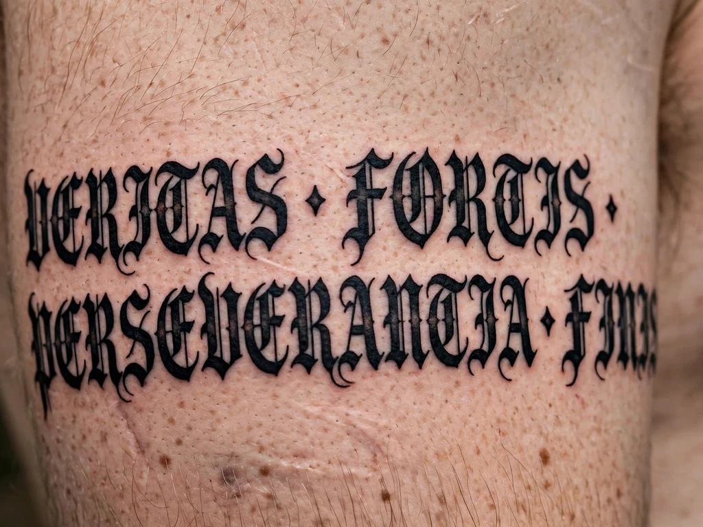
The cathedral voice: a word or short line in blackletter — the dense, angular, heavily built lettering of medieval manuscripts and newspaper mastheads — worn across the upper arm at genuine size. Blackletter script does not whisper and cannot be made to: its letters are architecture, thick verticals and narrow counters, and wearers take it for words that should feel carved rather than written — a family name, a creed, the one word in Latin or English that the wearer wants to arrive like a gate closing.
Its law is the mirror of cursive’s. Blackletter holds ink superbly — there is so much black that settling barely registers — but its counters are narrow by design, which makes it the worst lettering style ever invented for small sizes: reduce it and the letters do not blur, they fill, becoming black rectangles with ambitions. Blackletter’s honest minimum is the largest in this guide: a short word wants 12 cm or more, with the capitals built up as drawn lettering, stroke by stroke, exactly the constructed-letter discipline the letter arts describe — no font printed at wrist size will survive, and none should be asked to.
Best placement: Upper arm, across the outer flat where the letters get their breadth; a shoulder blade hosts a full line at ceremonial scale.
Best for / know before you book: Read the stencil at three metres and at thirty centimetres — blackletter must work as pure silhouette from the street and as lettering from the chair, and both tests are the booking.
12. Foreign-Language Script
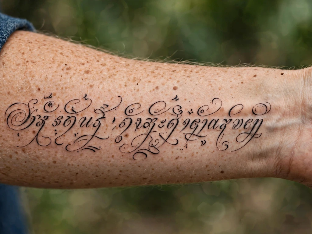
The design this guide most wants you to get right: a phrase in a language that is not your first — a line of poetry in the language it was written, a proverb from a grandmother’s country, words in Arabic, Hebrew, Japanese, Hindi, Italian, any of the world’s written tongues — worn because the words and the language are the meaning. Done well, it is among the most respectful and personal tattoos there are. Done carelessly, it is the subject of the most famous warning in tattooing, so the design and the warning are given together, here, as one thing.
The rule, from the lettering law, without softening: never wear words you cannot read, checked only by the internet. Translation apps garble register and grammar; charts on websites carry errors that have been copied for twenty years; and a script’s letterforms themselves are claims — a character drawn wrong is a word said wrong, in public, permanently. The classic failure mode is not exotic: it is a phrase that almost says the thing, off by one word’s grammar, discovered by the first native speaker who reads your arm. The prevention is boring and total. Finalise the exact text; have it checked, character by character, by a native speaker who reads and writes the language — ideally two; if the text is classical or sacred, have it checked by someone who knows that register; then have the artist work only from the checked text, letter for letter, and proofread the stencil against it yourself with the checker on a call if needed. Wearers with heritage in the language often involve family in the checking, which turns the chore into part of the tattoo’s meaning. However it is done: the check is not a step of this design. The check is this design.
Best placement: Forearm, where the line gets its length and the wearer can show the checker a flat, readable stencil photograph.
Best for / know before you book: Budget the verification before the deposit — if you cannot find a qualified checker, the honest options are a phrase in a language you read, or waiting. There is no third option that ages well.
13. Mirrored Script
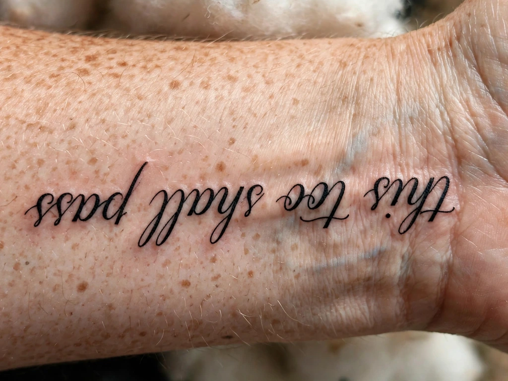
The word written backwards on purpose: a short word or name in cursive on the inner wrist, lettered in mirror-reverse, so that it reads correctly only in a reflection — or, in the version most wearers actually choose, lettered to read to the wearer when the wrist turns up, which the world sees as upside down. Both versions share one idea: this script’s first reader is its owner. The mirror version is the purest form of it — a word kept semi-private by physics, legible in the bathroom mirror each morning, a ribbon of beautiful nonsense to everyone else.
Be clear-eyed about the trade you are making. Mirrored lettering surrenders the world’s reading entirely, and it confuses every future viewer including, on tired days, medics and partners; wearers take it knowingly, for words that are instructions or confidences rather than statements. The craft risk is human, not technical: a reversed stencil is the easiest of all stencils to apply wrongly by one flip, producing a tattoo that reads correctly to the world and backwards to you — the exact opposite of the order. Proof the stencil in a mirror, in the shop, before it touches skin; that single check is this design’s whole safety system.
Best placement: Inner wrist, centred on the flat, the word short enough to keep its letters honest at mirror scale.
Best for / know before you book: Decide which reader the design serves — mirror or wearer — and say it to the artist in those words; the two are one flip apart, and the flip is forever.
14. Micro-Script Above the Ankle
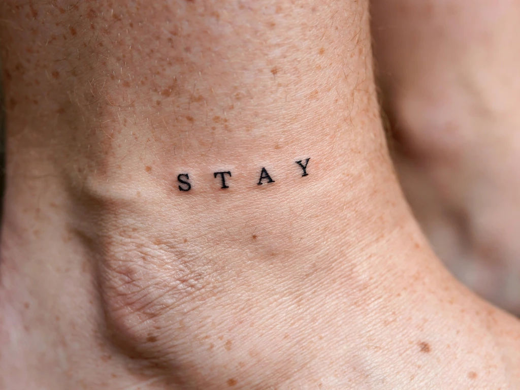
Script at its honest floor: two to five tiny letters — initials, a tiny word, a year in numerals — above the ankle bone, drawn as printed letters (never connected script) at 2–3 cm, bold for their size. This is the design the small-lettering law exists to govern, offered here the way the law dictates: at the size where lettering stops being small cursive and becomes a different discipline entirely — silhouette letters, each one a simple mark with real air inside it. The ankle’s own script tradition is well covered in our ankle tattoo ideas guide, whose words-on-skin section makes the same argument from the placement’s side: plain capitals are the most durable lettering at small sizes, because there are no joins to weld.
So the rules are printed on the design. Printed letters only — at this scale a cursive join is a merge scheduled in advance. Counters like portholes: the a, the e, the o drawn with holes you can see from a metre. One word maximum, and a date in numerals is a better tenant than a name in script. Expect the lowest letters to want a settling touch-up, and place the line above the bone’s flat, clear of the shoe collar — ankle script lives where footwear rubs, and its placement must be chosen with your own shoes in the room.
Best placement: Above the ankle bone, on the flat wall of the ankle, the line running horizontally and clear of straps and collars.
Best for / know before you book: Print it at true size and read it standing, from above, in your own shoes’ light — micro-script is judged at real scale or not at all.
15. A Date in Numerals and Words
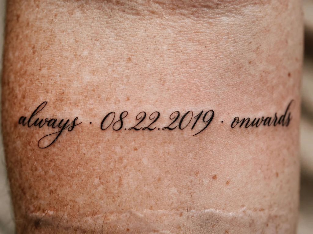
The archive entry: a date — a birth, a wedding, the day everything changed — written on the forearm in the form wearers choose most thoughtfully, numerals riding inside a line of words: the day in figures, the month or the meaning in script, the whole entry reading like a line from a register kept in a beautiful hand. It is Design 3’s documentary cousin, and wearers take it for the same reason dates are written in ledgers: this one is not to be forgotten, and the body is the ledger that cannot be lost.
Numerals obey the lettering law in their own dialect. Digits are tall, open shapes — the most forgiving characters tattooing has — but their counters still count: a 6, an 8, a 9 drawn small are three small rings waiting to fill, so numerals are sized like capital letters, never like lower-case filler. Roman numerals are the elegant, greedier alternative — two to three times longer for the same date — and earn their own check: write the conversion out in full, verify it twice independently (a wrong numeral is the date version of the translation error, and just as permanent), and size the line from the full string. Choose the format by arithmetic, not romance.
Best placement: Forearm, the entry running along the arm; a long Roman-numeral string also wraps a wrist honestly at bracelet scale.
Best for / know before you book: Read the stencil backwards and forwards, digit by digit, aloud — dates are the tattoo most often mis-transcribed and least often proofread, and the stencil check is the whole defence.
16. A Song Lyric Line
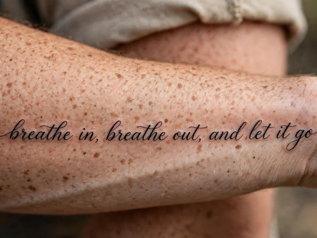
One line of the song that raised you: a single lyric in flowing cursive along the inner forearm — the line that plays at weddings, the line quoted at kitchen tables, the line that has become indistinguishable from the wearer’s own voice. Lyric tattoos are the quote design’s most emotional form, because the text arrives carrying its music with it: the wearer does not just read the line, they hear it. Choose accordingly — the line you still want at fifty is the one whose meaning has survived your own changing, not the one from the loudest summer.
The craft is Design 3’s, with one addition of its own: rhythm. A lyric has a natural breath, and a good lettering artist places the line’s joins and pen-lifts at the lyric’s own pauses, so the lettering’s rhythm and the song’s rhythm are the same rhythm — it is the difference between a lyric set and a lyric sung. And the honesty this guide owes every quote applies doubled to lyrics: songwriters’ lines are the most-misquoted texts in the world, misheard in choruses and misprinted on a thousand websites. Verify your line against the official lyric source or the album’s own liner notes before the stencil is drawn — the stencil check cannot catch a wrong word that arrived wrong.
Best placement: Inner forearm, one line at sentence size; a two-line lyric wants a shoulder blade and the honesty of Design 24’s spacing.
Best for / know before you book: Sing the stencil. If the words on your arm and the words as recorded differ by so much as a syllable, the arm is wrong — fix it on paper, where fixes are free.
17. Single Initial Monogram
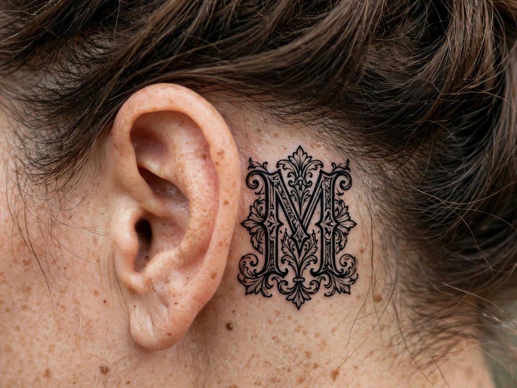
One letter, built like a jewel: a single capital — yours, theirs, the initial of the name that matters — drawn as a true monogram behind the ear, the letter constructed stroke by stroke with a swelled stem, a considered serif and one small flourish, at 2–3 cm. A monogram is lettering’s opposite pole from the quote: instead of many letters kept simple, one letter given everything. Hidden by hair, revealed by a tucked strand, it is the most private script in this guide — a whole name carried as its first letter.
At this scale the small-lettering law rules absolutely, in its monogram form: whatever the drawing surrenders is what saves it. One letter means the letter can be built — constructed lettering, in the letter arts’ own distinction, drawn up from marks rather than written in a gesture — and a built letter at 3 cm can carry more honest detail than a written one at 6: the counter is a real room of skin, the flourish is a genuine sweep, the stem has weight. What it cannot carry is company: a second initial doubles the detail at the same size and halves the life of both. One letter, perfectly built, is the design; behind-ear skin settles soft, so draw it one size bolder than instinct says.
Best placement: Behind the ear, centred on the flat below the cartilage fold; sized to the wearer’s own ear, not a universal template.
Best for / know before you book: Hold the true-size printout behind your ear in the mirror, hair up and hair down — the letter should delight you in the reveal and never embarrass you in the concealment.
18. Script Along the Collarbone Edge
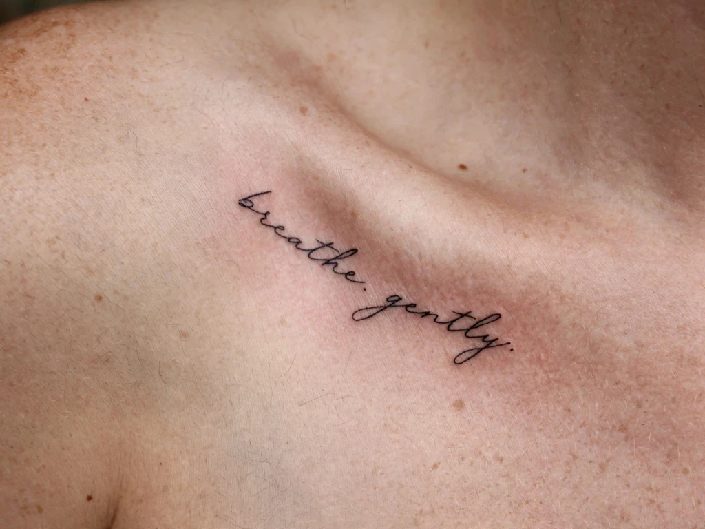
The necklace line: a word or short phrase in fine cursive lying along the outer edge of the collarbone, following the bone’s own gentle S from shoulder towards sternum, worn where a pendant’s chain would rest. It is the most elegant address script has — the lettering is discovered rather than displayed, half-hidden by necklines, and read at conversation distance by people already close. Wearers take it for words in the confidence register: names, single sentences of intent, the phrase that functions as a private motto with a public silhouette.
The collarbone is a slope, not a shelf, and the design is drawn for the slope. The line follows the bone’s outer edge rather than balancing on its peak, where skin stretches most over the bone’s movement; the letters are angled to stand upright when the wearer stands naturally, not when posed for the stencil photograph. Cursive here must be drawn a grade more open than forearm cursive, because the sloping skin shows the lettering at an angle forever — foreshortened letters need extra air to read as letters at all. Check the stencil from the front, at two metres, collar on and off: that is the view it will be judged from for its whole life.
Best placement: Outer edge of the collarbone, the line running towards the shoulder, letters sized by the lettering law and no smaller.
Best for / know before you book: Photograph the stencil standing relaxed in a mirror — collarbone script approved in a posed shrug sits crooked in every unposed hour of its life.
19. Script Down the Outer Forearm
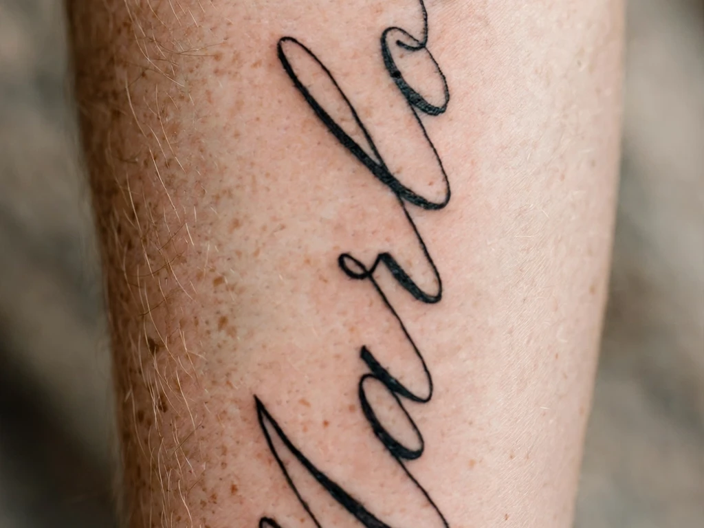
The edge line: a name or word in flowing cursive running down the outer edge of the forearm, along the arm’s border where the top of the arm turns towards the underside — the forearm’s equivalent of a book’s spine title. It reads as the arm moves, appears and disappears with rotation, and gives script a drama flat placements cannot: the word is revealed by gesture. Wearers take it for the name they want carried at the body’s edge, half in view — a guardian’s name on the arm that does the work.
Rotation is the whole craft. The outer edge is not a line but a turning zone, and a design centred a centimetre wrong falls either onto the top flat (losing its edge drama) or under the arm (losing its readers). The stencil must be placed and checked with the arm in its natural hang and in a handshake position, the two poses the tattoo will live in, and the lettering drawn to ride the turn: letters slightly elongated along the arm’s length, so rotation stretches them towards true rather than away from it. Cursive serves it better than print — a travelling line forgives a turning canvas; separate printed letters each rotate on their own axis and can look scattered.
Best placement: Outer forearm, the line centred on the edge’s crest from near-elbow towards wrist, checked in rest and rotation.
Best for / know before you book: Approve the stencil in motion, not in a pose — an edge line is a design in movement, and still approval of a moving design is the classic mistake.
20. Letters Dissolving into Birds
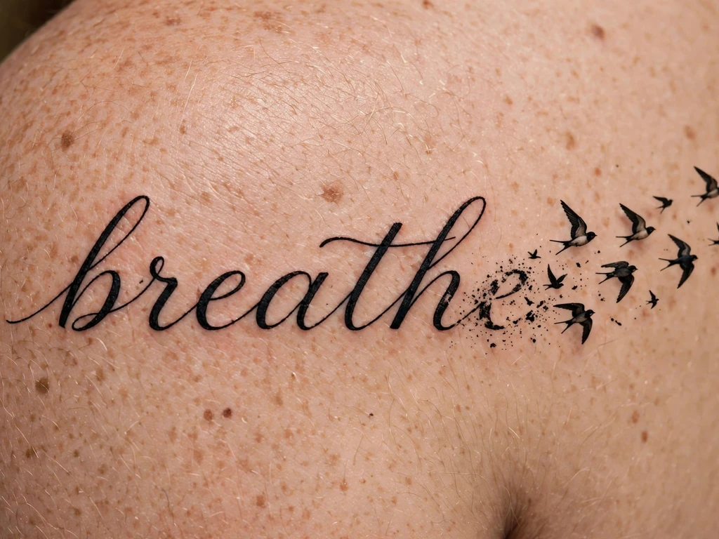
The sentence that lets go: a short word or name written across the shoulder in flowing script, and at its end the lettering itself unravels — the final letter’s tail lifting off the line and breaking into a small flight of birds, three to five silhouettes rising and shrinking away across the shoulder blade. It is this guide’s one true lettering fusion, and it is kept deliberately singular: script’s fusions are usually a tax on legibility, but the dissolve spends only the tail — the word itself is complete, written in full, before it begins to fly. The reading writes itself: the word that becomes freedom, the name that became a letting-go, grief or gratitude with wings on it.
Its craft is restraint at the exit, and it is the same restraint the flight designs elsewhere demand. The birds are silhouettes — the classic two-stroke gull and its fuller cousins — never detailed birds, because detail at dissolving scale is mud within years; each bird keeps real sky between it and the next, and the letters beneath obey every law untouched: open counters, honest joins, the full word readable with the birds imagined away. If the word needs the birds to be forgiven, the word is too small; the dissolve is a tail the design can afford to lose, and it must be able to afford it.
Best placement: Shoulder, the word running low across the joint and the flight rising behind it onto the blade’s edge.
Best for / know before you book: Count the birds and then remove one — a flight of three honest silhouettes outlives a flight of six detailed ones, and the emptiest sky reads as the most freedom.
21. Futuristic Chrome Script
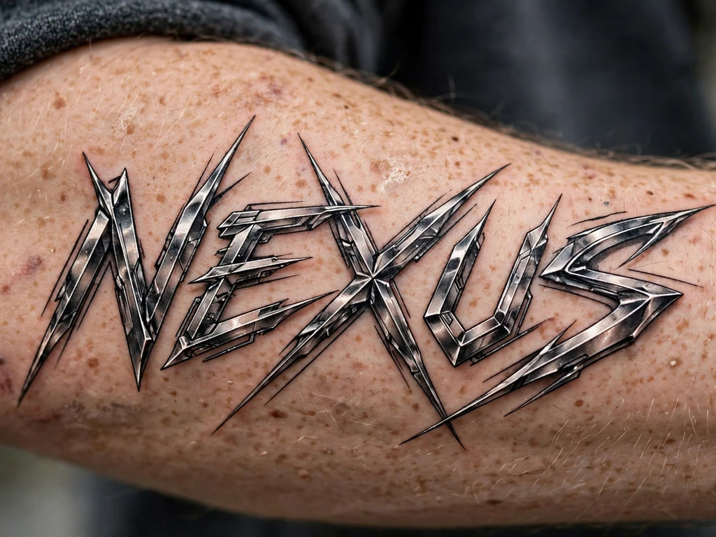
Letters from the next century: a word built in sharp, angular, blade-stroked lettering — constructed rather than written, all points, shards and swept terminals — the script counterpart to the blade-and-sigil aesthetic of our cybersigilism tattoo ideas guide. Where cursive flows, chrome script cuts: wearers take it for words that should feel engineered — a callsign, a creed, a name rendered as technology. It is the newest dialect in this guide and, handled honestly, a legitimate one: lettering has always dressed in the tools of its age, and this age’s tools are vector and blade.
Its laws are the lettering law translated into a colder tongue. Angular letters are built from straight strokes meeting at points, and every point is a merge point: two lines arriving at a sharp tip pool ink exactly where the design wants its sharpest detail, so tips are drawn blunted by a hair and counters opened wider than the style’s screen versions dare. Legibility is the second front — chrome lettering sacrifices reading ease for menace by design, and a word nobody can read is a sigil, not script; if the word matters as a word, test it on a stranger. At honest forearm size, with blunted tips and opened counters, it holds its edge for years.
Best placement: Forearm, where the letters get their length; the design also runs down a calf with genuine menace.
Best for / know before you book: The stranger test is the whole consultation — show the stencil to someone who does not know the word. If they cannot read it in three seconds, it is a pattern, and should be booked as one or redrawn as script.
22. A Survivor’s Quote in Fine Script
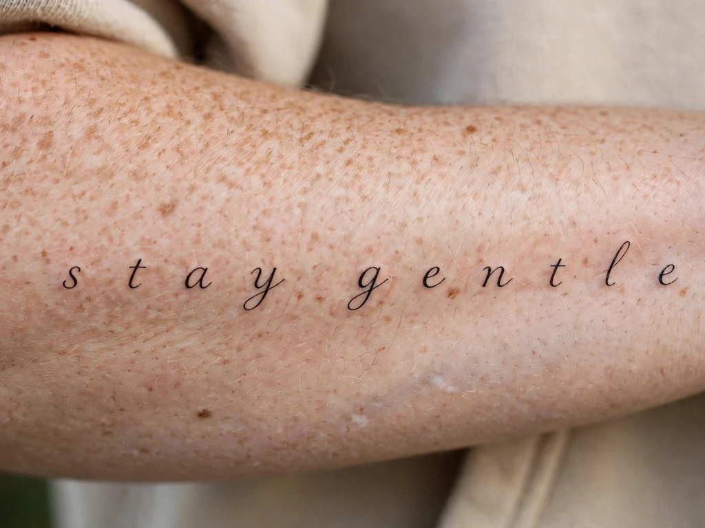
The sentence that was earned: a short quote — two to six words, almost always — in fine script on the inner forearm, worn by people marking the far side of something: an illness, an addiction, the worst year. It sits beside the tradition our medusa tattoo ideas guide treats in imagery — survival made visible — and makes the same statement in words instead of pictures: it did not end the story. The quotes are rarely long and never decorative; this is the most considered text in tattooing, chosen the way vows are chosen.
Fine script at quote length is the lettering law’s hardest examination, and this design passes it by generosity rather than delicacy: the words are few so that the letters can be large — fine in weight, never fine in size — with spacing opened wider than any other design here, because a survivor’s quote is read daily, by its wearer, at the distance of a forearm, and must still be reading clearly in twenty years. Resist absolutely the temptation to add the date, the name, the second sentence: every addition halves the letters. The quote, alone, at size, is the whole monument.
Best placement: Inner forearm, reading to the wearer, at the largest size the words allow.
Best for / know before you book: Choose the quote by its tenth year, not its first — the sentence that helps at year ten is shorter and quieter than the one that shouts at year one, and the letters will thank you for its brevity daily.
23. Bold Brush Script
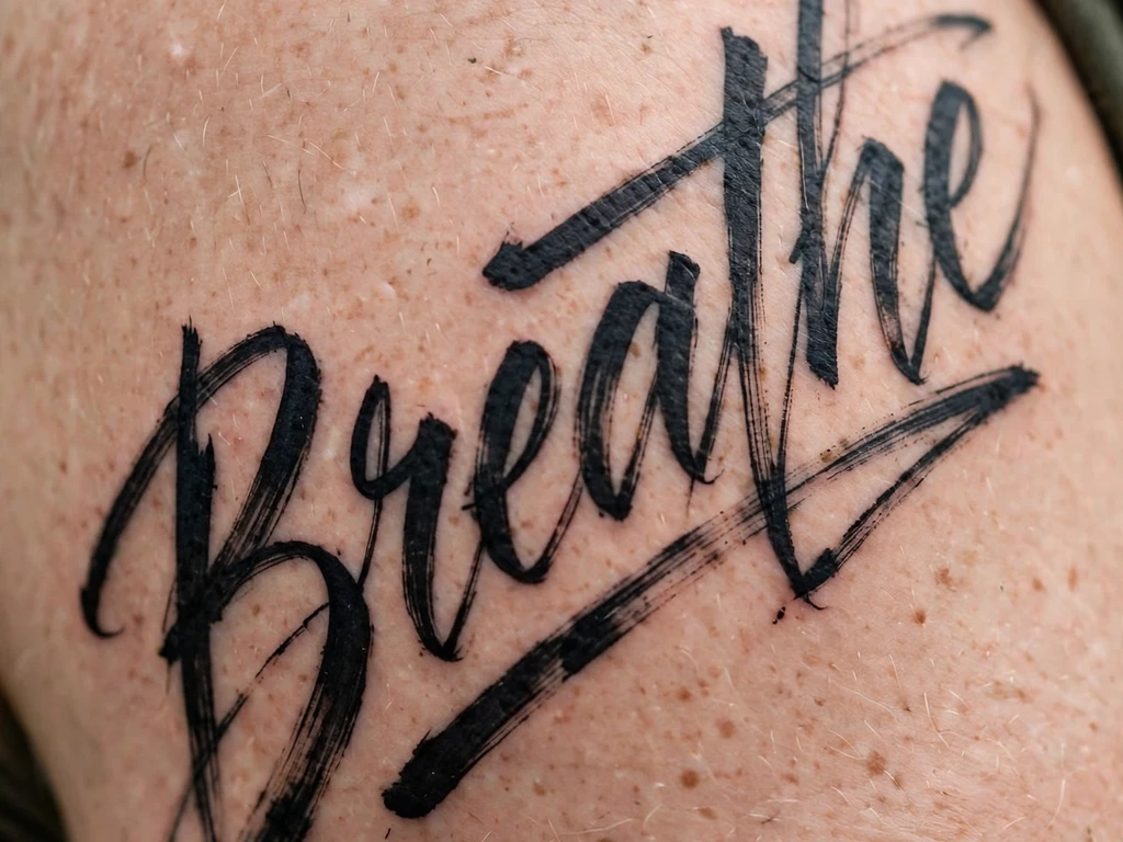
The sign-painter’s shout: one word — a name, a creed, a single defiant noun — in bold brush script across the upper arm, the strokes thick where the brush pressed and tapering where it lifted, lettering with a pulse in it. Brush script is the voice of shopfronts and speed signs, the hand of the Ross George generation of lettering masters whose model alphabets taught a century of sign writers — and as a tattoo it reads from across a street, which is precisely what its wearers want: the word as signage for a life.
The craft is the taper. A brush letter’s life is its ends — the stroke arrives fat and leaves in a point — and points are where settling ink rounds first, so the artist draws every taper one grade blunter than the brush original, trading a whisper of elegance for a decade of edge. Stroke contrast is the second law: brush script’s thick-and-thin rhythm must be decisive — thicks genuinely thick, thins hairline-but-present — because a half-hearted contrast heals into mere unevenness. At upper-arm size, with blunted tapers and honest contrast, this is among the longest-lived scripts in the guide.
Best placement: Upper arm, across the outer flat, the word given the arm’s full breadth; a shoulder blade takes a two-word statement.
Best for / know before you book: Approve it at three metres first — brush script is judged from the street before it is judged from the chair, and a word that shouts clearly at distance can afford its details.
24. Fine Single-Needle Script Quote
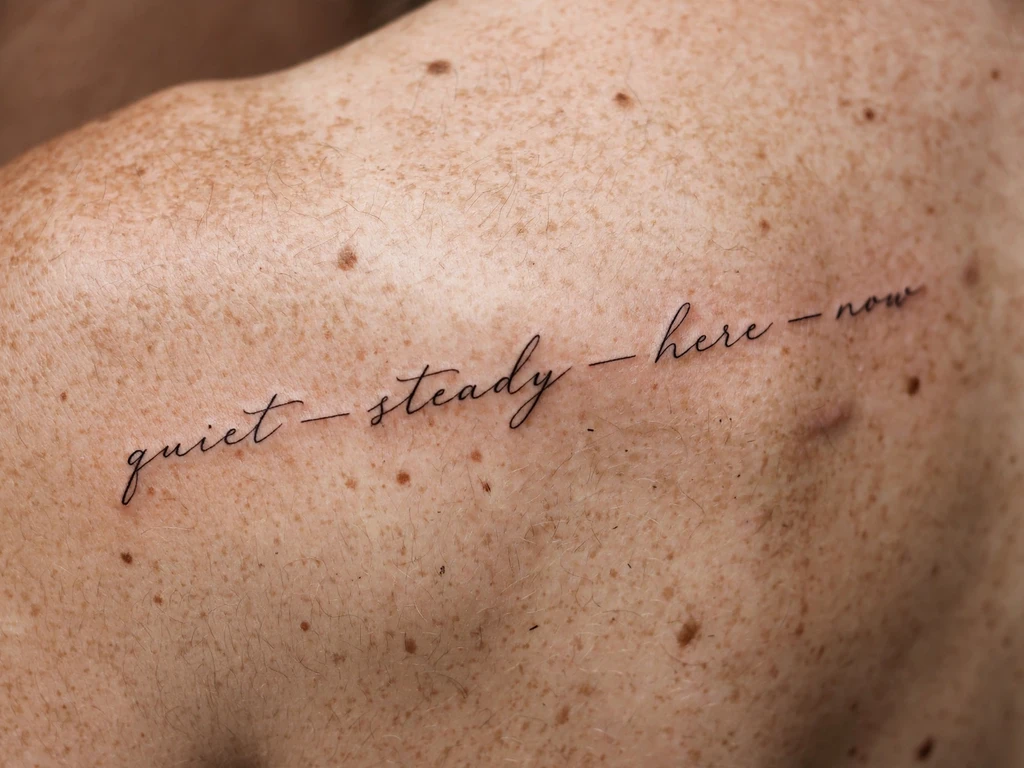
The quietest quote in the guide: a sentence in fine single-needle script across a shoulder blade — hairline letters, widely spaced, the text floating on the body’s broadest calm canvas like a line written on good paper. The shoulder blade is where fine script goes when it is serious: the skin is flat, sheltered and slow-moving, and the canvas is wide enough that a full sentence can be given what fine lettering always begs for and rarely gets — size. Wearers take it for the private text at ceremonial scale: the vow, the line of scripture or poetry, the words meant for one reader at a time.
Every discipline of the lettering law applies at once, and the design is their sum. Hairlines survive here only because the letters are large — fine is a weight, not a size, and confusing the two is this design’s one fatal error. Spacing is set at healed density with deliberate generosity between words as well as letters, because a sentence read across a back is read in phrases. And the stencil is checked standing, in a mirror, at two metres, since a line centred on a photograph of a back sits crooked on the living curve of one. Drawn that way, the hairline quote is not fragile at all; it is the fine style finally given its honest conditions.
Best placement: Shoulder blade, the line running level across the blade’s flat, sized from the letters up.
Best for / know before you book: Read the stencil backwards in the mirror, word by word — a back quote is proofread by reflection or not at all, and it is the text you will proofread least often once it is on.
25. A Tiny Initial on a Finger
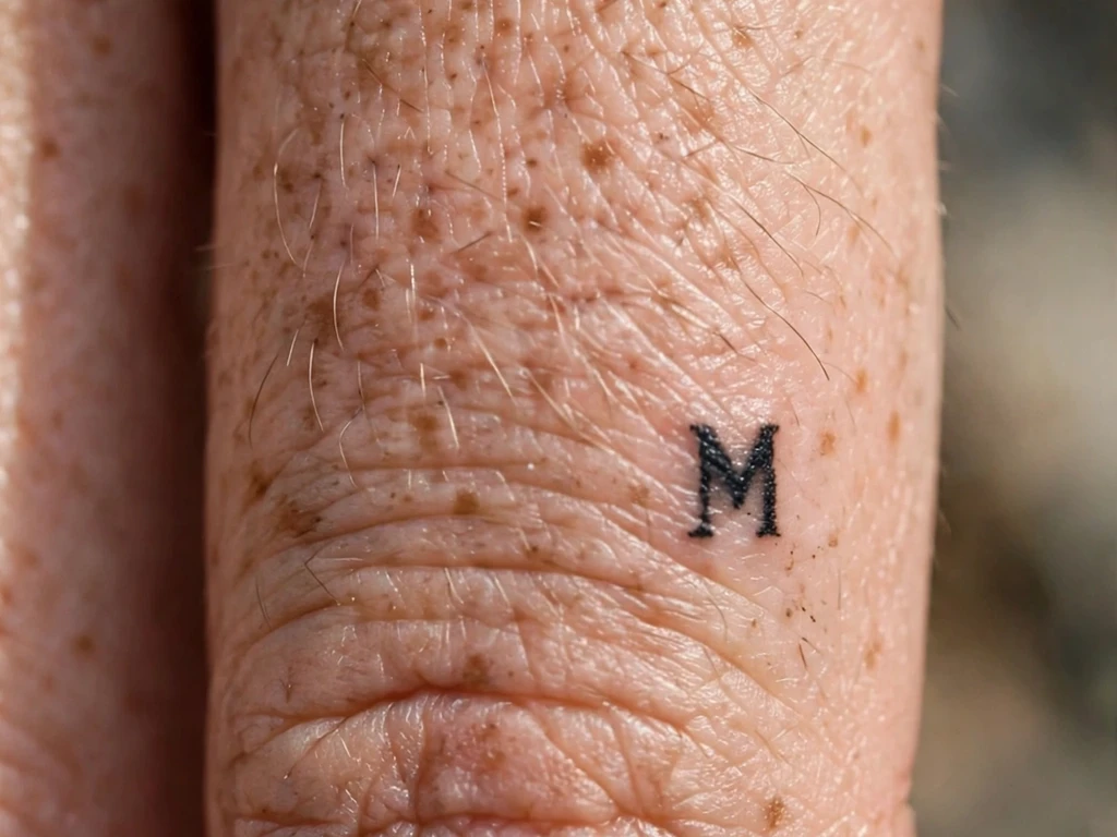
The smallest letter in the guide, offered with its full warning label: one capital initial — 1 to 1.5 cm — on the side of a finger, drawn as a bold little silhouette of a letter, worn like the tiniest signet ring that says a name. When the hand closes it hides; when it opens, there it is. It is script reduced to its atom: a single letterform, carrying a whole person the way Design 17’s monogram does, but at the body’s hardest address.
The honesty is stated plainly, because finger skin asks for it: finger skin regenerates fast, flexes constantly and sheds ink like no other placement in this guide, so a finger initial will fade — not might, will — faster than any other design here, and will need touch-ups, plural, across its life. It survives at all only by the silhouette discipline: one letter, the boldest and simplest version of itself (a plain capital, not a calligraphy flourish — flourishes at finger scale are pre-merged), its counter a genuine hole of skin. Choose it with open eyes as a high-charm, high-maintenance piece, ideally not as a first tattoo, and never as a letter you need to stay perfect: an initial that promises forever and requires regular re-promising.
Best placement: Side of the finger, where the skin holds ink slightly better than the palm-facing surface.
Best for / know before you book: Price in the maintenance before falling for the charm — if regular touch-ups would annoy you, Designs 17 and 2 offer the same letter-and-word idea on skin that keeps them far longer.
Script Tattoo Placement by Size
| Size | Typical dimensions | Best placements | Good to know |
|---|---|---|---|
| Tiny | 1–3 cm | Behind ear, side of finger | One letter or one tiny word only — silhouette letters, genuine skin counters; the finger version is a touch-up commitment |
| Small | 3–6 cm | Inner wrists, ankles | Single words and initials — printed letters outlive cursive at this size, and every letter needs air inside it |
| Medium | 6–12 cm | Forearms, collarbone edge, calves | The script sweet spot: names, dates and short quotes at honest letter height, joins and counters with room to age |
| Large | 12–20 cm | Shoulder blades, upper arms | Full sentences, blackletter and brush statements — letter height finally stops being the argument |
| Long lines | 14 cm+ single line | Inner forearms, shoulder blades | Quote territory: size the line from the letters up, and let the quote’s length be decided by the arm, not the heart |
Script is a horizontal art on a body of curves, so it rewards placements where a line can lie level and be read whole: forearms first, shoulder blades for the long sentences, the collarbone’s edge and the calf for the travelling lines. Mobile, turning skin — the wrist’s rotation, the outer forearm’s edge — can host beautiful script, but only when the stencil is checked in motion and in the mirror, in the reading direction you actually chose. Run the reading test at conversation distance: a word that reads at two metres is a word for life; a word that reads only at twenty centimetres is a word for a photograph.
How to Choose Your Script Tattoo (and What to Know Before You Book)
Run the counter-and-join check. This is the whole guide in one instruction. Print the design at true size. Look first at the counters — the holes inside the a, e, o, p, g — and check each one is a real hole of white, not a slit. Then follow the joins: every place two strokes meet is a place ink will pool and thicken, so count the joins the way earlier guides in this series count petals and arms. Letters with air and joins with mercy: an artist who welcomes both checks can be trusted with your words.
Choose the words before the hand, and the hand before the font. The text is the tattoo; everything else is tailoring. Settle the exact words, spelling and punctuation first — proofread them as if they were going on a gravestone, because the proofreading conditions are similar. Then choose the family (cursive for intimacy, typewriter for record, blackletter for weight, brush for volume), and only then look at fonts and generators, as dialect references for the artist’s redraw. A script chosen font-first is a font in search of a meaning, and it reads that way forever.
Let the letters set the size — never the reverse. Names, quotes and dates are not decorations fitted into a space you have already chosen; they are the sizing. Honest letter height determines the tattoo’s dimensions, and if the result is bigger than you pictured, the real options are a bigger placement, fewer words, or printed letters instead of cursive. Small script squeezed to fit a pre-chosen spot is the most common script regret there is, and it is entirely a drawing-stage decision — which means it is entirely avoidable, by you, now.
Get the language checked by a reader, not a machine. If your words are in a language you do not read, the verification described in Design 12 is not a courtesy step: a native reader checks the final text character by character, the artist works only from the checked text, and you proof the stencil against it. The internet is a sketchbook, never an authority. If no qualified checker can be found, the honest options are a language you read, or waiting — a tattoo in words you cannot verify is a sentence you cannot stand behind.
Decide the reader. Script has a direction, and direction is a decision: reading to the world (upright as your arm hangs) or reading to you (upright as you lift your wrist). Reminder words usually choose the wearer; names and statements usually choose the world. Say the choice to your artist in those words, and proof the stencil in a mirror in the exact position you chose. Script discovered upside down a day late is script that was never actually proofed.
Judge the artist on healed letters. Ask for healed script — a year old at least — and read three things: are the counters still open, do the words still read at arm’s length, and have the joins thickened gracefully rather than welded? An artist whose healed letters pass those three checks can be trusted with yours, in any style on this page. An artist with only fresh script to show is showing you the one state your tattoo will be in for the shortest time.
Key points to remember:
- A letter is read by the space inside it: counters close first as ink settles, so every letter needs real air inside it from day one
- Letter height is the real measurement — a long quote with small letters is a small tattoo, and small letters are a countdown
- Every cursive join is a merge point: connected script needs more size and more spacing than printed lettering, never less
- Fonts and generators are sketchbooks, not stencils — a lettering specialist redraws your words for skin, opening counters and loosening joins
- Never wear words you cannot read checked only by the internet: a native reader verifies the final text, character by character, before any stencil exists
- Test everything at true size — the printout taped in place, read at arm’s length, in a mirror, in the direction your reader will read it
Frequently Asked Questions
What does a script tattoo mean?
Exactly what it says — that is its distinction. Script is the tattoo of record: names for the people written into a life, single words as instructions to the self (breathe is the modern classic), quotes and lyrics for other people’s sentences that have become the wearer’s own, dates for the days a life turned, and handwriting replicas for the most intimate record of all — a real person’s words in that person’s actual hand. Where a picture symbolises, lettering states, which is why script is chosen when the meaning is too specific for any image to carry: the meaning is not behind the words, it is the words.
Do script tattoos age well?
The honestly drawn ones age superbly; the delicate ones age exactly as their smallest counter deserves. Ink settles and spreads slightly over the years, and lettering feels it first in the enclosed spaces of its letters — the counters of a, e, o — and at cursive joins, where strokes meet and pool. Script drawn with open counters, honest letter height, loosened joins and healed spacing (Designs 1, 3, 4, 23) reads clearly for decades. Hairline words drawn small, and cursive set at book spacing, close from the inside out. The fix is decided entirely at the drawing stage: air in the letters, letters sized by the law, and the true-size test passed before anyone books.
How small can script tattoo lettering go?
Smaller than you want, and larger than Instagram suggests. The governing measurement is letter height, not the tattoo’s length: flowing cursive wants a lower-case body of roughly 5 mm or more to keep its counters open across the years, printed lettering can live a little smaller, and below about 3 mm any lettering is a countdown rather than a tattoo. At the true floor — 1–3 cm designs like Designs 17 and 25 — only single letters survive, drawn as bold silhouettes with genuine holes of skin inside them. The honest rule: if a word must shrink below the law to fit its spot, the spot is wrong or the word is too long — change one of those, never the letters’ air.
Can a tattoo artist copy my loved one’s handwriting exactly?
They can copy its character exactly, and its measurements must change — that distinction is the design. Real handwriting is written at 3–5 mm letter height, far below what skin can hold, so a good lettering artist enlarges the sample and redraws it: the slant, rhythm and signature quirks (the crossed t, the tall l, the way the words lean) preserved faithfully, while the counters are opened and the joins loosened past anything the original hand allowed itself. Bring the clearest, darkest, flattest sample you have, with every letter the tattoo needs present in it. Judged by character, a skilled redraw is unmistakably them; judged as a photocopy, a traced original at real size would simply fade like one.
How do I choose a font for a script tattoo?
Use generators and font menus as a sketchbook, not a stencil. Run your exact words through several families — flowing cursive, pointed-pen calligraphy, typewriter, fine print — and choose the family by the reading you want: intimacy, ceremony, record, whisper. Then take the words, your two or three favourite examples, and the placement to a lettering specialist, who redraws the text for skin: letters adjusted to each other rather than identical, counters opened for a decade of spread, spacing set at healed density, joins placed at the word’s own rhythm. A font is a static system designed for screens and paper; a tattoo is constructed lettering on a body that will change. The redraw is not an optional extra — it is the step that makes the font into a tattoo.
Final Thoughts
A script tattoo is a small argument that some things should be said outright — drawn, fittingly, as the marks humanity has used to say things outright for five thousand years. The designs that honour it are drawn the way it deserves: letters with air in them, joins with mercy in them, words proofread like they matter and sized like they’re meant to be read in twenty years by the person who chose them today. Chosen that way, a script tattoo is not a fragile fashion piece; it is writing — the oldest recording technology there is — keeping your sentence the way writing has always kept sentences: by being read, and read again, and still saying it.
So choose your words, run the counter-and-join check, and book the artist whose healed letters still read. Then wear the sentence that is yours: spelled right, sized honestly, and legible for as long as you are.
1 thought on “25 Elegant Script Tattoo Ideas That Say It in Your Own Words”