
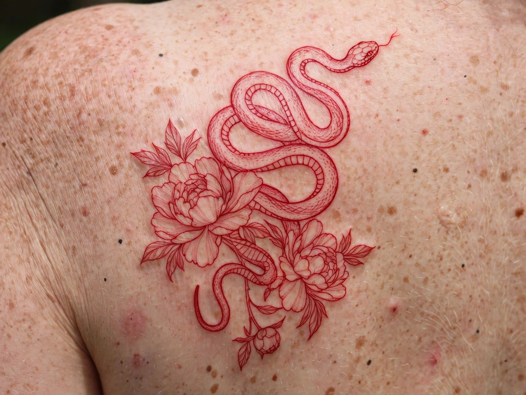
A red ink tattoo makes a decision most tattoos never have to: it gives up black entirely. No black outline to hold the drawing together, no grey shading to hide behind — one pigment, red, doing the line work, the shading and the statement all at once. The result is unmistakable across a room and unlike anything else in tattooing: part drawing, part flush, a design that looks less printed on the skin than lit from inside it. It is also, honestly, the colour that asks the most of its wearer. Red behaves differently from black in the skin — in how it heals, how it fades, how it reads on different skin tones, and how it comes out if you ever want it gone.
You will find 25 original red ink tattoo ideas here — fine-line snakes and spider lilies, red-only versions of classic motifs, dotwork, script, tiny symbols — every one of them drawn in red alone. But you will also find the conversation most red galleries skip, placed before the designs where it belongs: a full, calm account of red pigment’s reaction record, its faster fading and tone drift, how it shows across skin tones, and what laser removal actually involves for red. Read that section first. A red tattoo chosen with open eyes is a glorious thing; this guide exists so that yours is.
What Does a Red Ink Tattoo Mean?
Red is the oldest colour in body marking and the loudest in any room, and its meanings gather around that double fact. Passion and love are the readings everyone reaches first: red is the colour of the heart drawn literally, of roses given and received, of blood ties — and a red tattoo takes that symbolism at full strength, undiluted by any other colour’s commentary. Luck and protection run just as deep in the other direction: in Chinese tradition red is the colour of fortune and celebration, worn and displayed to keep misfortune off; in Japanese tattooing, red accents have marked sacred and protective subjects for centuries. A red-only piece takes those traditions’ colour and makes it the entire tattoo.
Defiance is the modern reading, and it is honest: red ink is visibly a choice against the default. Black is tattooing’s uniform; red-only work refuses it, and wearers regularly describe that refusal as the point — the tattoo as a signature rather than a picture. And remembrance: the red poppy and the red spider lily both carry memorial weight in their cultures, and red’s tie to blood makes it the colour wearers reach for when a tattoo is about someone carried in the body.
One framing note, because this colour needs it: red’s meanings are symbolism — personal and cultural, worn as meaning, not as fact. What is fact is how the pigment itself behaves, and that is where this guide goes next, because with red ink the practical and the beautiful cannot be separated.
The Honest Section: Reactions, Fading and Removal
This is the section to read twice. Nothing in it is here to frighten you out of a red tattoo — thousands heal uneventfully and stay beautiful for decades — but red pigment has a documented record that differs from black’s, and a guide that sold you the designs without it would be failing you. Everything below is stated as it stands in the dermatology literature and studio practice; none of it is personal medical advice, and the only advice-form sentences in this section are the two that end it.
Reactions: red’s record is real. Of all tattoo colours, red is the one most often reported in connection with skin reactions. A 2025 review of tattoo-related skin reactions in the dermatology literature (Missouri Medicine, indexed in PubMed Central) states it plainly: “red tattoos remain the most common ink pigment implicated in tattoo-associated allergic contact dermatitis” — and notes that the association has persisted even as older mercury-based red pigments (cinnabar) have been replaced by modern organic ones. The reactions described in the literature are usually confined to the red areas of a tattoo while black work beside them stays calm: itching, raised or scaly patches, swelling within the red lines, sometimes appearing weeks after healing, sometimes years later. Most tattoo reactions of every colour are uncommon, and most red tattoos never react at all — but the pattern is consistent enough that the cautious route into red is standard practice in good studios: a small first piece, or a small test area of red healed and watched before a large commitment, so your own skin gives its evidence at stamp size rather than at sleeve size.
Fading and tone shift: red moves faster than black. Red pigment lightens sooner and, more distinctively, changes tone as it goes — a bright scarlet settling toward rust, brick or orange-brown over the years, the drift fastest where sun reaches it. Sun exposure is red’s particular enemy: ultraviolet breaks red pigment down noticeably faster than it breaks down black, and an uncovered red forearm in a sunny climate is on a shorter clock than the same design under a sleeve. None of this is failure — plenty of wearers love the rusted, vintage register red settles into — but it must be chosen, not discovered: the tattoo you are buying is the healed, five-year version, not the photograph from the day it was done.
Skin tone: red does not read the same on everyone. Red ink sits in the skin under your own tone, and the two mix optically. On fair skin, red shows at something close to its bottle brightness. On medium and deeper skin tones, the same red reads progressively more muted — burgundy, wine, warm brown — and fine red lines can lose contrast against the skin entirely. This is physics, not a flaw in anyone’s skin, and the professional answer is the test dot: a tiny dot or short line of the exact red, healed for a few weeks on the exact placement, tells you the colour you will actually be wearing. On deeper skin, artists who know red reach for deeper, bluer reds and bolder lines, and judge the design on healed contrast rather than fresh.
Removal: red plays by different rules. Searches about removing red ink are rising fast, and the honest summary is: red can be lasered, but not by the wavelength that removes black. Laser removal works by matching light the pigment absorbs: black absorbs the standard 1064 nm wavelength, while red pigment absorbs its complementary colour — green light, the 532 nm wavelength. The classic clinical review of Q-switched laser tattoo treatment (Kilmer and Anderson, Journal of Dermatologic Surgery and Oncology, indexed on PubMed) records that “the 532-nm wavelength treats red ink effectively”, while noting it can also lead to temporary lightening of the surrounding skin — one reason clinics assess skin tone carefully before treating red. Modern picosecond machines work on the same colour-matching principle. What no honest source promises is a session count or a complete erasure: results vary with the pigment, its depth and your skin, some reds respond quickly and some are stubborn, and only a consultation at a reputable clinic — where they can see the actual tattoo — can assess yours. Anyone who guarantees you an outcome in advance is selling, not informing.
So the section’s two advice-form sentences, and they are the standard ones: talk to a dermatologist about any reaction that persists, spreads or worries you, and choose an artist who can show you healed red work — a rule the How to Choose section turns into a full checklist. Everything else here is simply what red does; the designs below are drawn with all of it in mind.
Red Is Not Black in Another Colour: How Red Pigment Behaves
Underneath the honest section sits a craft fact that shapes every design in this guide: a red-only tattoo has no structure but the red itself. In a normal colour tattoo, black line carries the drawing and colour fills it; if the colour softens, the drawing survives. In red-only work, the line is red — so when red softens, the drawing softens with it. Every design rule below follows from that single fact.
Line weight is the insurance policy. Red lines are drawn a fraction bolder than the same design would be in black — not coarsely, but at the weight the design still reads at when the red has settled and thinned slightly. Fine-line red is achievable and beautiful (half this guide is built on it), but it is fine line with the volume turned honestly down: expect a softer read at year five, and choose designs whose silhouette survives softening.
Saturation is laid in passes, and red packs differently. Red pigment is worked into the skin in smooth, even passes; overworked red is where healing trouble and patchiness begin, which is one reason large solid-red fields are rarer than large black ones and why several designs below build their red from line and dot rather than flat fill. A small design fully healed tells you more about an artist’s red than any fresh photograph.
Contrast must be designed, not assumed. With one colour, a design separates its elements by line weight, spacing and dot density — dark areas are denser red, not darker red. The strongest red-only work thinks like an etching: the drawing reads in monochrome structure first, and the colour is the register it is printed in. If a design only works because “this part is redder”, it does not work.
Placement is red’s quiet ally. Skin that stays covered holds red years longer than skin that lives in the sun; skin that stays still holds fine red lines better than skin over a joint. The placements in this guide are chosen with that arithmetic in mind — and where a design sits on fast-fading ground (the finger design, the wrist designs), the design itself says so, in so many words.
Red Ink Tattoo Styles and How They Age
Red ages by one law above all: it lightens and warms as it goes — scarlet toward rust, crimson toward brick. Every style below is a different treaty with that drift, and the best red tattoos are the ones designed for the colour they will become.
| Style | How it is drawn | How it ages |
|---|---|---|
| Fine line redwork | A single red line weight, minimal or no shading, the drawing carried by contour | Softens fastest of all red styles; reads as a warm blush line at year ten — survives only where the silhouette is simple and the line honestly weighted |
| Dotwork red | Stippled dots building tone, petals and fields over a red line skeleton | Dots hold their places well; the tone warms evenly, and generous spacing keeps fields airy as each dot spreads slightly |
| Traditional motifs, red only | Classic subjects redrawn in red line with flat red fills and no black anywhere | The boldest treaty: thick red lines and simple fills keep the read for decades, settling into the vintage rust register like old redwork embroidery |
| Red script / lettering | Words and names in cursive or calligraphic red line | Ages like fine line, with lettering’s own rule added: counters and joins soften first, so red script must start airier than black script |
| Brushstroke / ink-wash red | Painted strokes and washes of red with soft, un-outlined edges | The softest ageing of all — edges diffuse gently into a watercolour warmth; chosen for that diffusion, never against it |
| Solid red / band work | Flat, fully packed red shapes and wrapping bands | Packing is everything: evenly packed red holds a strong flat tone for years; patchy packing shows every miss as it lightens |
One more honesty belongs here, because red galleries attract it: the filter problem. The red tattoos that circulate most are photographed fresh — often still slightly raised, the skin’s own flush adding saturation the pigment never had — and then filtered warmer still. Every design in this guide is described at its healed reality: the calm crimson of week six, not the scarlet of hour one. Judge artists the same way: healed red, or it did not happen.
Red Ink Tattoo Ideas at a Glance
| # | Design | Style notes | Best placement |
|---|---|---|---|
| 1 | The Red Fine-Line Snake | Single line weight, flowing coil | Forearm |
| 2 | Red Script — One Word | Cursive, swash underline | Wrist (inner) |
| 3 | Red Spider Lily | Fine line, long curled stamens | Forearm |
| 4 | Red Cherries on a Stem | Traditional weight, flat red fill | Ankle |
| 5 | The Red Butterfly | Fine line wings, dot detail | Shoulder blade |
| 6 | Small Red Dragon | East Asian, whiskers and pearl | Upper arm |
| 7 | Red Koi, Rising | Line and dot scale work | Calf |
| 8 | Dagger and Rose, Red Only | Traditional classic, no black | Forearm |
| 9 | The Red Sun | Bold rays, face-free | Shoulder |
| 10 | The Watching Eye | Dotwork iris, fine lashes | Forearm |
| 11 | Red Dotwork Bloom | Stipple petals, line skeleton | Shoulder blade |
| 12 | Anatomical-Lite Heart | Simplified chambers, aorta arc | Forearm |
| 13 | Abstract Red Brushstroke | One painted stroke, dry-brush tail | Upper arm |
| 14 | The Solid Red Band | Fully packed wrap band | Upper arm |
| 15 | Red Poppy Sprig | Fine line stem, open petals | Collarbone (outer edge) |
| 16 | Tiny Red Heart Outline | Single line, 1–2 cm | Wrist (inner) |
| 17 | Red Rose on a Long Stem | Fine line, thorny stem | Forearm |
| 18 | Red Sparkle Cluster | Three four-point stars, dots | Ankle |
| 19 | Red Berry Branch | Line branch, packed berries | Shoulder |
| 20 | The Red Flame | Two interlaced flame tongues | Calf |
| 21 | Red Ribbon Bow | Fine line loops, knot centre | Wrist (side) |
| 22 | Red Cyber Sigil | Sharp angular line, symmetric | Forearm |
| 23 | Red Blossom Branch | Ink-wash blooms, line branch | Shoulder |
| 24 | Tiny Red Star Behind the Ear | Single bold star, micro | Behind ear |
| 25 | Tiny Red Heart on a Finger | Bold micro outline | Finger (side) |
25 Red Ink Tattoo Ideas
1. The Red Fine-Line Snake
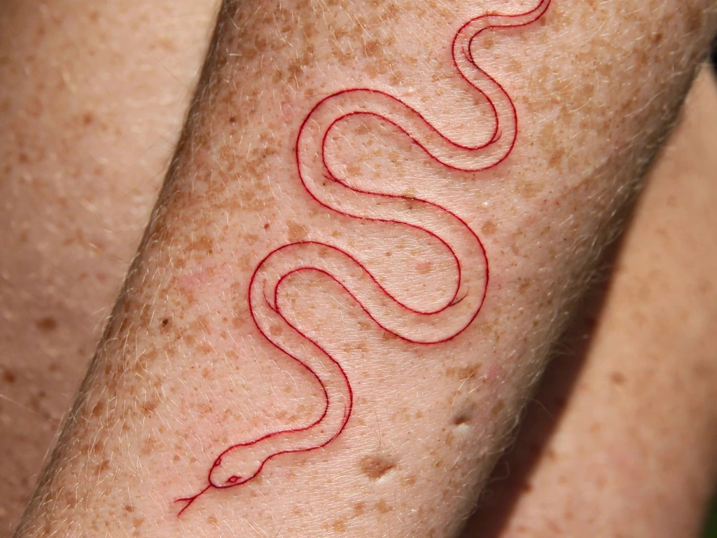
Begin with the design that shows what red alone can do: a snake drawn in one continuous-feeling red line down the forearm, no scales shaded, no black anywhere — just the coil, the head, a flick of tongue. The snake is tattooing’s most placeable animal, and in red it loses its menace and gains something stranger: it reads as a line of calligraphy that happens to be alive. Readers planning the animal in its full colour and blackwork range will find it in our snake tattoo ideas guide; this version is the snake distilled to a single red gesture.
The craft is line discipline. A one-line snake in red must be drawn at the honest weight the honest section demands — fine, but not hairline — because the line has no shading to retreat into as the red settles. Keep the coils’ spacing generous: curves that nearly touch when fresh will kiss when the line spreads slightly, and the S must stay an S.
Best placement: Forearm, the coil running wrist to elbow along the arm’s length; it wraps a calf equally happily.
Best for / know before you book: This is the design to judge a red artist by — ask for healed red line work and check whether the line is still one clean line, not a blush with edges.
2. Red Script — One Word
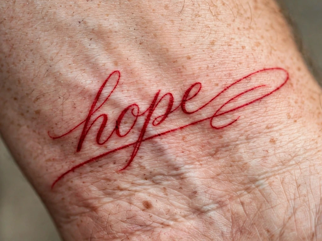
One word, in cursive, in red: a name, a verb, a promise — lettering where the colour is half the message. Red script reads intimate in a way black script does not, like handwriting in a margin, a note left in red pen; it is also the most personal design in this guide, because the word and the hand it is written in are both yours. The full craft of lettering tattoos — hands, sizes, spacing law — lives in our script tattoo ideas guide; this design is that craft in its smallest, reddest form.
Red adds one rule of its own: script’s joins and letter-counters are where softening strikes first, and red softens sooner than black, so red script is drawn airier than feels necessary on day one — loops opened, letters spaced a breath wider. Choose the word for its healed life: short words survive at wrist size; sentences belong on forearms, in black, or not at all.
Best placement: Inner wrist, the word running along the wrist’s length; a longer word takes the inner forearm.
Best for / know before you book: Print the word at final size in the chosen hand and live with it taped to your wrist for a day — red script is a whisper, and whispers are judged at true scale or not at all.
3. Red Spider Lily
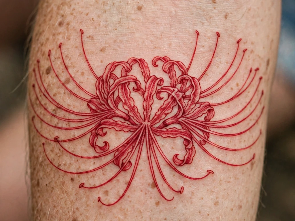
The flower red ink was invented for: the spider lily — higanbana — a bloom of narrow curled petals and extravagantly long stamens that arc out like fireworks, drawn in red line on the forearm. In Japanese tradition the spider lily is the flower of remembrance and of things lost, blooming at the autumn equinox around graves and temple paths; it carries the memorial reading with a beauty that needs no sweetening. It is also, botanically, a flower that is only ever red in its famous form — the one subject in this guide whose natural colour and ink colour are identical.
The stamens are the craft and the risk: they are the longest, finest lines in the guide, and they must be drawn with space between them and weight enough to survive, or in ten years the firework is a smudge. A good artist shortens nothing but strengthens everything — the arcs kept, the count kept, the line honest.
Best placement: Forearm, the bloom at the wide part and the stem running toward the wrist; the flower also crowns a shoulder blade beautifully.
Best for / know before you book: If the remembrance reading is yours, this is the guide’s deepest version of it; choose an artist whose fine line you have seen healed, because the stamens are a healed-work examination.
4. Red Cherries on a Stem
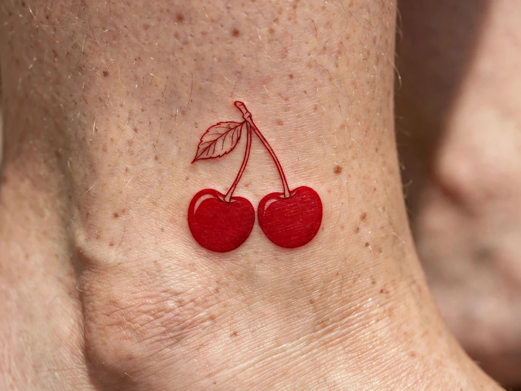
The classic, translated: two cherries on one stem, the fruit packed in flat red, the stem and leaf in red line — a design tattooing has drawn for a century, usually in black outline with red fill, here rebuilt in red alone so the fill is the outline. Cherries carry their meanings openly — sweetness, ripeness, life’s brief rich season — and the site’s cherry family is gathered in our cherry blossom tattoo ideas guide, where the blossom side of the tree gets its full treatment; this design is the fruit, in the fruit’s own colour, at its boldest and simplest.
Flat red fill is the craft test here, per the styles table: the fruit must be packed evenly in patient passes, because patchy red lightens patchily and cherries forgive nothing — a round shape shows every unevenness. The outline is drawn as a deeper-weight red line so the silhouette survives the fill’s settling.
Best placement: Above the ankle, the pair sitting small and bright; also a classic on the outer collarbone edge at slightly larger size.
Best for / know before you book: Ask to see healed flat-fill colour from any artist you consider — cherries are a packing examination disguised as a cute tattoo.
5. The Red Butterfly
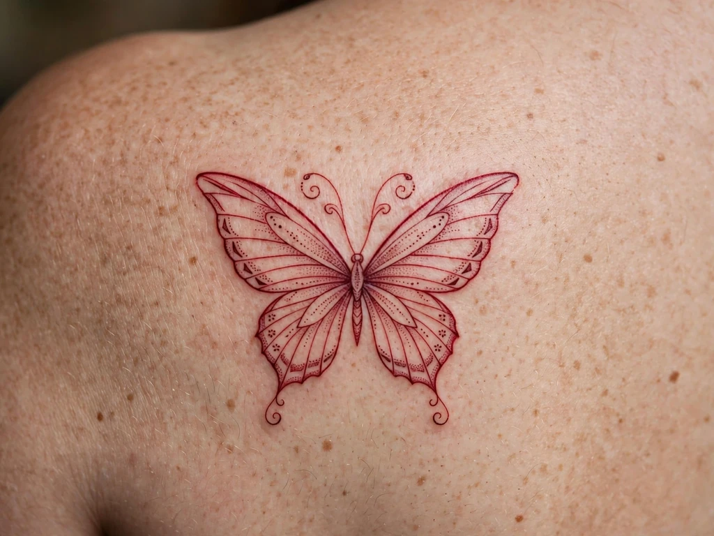
A butterfly drawn the way a naturalist’s notebook would draw it, if the notebook were kept in red ink: wings open on a shoulder blade, the veins and wing-cells in fine red line, a scatter of dots for the wing dust, no black at all. The butterfly’s meaning — change, the self remade — is the most worn in tattooing, and the full family is explored in our butterfly tattoo ideas guide; in red the meaning warms: this is transformation with a pulse in it, less diagram, more blush.
Symmetry is the craft, doubled by the colour. The two wings must match as drawings and as red — same line weight, same packing — because red shows density differences the eye would forgive in grey. Stencil it, check it standing in a mirror, and keep the wing detail at the level that survives softening: veins yes, lace no.
Best placement: Shoulder blade, wings spread across the flat; a smaller version sits centred on an upper arm.
Best for / know before you book: Approve the design as a silhouette at final size — a red butterfly whose outline reads at two metres can be as fine inside as the artist dares; one that needs its detail to read cannot.
6. Small Red Dragon
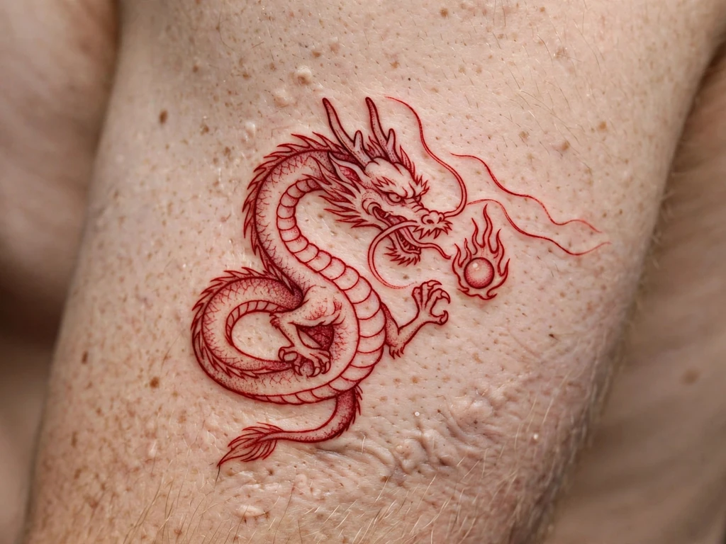
The East Asian dragon at keepsake scale: a serpentine ryū in red line on the upper arm, whiskers flowing, horns back, chasing its small flaming pearl. Red is the dragon’s own festive colour in Chinese tradition — the colour of the celebrations it is painted for — and a red-line dragon reads as the creature drawn in a scholar’s vermilion ink, all elegance and intent. The dragon family’s full range, from sleeves to back pieces, lives in our dragon tattoo design ideas guide; this design is the dragon as a single red brushstroke of a creature.
Small dragons die by detail, and red adds its softening to the sentence: claws become suggestions, whiskers are drawn as two confident lines rather than four fine ones, and the body keeps one clear coil rather than three tight ones. Drawn at that discipline, a 8–10 cm red dragon stays a dragon for decades.
Best placement: Upper arm, the dragon coiling on the outer flat; a forearm takes it lengthwise at the same scale.
Best for / know before you book: Count the whiskers and claws on the stencil and delete half of them yourself before the session — the deletion is the design, and it is better chosen by you than by time.
7. Red Koi, Rising
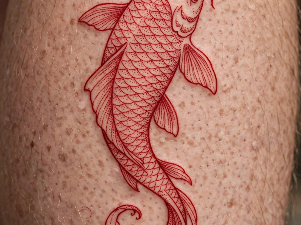
A koi climbing a calf, drawn in red line with its scales built from dotwork arcs — the fish that in Japanese legend swims up the waterfall and becomes a dragon, wearing the colour of perseverance. Red koi specifically are tied in Japanese symbolism to love and bravery, and the rising composition gives the calf’s long muscle its natural subject: a creature mid-effort, tail still curling at the ankle end, head reaching up.
Dotwork scales are this design’s treaty with red’s ageing: dots hold their positions as they soften, so the scale pattern mellows into texture rather than dissolving into wash. The line skeleton — spine, fins, the outline of the head — must be complete and confident underneath, because in fifteen years the skeleton is what will still be swimming.
Best placement: Calf, head up, the body following the muscle’s curve; the same composition climbs a forearm at smaller scale.
Best for / know before you book: Judge koi artists on healed scale work — fresh dotwork scales always look crisp, and healed ones show whether the spacing was honest.
8. Dagger and Rose, Red Only
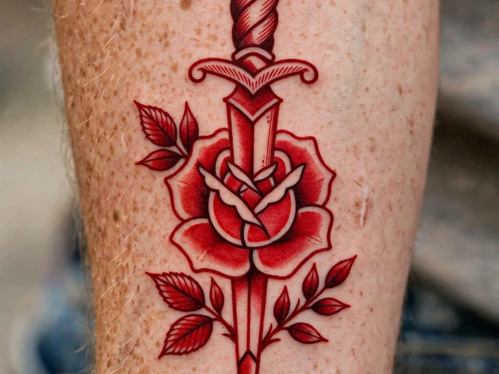
The boldest experiment in this guide: tattooing’s most traditional pairing — a dagger through a rose — drawn with no black at all. Traditional work is supposed to need its black outline; this design tests the supposition and passes, provided the drawing respects what the black used to do. The line weight goes up a full grade, the shading is built from flat red and dotwork rather than grey, and the silhouettes do the talking: blade, petals, a banner curve, nothing that needs a hairline to read.
The meanings are the classic ones — love and loss, beauty defended, the wound and the flower in one emblem — warmed a full register by the colour: a red dagger-and-rose reads less like a sailor’s warning and more like a valentine with teeth. It will settle, over the years, into exactly the rusted vintage tone of old redwork samplers, which suits traditional subjects better than any other ageing in this guide.
Best placement: Forearm, vertical, blade down the arm’s length; an upper arm takes it slightly larger and bolder.
Best for / know before you book: This is the design for wearers who love traditional tattooing and the red-only idea — approve it in a red-only photocopy of the drawing, since that is literally the tattoo.
9. The Red Sun
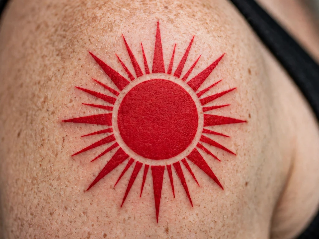
A disc and its rays, nothing else: the sun drawn as a filled red circle with alternating long and short rays around it, sitting on the shoulder like a seal or a stamp. Red suns carry real heraldry — the rising sun, the sun of celebration and of flags — and as a tattoo this is the guide’s most graphic design: pure shape, readable across a street, the one red piece a blackwork wearer might cross the room for.
The craft is the packing and the geometry together. The disc must be packed to an even, patient solidity — a filled circle shows patchiness the way a drum shows dents — and the rays must be struck from the disc’s true centre at even intervals, long-short-long-short, because a sun with one irregular ray limps forever. End the rays in clean points with weight in them; needle-sharp ray tips soften into nubs.
Best placement: Shoulder, centred on the cap; the same design stamps a shoulder blade or an upper arm at badge size.
Best for / know before you book: Ask the artist how they pack a solid circle and how long it takes — the honest answer is “slowly”, and it is the right one.
10. The Watching Eye
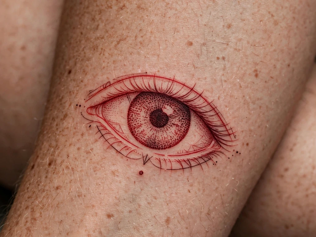
An eye, open, drawn in red on the forearm: iris built from dotwork rings, lashes in confident red line, one small tear-drop of a dot beneath. Eyes are among the oldest protective symbols there are — the watching eye that watches back — and in red the symbol gains its warning register: this eye is not serene, it is alert. Wearers take it for protection, for witness, for the person they refuse to stop watching over.
The iris is the craft: concentric dotwork must be spaced at healed density or the rings merge into a red coin, and the pupil must be a genuinely packed centre or the gaze dissolves. Keep the whole eye at 6 cm or larger — an eye is a design of circles inside circles, and circles inside circles are where small tattoos go to blur.
Best placement: Forearm, centred on the inner forearm where the gaze meets the world; an upper arm hosts it larger and calmer.
Best for / know before you book: Print it at final size and check the gaze reads from arm’s length — an eye that does not read as an eye at one metre is a red oval with ambitions.
11. Red Dotwork Bloom
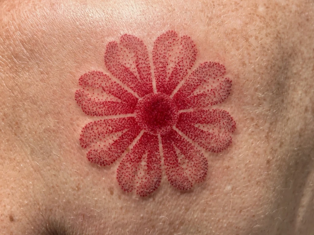
A flower built the way halftone prints are built: petals of stippled red dots, sparse at the edges and deepening toward a packed red heart, over the lightest of line skeletons. Dotwork is red’s most forgiving technique — each dot is a separate, stable deposit of pigment — and a bloom is its natural subject, because a real flower’s colour does deepen toward its centre exactly the way stipple does.
The density map is the whole craft: the gradient from petal-edge to heart must be composed in steps the eye reads as continuous, and every step’s spacing chosen for the healed spread, not the fresh one. The skeleton line stays minimal — a petal outline, a stem line — because the dots are the drawing here, and a bloom outlined heavily and then dotted is two tattoos arguing.
Best placement: Shoulder blade, where the bloom gets a flat, calm field; a forearm takes a smaller, tighter version.
Best for / know before you book: Ask to see the artist’s density sketch before the session — a dotwork artist who plans gradients on paper is the artist this design exists for.
12. Anatomical-Lite Heart
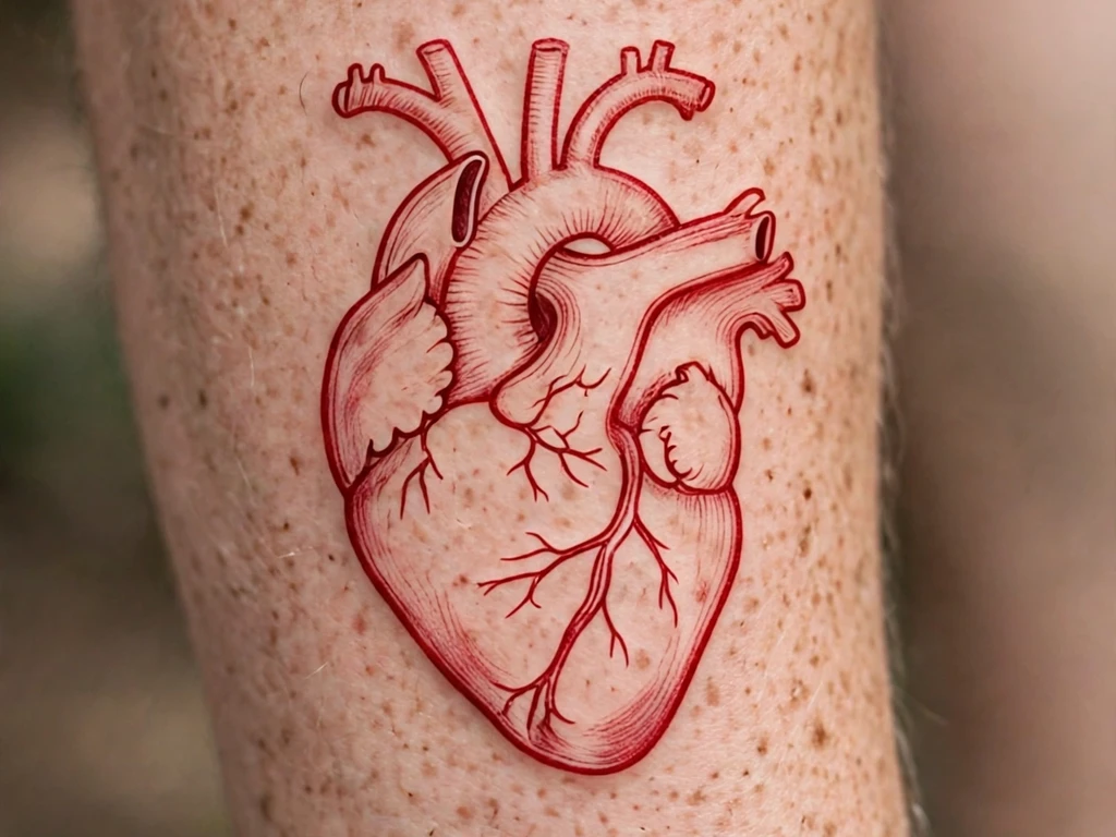
The heart as it actually is — or at least, as much of it as red line can honestly hold: the aorta’s arch over the top, the great vessels as clean tubes, the chamber mass below, drawn simplified and graphic rather than medical. “Anatomical-lite” is the design’s own honesty: this is an emblem of the real heart, not an atlas plate, and wearers take it for the meanings the valentine heart cannot carry — survival, medicine, a heart that has been through something and is still, demonstrably, beating.
Simplification is the craft and must be done by the artist’s reduction, not the calendar’s: vessels drawn as a few bold tubes with clear spacing between them, because parallel red lines at close quarters merge into a red thicket as they settle. If a detail cannot survive at double its drawn spacing, it is cut at the drawing stage.
Best placement: Forearm, the heart upright along the arm; an upper arm takes it larger with one or two more vessels kept.
Best for / know before you book: Bring a reference of the simplified kind you want, not a medical illustration — the gap between the two is where disappointment lives.
13. Abstract Red Brushstroke
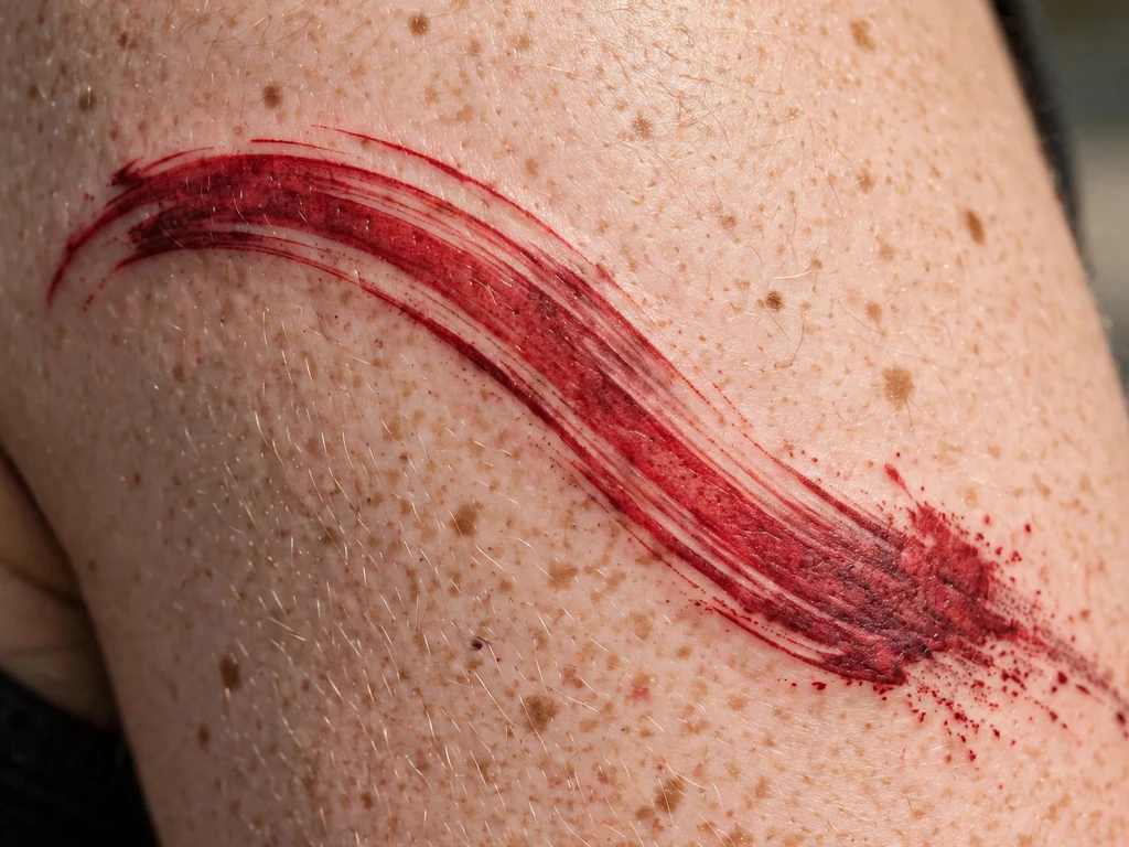
One stroke: a loaded brush dragged across the upper arm in a single arc, fat where the brush landed, breaking into dry-brush texture where it lifted — the gesture itself as the tattoo. Brushstroke pieces borrow from East Asian ink painting, where one stroke is a complete statement, and in red the statement warms into something between a calligrapher’s mark and a flare of pure energy. It means what the wearer loads into it: a moment, a decision, a before-and-after line drawn on the body.
The honesty is in the edges: an un-outlined wash of red softens as it ages, its dry-brush tail dissolving gently into the skin — this design is chosen for that diffusion, the way a watercolour is chosen for its bleeds. The stroke’s spine must be packed densely enough to hold the gesture’s shape when the edges have melted; judge it by its silhouette, not its texture.
Best placement: Upper arm, the stroke sweeping with the muscle’s line; it also arcs across a shoulder blade at grander scale.
Best for / know before you book: This is the most artist-dependent design in the guide — the stroke is drawn freehand in the session’s spirit, so choose a painter, not a tracer, and rehearse the arc’s direction together.
14. The Solid Red Band
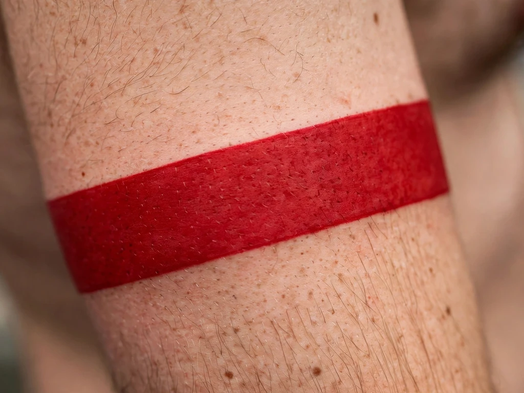
A band of solid red wrapped around the upper arm: no subject, no line drawing, just a ring of the colour itself, worn like a band of cloth or a stripe of pure declaration. Armbands are among the oldest tattoo forms there are, and a red one stripped of pattern becomes the colour’s purest possible statement — commitment, mourning, celebration, tribe: the band has carried all of them, and the wearer chooses which. It is also, quietly, the most demanding packing job in this guide.
A band is judged on two things only: the evenness of its fill and the truth of its circle. The fill must be packed in patient, overlapping passes to a single flat tone — patchiness in a band has nowhere to hide — and the band’s edges must be checked as a true circle on the standing, relaxed arm, because an arm’s taper turns a level-looking stencil into a spiral. Expect the artist to stencil, check from every angle, and adjust.
Best placement: Upper arm, mid-bicep, where the arm’s taper is gentlest; width 1.5–3 cm reads as a band rather than a stripe or a sleeve-start.
Best for / know before you book: If your skin’s relationship with red is untested, the honest route is a small red piece first and the band second — a band is a lot of pigment to learn from, and the honest section explains why the small test is standard practice.
15. Red Poppy Sprig
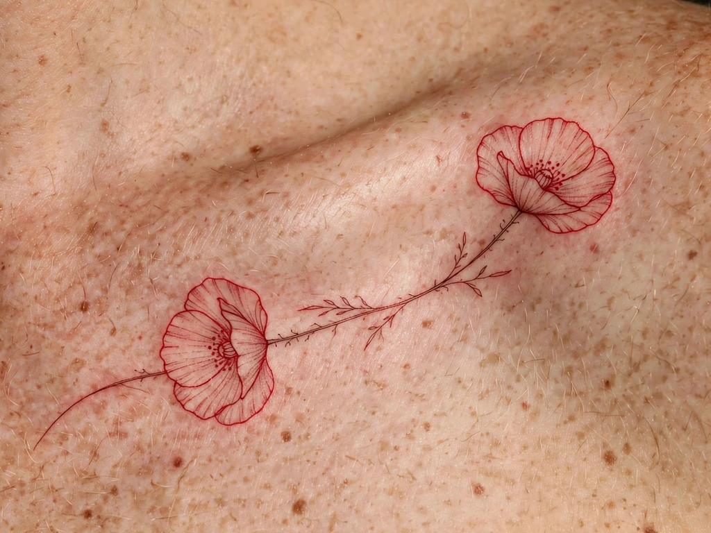
Two poppies on a fine curving stem, laid along the outer edge of a collarbone: the poppy is red’s memorial flower across much of the world — the remembrance poppy worn for the war dead — and a sprig of them in red line carries that meaning at its gentlest and most wearable. Poppies are also, honestly, drawn for their shape: tissue-thin petals that a fine red line imitates almost perfectly, the ink doing what the petal does.
The collarbone’s edge is a placement of movement and bone, and the design respects both: the stem follows the bone’s own line so the tattoo moves with the shoulder rather than across it, and the blooms sit on the flat just outside the bone’s ridge. Petals are drawn as open, separated shapes — poppy petals drawn overlapping in fine line become one red cloud as they settle.
Best placement: Outer edge of the collarbone, stem following the bone; the same sprig runs down a forearm with the blooms opening upward.
Best for / know before you book: If the remembrance meaning is the point, say so at the consultation — artists draw memorial poppies with a simplicity that honours it, and will steer you off decorative clutter.
16. Tiny Red Heart Outline
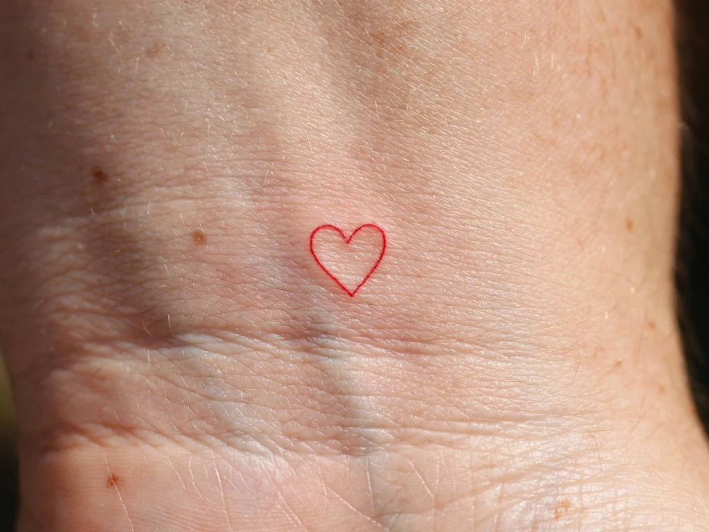
The smallest complete statement in the guide: a heart drawn in one red line, under two centimetres, on the inner wrist — the tattoo equivalent of a heart drawn in the margin of a notebook in red pen. It is many wearers’ first red piece and, per the honest section’s logic, a genuinely sensible one: a small, single-line design is exactly how a cautious wearer learns what red does in their skin before committing to more of it.
Even at this size there is a craft rule: the line must be a real line, drawn at a weight that survives settling, and the heart’s two lobes kept openly curved — a tiny heart drawn with a pinched top point closes into a red blob within a few years. One line, honestly weighted, openly drawn: that is the whole design, and it is enough.
Best placement: Inner wrist, just above the crease; also the classic first red test-piece placement for exactly that reason.
Best for / know before you book: Treat it as the guide suggests — a first chapter, not a compromise: if this small red heals beautifully on you, every larger design in this guide is open to you with evidence behind it.
17. Red Rose on a Long Stem
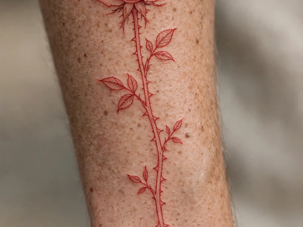
A single rose, bloom at the top, drawn in fine red line with its long thorny stem running the forearm’s length — the rose reduced to its red essentials. The rose is the flower tattooing draws most, and it is usually a colour piece wearing black’s scaffolding; here the scaffolding is gone and the bloom stands on line alone, which suits it: a rose is a spiral of line before it is anything else, and red line finds that spiral naturally.
Petals are the discipline. A rose’s petals must be drawn as separated, countable shapes — each petal its own closed curve with skin between it and the next — because a rose drawn as nested scribble becomes a red pom-pom as the lines settle. The thorns earn their place as the design’s only sharp accents: two or three, bold, spaced down the stem like punctuation.
Best placement: Forearm, bloom toward the elbow and the stem running to the wrist; the composition also climbs a calf elegantly.
Best for / know before you book: Count the petals on the stencil — if you cannot count them fresh, you will not be able to count them healed, and a rose you cannot count is a rose already lost.
18. Red Sparkle Cluster
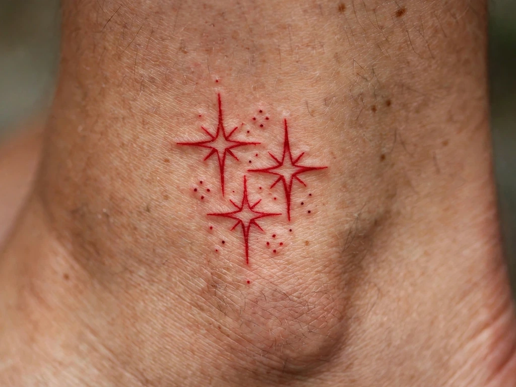
Three four-pointed sparkles and a scatter of dots above an ankle: the jewellery end of red ink, a design with no subject but shine. Sparkle clusters have become the decorative punctuation of modern tattooing — placed in the gaps of a collection, worn like a glint — and in red they read as tiny celebratory fireworks, the ankle’s version of confetti. Wearers take them as pure ornament, and ornament honestly chosen needs no further defence.
Small shapes live or die on spacing, and sparkles are nothing but points and gaps: the four points of each star must be drawn open, with real skin at the centre of each sparkle, or the points thicken into a red asterisk-blob. Keep the cluster’s composition loose and asymmetric — a constellation, not a grid — and let the dots be genuinely small but genuinely separate.
Best placement: Above the ankle, the cluster scattered naturally; the same punctuation works on a wrist or at a collarbone’s end.
Best for / know before you book: Approve the cluster printed at final size, not zoomed — sparkles are a true-scale judgement, and screens lie about them kindly.
19. Red Berry Branch
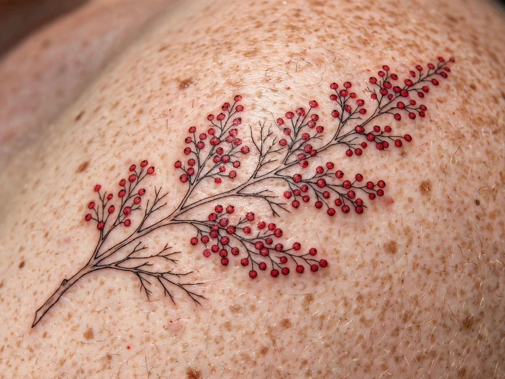
A branch of berries across a shoulder: fine red line for the twigs and leaves, and the berries themselves packed solid — a design of two reds, the drawn red and the filled red, playing against each other. Berry branches carry the late-autumn meanings: provision, endurance, the fruit that stays on the branch after the leaves have gone — winterberry and hawthorn energy, worn by people who pride themselves on lasting. It is the quietest design in this guide and, in healed life, one of the most elegant.
The berries are a packing job in miniature — a dozen small circles, each needing the even, patient fill of Design 9’s sun at a fraction of the size — and circles that small show misses mercilessly. The branch line, by contrast, should stay fine and sparse: the design’s whole charm is the contrast between the wiry drawing and the dense fruit, and a heavy branch makes it a diagram.
Best placement: Shoulder, the branch following the shoulder’s curve toward the blade; a forearm takes a straighter branch lengthwise.
Best for / know before you book: Ask how the artist packs small circles and how they handle a miss — a berry filled twice heals a different red from its neighbours, and the honest artists plan the passes to avoid it.
20. The Red Flame
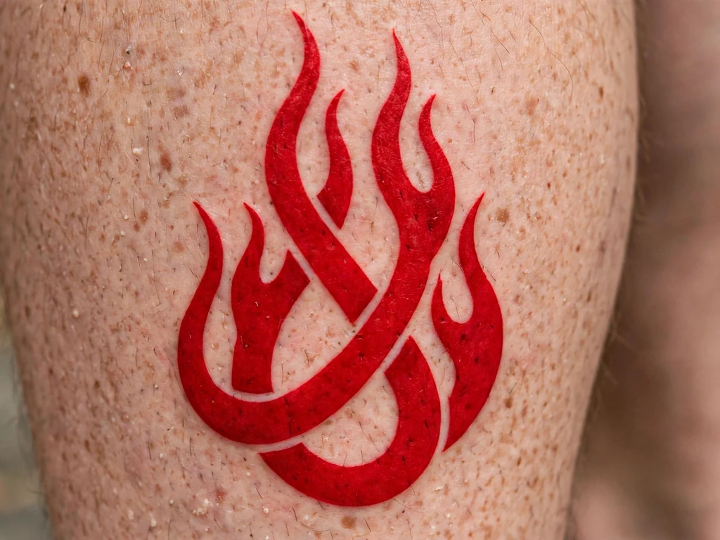
Two tongues of flame, interlaced, rising up a calf in bold red line with flat red at their hearts: fire drawn in the one colour fire actually wears at its edges. Flame tattoos are usually black tribal scaffolding with colour poured in; in red only, the flame becomes essential — no outline colour between the fire and the skin — and reads the way a coal’s glow reads, as heat rather than picture. The meanings are the old ones: passion, transformation, the thing that burns and the thing that survives burning.
Flames are curves with rules. Each tongue must taper to a real point with weight in its base, the two tongues must interlace at genuinely different heights, and the negative space between the flames is as much the design as the flames themselves — it is the air the fire breathes. Drawn too close together, the pair settles into one red mass; drawn at honest spacing, they flicker forever.
Best placement: Calf, flames rising from ankle toward knee along the muscle; an upper arm takes a shorter, broader pair.
Best for / know before you book: Check the stencil in motion — calves flex, and a flame that reads standing still should still read as two tongues walking; if it merges in motion, widen the gap before the session, not after.
21. Red Ribbon Bow
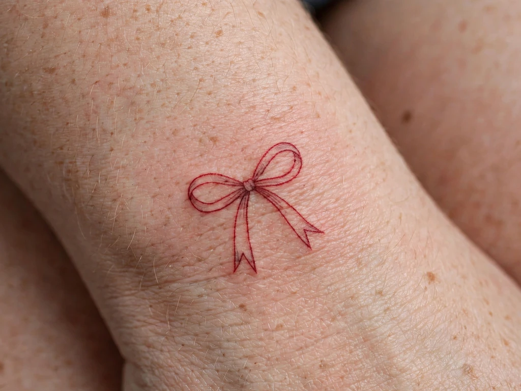
A small bow on the side of the wrist, tied in red line: two loops, a knot, two ribbon ends with their V-cuts — the gift-wrap bow, the hair ribbon, drawn in the colour ribbons are. Bows carry their meanings lightly: a gift, a keepsake, femininity worn as a flourish rather than a statement. In red the bow gains a festive register no other colour gives it; it is the most cheerful design in this guide, and deliberately so — not every red tattoo is a warning or a memorial.
A bow is a symmetry appointment in miniature. The loops must match as drawings, the knot must sit at the design’s true centre, and the ribbon ends’ V-cuts must be cut generously — a fine V in fine red line closes into a notch within a few years. At the wrist’s side, the design also meets the hand’s movement, so it is stencilled with the hand in its natural rest, not flattened for the artist’s convenience.
Best placement: Side of the wrist, the bow sitting on the wrist’s flat edge; it also ties neatly above an ankle.
Best for / know before you book: Mirror-check the stencil — a bow drawn even slightly lopsided reads as a knot coming undone, and the mirror is where you will actually see it daily.
22. Red Cyber Sigil
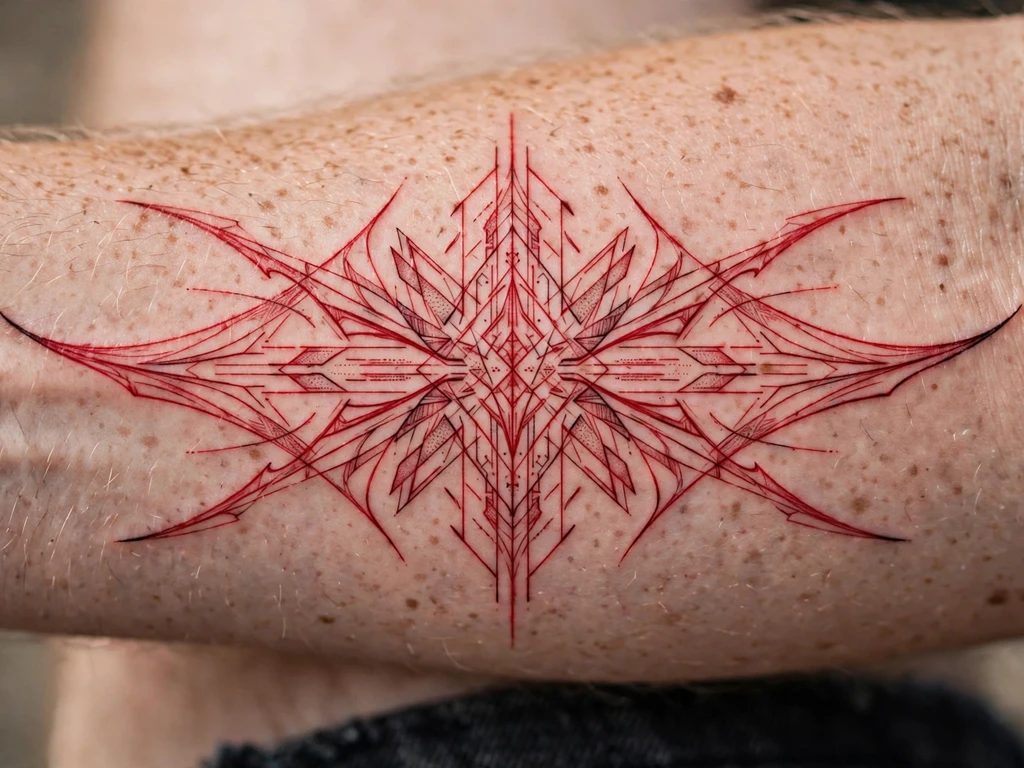
The future, in red: a sharp, angular sigil of the cybersigilism family — blades, points and symmetric sweeps drawn like a circuit’s signature — executed in red line instead of the style’s usual black. The effect is a deliberate short-circuit: the most digital-looking drawing in tattooing, printed in its most organic colour, like a warning light or a wire glowing hot. Wearers take it for exactly that friction — the sigil as a personal mark, a signature from a self that is half signal, half blood.
Points are this design’s whole vocabulary and its whole risk: cybersigilism lives on needle-sharp tips, and red softens sooner than black, so the red version must be drawn with its points a grade bolder and its fine sweeps a grade more separated than the black original would be. What survives is still unmistakably the style — the angles and the symmetry carry it — but it survives as a sigil, not as a spiderweb.
Best placement: Forearm, the sigil centred on the inner forearm’s flat; a shoulder blade hosts a larger, more elaborate version.
Best for / know before you book: Bring references of the style healed in black to judge the drawing, then ask the artist to show you the redrawn, boldened red version before booking — the redraw is the design.
23. Red Blossom Branch
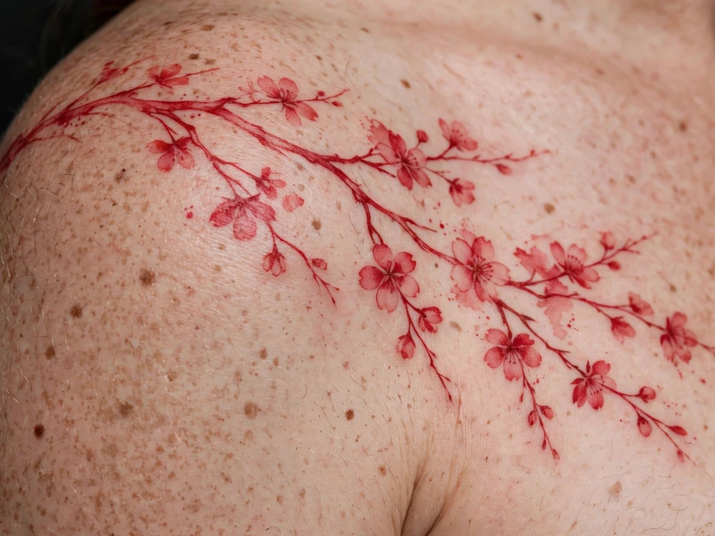
A branch across the shoulder, its blossoms laid in as soft red washes rather than outlined flowers — the ink-wash end of red’s range, in the spirit of a brush painting where the colour itself makes the shapes. Blossom in red wash reads as the season caught mid-drift: blooms open, a petal or two already loose, everything slightly softened by the air it hangs in. It is the most painterly design in this guide, and the one that asks its wearer to love softness as a feature with the longest future.
Because there is no outline, the branch line does the structural work alone and must be drawn as a complete, confident drawing — the washes are laid on a design, never instead of one. The blooms’ edges will diffuse gently over the years, each flower becoming a warmer blur of itself; wearers choose this knowingly, the way the cherry blossom’s own brief season is chosen knowingly, for the beauty of the softening rather than despite it.
Best placement: Shoulder, the branch running from the shoulder point toward the blade; the same branch wraps a forearm at smaller scale.
Best for / know before you book: Judge the artist on healed wash work of any colour — fresh washes always look deliberate, and healed ones show whether the softness was composed or merely spilled.
24. Tiny Red Star Behind the Ear
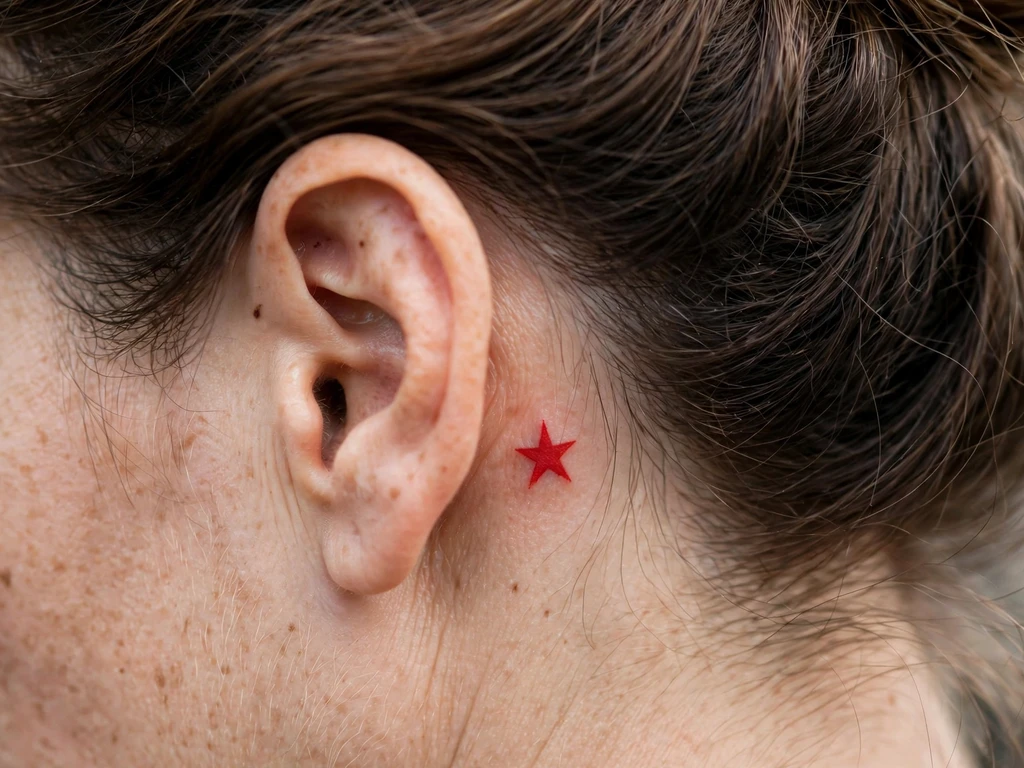
The guide’s one behind-ear design, kept to the single most durable shape there is: one small five-pointed star in red, tucked onto the flat behind the ear — hidden by hair in every formal room, revealed by a tucked strand like a secret kept in the brightest colour. A star is the smallest complete symbol tattooing owns, and in red it becomes a private signal: luck, ambition, a person who is a star to you, worn where only the chosen see it.
At 1–1.5 cm, the craft is pure honesty: the star must be drawn bold for its size, its points short and sturdy rather than needle-fine, with the centre left as open skin or packed fully — the half-filled middle is what reads as a blob at this scale. Behind-ear skin settles a touch soft, so the star is drawn a fraction larger and bolder than the dainty version in the reference photo, and that fraction is the difference between a star at year ten and a red freckle with ambitions.
Best placement: Behind the ear, centred on the flat of skin beneath the cartilage fold; sized to the wearer’s own ear, never from a universal template.
Best for / know before you book: Hold the printed design behind your ear in a mirror at true size — behind-ear tattoos are judged at real scale or not at all, and red at this size is a commitment to boldness, not delicacy.
25. Tiny Red Heart on a Finger
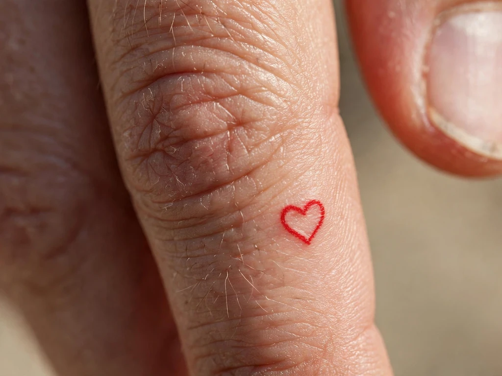
The smallest design in the guide, offered with the fullest honesty, because this placement and this colour are the fastest-fading combination tattooing has: a tiny red heart outline on the side of a finger. Finger skin regenerates fast, flexes constantly and sheds ink faster than anywhere else on the body — and red, the fastest-softening colour, goes first of all. So say it plainly: this heart will fade, sooner than any other design here, and will need touch-ups across its life to stay a heart rather than a rumour of one. Wearers choose it anyway, as a charm with a maintenance schedule — a small bright thing that asks to be renewed, like the feeling it usually stands for.
What can be done is done at the drawing: the heart drawn as boldly as a finger allows — a real line, not a hairline — its lobes openly curved, its point honest, at the largest size the finger’s flat takes. And the side of the finger, not the palm side, because side skin holds ink slightly better and it is the best bargain this placement offers.
Best placement: Side of the finger, where the line can run unbroken and the skin keeps ink longest of anywhere on a finger.
Best for / know before you book: Price the touch-ups before you fall for the charm — if re-inking a small red heart every year or two would annoy you, Design 16’s wrist heart carries the same meaning on skin that keeps it far longer.
Red Ink Tattoo Placement by Size
| Size | Typical dimensions | Best placements | Good to know |
|---|---|---|---|
| Tiny | 1–2 cm | Behind ear, side of finger, inner wrist | One bold shape only — a star, a heart; red at this size must be drawn bolder than instinct, and finger red carries a permanent touch-up commitment |
| Small | 2–6 cm | Wrists, ankles, collarbone edge | Script words, cherries, sparkles, tiny hearts — simple silhouettes, open spacing, the ideal scale for a first red test piece |
| Medium | 6–14 cm | Forearms, calves, shoulders, upper arms | Most of this guide lives here: snakes, koi, suns, eyes and blossom branches at honest line weight with room for dotwork |
| Large | 14–25 cm | Shoulder blades, upper arms | Butterfly and dotwork bloom compositions, large brushstroke work — the scale where red’s gradients and density games become possible |
A red tattoo’s placement is also a sun decision: the same design keeps its scarlet years longer on covered, still skin than on skin that lives outdoors. Forearms are red’s showcase and its fastest clock; shoulder blades and upper arms are its archive. Choose the placement the way you choose the design — for the five-year version, not the first-week photograph.
How to Choose Your Red Ink Tattoo (and What to Know Before You Book)
Start small, on purpose. The honest section gives the reason in full: red’s reaction record, though it affects a minority of wearers, is the strongest of any colour, and the standard cautious route is a small first piece of red, healed and watched, before any large commitment. This is not timidity — it is evidence-gathering at the cheapest possible price, and Designs 16, 18 and 24 exist in this guide partly to be exactly that first piece.
Ask for the exact red, and test it on your skin. “Red” is a family, not a colour: scarlet, crimson, brick, wine and blue-red all heal differently and read differently across skin tones. The professional habit is a test dot — a tiny dot or short line of the actual ink, on the actual placement, healed for a few weeks — before judging. On deeper skin especially, the healed test dot is the only honest colour chart there is; choose deeper, bluer reds and bolder lines where the test says contrast is short.
Judge the artist on healed red — this is the search that matters. Searches for a “red ink tattoo studio” are rising fast for a reason: red is a specialism. Ask any artist you consider for healed photographs of red work, a year old at least, and look at three things: is the line still a line rather than a blush, is flat red still even rather than patchy, and has the tone settled somewhere the wearer still loves? An artist who shows healed red gladly is an artist who understands the pigment; one who shows only fresh red is showing you the one state your tattoo is in for a fortnight.
Design for the drift. Choose, at the drawing stage, the colour your tattoo is travelling toward: scarlet settles to rust, crimson to brick, bright red to a warm vintage register. Designs whose silhouettes are strong — snakes, suns, bands, bold traditional redraws — look better in the settled register; designs living on fresh scarlet’s shock will spend their lives disappointing you. Ask your artist to show you the reddest healed piece in their book and design toward that photograph.
Budget the sun and the refresh. Red’s two maintenance facts are sunscreen and time: healed red under daily sun protection keeps its tone years longer, and even well-kept red may want a refresh pass sooner than black work would. Neither is a failure state — both are the running costs of the colour, and they belong in the decision at booking, not in a surprise at year four.
Know the exit before you enter. If there is any real chance you will want the tattoo gone, hear the removal facts from the honest section once more: red needs the 532 nm wavelength rather than the black-removing 1064 nm, results vary by pigment and skin, temporary lightening of surrounding skin is a documented possibility, and only a clinic that has seen your tattoo can assess it. A small, simply drawn red piece is also, not coincidentally, the easiest kind to remove or rework later — one more reason the start-small rule is this guide’s spine.
Key points to remember:
- Red is the colour most often reported in tattoo skin reactions — the standard cautious route is a small first red piece, healed and watched, before a large commitment
- Red fades faster than black and drifts in tone (scarlet toward rust, crimson toward brick); sun exposure is its fastest enemy, and sunscreen is structural, not optional
- Red reads differently on every skin tone — muted and wine-dark on deeper skin — so judge it by a healed test dot of the exact ink on the exact placement
- Red-only designs have no black structure to fall back on: line weight, spacing and silhouette must be designed for the settled, softened version from day one
- Removal is possible but different: red absorbs the 532 nm wavelength, not the 1064 nm used for black, results vary, and only a clinic consultation can assess a real tattoo
- Judge artists on healed red work — lines still lines, flat fills still even — and treat any reaction that persists or spreads as a dermatologist conversation, not a studio one
Frequently Asked Questions
What does a red ink tattoo mean?
Most often, the colour is the meaning: passion and love in the Western reading — the heart, the rose, the blood tie — luck and protection in Chinese and Japanese traditions where red is the festive, fortune-keeping colour, remembrance in the poppy and the spider lily, and in modern wear a deliberate defiance of tattooing’s black default. Because a red-only tattoo gives up every other colour, the choice of red itself becomes the statement: wearers are rarely casual about it, and the designs that last are the ones where the colour and the subject were chosen together, for the same reason.
Do red ink tattoos fade faster than black?
Yes — faster, and differently. Red pigment lightens sooner than black and shifts in tone as it goes: bright scarlet settles toward rust and orange-brown, crimson toward brick, with the drift fastest where the tattoo sees the most sun. It is a change of register more than a disappearance: bold red designs — suns, bands, traditional redraws, snakes — settle into a vintage warmth many wearers prefer, while delicate fine-line red softens toward a blush and can lose its drawing if it was not honestly weighted. Sun protection on healed red is the single habit that slows the whole process most.
Are red ink tattoos more likely to cause a reaction?
Red is the colour most often reported in connection with tattoo skin reactions. A 2025 dermatology literature review states that red tattoos remain the most commonly implicated pigment in tattoo-associated allergic contact dermatitis, an association that has persisted even as older mercury-based red pigments were replaced by modern organic ones — and reactions, when they happen, typically appear inside the red areas while black work nearby stays calm. Most red tattoos heal and live without any reaction at all; the record is a reason for the standard cautions — a small first red piece, healed and watched; an artist who works cleanly with quality ink — not a reason to avoid the colour. Anything that persists, spreads or worries you belongs in a dermatologist’s office, not a forum thread.
Can red ink tattoos be removed?
Yes, but by a different light than black. Laser removal matches wavelength to pigment: black absorbs the 1064 nm wavelength, while red pigment absorbs its complementary colour — the green 532 nm wavelength, which the classic clinical literature on Q-switched lasers records as treating red ink effectively, with temporary lightening of the surrounding skin a documented possibility. Modern picosecond lasers use the same colour-matching principle. Session counts and completeness vary with the pigment, its depth and your skin, and no honest clinic promises either in advance — only an in-person assessment of the actual tattoo can say what removal would involve for you.
How does red ink look on dark skin?
Redder in the bottle than on the skin. Red pigment sits beneath your own skin tone and mixes with it optically, so on medium and deeper skin the same ink heals progressively more muted — burgundy, wine, warm brown rather than scarlet — and fine red lines can lose contrast altogether. The professional answers are a healed test dot of the exact red on the exact placement before committing, deeper and bluer red shades chosen for contrast, and lines drawn bolder than the fair-skin version of the same design. Bold, simple red designs keep their read on every skin tone; hairline red is a fair-skin luxury the pigment does not extend to everyone, and an honest artist will tell you so at the consultation.
Final Thoughts
A red ink tattoo is the boldest simplification in tattooing: one pigment, asked to do everything — line, shade, symbol and statement — on skin that will spend years quietly negotiating with it. The wearers who love theirs longest are the ones who made the negotiation part of the choosing: a small red first piece as evidence, a healed test dot as the colour chart, an artist judged on healed red, a design drawn for the rust it will become rather than the scarlet it starts as.
So pick the design whose silhouette you would love in brick and rust as much as in scarlet, book the artist whose healed red work passes the three checks, and let the colour be what it has been for a thousand years of body marking — the loudest, warmest, most alive register a tattoo can speak in. Red asks more of you than black does. Worn knowingly, it gives more back.