
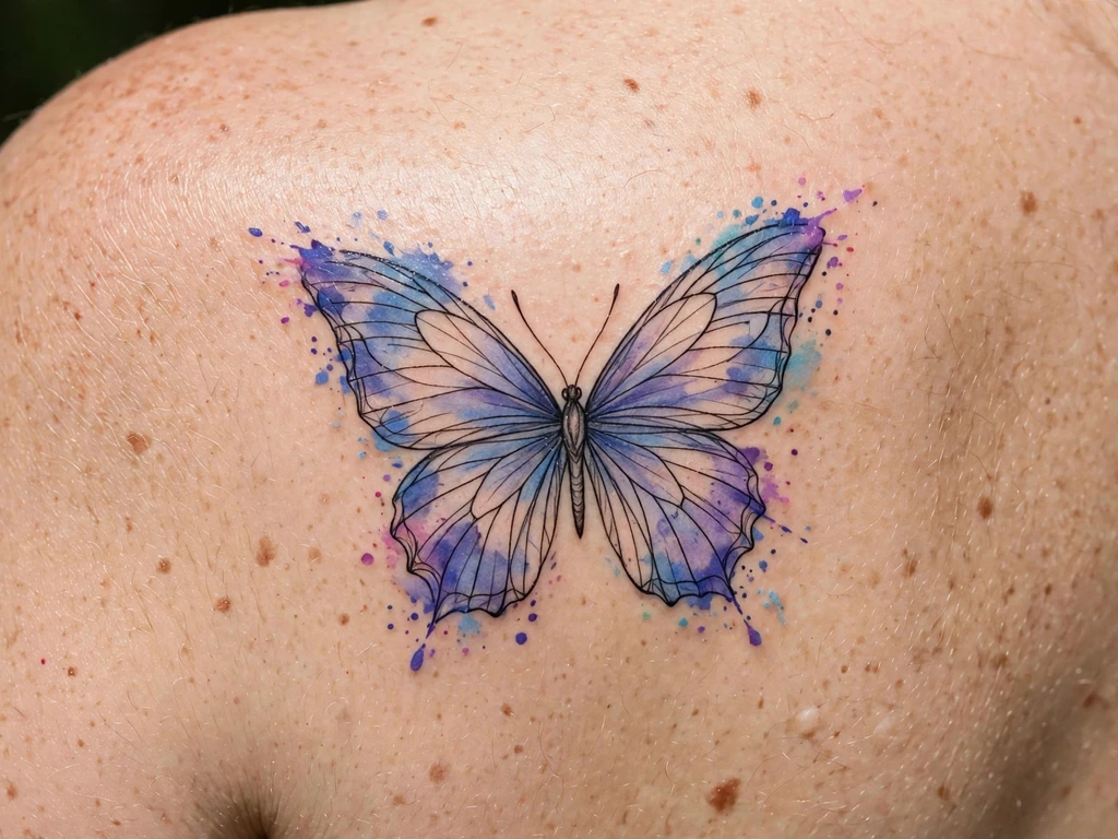
A watercolor tattoo is the one style in tattooing that refuses to pretend it is permanent in the way other tattoos are. A watercolor tattoo is built on washes: pigment laid into the skin the way a painter lays it onto paper, in soft fields of colour with feathered edges, splashes, drips and bleeds, often with little or no black outline at all. Fresh, it is the most luminous work in tattooing — colour that looks lit from behind, subjects that seem to be dissolving and arriving at the same time.
You will find 25 original watercolor tattoo ideas here — wash butterflies and painted florals, a galaxy splash, a koi, a feather, silhouettes standing in fields of colour. But before the designs come the two sections this style cannot be honestly sold without: a plain answer to what a watercolor tattoo actually is, and a fuller, calmer answer to how long one actually lasts — because the honest lifespan of a wash is this article’s whole argument. Every design below is then classified the way experienced watercolor artists classify their own work: by its anchor, the holding element that decides whether the piece still reads as itself in ten years. Read the first sections before you scroll the designs. A watercolor tattoo chosen with open eyes is a beautiful, deliberate thing; this guide exists so that yours is.
What Is a Watercolor Tattoo?
The rising question deserves its answer in its own wording, so: a watercolor tattoo is a tattoo executed in the visual language of watercolour painting — transparent washes of colour with soft, un-outlined edges, layered glazes, splashes and drips — rather than in the outlined, filled language of conventional tattooing. The subject might be anything — a butterfly, a rose, a wave — but the treatment is the style: colour laid down in diluted fields that fade into the skin at their borders, deeper colour pooling where the “brush” lingered, pale colour where it merely passed. There is no actual watercolour paint involved; the artist uses ordinary tattoo pigment, applied with a tattoo machine, and imitates the medium’s behaviour. The name describes the look, not the materials.
The imitation is more faithful than most wearers realise, because the two mediums share a piece of physics. In watercolour painting, the paint is transparent pigment in a gum arabic binder, and the picture’s light does not come from the paint at all — as the Jackson’s Art glossary of watercolour terms puts it, transparency is the measure of how much light passes through the applied paint to interact with the surface beneath, and transparent paints look luminous because light reflects off that surface and back through the colour. On paper, the surface is the white page. On skin, the surface is you. A watercolor tattoo’s glow is your own skin shining through diluted pigment — which is why the style looks different on every body, why there is no backing white to rescue a pale wash, and why the skin-tone discussion in the next section is physics rather than opinion.
What a watercolor tattoo is not is equally definite. It is not a style defined by its subjects — the same butterfly exists in traditional, fine-line and blackwork versions, and only the wash treatment makes it watercolor. And it is not lineless by definition: many of the best watercolor tattoos are drawn over a complete line skeleton, with the washes laid inside and beyond it. That distinction — skeleton or no skeleton — is the biggest predictor of how the tattoo ages, and the axis this whole guide is organised around.
What Does a Watercolor Tattoo Mean?
Because the style is a treatment rather than a subject, its meanings attach to the manner as much as to the motif — and they are remarkably consistent. Freedom and spontaneity lead: a wash cannot be fully controlled, on paper or on skin, and wearers who choose it are often choosing that looseness deliberately — the tattoo as a gesture rather than a diagram. Emotion over precision follows: watercolor subjects read as feelings first and objects second, a rose that is more the idea of missing someone than a botanical specimen. And underneath both sits the meaning this style carries more honestly than any other: chosen impermanence. A watercolor tattoo will soften, diffuse and change across its life more visibly than a structured tattoo will. Many wearers know this and want it — the tattoo as something that lives and mellows alongside them rather than a stamp fixed at one moment.
One framing note, as this series always makes: these meanings are personal and cultural symbolism, worn as meaning.
How Long Do Watercolor Tattoos Actually Last?
This is the question that dominates every search box attached to this style, and it deserves a complete answer rather than a reassuring one. The honest summary first: a watercolor tattoo does not disappear, but it does change — faster and more visibly than a structured tattoo — and how much it changes is largely decided at the drawing stage, by choices this section names. Nothing here is a guarantee, in either direction: no artist can promise you a decade, and no honest one will promise you a disappearance either.
The edges go first, and that is by design. A wash has no outline, so its border is simply where the pigment gets too dilute to see. As the skin renews itself and the pigment settles and disperses slightly over the years, that dilute frontier retreats: splashes shrink, feathered edges pull inward, the soft halo around a subject tightens toward its core. A watercolor tattoo at year eight usually reads as the same picture with its weather turned down — less mist, more object. Wearers who chose the piece for the mist should know the mist is the first thing time spends.
Pale and pastel tones lighten fastest. The law is simple arithmetic: a pale wash starts with very little pigment in the skin, so the ordinary, slow lightening every tattoo undergoes spends a larger share of it. Baby pinks, pale lavenders, powder blues and light yellows quieten first; deep blues, violets, saturated reds and greens hold their voices far longer. Watercolour painters have always known the paper version of this law: the paint manufacturer Winsor & Newton notes in its guide to watercolour terms that some colours rated permanent at full strength “may fade in thin washes” — the pigment is sound, but dilution itself is the exposure. Tattooing obeys the same physics with higher stakes, because skin is a less stable gallery than paper: the thinner the wash, the shorter its readable life, whatever the pigment’s quality.
Saturation is the longevity lever you control. It follows directly: a wash laid in deeper — more pigment per pass, colour chosen a register darker than the fresh-photo ideal — has further to fall before it stops reading. Artists who specialise in this style routinely tattoo past the target colour, knowing the piece will settle back to it; the fresh version looks almost too strong, and the five-year version looks like the photograph the client brought in. If your artist proposes to match the exact pastels of a filtered reference on day one, the healed arithmetic is already against you.
Sun is the accelerant. Ultraviolet light breaks down tattoo pigment in every style, but washes have the least pigment in reserve, so sun spends them fastest. An uncovered watercolor forearm in a sunny climate is on a visibly shorter clock than the same piece under a sleeve, and healed wash work under daily sun protection keeps its register years longer. For this style, sunscreen is structural.
Skin tone sets the palette’s register. Because the style’s light comes from the skin showing through the wash, the wash is always a mixture of the pigment and the wearer. On fair skin, pale washes show near their bottle register. On medium and deeper skin, the same pale wash reads progressively quieter — a powder blue can go nearly silent — while deep, saturated tones keep their contrast and read richly. The professional answer is palette selection, not resignation: deeper jewel tones, stronger saturation, and a healed test area of the exact colours on the exact placement tell you the register you will actually be wearing.
Touch-ups are maintenance, not failure. Every style benefits from an occasional refresh, but watercolor is the one style where a planned refresh belongs in the original decision. A wash piece commonly wants its palest fields re-laid somewhere in its first several years — sooner for pure-wash and pastel pieces, later or never for deeply saturated, anchored ones — and a refresh pass on a well-drawn piece is a short appointment that restores the colour while the drawing underneath carries on.
This site’s red ink tattoo ideas guide makes the same honesty argument for a single colour; watercolor is where the argument covers the whole rainbow. The designs below are not exempt from anything in this section — each one states plainly which of these laws will spend it, and what, if anything, holds it.
The Anchor: How a Watercolor Tattoo Is Built to Survive
Underneath the longevity section sits the craft fact that organises this guide: a wash, alone, has nothing to hold its drawing together as it softens — so the watercolor tattoos that last are the ones built around an anchor. An anchor is any holding element that keeps the design reading as itself after the dilute edges have retreated and the pale tones have quietened. There are four kinds, and every design in this guide is classified by which it carries.
The line skeleton. A complete line drawing underneath the wash — black, or a deep tone of the design’s own palette — that carries the subject’s structure while the colour floats inside and beyond it. As the wash softens, the skeleton remains: the butterfly is still a butterfly, the koi still swims. This is the strongest anchor and the one this guide recommends by default. A skeleton can be discreet — fine line, drawn in deep plum or brown rather than black — but it must be complete: a half-drawn skeleton anchors half a tattoo.
The saturated core. No line, but a heart of deeply laid pigment at the design’s centre of gravity — the packed centre of a flower, the dark body of a bird — from which the washes dilute outward. The edges retreat toward this core over the years, and the core is positioned so the settled version is still the intended picture.
The dark accent. A small, deliberate piece of near-black or darkest-tone work placed where the eye needs a full stop — an eye, a seed head, a cluster of dots — which fixes the design’s contrast even as its fields lighten.
Saturation itself. A wash laid so deeply throughout that even its settled, lightened self is still a full colour field. This is the anchor of the abstract pieces: no subject to lose, and enough pigment that diffusion reads as mellowing rather than vanishing.
Where does fine line fit? A fine-line skeleton is a genuine anchor — the site’s fine line tattoo ideas guide covers single-needle line work and its own ageing in full — but it is the lightest anchor of the four: the skeleton itself softens on the same schedule as fine line always does, so a fine-line-and-wash piece should be drawn expecting both elements to mellow together, gracefully and at roughly the same pace.
The classification used in this guide is therefore threefold. Anchored designs carry a skeleton or silhouette strong enough to hold the picture alone. Half-anchored designs carry a saturated core or dark accents — they will settle into a smaller, deeper version of themselves. Deliberately free designs carry nothing but saturation, or not even much of that: they are chosen for their diffusion, the way a note held until it fades is still music. The only wrong answer is a free design chosen by someone who believed they were buying an anchored one.
Watercolor Tattoo Styles and How They Age
Every watercolor approach is a different treaty with the same arithmetic: dilute pigment lightens, un-outlined edges retreat, and whatever structure exists is what remains.
| Style | How it is drawn | How it ages |
|---|---|---|
| Line-and-wash | A complete line skeleton — fine or standard weight — with washes laid inside and feathering beyond it | The longest-lived watercolor of all: the wash mellows into a tint while the skeleton keeps the drawing; reads as a coloured drawing for decades |
| Silhouette-and-wash | A solid black or darkest-tone subject standing in or against a field of pure wash | The subject is permanent and the field is weather: the silhouette stays graphic forever while its sky softens around it — a contrast that often improves with age |
| Saturated wash, no line | No skeleton; subjects built from deeply laid colour fields with soft edges | Settles into a smaller, deeper version of itself; saturated hearts of flowers and birds hold for many years while their pale outskirts retreat first |
| Fine-line-and-wash hybrid | The lightest skeleton — single-needle fine line — under gentle washes | Both elements mellow together at the same gentle pace; the most delicate ageing of the structured styles, and the soonest to want a refresh |
| Pure wash / splash abstract | No subject structure at all: splashes, drips, brushstroke fields of colour | Pure diffusion: fields shrink and quieten evenly; chosen for exactly that evaporation, and renewed by refresh passes rather than preserved |
One more honesty belongs here, because watercolor galleries attract it most of all: the filter problem. Every design in this guide is described at its healed reality: the calm register of month three, which is the version you will actually live with. Judge artists the same way: healed wash work, a year old at least, or it did not happen.
Watercolor Tattoo Ideas at a Glance
| # | Design | Anchor | Best placement |
|---|---|---|---|
| 1 | The Watercolor Butterfly | Anchored: fine-line skeleton | Forearm |
| 2 | Wash Rose With a Black Stem | Anchored: stem skeleton, saturated core | Forearm |
| 3 | The Sunflower in Wash | Anchored: dark seed core | Upper arm |
| 4 | Wash Peony in Full Bloom | Half-anchored: saturated cores | Shoulder blade |
| 5 | The Wash Daisy, Deepened | Half-anchored: stipple centre | Forearm |
| 6 | Hummingbird in Wash | Anchored: fine-line skeleton | Shoulder |
| 7 | The Fox in Wash | Anchored: deep-tone skeleton | Forearm |
| 8 | Galaxy Splash | Half-anchored: saturated core, dark accents | Upper arm |
| 9 | Abstract Brushstroke Wash | Deliberately free: saturated fields | Upper arm |
| 10 | Splash-Only Abstract | Deliberately free: deep saturation | Forearm |
| 11 | Ocean Wave in Wash | Half-anchored: deep crest core | Calf |
| 12 | The Feather in Wash | Anchored: central shaft line | Forearm |
| 13 | Koi in Wash | Anchored: line skeleton | Calf |
| 14 | Dragonfly in Wash | Anchored: body line skeleton | Shoulder blade |
| 15 | The Anchor With Splashes | Anchored: bold silhouette | Forearm |
| 16 | Heart in Wash | Half-anchored: saturated core | Wrist (inner) |
| 17 | Black Cat, Wash Sky | Anchored: solid silhouette | Calf |
| 18 | Geometric Circle, Wash Field | Anchored: geometric frame | Upper arm |
| 19 | Fine-Line Branch, Wash Blossom | Anchored: fine-line skeleton | Collarbone (outer edge) |
| 20 | Lavender Sprig in Wash | Half-anchored: fine stem line | Ankle |
| 21 | The Painted Poppy | Half-anchored: dark centre | Shoulder |
| 22 | Splash Star Cluster | Half-anchored: dark dot accents | Behind ear |
| 23 | Wash Swallow in Flight | Anchored: fine-line skeleton | Shoulder |
| 24 | The Rainbow Wash Arc | Deliberately free: saturated bands | Wrist |
| 25 | Tiny Wash Bloom | Deliberately free: none | Finger (side) |
25 Watercolor Tattoo Ideas
1. The Watercolor Butterfly
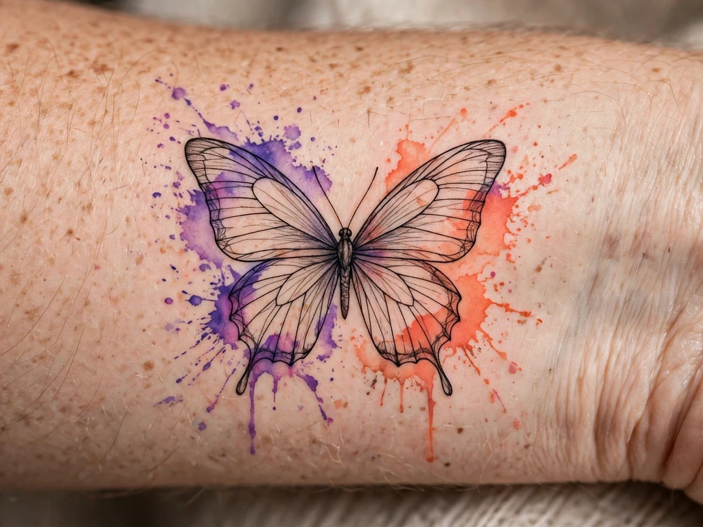
The iconic watercolor subject, drawn the way this guide insists it be drawn: a butterfly whose wings are fields of coral and violet wash — and underneath the colour, a complete fine-line skeleton of veins, wing divisions and body, so that the washes have a drawing to live in. The colour splashes a little beyond the wing edges, as wash should; the butterfly’s meaning — change, the self remade — is the most worn in tattooing, and the butterfly family’s full range lives in our butterfly tattoo ideas guide. This version is the butterfly as weather: bright, soft, and held.
Anchored, and the ageing follows the classification: the splashes outside the wings retreat first — a memory within some years — and the palest inner wash quietens, but the skeleton keeps the butterfly a butterfly indefinitely, and a refresh pass can re-lay the colour fields in an afternoon.
Best placement: Forearm, wings open across the flat; a shoulder blade hosts a larger, grander version.
Best for / know before you book: This is the design to judge a watercolor artist by — ask for healed line-and-wash work and check whether the wash still sits inside a drawing, or whether the drawing has dissolved entirely.
2. Wash Rose With a Black Stem
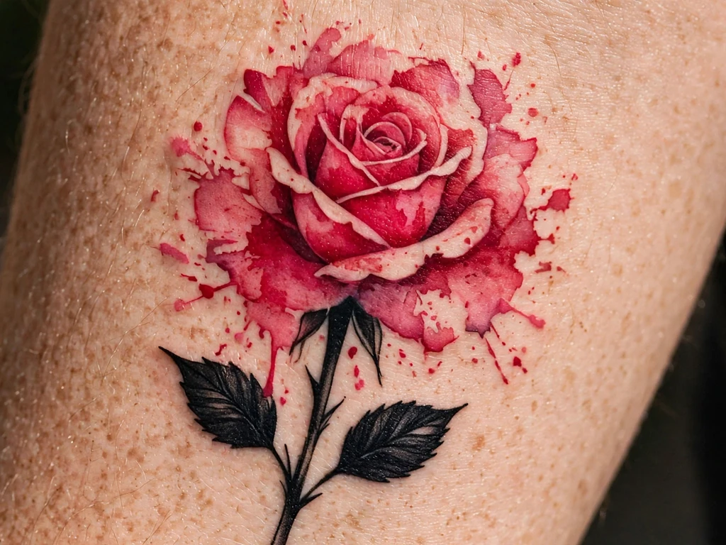
The rose is where beginners’ watercolor goes to blur, and this design exists to show the fix: the bloom itself is pure wash — deep pink diluting to crimson at the petal hearts — but beneath it runs a stem drawn in solid, confident black with two black leaves, an anchor you can see. The contrast is the design’s whole intelligence: the softest flower in tattooing, standing on its hardest line.
Anchored twice over — stem skeleton below, saturated cores inside the petals — this rose is built to settle, not to vanish: the petal edges soften and the lightest pink quietens, while the cores and the stem carry the picture at year ten. Petal discipline still applies: each petal a separated wash field with skin or deeper tone between, because petals poured into one continuous field settle into one continuous cloud.
Best placement: Forearm, the bloom toward the elbow and the stem running down the arm’s length; the composition also climbs a calf.
Best for / know before you book: Approve the design in two passes — the black drawing alone first, then the wash plan over it; if the drawing alone does not read as a rose, no amount of colour will save it healed.
3. The Sunflower in Wash
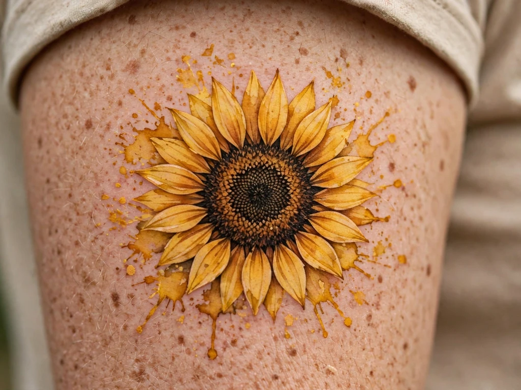
A sunflower is, structurally, a watercolor tattoo that anchors itself: the petals are pure wash — gold diluting to amber, edges feathering into the skin — but the centre is a disc of deep brown packed nearly solid, the darkest natural object in any flower garden, and it holds the whole bloom the way a full stop holds a sentence. Wearers take the sunflower for loyalty and joy, the flower that turns to follow its light; the site’s sunflower tattoo ideas guide covers the bloom in every style, and this is its wash register — the sun rendered as weather around a seed-dark heart.
Half the ageing battle is won by botany: the centre outlasts everything around it, so the design is drawn expecting the petals to settle toward it — petal washes laid a register deeper than the reference suggests, because yellow is among the fastest-quietening tones and a wash sunflower starts life needing a reserve.
Best placement: Upper arm, the bloom centred on the outer flat where it gets the width its rays need; a shoulder takes it at the same scale.
Best for / know before you book: Yellow is the honesty test — ask to see the artist’s healed yellow work specifically, because fresh gold photographs gloriously and healed gold is where the truth is filed.
4. Wash Peony in Full Bloom
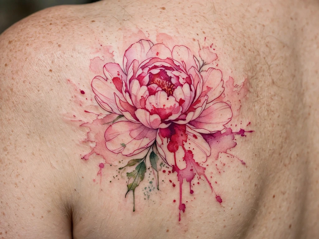
The peony is the wash style’s natural aristocrat: a flower that is already, in life, a study in dilution — petals that run from deep pink at the heart to near-white at their frilled edges. This design lays that gradient honestly: no skeleton at all, but petal after petal of wash, each with a saturated core at its base deepening the bloom’s centre, so the flower is half-anchored by accumulation — many small reserves of pigment adding up to one durable heart.
The expectation must be set precisely: the outermost, palest petals are a temporary pleasure, and the design is composed so that their retreat reveals a smaller, deeper peony rather than a wound — the flower at year eight is the flower at a later stage of opening in reverse, tighter and richer. Size is its ally: below about 10 cm the petal layers compress into one pink field, so this design asks for scale and takes it gladly.
Best placement: Shoulder blade, centred on the flat; a large version opens beautifully across the upper arm’s outer face.
Best for / know before you book: Ask the artist to show you the design twice — as drawn, and with the palest outer petals mentally removed; you are buying both flowers, and the second is the one you will keep longest.
5. The Wash Daisy, Deepened
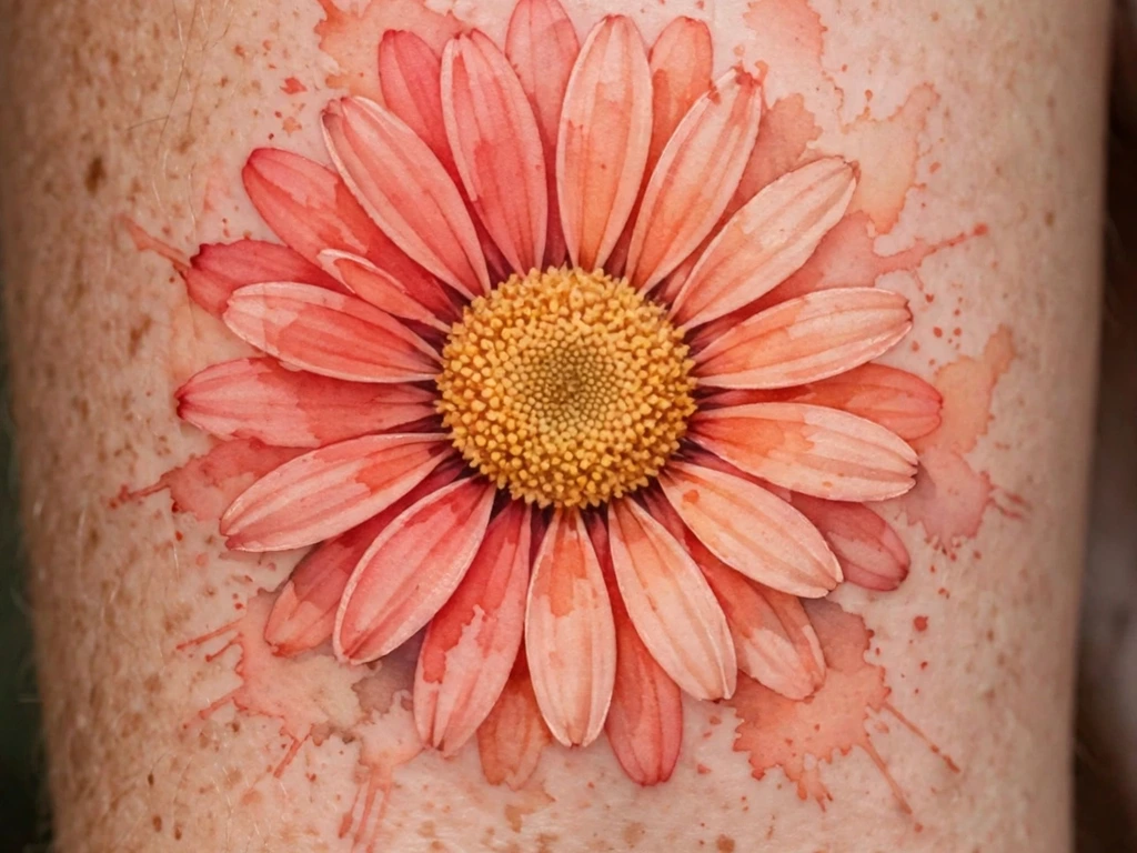
This series already owns one wash daisy — the daisy guide’s pale, skeleton-led version, all blush and cream over a minimal line drawing — and this design is its deliberate opposite and cousin: a gerbera-toned daisy in saturated wash, coral and peach laid deep, with a dense stippled golden centre doing the anchoring. The full daisy family, and that paler sister design, live in our daisy tattoo guide; this piece exists to prove the longevity section’s central claim on a single flower — that the same subject, in the same style, lives a completely different lifespan when saturation replaces delicacy as the plan.
Half-anchored, by its centre and its depth: the stipple disc will hold its texture as it softens, and the petal washes, laid a full register deeper than the classic wash daisy, settle into the gentle version rather than past it.
Best placement: Forearm, the bloom centred on the flat; a calf takes the same composition lengthwise.
Best for / know before you book: If you are choosing between this and the pale version, choose by decade, not by photograph: this is the wash daisy for wearers who want the softness and the long lease.
6. Hummingbird in Wash
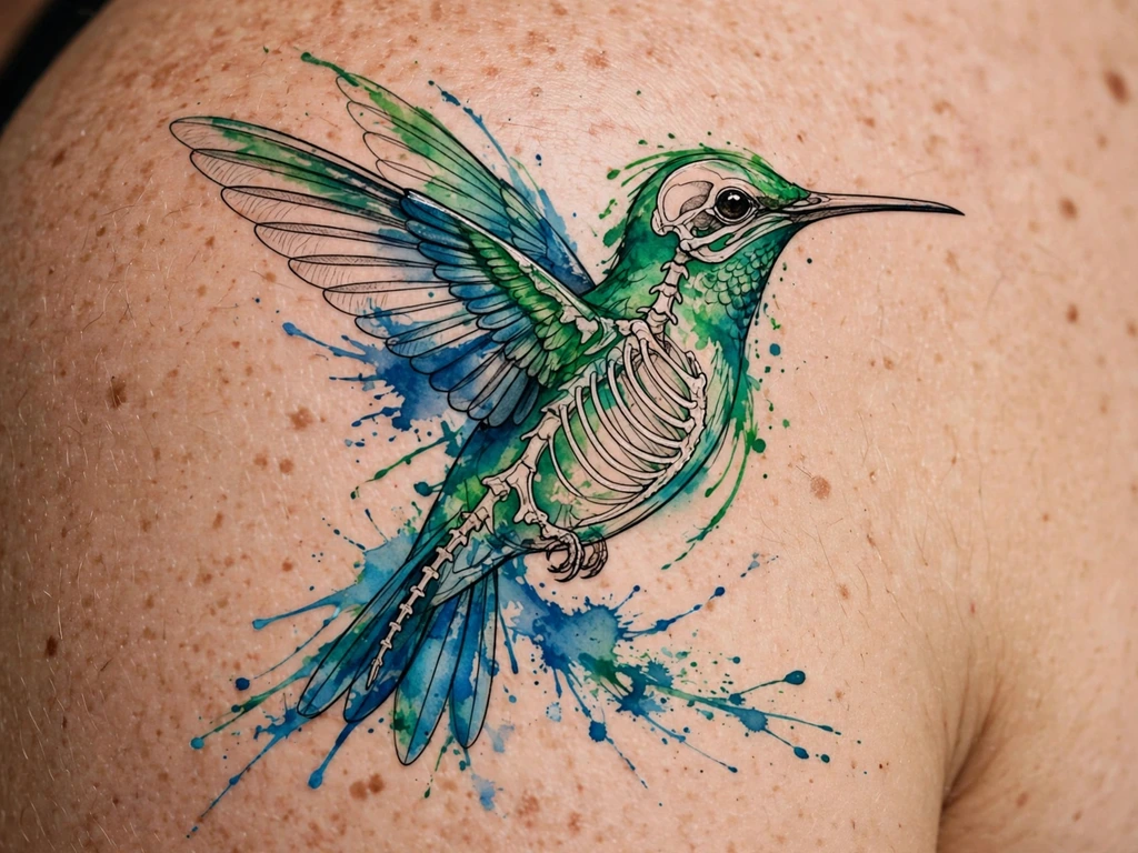
A hummingbird is motion rendered as an animal, and wash is the only style that draws it truthfully: emerald and sapphire fields for the body, the wings suggested in two diluted arcs of colour rather than drawn feathers, a soft splash trail behind the tail where the bird has just been. Underneath, a fine-line skeleton — beak, body line, the long tail’s structure — keeps the bird a bird when its weather settles.
Anchored, with one honest exception: the wing arcs are deliberately free, and they will soften into a general shimmer — which the design intends, since a hummingbird’s wings in life are a blur anyway. It is the rare case where diffusion is the subject. Keep the body washes saturated — jewel tones are this species’ gift to the longevity ledger — and let the beak’s line be the boldest single mark in the piece.
Best placement: Shoulder, the bird hovering at the cap with its trail running toward the blade; a forearm takes it lengthwise, beak toward the elbow.
Best for / know before you book: Judge the skeleton drawing alone before any colour is discussed — a hummingbird whose line drawing hovers will survive its washes; one that needs the colour to fly will not.
7. The Fox in Wash
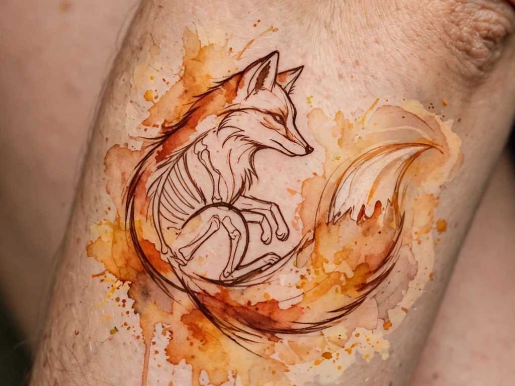
The fox, translated into weather: rust and amber washes for the coat, white of the wearer’s own skin reserved for the chest and tail tip, and a deep brown — not black — line skeleton carrying the ears, the muzzle and the long brush of the tail. Brown line is this design’s refinement: it anchors exactly as black does while keeping the piece inside the autumn register, so the whole animal reads as something seen through late light.
Anchored, and drawn for settlement: the lightest amber at the tail’s edges retreats toward the skeleton over the years, leaving a slightly smaller, deeper fox — the design is composed at that settled size, the fresh haze treated as a bonus rather than part of the animal.
Best placement: Forearm, the fox sitting or curled along the arm’s length; the same animal curls around a calf muscle beautifully.
Best for / know before you book: Insist on seeing the skeleton in the design’s own brown at full darkness before the session — the anchor only counts if you can see it standing alone.
8. Galaxy Splash
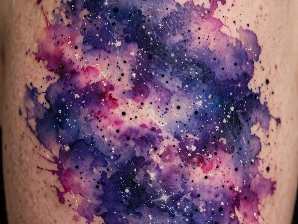
The galaxy is the splash style’s flagship: a nebula of indigo and violet laid deep, magenta and teal clouds drifting through it, and — the anchor — a scatter of genuine black worked into the field: star dots at full density, a few deep-space shadows at the nebula’s heart. It is half-anchored by saturation and accent together: the field itself is laid at the deepest register wash allows, and the black points give the eye fixed stars to read the softness against.
The honest forecast is favourable, by wash standards: deep indigo and violet are among the longest-lived wash tones, and this design’s settled version may read better than its fresh one, the colours knitting into a genuine night as their edges marry. The budgeted losses are the palest teal wisps at the field’s rim.
Best placement: Upper arm, the nebula wrapping the outer face; the same field wraps a calf as a vertical night.
Best for / know before you book: Depth is the whole purchase — a galaxy poured pale is a bruise by year three, so approve the saturation on a test patch of the design’s darkest cloud, not on the photograph’s lightest one.
9. Abstract Brushstroke Wash
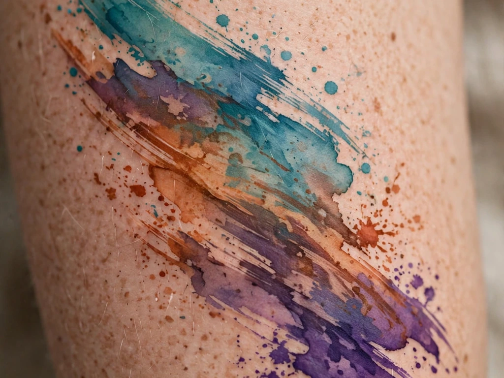
One gesture, three colours: a broad brushstroke of layered wash — teal laid over rust, violet bleeding at the tail — sweeping across the upper arm with its dry-brush texture and trailing splashes intact. Where the red ink guide’s brushstroke is a single colour’s single statement, this is the painter’s full palette in one pass: the stroke as landscape, weather and signature at once. It is deliberately free: no skeleton, no core, nothing but saturation standing between the gesture and time.
The design’s defence is entirely in its depth. Each colour field is laid at genuine strength, so the settled version — edges married, tones knocked back a register — is a softer stroke, not a vanished one. Of all the free designs here, this and the next are the ones whose freedom is survivable, because they spend from a reserve.
Best placement: Upper arm, the stroke following the muscle’s long line; a grander version arcs across a shoulder blade.
Best for / know before you book: This is the most artist-dependent design in the guide — the stroke is composed freehand, so choose a painter, and rehearse the arc together on skin with a marker before any ink is opened.
10. Splash-Only Abstract
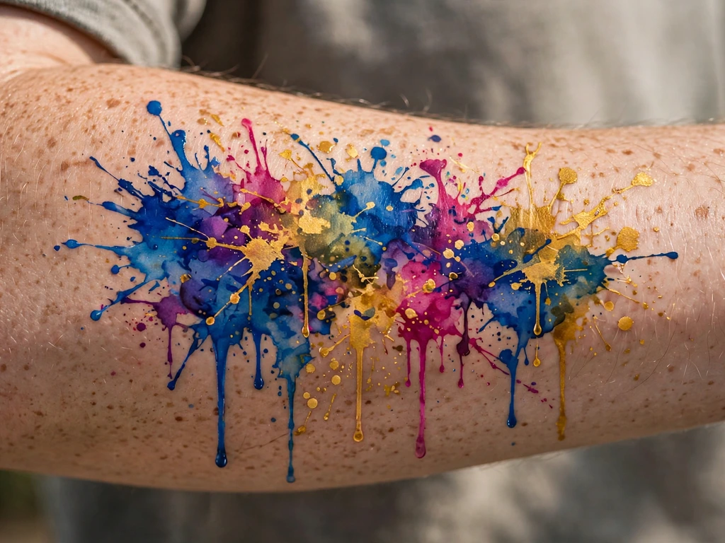
The purest object in this guide: no subject at all — a constellation of splashes, drips and pooled fields in cobalt, magenta and gold down a forearm, colour as its own excuse. Splash-only work is where the style’s honesty is total, because there is nothing to hide behind: the piece is its pigment behaviour.
Deliberately free — and the guide will not pretend otherwise: the smallest splashes quietly resign within some years, the drips shorten, the palest gold goes first. What survives longest is exactly what was laid deepest, so the composition is a hierarchy of saturation: the largest fields at full strength, the satellites progressively lighter, the whole designed to lose its outskirts gracefully and keep its cities. A refresh pass restores the map in one sitting whenever the wearer wants the borders back.
Best placement: Forearm, the field running wrist to elbow with room to breathe; an ankle takes a miniature galaxy of the same logic.
Best for / know before you book: Budget the refresh at the booking, in writing if the studio offers it — this design is a subscription to colour, and it is a fair one only when both parties know it.
11. Ocean Wave in Wash
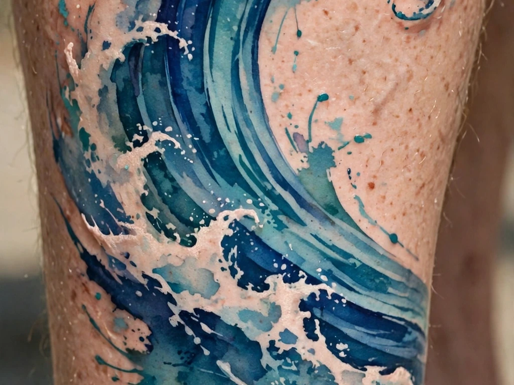
A wave is water wearing its own portrait: layered blues and teals poured in the curl’s direction, foam left as the wearer’s skin and a few flecks of white, and — the half-anchor — a deep indigo core running through the crest where the wave’s power concentrates, laid saturated enough to hold the curl’s shape when the lighter water around it has quietened. The wave’s meanings are the old ones: change that returns, power that does not need to shout, the sea carried inland.
The curl is the craft: washes must be poured in the direction of the water’s travel or the wave reads as a blue shell, and the crest core must sit exactly at the curl’s lip, because that line is what the eye will read as “wave” at year ten. Foam is drawn as reserved skin, never as white ink fields — the same negative-space honesty the daisy guide demands of petals — with white reserved for flecks small enough to lose without loss.
Best placement: Calf, the wave curling up the muscle from ankle toward knee; a forearm takes a tighter curl at smaller scale.
Best for / know before you book: Approve the curl’s direction in a mirror with the leg in motion — a wave is a verb, and a stencil checked standing still can pour the wrong way walking.
12. The Feather in Wash
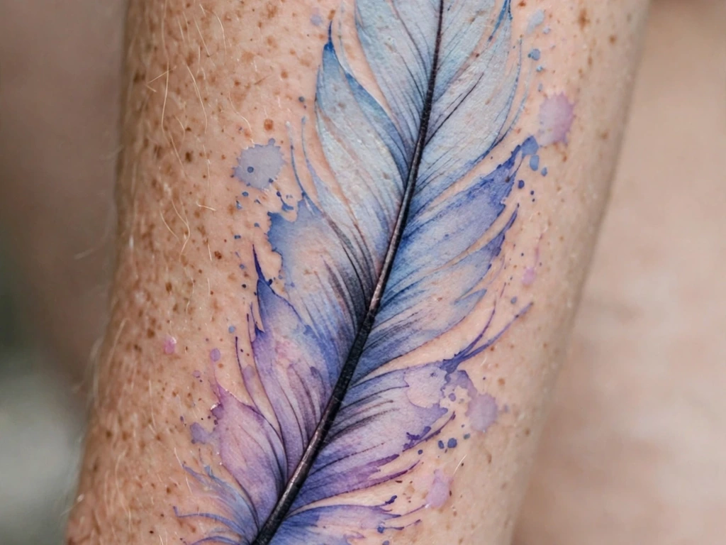
The feather is one of this series’ established subjects — its construction, its meanings of freedom and lightness, its eagle-feather respect passage all live in the feather guide — and this design is deliberately narrower: it is the wash treatment of a feather, nothing more. A single feather down the forearm, its barbs rendered as blue and lavender wash that thins toward the edges, and its anchor worn openly: the central shaft drawn as one solid, deep-tone line from quill to tip, the spine the whole soft structure hangs from.
That shaft is the lesson in miniature: a wash feather without it is a blue smudge by its fifth year, while the shafted version settles into a softer feather that is still unmistakably one. Meanings are inherited, not repeated: freedom, a message carried, a person remembered by their lightness.
Best placement: Forearm, the feather running the arm’s length with the quill at the wrist; the same design lies along a calf at equal scale.
Best for / know before you book: The shaft line is the tattoo — if the artist’s single-pass line work wobbles in their healed portfolio, this design will tell on them forever; choose accordingly.
13. Koi in Wash
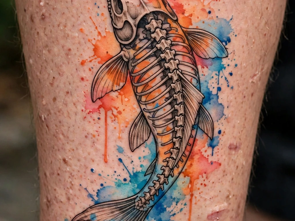
A koi climbing a calf, its body built from orange and coral washes, the water around it a field of soft blue wash — and beneath the colour, a complete line skeleton: spine, fins, tail and the suggestion of scales, drawn first and drawn properly. The koi’s legend — the fish that swims up the waterfall and becomes a dragon, perseverance made beautiful — is usually told in bold Japanese colour; the wash version tells it at a gentler register, a striver rendered in watercolour weather, and the skeleton is what keeps the story legible when the weather changes.
Anchored, with the water treated as expendable: the blue field around the fish is expected to retreat and quieten across the years, and the design is composed so that its loss frames the fish more starkly rather than erasing the scene. Scales are suggested in wash density, never lined individually over the whole body — the skeleton carries a few at the fish’s shoulder, where the eye lands, and suggestion does the rest.
Best placement: Calf, head up, the body following the muscle’s curve toward the knee; the same composition climbs a forearm at reduced scale.
Best for / know before you book: Judge the artist on the skeleton drawing alone — photograph it before colour if the studio allows; that drawing is the ten-year version of your tattoo, and you are entitled to love it by itself.
14. Dragonfly in Wash
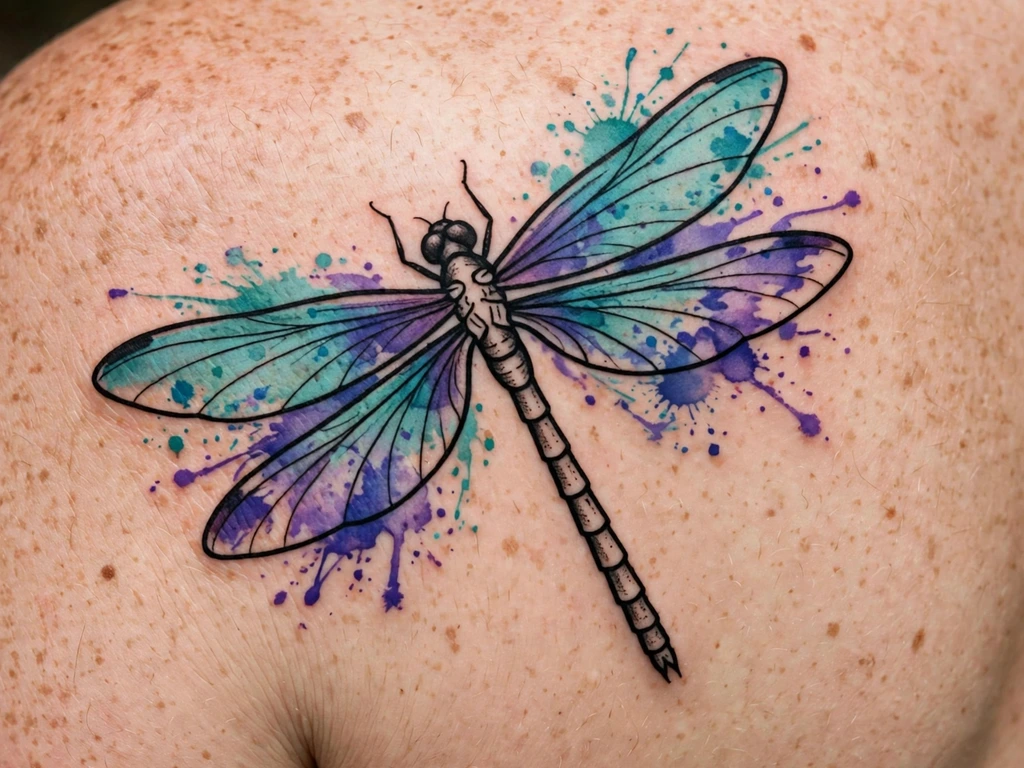
A dragonfly is a wash design nature pre-anchored: the wings are membranes — translucent, barely there — and the body is a solid, segmented rod. This design honours that anatomy exactly: wings poured as teal and violet washes with the lightest vein suggestions, body drawn as a complete line-and-fill skeleton in deep tone. The wash is as free as a wing actually is, because the body does the holding.
Anchored by the body, honest about the wings: the palest wing wash softens toward a tint, and the design intends it — a dragonfly whose wings fade to a shimmer is more dragonfly, not less. What must not soften is wing placement: the four wings’ angles are fixed by their roots at the body, so stencil those roots with care, because a wing that drifts reads as damage rather than weather.
Best placement: Shoulder blade, wings spread across the flat; a smaller version perches on an upper arm with wings at rest.
Best for / know before you book: Check the wing roots in the mirror, not the wing colour — roots are structure, colour is weather, and only one of them can be corrected later.
15. The Anchor With Splashes
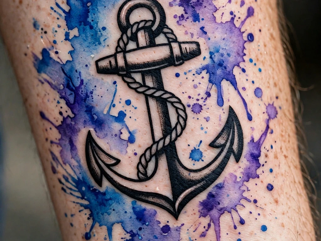
The guide’s emblem, worn literally: a sailor’s anchor drawn in bold, solid black — flukes, ring and rope complete — with watercolor splashes in blue and violet exploding around it and not a drop of wash inside the anchor itself. It is the anchor principle as a picture: the black form is permanent and unmoved, and the colour gets to be weather precisely because the form is not.
Nothing here requires faith: the anchor will read at year thirty, and the splashes are understood from day one to be the changeable part, refreshable in a short sitting whenever their retreat bothers the wearer. Keep the splash field clear of the anchor’s silhouette by a margin of bare skin, so the two never blur into each other.
Best placement: Forearm, the anchor upright along the arm; an upper arm takes it larger with a wider splash field.
Best for / know before you book: Draw the boundary first — the bare-skin margin between black and wash is the design’s grammar, and it must be in the stencil, not improvised in the chair.
16. Heart in Wash
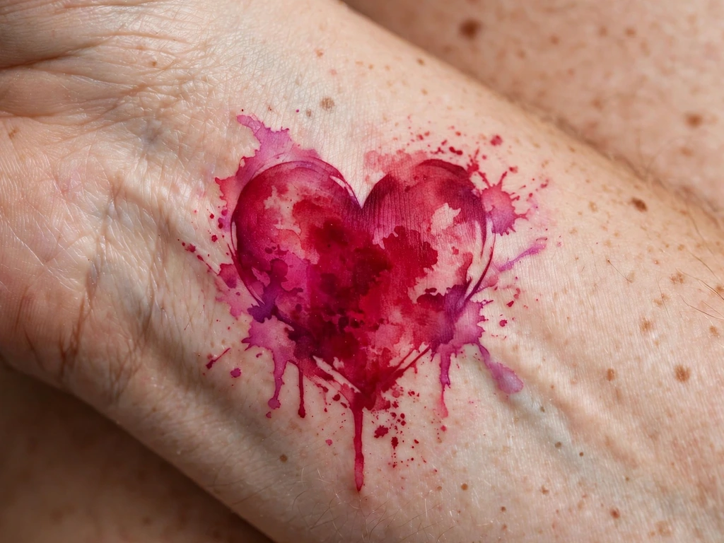
A heart drawn the way the organ actually behaves — as weather with a centre: crimson and magenta washes bleeding softly outward from a core laid deep enough to hold the shape’s read, on the inner wrist where the wearer watches it daily. No outline, and none needed at this scale, because the design is half-anchored by its core: the edges are supposed to look like a flush, the colour of feeling arriving.
Small wash pieces live closer to their limits than large ones, and this design says so plainly: at wrist scale there is less reserve of pigment, so the core must be laid with real commitment, and the wearer should expect the flush edges to tighten toward it over the years, leaving a smaller, deeper heart.
Best placement: Inner wrist, centred above the crease at 3–5 cm; the same heart sits over a shoulder blade’s flat at larger, grander scale.
Best for / know before you book: Saturation is the appointment — ask the artist to show you the core colour at healed depth in their portfolio, because the wrist heart is bought at its core or not at all.
17. Black Cat, Wash Sky
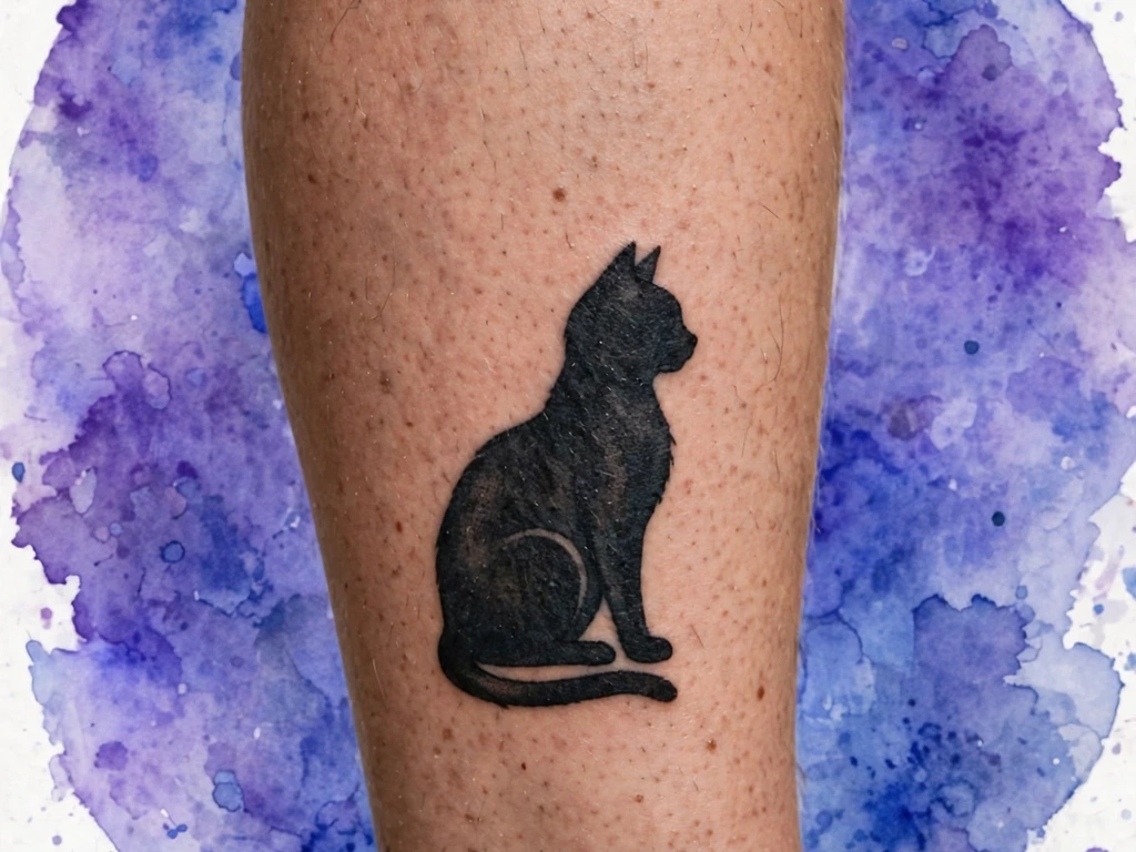
The silhouette-and-wash style’s showcase: a cat drawn as one solid black silhouette — seated, tail curled, ears exact — sitting inside a round field of violet and blue wash like a moon of weather behind it. The cat is pure structure, packed silhouette work that will read at forty years; the sky is pure wash, free to soften and quieten around it. The division of labour is the composition’s intelligence: the subject that must survive is built from the thing that survives, and the atmosphere that may change is built from the thing that changes.
Anchored by that silhouette, the design is drawn expecting the field’s retreat: as the wash pulls inward from its rim over the years, the cat sits centred with margin to spare, so the settled field — a smaller, deeper halo — still frames it completely. The one unforgiving element is the silhouette’s edge: it must be packed to a true, clean border against the wash, with a hairline of bare skin between black and colour if the artist prefers the separation guaranteed.
Best placement: Calf, the circle centred on the muscle with the cat seated at its heart; a shoulder blade takes a larger moon and a larger cat.
Best for / know before you book: Judge the artist on healed silhouette edges — a cat whose border stays crisp against colour is a packing examination, and fresh photos will not show you the result.
18. Geometric Circle, Wash Field
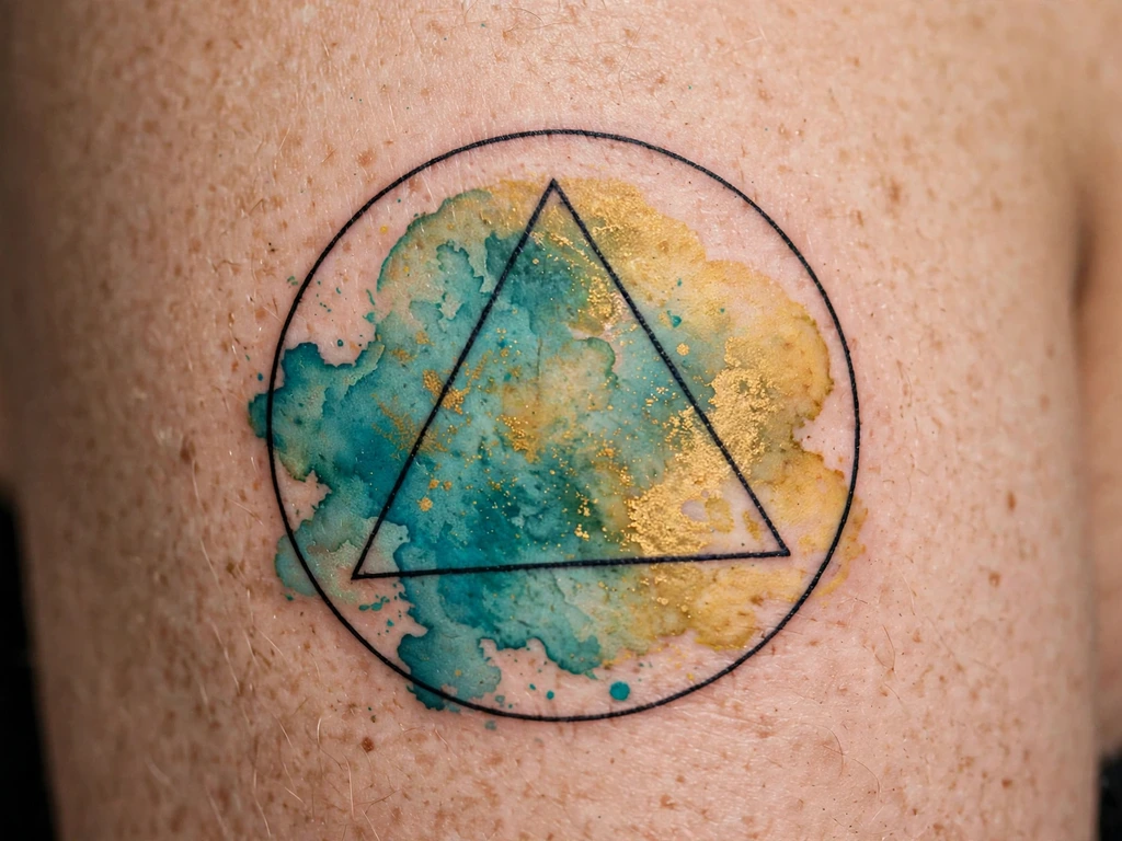
Geometry is the other natural anchor: a circle and an inscribed triangle drawn in clean, standard-weight black line on the upper arm — and inside the frame, instead of flat fill, a field of teal and gold wash poured free. The frame is permanent and exact; the weather inside it is allowed to be weather. It is also the design here whose ageing is easiest to predict, because the frame announces precisely where the picture ends whatever the wash does.
The frame’s geometry is the appointment: a circle on skin must be stencilled on the standing, relaxed arm and checked as a true circle in a mirror, because the arm’s taper quietly turns circles into eggs. Inside, the wash should respect the frame and breach it nowhere — the style’s charm is containment, not overflow.
Best placement: Upper arm, the circle centred on the outer flat; a forearm takes it at badge size with the same grammar.
Best for / know before you book: Approve the frame alone, in marker, in motion — geometry forgives nothing, and the wash inside can only ever be as good as the circle holding it.
19. Fine-Line Branch, Wash Blossom
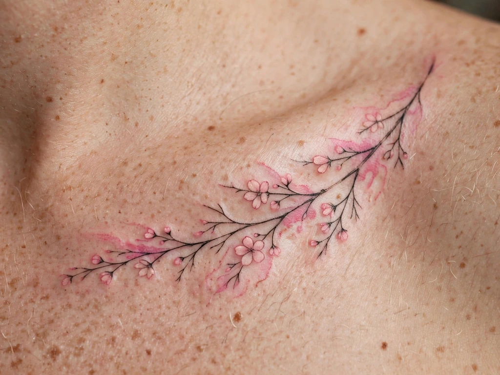
The hybrid at its most delicate: a branch drawn in single-needle fine line — twigs, buds and two leaves complete — running along the outer edge of a collarbone, with its blossoms rendered not in line at all but in soft pink wash, small colour clouds sitting on the drawn wood. It is the fine-line-and-wash treaty in one composition: the branch is the skeleton — this piece’s anchor — the blossom is the weather, and each makes the other legible.
Both elements mellow on the same gentle schedule, which is the design’s bargain and its charm: at year ten the piece reads as a memory of a branch in blossom rather than a diagram of one.
Best placement: Outer edge of the collarbone, branch following the bone; the same branch runs down a forearm with blossoms opening upward.
Best for / know before you book: This is a two-specialism piece — the artist must be fluent in fine line and wash; a portfolio strong in only one of them is a portfolio for a different design.
20. Lavender Sprig in Wash
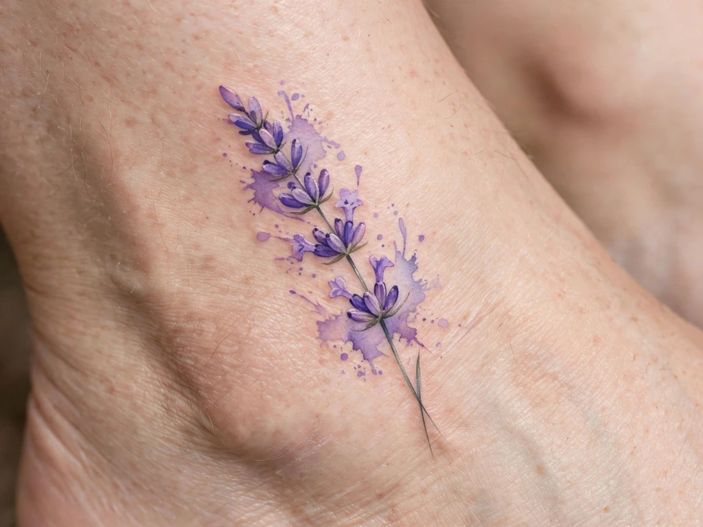
A lavender sprig is dilution drawn by nature: a stem of small buds that are themselves a gradient, deep violet at the base paling toward the tip. This design draws it in its own medium — violet and lilac washes for the buds, laid deepest where the real flower is deepest — on a fine stem line in grey-green that serves as the half-anchor, holding the sprig’s posture when the buds’ palest members have quietened.
The forecast is written into the flower: the tip buds are palest and go first, so the sprig is drawn slightly longer and fuller than its settled self, spending its outskirts the way the galaxy spends its rim.
Best placement: Above the ankle, the sprig upright on the flat wall off the bone; a wrist takes a shorter sprig at the same register.
Best for / know before you book: Bring your usual shoes to the stencil check — ankle sprigs live exactly where straps and collars rub, and wash already has enough spending scheduled without friction’s help.
21. The Painted Poppy
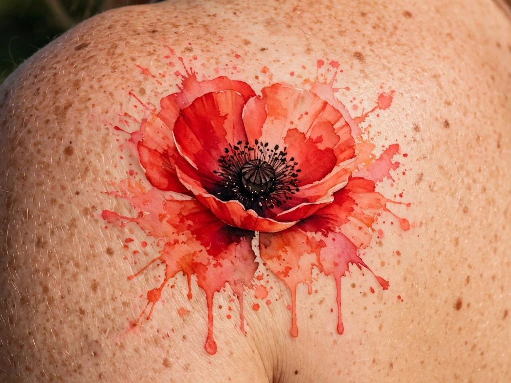
The poppy is red’s memorial flower, and this is its wash portrait: petals of scarlet and coral laid in at genuine saturation — tissue-thin shapes built from the deepest washes in the floral section — around a centre drawn nearly black, the poppy’s own dark heart doing the anchoring botany provides. No stem line, no skeleton: the dark centre and the petals’ depth are the whole structure, and they are enough, because a poppy’s read lives in its ruffled silhouette around that one dark point.
Half-anchored, with the petals’ ruffled edges as the budgeted loss: they smooth and tighten toward the centre across the years, so the ruffles are drawn exaggerated a degree beyond the reference, and the settled flower still reads as tissue rather than a plain disc. The centre, being near-black, is effectively permanent — the fixed point the whole flower retires around.
Best placement: Shoulder, centred on the cap where covered skin keeps red’s register longest; a shoulder blade takes a pair of poppies at staggered heights.
Best for / know before you book: If the remembrance is the point, say so at the consultation — artists draw memorial poppies with a simplicity that honours it, and will steer the composition away from decorative clutter.
22. Splash Star Cluster
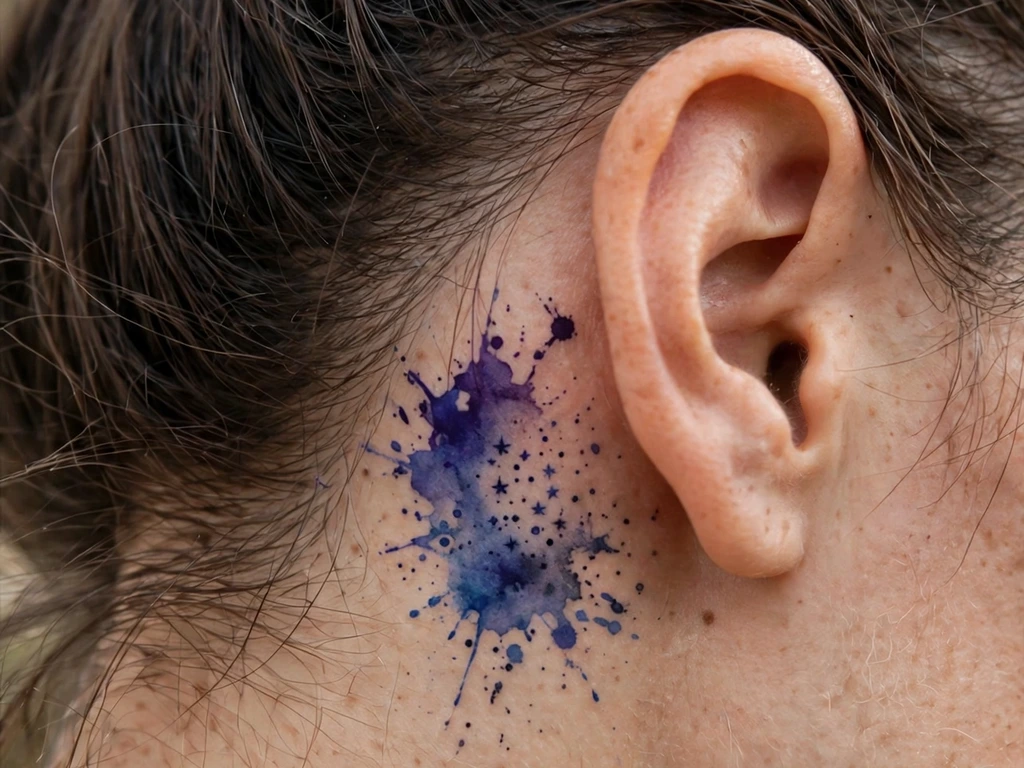
The guide’s one behind-ear design, and the style’s smallest honest object: a thumbprint of deep violet and blue wash tucked on the flat behind the ear, with three or four star dots worked into it at full dark density — the anchors — and nothing else.
Half-anchored: behind-ear skin settles a touch soft and sees shampoo, sun and sunglass arms, so the field quietens sooner than the same wash on an arm — the design answers by starting deep, violet and indigo being the longest-lived wash tones, and by keeping the star dots genuinely dark, so the cluster still reads as a constellation when its nebula has thinned. It is drawn a fraction larger than the dainty reference suggests; at this address, boldness is what delicacy costs.
Best placement: Behind the ear, centred on the flat beneath the cartilage fold; sized to the wearer’s own ear, never from a universal template.
Best for / know before you book: Hold the printed design behind your ear in a mirror at true size — behind-ear pieces are judged at real scale or not at all, and a wash cluster misjudged small becomes a bruise-coloured rumour.
23. Wash Swallow in Flight
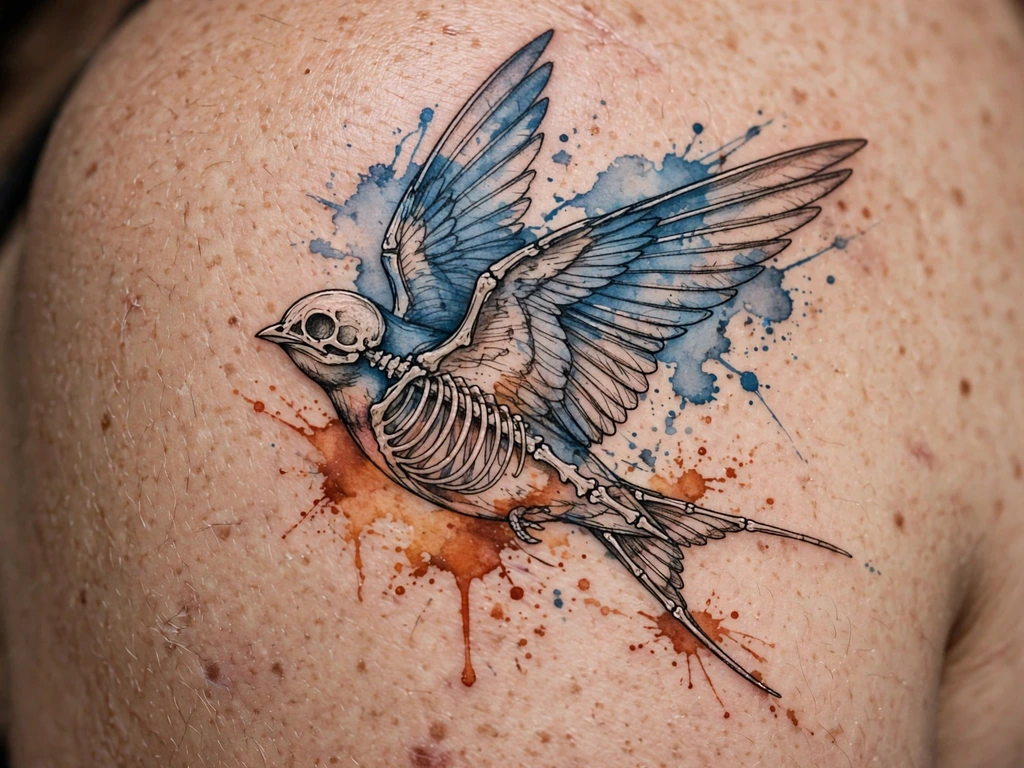
A swallow caught mid-flight on a shoulder: steel blue and rust washes for the wings and back, the wearer’s skin reserved for the breast, and a fine-line skeleton — beak, back line and the swallow’s signature forked tail — carrying the bird’s unmistakable silhouette.
Anchored, with the tail as the non-negotiable: the fork is the swallow’s signature and its two points are exactly where dilution and distance conspire, so the tail’s line is drawn a grade bolder than the rest of the skeleton and its fork cut generously. Wings are checked in the mirror with the arm raised and lowered — a flying bird lives on a moving shoulder, and its wings must look airborne in every position, not just the pose.
Best placement: Shoulder, the bird crossing the cap with its tail toward the blade; a forearm takes a smaller swallow in level flight.
Best for / know before you book: Approve the flight path in motion, not on the table — swallows are judged by their line through the air, and a bird that flies into the armpit has been misdrawn no matter how lovely its colours.
24. The Rainbow Wash Arc
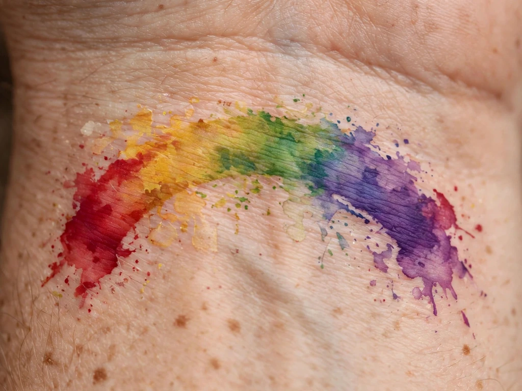
A small rainbow, not as a symbol printed in bands of flat colour but as the thing itself happens in this style: arcs of saturated wash — red into gold into green into violet — laid one inside the next across a wrist, their edges bleeding gently into each other the way real watercolour bands do on wet paper. It is the deliberately free end of the guide worn cheerfully: no skeleton, no core, the arc held together by nothing but the depth of its own colour and the wearer’s knowledge of what it is.
The forecast is graded by band, and the design is honest about it in its construction: the violet and red ends are laid deepest, and gold — the fastest-quietening band — is given the widest arc and the strongest saturation the palette allows, so the settled rainbow still shows four registers rather than two and a rumour.
Best placement: Wrist, the arc spanning the inner wrist’s width above the crease; the same arc crowns an ankle bone at smaller scale.
Best for / know before you book: True-size it on paper and wear it for a day — a rainbow is read at conversational distance, and its bands must separate at that range fresh and in their settled register, which your artist should show you in healed work.
25. Tiny Wash Bloom on a Finger
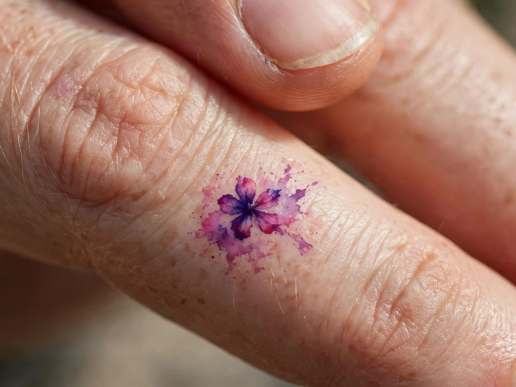
The smallest design in the guide, offered with the fullest honesty, because this placement and this style are the fastest-fading combination tattooing has: a tiny wash bloom on the side of a finger. It is deliberately free in the purest sense: no skeleton, no core. Finger skin regenerates fast, flexes constantly and sheds ink faster than anywhere else on the body — and a wash, the least-pigmented construction there is, goes first of all. So say it plainly: this bloom will fade, sooner than any other design here, its edges softening within seasons rather than years, and it will need touch-ups across its life to stay a flower rather than a rumour of one.
What can be done is done at the drawing: the bloom is a single flower shape in the deepest wash tones available — violet and magenta, never pastel — laid as saturated as finger skin will hold, at the largest size the finger’s flat takes. And the side of the finger, not the palm side, because side skin holds ink slightly better and it is the best bargain this placement offers. Drawn that way, each touch-up restores a flower, not a fog.
Best placement: Side of the finger, where the bloom can sit unbroken and the skin keeps ink longest of anywhere on a finger.
Best for / know before you book: Price the touch-ups before you fall for the charm — if re-inking a small wash bloom every year or two would annoy you, Design 16’s wrist heart carries the same register of meaning on skin that keeps it far longer.
Watercolor Tattoo Placement by Size
| Size | Typical dimensions | Best placements | Good to know |
|---|---|---|---|
| Tiny | 1–3 cm | Behind ear, side of finger | Wash at this scale must start at the deepest tones; the finger bloom carries a permanent touch-up commitment and fades fastest of anything in this guide |
| Small | 3–6 cm | Wrists, ankles, collarbone edge | Hearts, arcs and sprigs — saturation is the whole survival plan; pale pastels at this size are a short lease |
| Medium | 6–14 cm | Forearms, calves, shoulders, upper arms | Most of this guide lives here: butterflies, koi, foxes and waves at wash depths that can carry a reserve of pigment |
| Large | 14–22 cm | Shoulder blades, upper arms | Peonies, galaxies and grand brushstrokes — the scale where layered glazes and a real saturation gradient become possible |
A watercolor tattoo’s placement is also a sun and friction decision: the same wash keeps its register years longer on covered, still skin than on skin that lives outdoors or under straps. One deliberate omission, stated plainly: wash galleries love this style across the sternum and ribs, and this guide offers no designs there — not from any judgement of the look, but because their movement and healing behaviour would make this article’s ageing forecasts impossible to state honestly.
How to Choose Your Watercolor Tattoo (and What to Know Before You Book)
Choose your anchor before your subject. The fork that decides your tattoo’s lifespan is not butterfly versus koi — it is skeleton versus core versus free. Decide, in words, which treaty you are signing: anchored for the long read, half-anchored for the graceful settle, deliberately free for the diffusion itself. An artist who can discuss your design in those terms has watched their own work age; one who promises that wash “lasts just as long as any tattoo” is selling you the fresh photograph.
Judge the artist on healed wash work — two years old at least. Fresh wash work is luminous on everyone’s skin, including the work of artists whose healed pieces have dissolved into bruises of colour. Ask for healed photographs with ages stated, and look at three things: does the subject still read as itself, do the deep tones still hold their register, and are the edges softened evenly rather than patchily? Even softening is skill; patchy softening is pigment laid without a plan.
Saturate past the photograph. Bring your reference, then agree with your artist to tattoo a register deeper than it — the settled version you will live with is a register lighter than the fresh one, and the artist’s job is to land the settled piece on your reference, not the fresh one. If a design only works at exactly the pastels of a filtered image, it does not work; redraw it deeper or choose it knowingly as a short-lease piece.
Match the palette to your skin, with evidence. Because this style’s light is your own skin showing through, palette choice is personal in a way structured styles forgive. Ask for a healed test area of your exact colours on your exact placement if your heart is set on pale tones, and let the result vote. On deeper skin, jewel tones at full saturation are this style’s glory; on fair skin the pastel register is available but remains the shortest lease in the catalogue.
Size for the settled design, not the fresh one. Wash retreats at its edges, so every wash design has two sizes: the one drawn, and the smaller one it settles into. Approve both at the stencil stage — the artist should be able to show you roughly where the settled borders will run — and choose placements whose flats can host the fresh size without the subject wrapping onto curves.
Budget the refresh and the sun. Two running costs belong in the booking decision: a refresh pass for the palest fields somewhere in the piece’s first several years (short, and planned with the original artist where possible), and daily sun protection on healed work, which for this style is the difference between registers. Neither is a failure state; both are the known price of the most luminous register in tattooing, stated here so it never arrives as a surprise.
Key points to remember:
- A watercolor tattoo’s lifespan is decided mainly at the drawing stage: its anchor — a line skeleton, a saturated core, dark accents or sheer saturation — is what remains when the washes soften
- Pale and pastel washes lighten fastest, because dilution itself is the exposure; deep, saturated tones are the longevity reserve, and tattooing a register deeper than the reference is standard professional practice
- Edges retreat before centres do: every wash design settles into a smaller, deeper version of itself, so approve the settled design at the stencil stage, not just the fresh one
- Sun spends wash pigment faster than any other style’s, because there is less of it in reserve — sun protection on healed work is structural, not optional
- The style’s light is your own skin showing through the pigment, so palettes read differently on every skin tone; deep jewel tones hold their register on deeper skin where pastels can go silent
- Touch-ups are planned maintenance for this style, not a failure — budget the refresh when you book, and judge every artist on healed wash work at least two years old
Frequently Asked Questions
How long do watercolor tattoos actually last?
They last — but they change, faster and more visibly than structured tattoos, and the honest answer is a range with reasons rather than a number. The tattoo does not evaporate: its deepest pigment and any line skeleton are as durable as tattooing gets. What spends is the wash’s weather — the feathered edges retreat, the pale and pastel tones lighten first, splashes shrink toward the subject. In the experience of artists who show their healed work, an anchored design in saturated tones commonly reads clearly for a decade and beyond, often with one refresh of its palest fields along the way; a pure-wash pastel piece may want that refresh within its first several years and will settle into a much quieter version of itself regardless. Sun exposure shortens every one of those clocks, and covered skin lengthens them.
Do watercolor tattoos fade completely?
No — “fade away entirely” is the style’s popular myth, and healed evidence does not support it. What actually happens is differential: the dilute frontier of a wash lightens below readability first, so the tattoo contracts toward its deepest pigment and its structure. A design with a skeleton or a saturated core keeps a permanent, readable picture at its heart indefinitely, the way a watercolour painting kept in the dark keeps its drawing. A design that was only dilute wash — pale splashes with nothing deep in them — can indeed soften toward a faint tint over many years, which is precisely why this guide classifies designs by their anchor and tells you, for each one, what will still be there.
Can a watercolor tattoo be touched up or refreshed?
Yes — refreshing is this style’s normal maintenance, and a well-drawn piece is designed to receive it. A refresh pass re-lays the wash fields that have quietened, over the surviving skeleton and cores, and is typically a shorter appointment than the original session. Two honest qualifications: a refresh restores colour, not the original feathered edges — the artist re-pours the weather rather than rewinding it, so each refresh is a new, slightly deeper interpretation — and a refresh cannot rescue a design that had no structure to begin with, because there is nothing left to pour the colour back into.
Do watercolor tattoos work on dark skin?
Yes — with the palette chosen for the skin, which is true of this style on every body and simply more decisive on deeper tones. A wash is transparent pigment over your own skin, and its light is your skin showing through: on medium and deeper skin, pale pastels mix down toward the wearer’s tone and can lose their register almost entirely, while deep jewel tones — indigo, violet, saturated magenta and green — keep strong contrast and read richly, often more beautifully than on fair skin. The professional method is a healed test area of the exact colours on the exact placement before committing, deeper saturation than the fair-skin version of the same design, and an artist who shows healed wash work on skin like yours. What does not work, on any honest account, is insisting on the exact pastel register of a photograph taken on someone else’s skin.
Can any tattoo artist do watercolor work?
It is a genuine specialism, and the difference shows at year three rather than day three. Wash work asks for things structured tattooing does not: diluting pigment to controlled, repeatable registers; laying fields that settle evenly rather than patchily; knowing how far past the target colour to tattoo; and drawing the skeleton — if there is one — as a complete design in its own right. Plenty of excellent blackwork and traditional artists do none of this, and their occasional wash pieces are where the style’s dissolved-bruise reputation comes from. Choose a specialist whose book is full of the style, whose healed photographs carry ages, and who talks about your design’s anchor and settled size before you have finished describing it.
Final Thoughts
A watercolor tattoo is tattooing’s honest style: the only one that admits, in its very construction, that it will change. This one writes the negotiation into the design — the anchor chosen, the saturation banked, the edges understood to be weather. The wearers who love theirs longest are the ones who signed that treaty knowingly: a skeleton under the butterfly, depth in the galaxy, a poppy drawn for the flower it will settle into, a splash field chosen for its evaporation.
So choose the treaty first and the picture second, book the artist whose healed wash work passes the three checks, and let your skin be what it is — not a wall the picture hangs on, but the light the picture is made of. A watercolor tattoo does not ask to be preserved. Chosen with open eyes, it asks only to be allowed to mellow beautifully.