A sword tattoo says what a lot of tattoos only hint at. It is a line drawn between what you will stand for and what you will not. It is also one of the oldest marks a person can wear, and one of the easiest to get wrong, because a sword is not a shape, it is a weapon with a point, an edge, a guard and a grip, and if any of those parts are wrong, the whole thing looks wrong.
That is why this guide is built the way it is. You will find 25 sword tattoo ideas here, each one photographed on skin, each one with the placement, the size and the line work that makes it work. Before the designs, there is a short section on what swords mean, because the meaning is the reason most people choose one, and after the designs, there are tables you can use to compare styles, placements and sizes in one look.
Use it like this. Read the meaning section first if you are still deciding whether a sword is the right image for you. Skip to the designs if you already know it is. Then, when you have two or three favourites, take them to an artist and ask which one will hold up on your skin, at your size, in ten years. A good artist will tell you the truth about that, and the truth is worth hearing before the needle starts.
What a Sword Tattoo Means
A sword tattoo carries four readings, and most people who wear one are carrying at least two of them at once. The first reading is honour. A sword is the weapon of a person who stands in the open and answers for what they do. It does not hide, and it does not strike from behind. When someone says a sword tattoo is about honour, they usually mean that the person wearing it wants to be judged by their word, and to keep it.
The second reading is protection. A sword is held between the person wearing it and the world, and in that position it becomes a guard. Parents choose swords for children they have lost or want to protect, soldiers choose them for the people they came home to, and anyone who has had to defend a boundary knows what the blade is standing in front of.
The fourth reading is sacrifice. A sword is also the weapon that is laid down, broken or sheathed when the fight is over. A broken sword, a sword in its scabbard, a sword pointed at the ground: all of these say that the fight cost something, and that the person wearing the mark knows what it cost.
There is also a quieter reading that runs through all four. A sword is a straight line. It does not bend, and it does not wander. People who have spent years trying to live straight after a crooked time in their life will often choose a sword for exactly that reason, because the line on their skin reminds them of the line they are trying to walk.
None of these readings cancels out the others, and the same design can mean different things to different people. What matters is that you know which reading you are carrying, because that will decide whether your sword points up, down or across, whether it is drawn or sheathed, and whether it stands alone or is paired with a rose, a wing or a cross.
Why Swords Age Better Than Most Tattoo Ideas — When the Line Is Right
Swords age well for a simple reason: they are built out of lines that are meant to be read at a distance. A blade is a long, straight edge, a crossguard is a short, straight bar, and a grip is a short, dark block. At 15 feet, that is still a sword. At 15 feet, a lot of other tattoos are a blur.
The risk is the opposite one. Because a sword is a straight object, any wobble in the line is easy to see, and because it is a long object, a line that is too thin at the start will be a broken line in ten years. Fine-line swords look beautiful in a photograph on the day they are done, and some of them look just as good ten years later, but only if the lines were laid down cleanly and the placement is somewhere the skin does not stretch much.
Three rules keep a sword readable as it ages. First, the blade should be one continuous line from guard to point, with no breaks and no places where two lines meet at a shallow angle. Second, the grip and the guard should be darker and heavier than the blade, because that contrast is what tells the eye where the sword ends and the skin begins. Third, the sword should be large enough that the details have room to breathe: a fuller, the groove down the middle of a blade, needs at least a few millimetres of width, and an engraved pattern on a guard needs the same.
Placement matters as much as line weight. A sword down a forearm or a calf sits on skin that is fairly stable, so it keeps its shape. A sword across a shoulder or down a spine sits on skin that moves, so it needs a bolder line to survive that movement. A sword behind an ear or on a finger sits on skin that is thin and exposed, so it needs to be simple, because detail will not survive there.
If you want your design to feel right, it helps to look at real swords. You can spend an afternoon looking through the Royal Armouries collection and comparing the crossguards, pommels and blade shapes to the designs in this guide, and you will see very quickly why some swords look right and some do not. A real sword has a balance to it, a point where the weight sits, and a tattoo that respects that balance looks like a sword. A tattoo that ignores it looks like a drawing of a sword, and the difference shows on skin.
Sword Tattoo Styles Compared
Before you choose a design, it helps to know how the styles differ. A sword can be drawn in any style, but the style changes what the sword says, how long it lasts and how much it hurts. The table below compares the eight styles used in this guide, so you can see the trade-offs in one place.
| Style | What it looks like | Best for | Ageing |
|---|---|---|---|
| Black and grey | Shaded in black and grey, no colour | Realistic blades, large pieces | Very good, shades soften evenly |
| Fine line | Thin, precise black lines, little shading | Small, delicate swords | Fair, lines can fade and need touch-ups |
| Traditional | Bold outline, flat colour, red and gold | Classic crossed swords, roses | Excellent, bold lines hold for decades |
| Neo traditional | Bold outline with rich, detailed colour | Flaming swords, flowers, peonies | Very good, colour stays bright |
| Blackwork | Solid black, heavy fill, high contrast | Silhouettes, etched designs | Excellent, solid black lasts |
| Dotwork | Built from dots, stippled shading | Ornamental guards, patterns | Good, dots soften into a grey wash |
| Realistic | Shaded to look like polished steel | Large calf and forearm pieces | Very good if the shading is smooth |
| Minimalist | One thin line, almost no detail | Tiny swords, wrists, fingers, ears | Fair, keep it simple and it lasts |
The pattern in that table is simple: the bolder the style, the longer it lasts. That does not mean a fine-line sword is a bad choice. It means that a fine-line sword should be placed somewhere the skin is stable, and that you should expect a touch-up in five to ten years. A traditional or blackwork sword, by contrast, will look almost the same in twenty years, because there is nothing delicate in it to lose.
How to Choose the Right Sword for You
Start with the meaning, not the picture. Decide which reading from the section above is yours: honour, protection, truth, sacrifice, or the straight line. Then decide whether your sword is drawn, sheathed, broken or paired with something else, because each of those choices is a different statement.
Then decide on size. A sword is a long object, and it needs length to read as a sword. A sword that is too short looks like a dagger, and a sword that is too thin looks like a needle. On a forearm, a sword needs at least 15 cm of length to show a guard, a grip and a blade. On a back, it needs at least 25 cm. On a wrist or a finger, it needs to be simple, because there is no room for detail.
Then decide on style. If you want a sword that will look the same in twenty years, choose traditional, blackwork or black and grey. If you want a sword that looks delicate, choose fine line or minimalist, and accept that it will need a touch-up. If you want colour, choose neo traditional, and make sure the artist has a strong portfolio in colour, because bad colour is worse than no colour.
Then decide on placement, using the placement table at the end of this guide. A sword that runs down the spine or down a limb works with the body. A sword that runs across a joint or across a muscle that moves a lot will distort, and a sword that is placed on the inside of a wrist or the side of a finger will fade faster, because the skin there is thin and the hands are washed a hundred times a day.
Finally, take your shortlist to an artist and ask three questions: will this design hold up at this size, will it hold up in this placement, and what would you change? A good artist will answer all three honestly, and the answer is often a small change, a slightly thicker line, a slightly larger guard, a slightly different angle, that makes the difference between a tattoo that lasts and one that does not.
25 Sword Tattoo Ideas
These are the 25 designs, in the order that makes the most sense if you are browsing: the large back and forearm pieces first, then the classic pairings, then the styles that suit a smaller placement, then the tiny pieces for wrists, ears and fingers. Each one has a photograph on skin, so you can see how the line sits on a real body, not on paper.
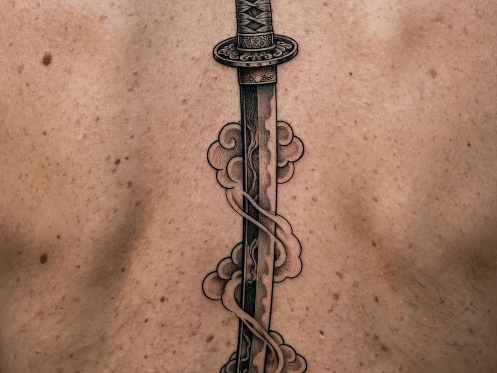
1. Katana Down the Upper Back
A katana is not just a sword, it is a statement about discipline. The blade is long and slightly curved, the grip is wrapped, and the guard is small and round. Down the centre of the upper back, between the shoulder blades, it reads as a spine of its own, a straight line that the body can carry without distortion.
This placement works because the back is wide and flat, so a long blade can run the full length without bending around a joint. The black and grey shading gives the steel a soft, polished look, and the lack of colour keeps the focus on the shape of the sword itself. At this length, the design will also give the artist enough space to describe the curvature of the blade, the wrapping of the handle and the round guard, all of which would be lost on a smaller placement.
This is the best choice if you want a sword that is visible when you want it to be, and easy to cover for work. A katana down the upper back is the classic honour tattoo in this guide, and if you are only going to get one sword tattoo in your life, this is a good place to start.
2. Claymore Between the Shoulder Blades
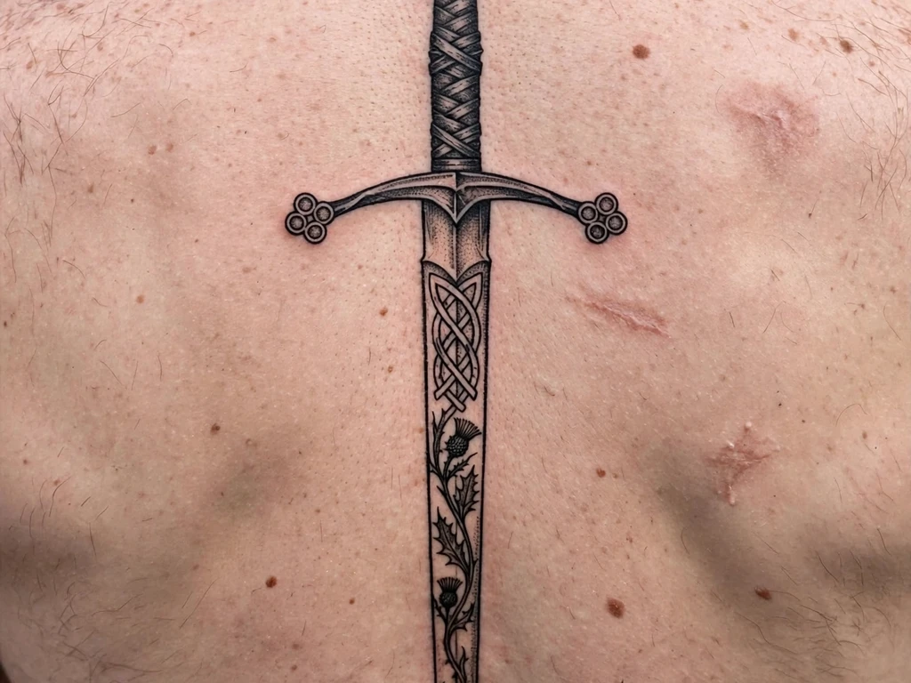
A claymore is a Scottish sword, and it looks different from a katana or a longsword because the guard slopes down towards the blade, and the pommel is a round button that you can feel in the photograph. That sloping guard is the thing to get right: if it is drawn straight, the sword looks like any other longsword, and the Scottish reference is lost.
Between the shoulder blades is the right placement for a claymore, because the sword is long, and the back is the only place it will fit without being bent. Place it vertically, with the point down, and let the guard sit at the top, just below the base of the neck, where a real sword would rest if it were carried on the back.
Think of this one as the protection placement: between your shoulders, at your back, where you cannot see it but you know it is there.
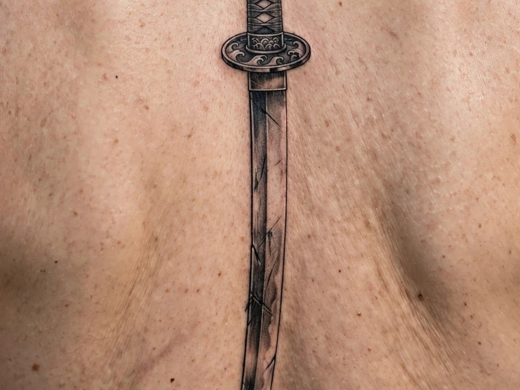
3. Fine-Line Sword Down the Upper Back
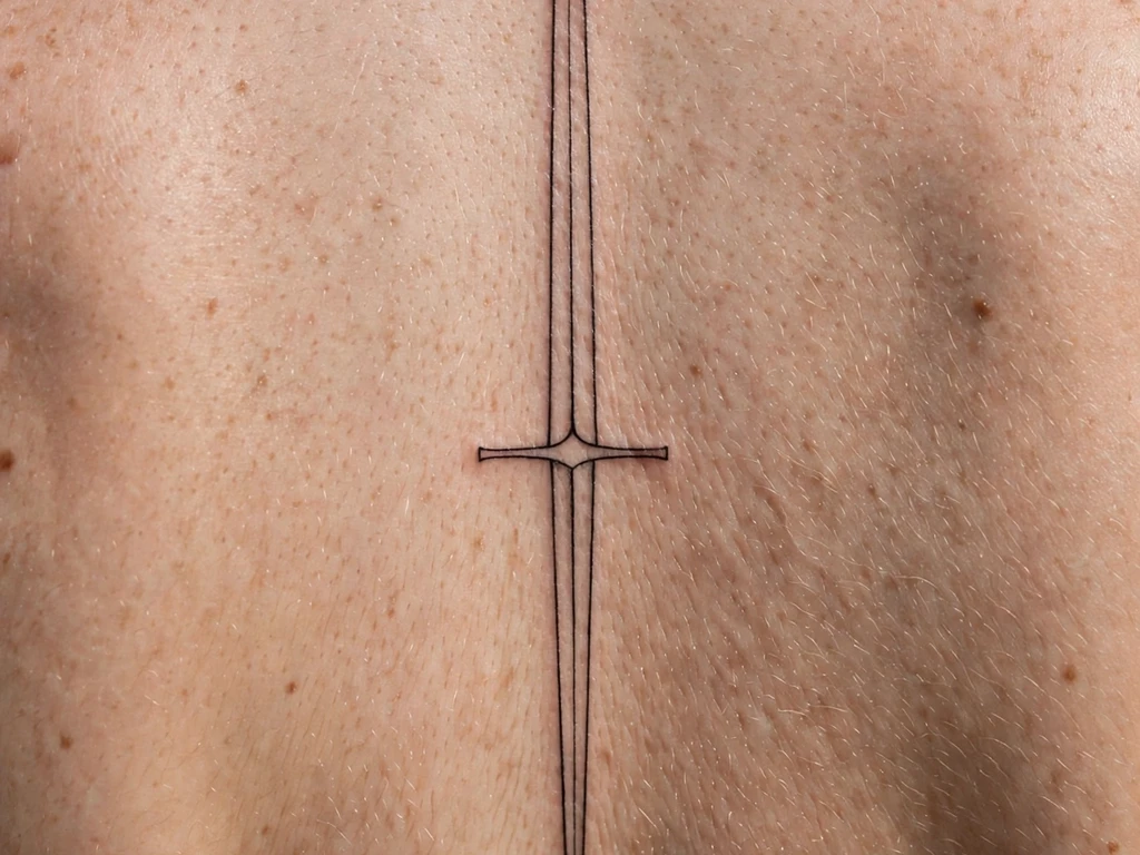
A fine line only works when the idea is simple, and a sword is a simple idea. Take away the shading, take away the guard and the grip, and what you have is a long, clean line with a point. Down the upper back, that line is elegant and understated, but there is a new problem: the line is so fine that it can be mistaken for a scratch or a crease if it is too small.
Make sure the artist uses a slightly thicker needle for the blade than they would for a tiny wrist sword, because a back piece at this size needs a line that will stay a line. A lot of fine-line sword designs are too delicate, so they look great in a photograph on the day they are done and disappear within a few years. This one works because the line is a single, confident stroke, and the guard and pommel are shown in their simplest form, just enough to tell you that this is a sword and not a line.
Choose this design if you want a sword tattoo that whispers rather than shouts. It is for you if you want people to notice the sword only when they are close enough to see it clearly.
4. Medieval Longsword
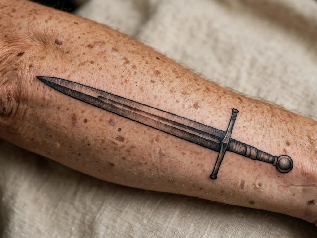
A medieval longsword is what most people picture when they hear the word sword: a long, double-edged blade, a straight crossguard, a grip and a round pommel, with no curve and no extra decoration. On a forearm, it is the perfect size, long enough to show the whole weapon, short enough that the guard and the pommel do not have to be compressed.
The black and grey shading is what gives this design its realism. The blade is shaded to look like steel, with a highlight down the centre, and the guard is darker, so the eye can tell where the handle ends and the blade begins. In the photograph, you can also see the fuller, the groove down the middle of the blade, which is a detail that many sword tattoos leave out, and which makes a big difference on skin.
This is a good first sword tattoo, because it is easy to read and easy to explain. It is also a good way to judge an artist: if they can draw a straight blade, a straight guard and a round pommel, and keep them all in proportion, they can draw any sword in this guide.
5. Crossed Swords
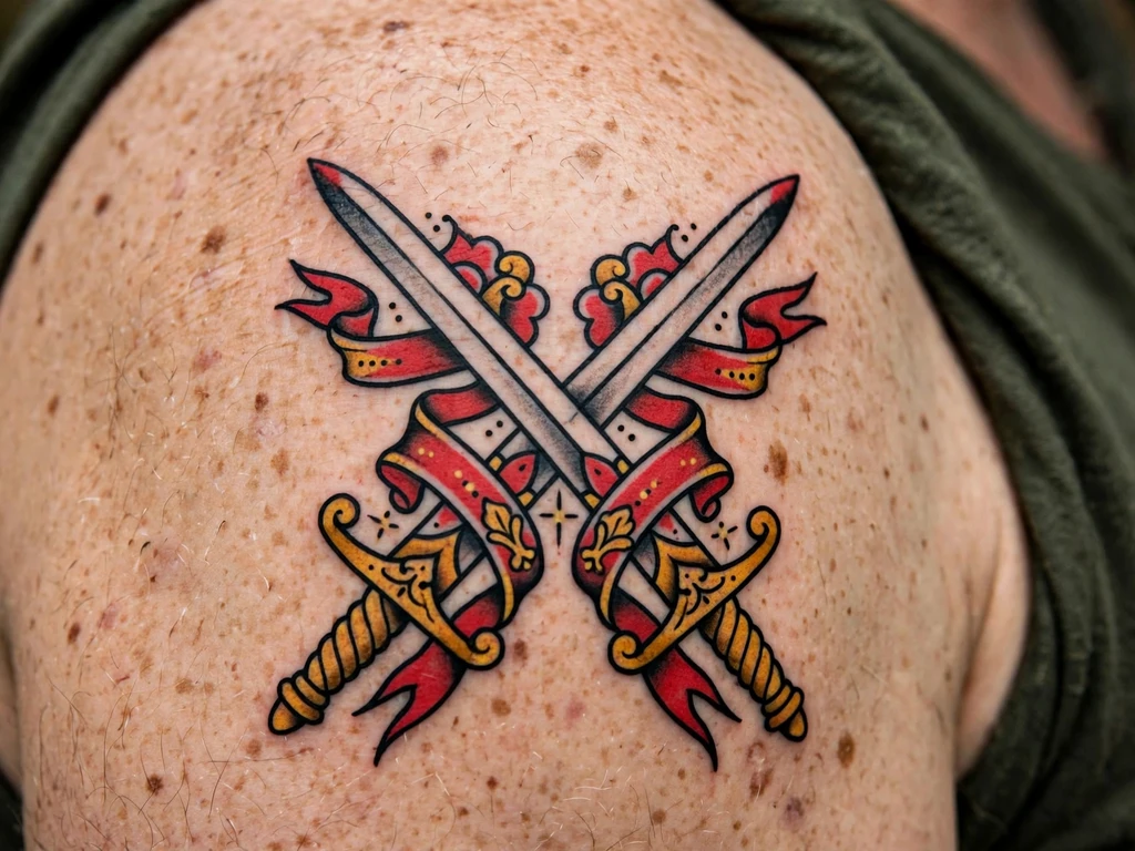
Two swords, crossed in an X, make the strongest design you will see on a tattoo, and crossed swords are one of the most popular sword tattoo designs for a simple reason: they are no longer a single blade, they are a pair. Two blades crossed can mean two people, two vows or two fights, and a lot of commercial designs shrink the swords and use two tiny ones so that they fit easily on the arm, which is a shame. Full arms of crossed swords are a much stronger statement than the ones that only get a tiny version.
Crossed swords are also one of the easiest ways to honour a unit, a team or a friendship, because they are a symbol of strength in numbers. In the photograph, the swords are drawn in bold, traditional style, with red and gold accents, which means this design will age well: the lines are thick, the colours are flat, and the contrast is high.
On the shoulder, the swords sit in a place that keeps them visible, and the size is large enough that the blades, the hilts and the pommels can all be described clearly. A lot of commercial designs are not worth looking at, but real swords are always worth looking at. This is one of the easiest designs to get right, because the composition is already balanced, you just have to draw two swords at right angles.
6. Sword and Rose
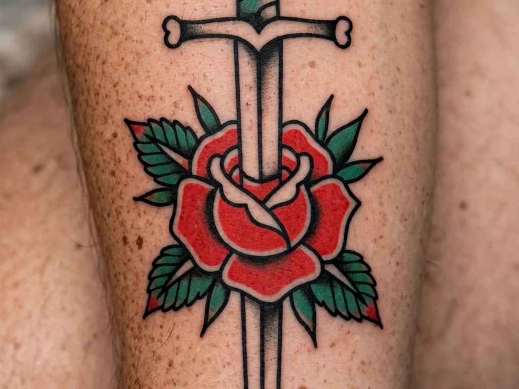
The sword-and-rose is a traditional tattoo combination, and it works because it is a contrast: the strength of the sword and the beauty of the rose, and for this design, it is essential that the sword runs straight, because if it is at an angle, the rose looks like it is being cut off, and the design reads as an accident rather than a statement.
On the forearm, the sword is drawn vertically, its point through a rose. The bold black outline and the red and green colour make this a strong black tattoo, and the contrast with the flat red rose and the dark green leaves keeps the design attractive over time. The meaning lines up with the one in our rose tattoo ideas guide, so if you like the flower as much as the blade, this is a pair worth looking at together: a sword for protection, a rose for love, and a point that goes through both.
Choose this design if you want a sword that says something kind, not just something hard. It is a good choice for a first sword tattoo, because the rose is the most familiar flower in tattooing, and the pairing is one that people will read correctly even if they know nothing about swords.
7. Broken Sword
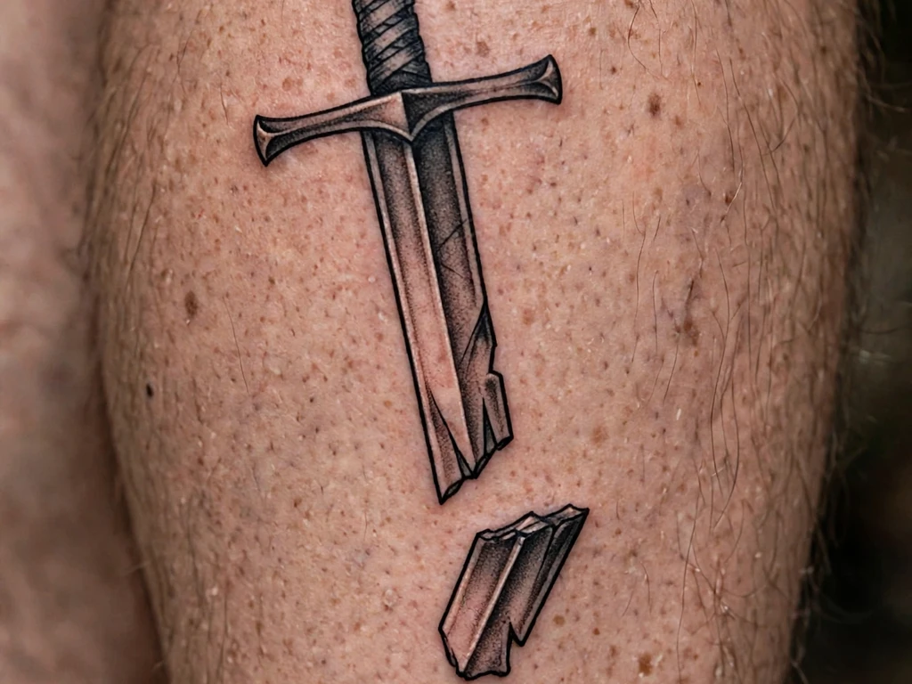
A broken sword is a sword that has been in a fight and lost, and a broken sword is one of the most honest tattoos you can wear. It is the tattoo for someone who has survived a loss: the loss of a person, the loss of a job, the loss of a belief, or a relationship that ended. A broken blade is a powerful shape, with a snapped tip and a blade that is no longer whole, and in a way it is a symbol of how the world used to be, and how it is now.
Down a calf, it has room to breathe, so it reads as a broken longsword rather than a short one. That placement is worth taking seriously, because the calf is a place that is not grabbed a lot, and it is also a place that can carry a longer tattoo without distorting. The black and grey style keeps the feeling sombre, and the tip falling to one side makes the break more obvious, which is what you want.
With this design, you will need a lot of time and a skilled artist to get it right. The broken blade is a complicated shape, with a jagged edge, a falling tip, and a difference in scale between the sword and the severed tip, and it is easy to get the proportions wrong.
8. Winged Sword
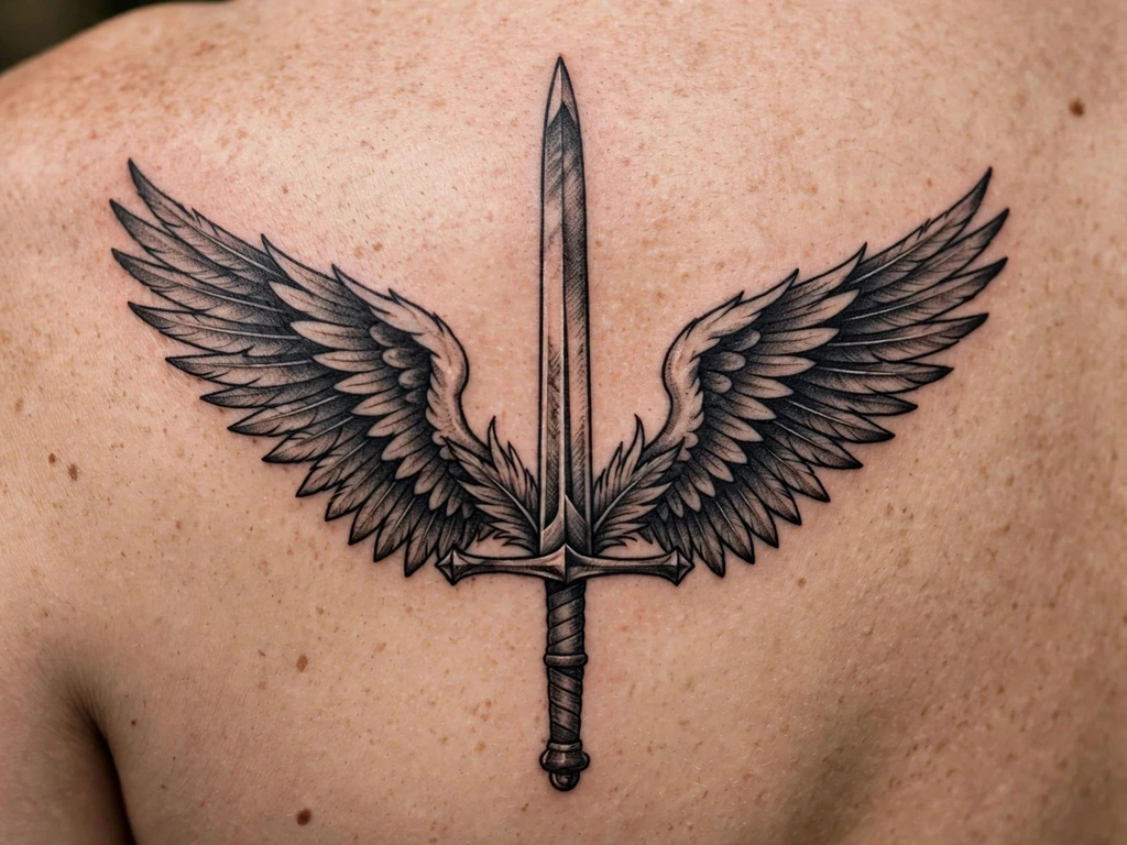
A winged sword is a sword that has been given wings, and it is also one of the most literal ways to show protection. The wings rise from the crossguard, one on each side, which is good for a tattoo that covers a wide space, like a shoulder blade, because it makes an outline that fills the shape of the bone.
On the shoulder blade, the tattoo needs to curve up at the ends and widen with the blades of the wings. The winged sword in this photo is shown in black and grey. The wings are drawn with care, each feather individually, and the sword is also drawn in detail, in a style that is both serious and decorative.
Choose this design if you want your sword to look protective rather than aggressive. The wings soften the sword, while still keeping its power, and on the shoulder blade, it is a design that is easy to protect for work and easy to show off in the summer.
9. Knight’s Sword and Cross
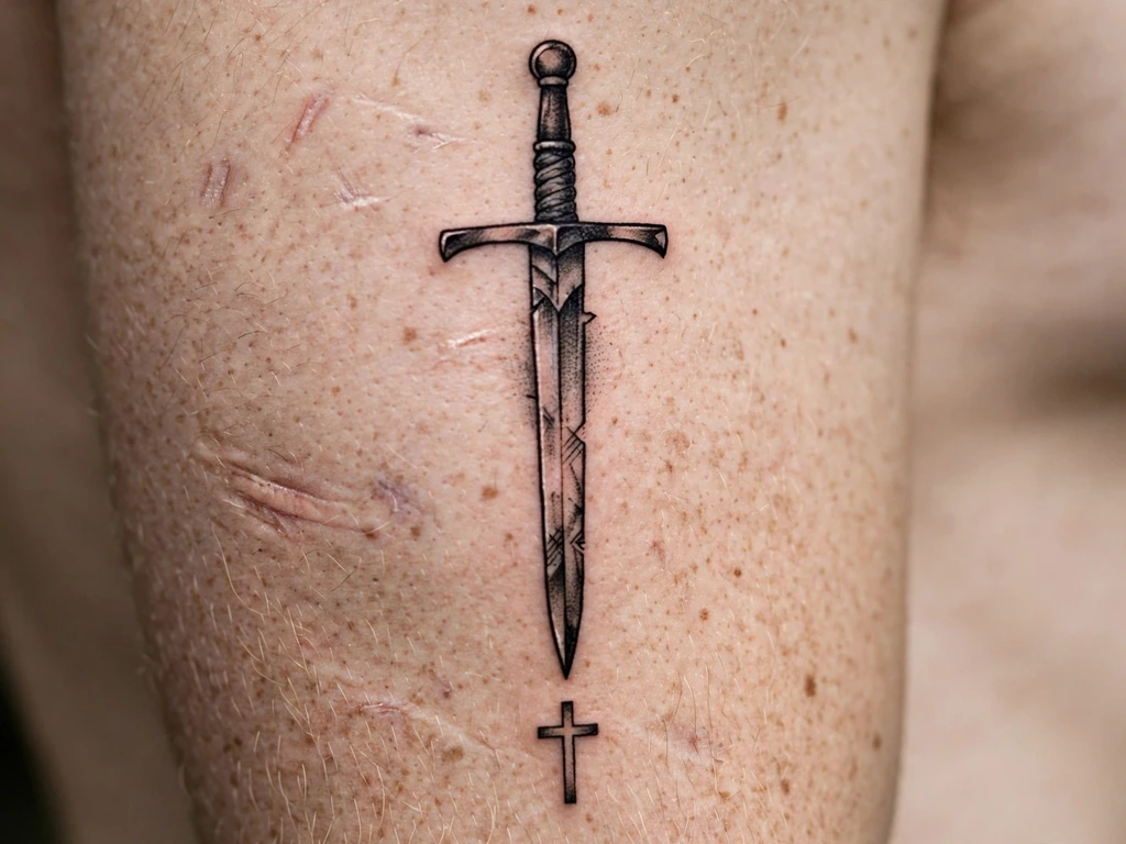
A knight’s sword paired with a cross is a design that speaks to both military history and faith. The sword is a medieval arming sword, and the cross is the simplest form of the Christian cross: a vertical line and a shorter horizontal one, with no decoration beyond that.
On the upper arm, the sword stands vertically using broad shoulders, with the point down, and the cross is barely visible. The sword is a question, and the cross is an answer, because one says put down the sword and the other says the sword is not needed. The point-down position is deliberate: a sword that points down is at rest, and a sword that is at rest is safer than a sword that is drawn.
This design is a good fit if your faith is important to you and you want a tattoo that is not just about protection, but also about how you wish to be treated. It pairs naturally with the angel tattoo ideas and cross tattoo ideas guides, so if you are considering a religious collection, start with those two and see how this one fits.
10. Traditional Sword
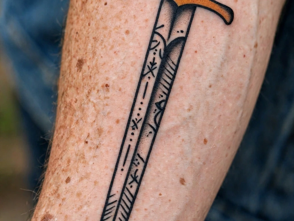
American traditional is the boldest style in the book, and as a style it is hard to get right except in the hands of someone who knows their craft. You could, famously, walk into a local traditional tattoo shop, and you would likely find that the traditional artists on the staff could draw you a beautiful sword in this style.
Our traditional tattoo ideas guide shows just how timeless this style is, with a bold outline in black and flat colours. In the photograph here, the sword is drawn in bold black, with a red grip and a gold crossguard. The design is simple, but it is a timeless one, and there is no reason to change it, as any style that is more complicated would be worse.
The sword-and-cross idea is seen in the photograph in the guide, and if you look at it as a picture rather than as a drawing, you will notice that the sword is drawn on the forearm at an angle, with the blade running from the wrist towards the elbow. In the photograph, the tattoo looks timeless and simple, and that is exactly what this style is supposed to do.
11. Dragon and Sword
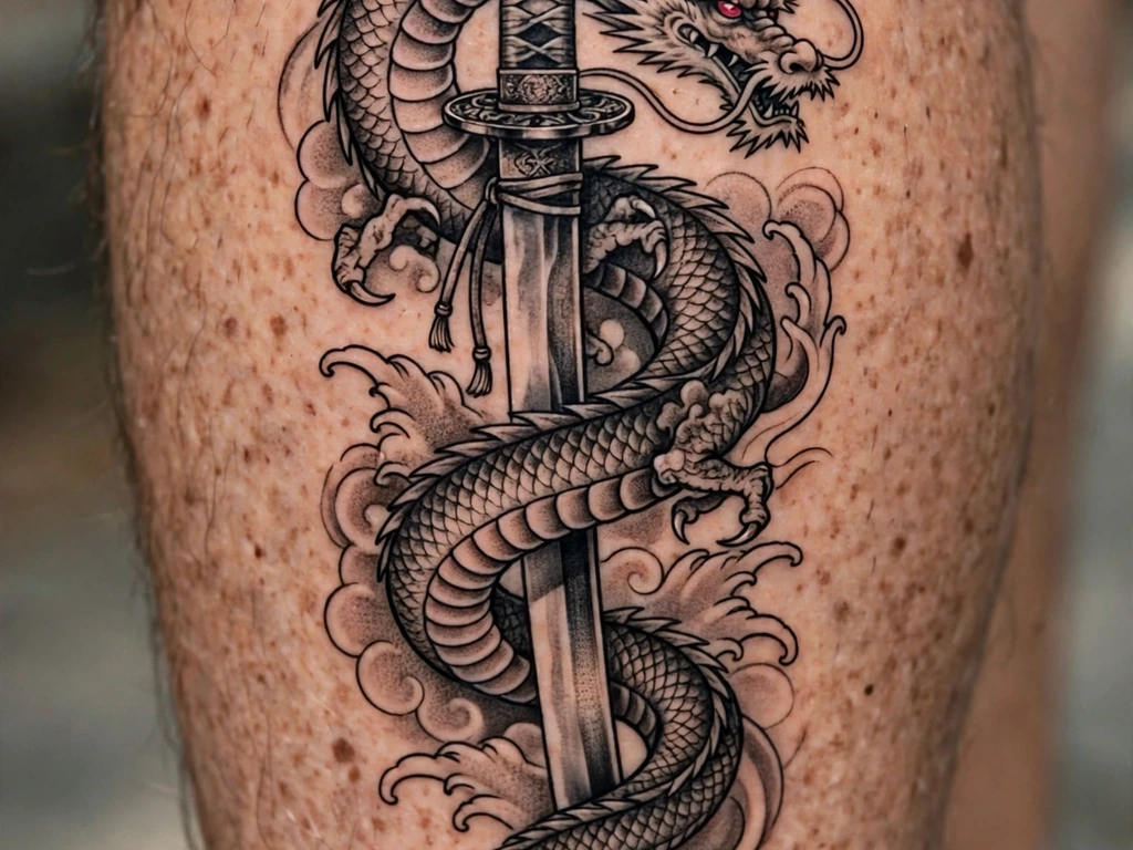
A dragon and a sword make a powerful combination, but one that is also a good way to make your tattoo more complicated than it needs to be. In this photo, the dragon coils around a katana, and the sword is hidden by the dragon, with the hilt showing at the top, and the point coming out of the bottom. The single colour accent is a nice touch, as it keeps the focus on the shape of the sword and the dragon, and adds colour where the design needs it.
On a calf, it works well because it needs room: the dragon’s coils and the sword’s length both need space, and the calf is one of the best places to give them that space. A dragon tattoo in this style is also a good design if you like Japanese art, because the composition is a classic pairing used in Japan, where a dragon symbolises strength, and a sword symbolises the ability to cut through it.
You will find the same curl in our dragon tattoo ideas guide, so if you like this one, start there. This one is a pair of symbols, and it is also a pair of subjects that, together, make a tattoo you could spend a day looking at.
12. Flaming Sword
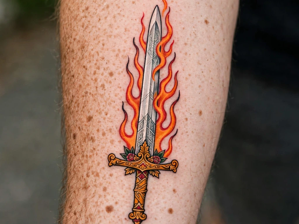
A flaming sword is a sword that is on fire, and it is also a good design for a tattoo because the flames are a dynamic element that moves with the arm. The sword and flame design is a difficult one to get right, because if the flames are too symmetrical, the design becomes a cartoon, and if the flames are too wild, the sword loses its shape. This one works because the flames are controlled: they rise along the blade, and the tails are slightly uneven, so the design feels alive.
The flames are drawn in orange and red in this design, and they look dramatic and alive in the photo. The style is neo traditional, which means the outline is bold and the colour is flat and bright, so the design will age well. The key is to keep the guard and the grip simple, so that the eye does not get distracted from the flames.
Keywords like power, justice, and the desire to be the one to cleanse or to burn are what people think of with a flaming sword. It is a bold choice, and it is also a good one, because the flames give it a sense of protection, as if the sword has been set alight to keep the dark at bay.
13. Fine-Line Minimalist Sword
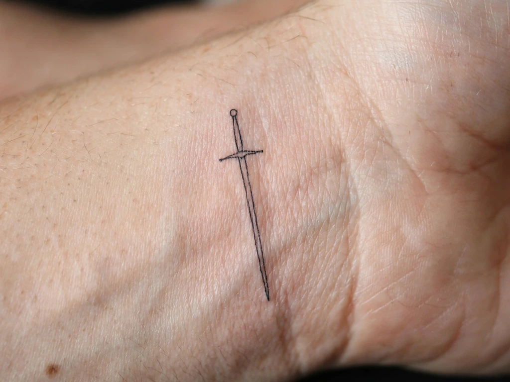
Minimalism works for a sword tattoo when the sword itself is the minimal thing: a blade, a grip, and a small crossguard. With a fine-line minimalist sword, you get a clean, elegant design that is easy to hide and easy to explain. For this design, it is essential that the shape is simple, because any extra detail at this size will be lost.
Small swords look better when they are on the inside of a wrist, as in the photograph. A tiny sword like this is a subtle and understated choice, and in that photo, the design is shown at a large size so you can see the details. In real life, the design is about 5 cm long, so it is easy to hide under a watch or a cuff, but also easy to show if you want to present it.
Choose this design if you want a sword tattoo that is personal and private. It is a good choice for people who work in a formal environment, because it is small enough to be covered by a long sleeve, but also simple enough to be read correctly when it is visible.
14. Blackwork Sword
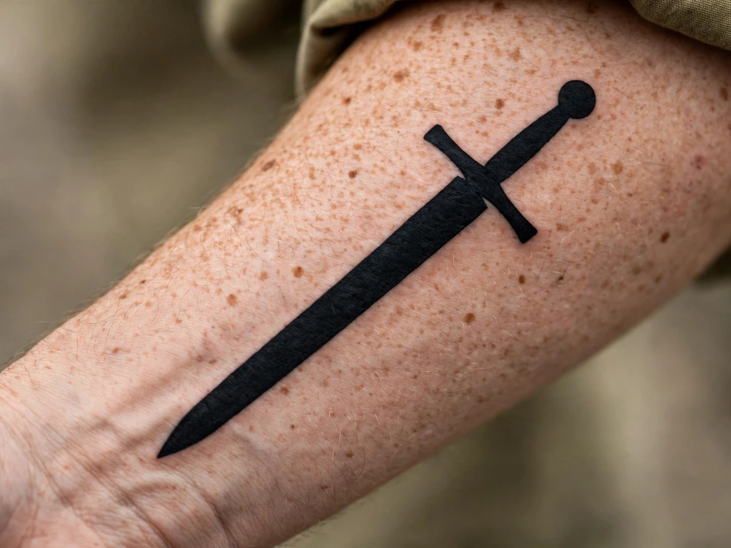
Blackwork is about using solid black, and it is also a good choice for a sword tattoo because a sword is a shape that looks good as a silhouette, with the solid black giving it a bold look on the skin. In the photograph, the sword is a solid black silhouette, and the design is simple, with a straight blade and a solid black grip.
Blackwork swords age very well, because solid black lasts, and the design is also the most forgiving of any of the styles, because it does not rely on fine shading or detail. In this photo, the sword is drawn on the forearm, and the black is solid, so the design will still look like a sword in twenty years.
Choose this design if you want a sword tattoo that is simple and bold. It is a good choice for people who want a design that will not age, and who do not want colour or shading in their tattoo.
15. Neo Traditional Sword
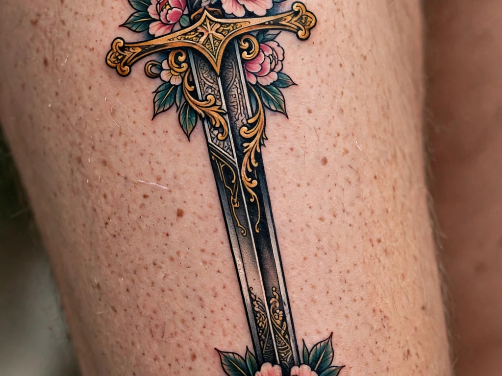
Traditional swords are bold and flat, but neo traditional swords add colour and detail. The peony in this design makes it look more decorative and less aggressive, and the mix of a sword with a flower in rich colour is a classic pairing. In the photo, the sword is drawn with a decorated gold crossguard, and the peony adds a touch of colour, with the sword going down the thigh so that the composition creates a strong design on a bigger area of skin.
The thigh is one of the best locations for a design of this size, because the composition is larger and has more space, and the thigh keeps the design away from the joints so that it does not distort. This design needs an artist who is confident with colour, so that the peonies are rich and the sword remains the focus of the design.
For this design, take your time and choose an artist who is confident with colour. The peony-and-sword design is one of the most decorative in this guide, and the result is a tattoo that is more elegant and less aggressive than a bare blade.
16. Realistic Steel Longsword
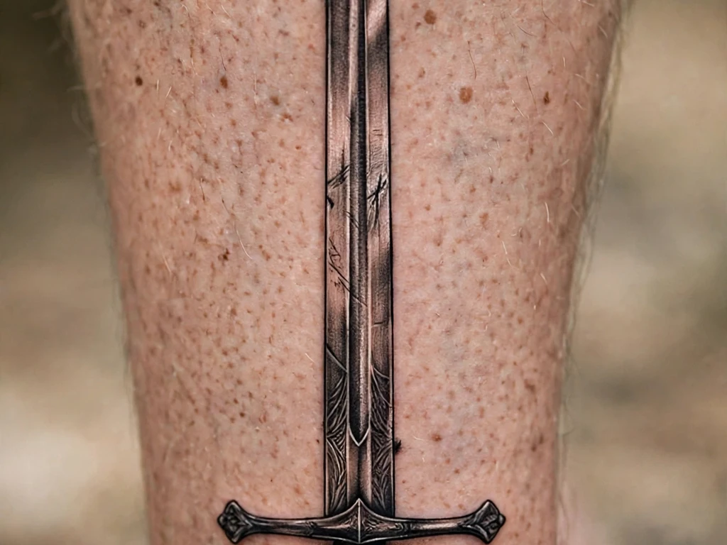
Realism, in this style, is about making the sword look like steel, not like a drawing of a sword. The blade in this photo is shaded with highlights and shadows to give it the look of polished steel, and it is more realistic than any of the other designs in this guide, as a realistic sword tattoo draws a lot from the details of the design.
The calf is the right placement for this design, because it is a large, flat area that can carry a long sword without distortion, and it also allows the artist to show the details of the blade, such as the fuller and the engraved pattern. This design is about realism, and it works because the shading is smooth and the highlights run down the centre of the blade, as they would on real steel.
Check that your artist’s portfolio shows realistic work before you book, because realism is a difficult style to get right, and it can look like a blur if the artist is not experienced. In this photo, the blade looks like it has weight and the hilt looks like it is held, so the design reads as a sword, not as a drawing of a sword.
17. Ornamental Short Sword
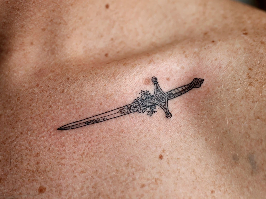
A short sword is a good choice when you want a sword tattoo but do not want a long design. The shoulder is a good place for an ornamental short sword, as the collarbone is a natural line in the body, so a small sword placed along it looks like it belongs. In the photograph here, the sword is drawn with an engraved guard, and the design is shown at a larger size than life so you can see the detail in the guard.
Think of this one as the sword for a person who wants a design they can cover with a shirt collar if they need to, but show off if they are wearing a vest or a top. It is the sword for a person who likes swords but does not want to be too obvious about it.
Choose this design if you want an ornamental sword that is simple and does not need a lot of shading. It is a good choice for a first sword tattoo, because the placement is subtle and the size is small.
18. Sword in the Stone
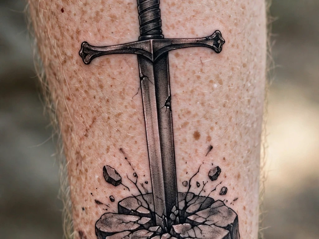
The sword in the stone is a classic tale, and it is also a good design for a tattoo because the sword is vertical and the stone is a natural element. The sword is driven into the stone, and the design reads as a story you can tell without opening your mouth. In the photograph, the sword is drawn in black and grey, and the stone is drawn in a cracked pattern.
This design is a great fit for a person who wants a meaningful tattoo, but also a simple one, because the composition is a sword and a stone, and nothing else. It is also a good design for a person who wants a tattoo on their forearm, because it is easy to read and easy to explain. The image in the photograph is large, about 15 cm, and it is a good size for a sword in the stone tattoo.
Choose this design if you want a tattoo that is a story rather than just an image. It is a good choice for people who like the Arthurian legend, because the sword and the stone are the two best characters in that story.
19. Sword and Laurel
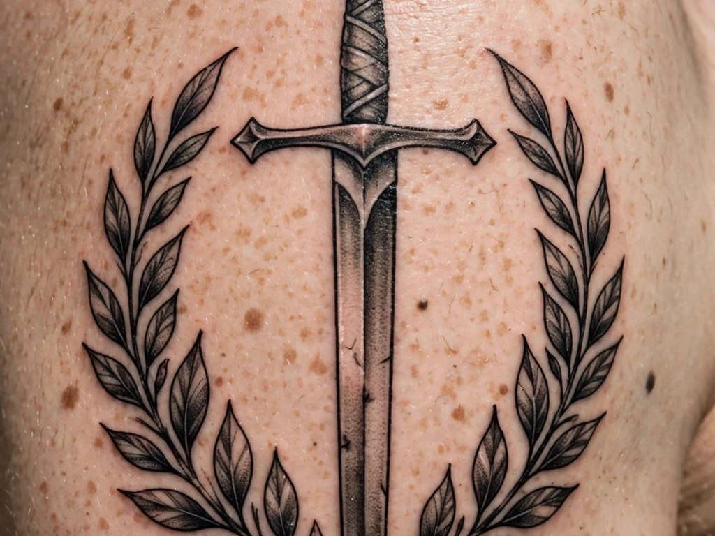
Laurel wreaths are a symbol of victory and honour, and a sword framed by laurels is a classic pairing. The laurel is a natural shape, and the sword is a straight line, so together they make a design that is both serious and decorative. In the photograph, the sword is drawn in a vertical position, and the laurels are drawn in a curve on either side of the blade.
The shoulder is a good place for this design, as the sword can sit vertically and the laurels can curve around it, so it fills the space of the bone. In the photograph, it is drawn in black and grey, and the leaves of the laurel are individually drawn, which gives it the feel of an engraving.
This design is a good choice if you want a tattoo that is both meaningful and decorative. It is a good design for a person who wants a sword tattoo that is not aggressive, but rather a symbol of honour and achievement.
20. Slender Rapier
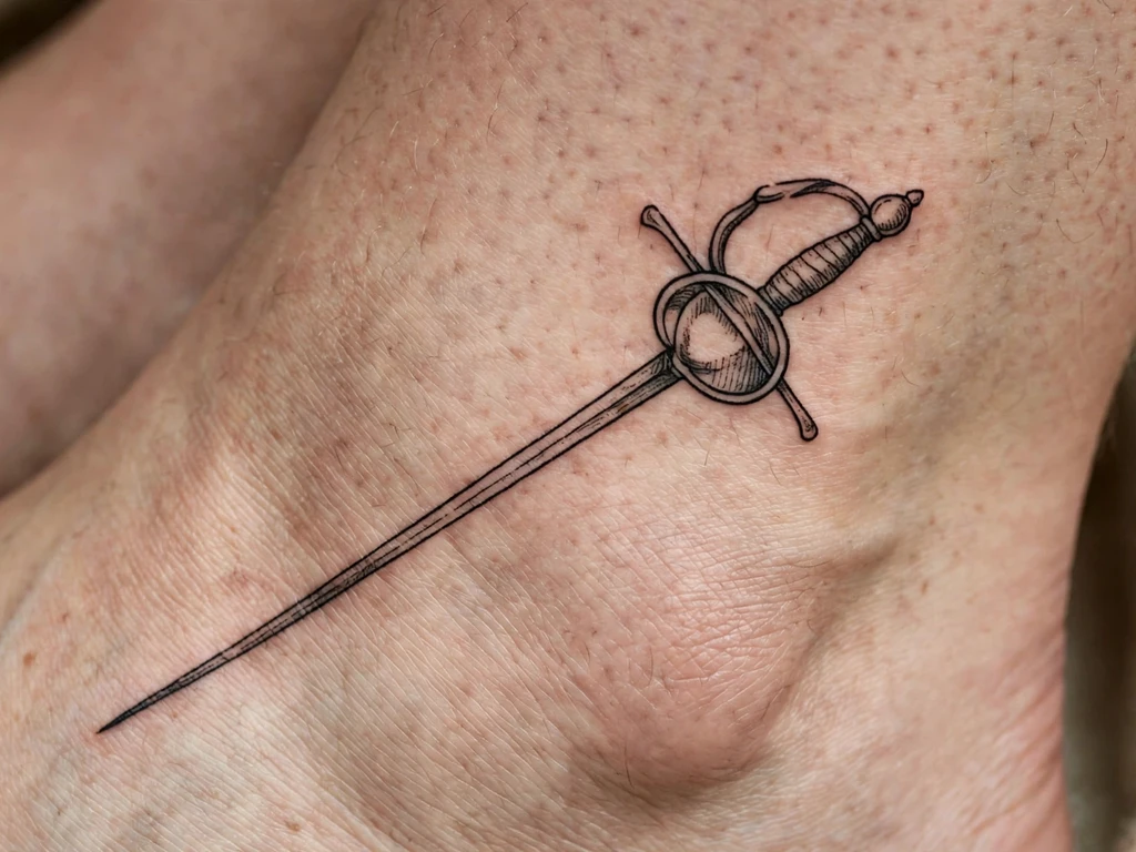
A rapier is far more slender than a longsword, and it is also far more elegant. The long blade and the delicate hilt make it a design that is both serious and beautiful. Above the ankle, the way the blade is drawn in a diagonal direction means that the design sits well on the body. The sword is drawn at an angle, and the hilt is shown as a small, decorative piece.
Choose this design if you want a sword tattoo that is delicate and elegant, and that you can show off when you are wearing shorts or a skirt. The rapier is a good choice for a person who likes swords but wants a design that is less aggressive than a longsword.
In this photo, the sword is drawn in fine black ink, and the hilt is shown in detail. The design is simple and elegant, and the diagonal placement keeps it from looking like a straight line drawn on the skin.
21. Etched Sword
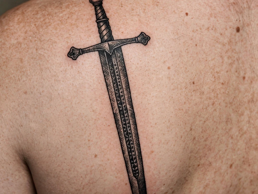
Etching is a technique from printmaking that uses fine lines to create shading and detail, and it is a technique that works very well for a sword tattoo, because it gives the blade a textured, worked look rather than a flat black one. In this photo, the sword is drawn with crosshatched shading, and the fuller is shown as a patterned groove down the middle of the blade.
On the shoulder blade, the design works well because the shoulder blade is a wide, flat surface, and the etched sword can fill it without distortion. It is a strong design, with a bold outline and deep shading, and it is one of the best examples of blackwork in this guide.
Check that your artist is comfortable with etching, because crosshatching is a fiddly technique that needs a steady hand. If they can do it well, the result is a tattoo that looks like an engraving, and that is a very distinctive thing to wear.
22. Tiny Sword Behind the Ear
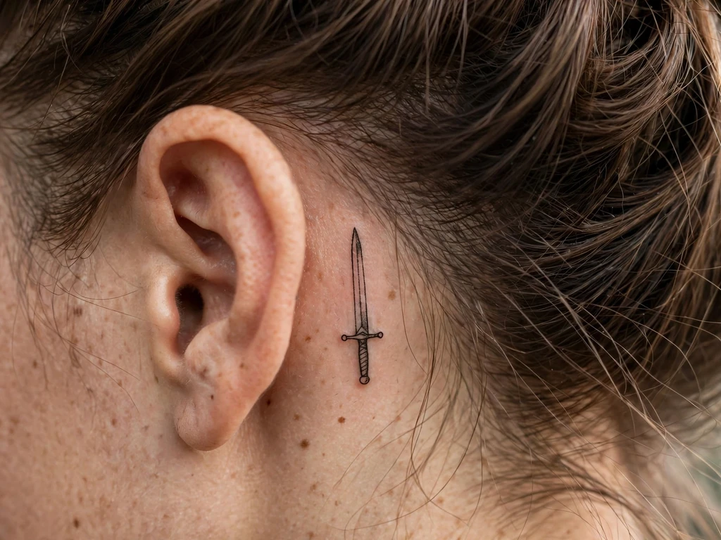
Behind the ear is a perfect spot for a small, very distinctive sword, especially if you are trying for a minimalist design. Here, the little sword is this small, but it is still great, with a short blade and a little guard, and it is drawn in fine black, so it is easy to hide under your hair, and it is also easy to show it off.
Choose this design if you want a sword tattoo that can be shown and hidden easily. It is a good choice for someone who works in an office, but also for someone who just likes the idea of having a little sword tucked away behind their ear, so that it can be seen if you brush your hair back, and hidden if you leave it down.
In this photo, the design is shown at a larger size to show the details of the work, with the short sword that has a small round pommel, and in real life, the sword is very much bigger than it looks in the photo, so seeing the design without it being a big impression is a nice surprise.
23. Tiny Sword on the Side of a Finger
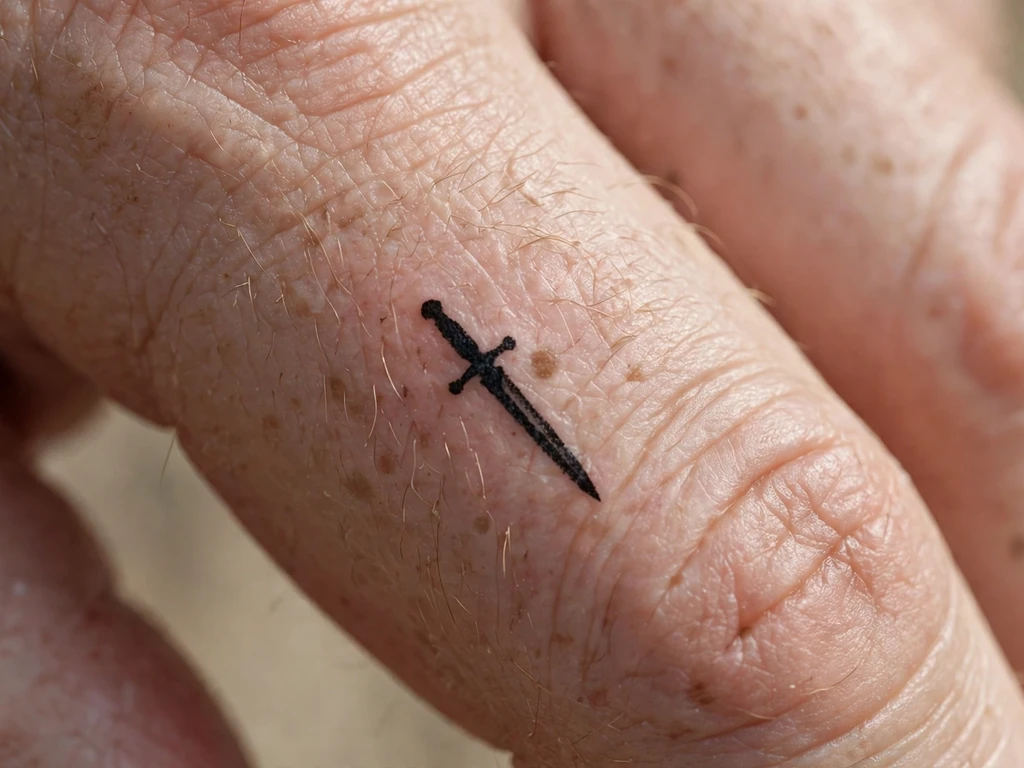
A tiny sword on the side of a finger is a small, very distinctive design, and it is also one of the best examples of a meaningful tattoo at a small scale. The finger is a small area, so the design has to be simple: a tiny blade and a small guard, and nothing else. In the photograph, the design is shown at a very large size, so you can see what is being drawn, but in real life, the sword is tiny, about 2 cm long, and it is also the most distinctive design in this guide.
Choose this design if you want a sword tattoo that is private and personal, and that you can show off when you hold your hand up. The finger is a good place for a design of this size, because it is a small canvas and the design is a simple shape.
Be aware that finger tattoos fade faster than tattoos elsewhere, because we use our hands so much and wash them so often. A tiny sword like this one will need a touch-up in a few years, so if you want a design that lasts, choose a slightly larger one.
24. Dotwork Ornamental Sword
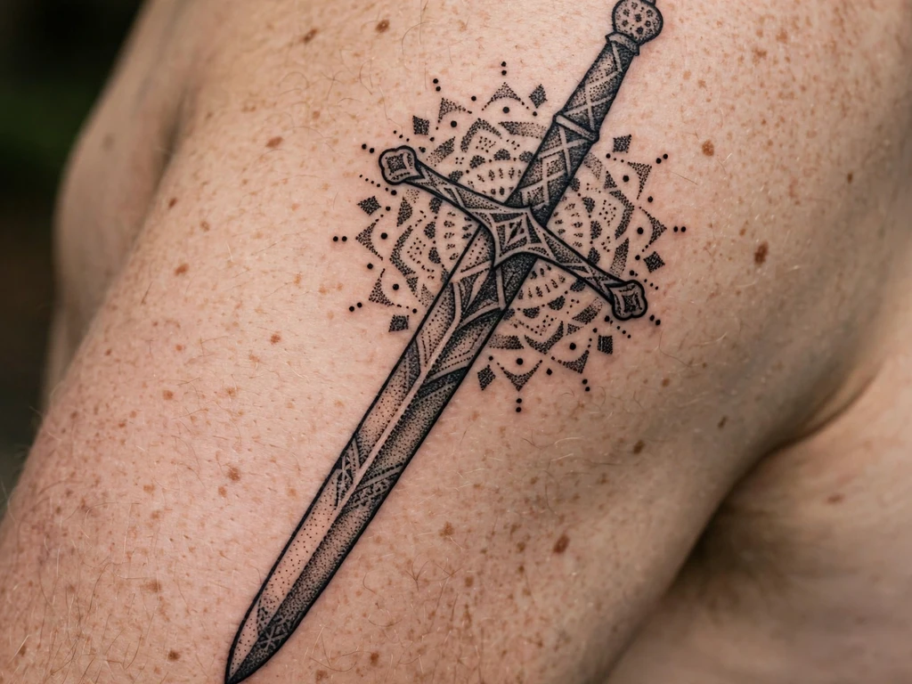
Dotwork is a style that uses dots to create shading and texture, and it is a style that works very well for an ornamental sword, because the geometry of the guard and the stippled shading are a great combination. In this photo, the sword is drawn with a geometric pattern around the guard, and the blade is shaded with dots, giving it a texture that is unique to this style.
On the upper arm, the design covers a large area, and the sword is drawn at a size that allows the dots to be seen clearly. It is a good example of dotwork tattooing, and the design is one of the most decorative in this guide.
Before you book this design, hold it against a real piece before you see it drawn, and use it in a way that makes you feel comfortable. The best way to check whether your artist really knows their sword history is to look at their portfolio with a reference, and the best reference is the Wallace Collection’s arms and armour holdings, which give you a clear sense of what a real sword looks like.
25. Sheathed Sword
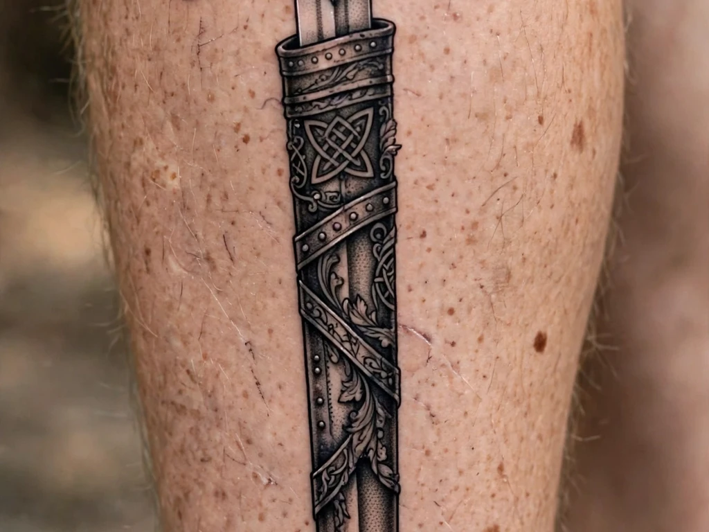
A sheathed sword is a sword that is at rest, and it is a good design for a person who wants a tattoo that is not about aggression, but about peace. The sword is drawn in its scabbard, and you can see the belt loop and the shape of the sword under the sheath. It is a design that is both meaningful and restful, and in a way it is more powerful than a drawn sword, because it says that the fight is over and the sword can rest.
On a calf, it works well because the design is long and straight, and the calf gives it the space to be drawn at full length. In the photograph, the sword is drawn with a belt loop, and the scabbard is drawn with a line down the middle, just like a real scabbard would be.
Choose this design if you want a sword tattoo that says you have already fought the fight, and that you are now at peace. It is a good choice for a veteran, or for anyone who has been through a difficult time and come out of it safe.
Sword Tattoo Ideas at a Glance
If you are short on time, this table is the whole guide in one place. Find a design you like, check its style and placement, and then read the full section for that design before you book.
| Design | Style | Placement | Best for |
|---|---|---|---|
| Katana Down the Upper Back | Black and grey | Upper back | Honour, discipline |
| Claymore Between the Shoulder Blades | Black ink | Between shoulder blades | Scottish heritage, protection |
| Fine-Line Sword Down the Upper Back | Fine line | Upper back | Minimal, elegant |
| Medieval Longsword | Black and grey | Forearm | Classic first sword |
| Crossed Swords | Traditional | Shoulder | Friendship, unit, team |
| Sword and Rose | Traditional | Forearm | Love and protection |
| Broken Sword | Black and grey | Calf | Loss, survival |
| Winged Sword | Black and grey | Shoulder blade | Protection, freedom |
| Knight’s Sword and Cross | Black and grey | Upper arm | Faith, knighthood |
| Traditional Sword | Traditional | Forearm | Timeless, bold |
| Dragon and Sword | Black and grey | Calf | Japanese art, strength |
| Flaming Sword | Neo traditional | Forearm | Power, justice |
| Fine-Line Minimalist Sword | Fine line | Inner wrist | Private, subtle |
| Blackwork Sword | Blackwork | Forearm | Bold, lasting |
| Neo Traditional Sword | Neo traditional | Thigh | Colour, peonies |
| Realistic Steel Longsword | Realistic | Calf | Steel, detail |
| Ornamental Short Sword | Black ink | Collarbone | Subtle, ornamental |
| Sword in the Stone | Black and grey | Forearm | Arthurian legend |
| Sword and Laurel | Black and grey | Shoulder | Victory, honour |
| Slender Rapier | Fine line | Above ankle | Elegant, delicate |
| Etched Sword | Blackwork | Shoulder blade | Engraving, texture |
| Tiny Sword Behind the Ear | Fine line | Behind ear | Hidden, tiny |
| Tiny Sword on the Side of a Finger | Black ink | Finger | Private, tiny |
| Dotwork Ornamental Sword | Dotwork | Upper arm | Ornament, pattern |
| Sheathed Sword | Black and grey | Calf | Peace, rest |
Sword Tattoo Placement by Size
Placement is not a matter of taste alone. It is a matter of how much room the sword needs, and how much the skin in that place moves. The table below gives a safe starting point for each size.
| Size | Length | Best placements | Notes |
|---|---|---|---|
| Tiny | 2–5 cm | Finger, behind ear, inner wrist | Keep it simple, expect touch-ups |
| Small | 5–10 cm | Wrist, ankle, collarbone | One thin line, little detail |
| Medium | 10–20 cm | Forearm, upper arm, calf | The most versatile size |
| Large | 20–30 cm | Back, thigh, shoulder blade | Room for detail and shading |
| Extra large | 30 cm or more | Full back, full calf | Needs a bold line to read |
If your sword is too small for its placement, it will look lost. If it is too large, it will bend around a joint and distort. Use the table above as a starting point, and then ask your artist whether it will work at the size you want, on the part of the body you want it on.
What to Ask Your Tattoo Artist
Before you book, ask your artist these questions. Their answers will tell you whether they have drawn swords before, and whether they understand what makes a sword tattoo last.
Will this design hold up at this size? A good artist will tell you if a design is too small for the detail in it, and will suggest a larger size or a simpler version.
Will it hold up in this placement? A good artist will tell you if a placement will distort the design, and will suggest a different placement or a different angle.
What would you change? A good artist will have an opinion, and it will usually be a small change: a thicker line, a larger guard, a different angle.
Can you show me a sword you have done before? A good artist will have a portfolio with swords in it, and the swords in that portfolio should be straight, in proportion, and well shaded.
How will this age, and will it need a touch-up? A good artist will be honest about ageing, and will tell you that fine-line work needs a touch-up and that bold work does not.
Key points to remember:
- A sword is a straight line, so any wobble will show.
- The guard and grip should be darker than the blade.
- A sword needs length: at least 15 cm on a forearm, 25 cm on a back.
- Bold styles last longer than fine-line styles.
- Placement matters: stable skin keeps a sword straight.
- Look at real swords before you book, so you know what a real guard and pommel look like.
Common Sword Tattoo Mistakes
The freehand guard. A guard drawn freehand without measuring will be crooked, and a crooked guard makes the whole sword look wrong. The artist should use a stencil, not freehand, for a straight guard.
The sword that is too small. A common mistake is to want a sword tattoo that is small and delicate, but a sword needs length to be a sword. If you make it too small, it will look like a dagger or a needle, and the design loses its meaning.
The wrong placement. A sword placed across a joint, like the elbow or the knee, will distort when you bend that joint. Place a sword along a limb, not across it.
The sword that points the wrong way. A sword that points up is a different statement from one that points down. Make sure you know which direction yours points, and why.
The crossed swords that are not symmetrical. If you want crossed swords, make sure they are symmetrical. A pair of swords that are not the same size or at the same angle will look like a mistake, not a design.
The sword with no pommel. A sword needs a pommel, and without one, the design is incomplete. A lot of artists leave out the pommel to save time, but a sword without a pommel looks unfinished.
Getting the Size Right
Size is the one thing that new tattoo customers get wrong more often than anything else. A sword tattoo should be bigger than you think it needs to be, because the details of the blade, the guard and the grip need room to breathe, and because a tattoo shrinks slightly as it heals.
A good rule is to take the size you think you want, and add 20 percent. A sword that is 15 cm on a forearm looks right; a sword that is 10 cm on a forearm looks small and a little apologetic. A sword that is 25 cm on a back looks right; a sword that is 15 cm on a back looks as if the artist ran out of room.
For tiny swords, the opposite rule applies. A tiny sword on a finger or behind an ear should be as simple as possible, with no detail at all, because detail will not survive at 2 cm. In that case, the size is right when the design is just a blade, a grip and a guard, and nothing else.
How Sword Tattoos Age
Sword tattoos age well, but they age differently depending on the style and the placement. A black and grey sword on a forearm or a calf will soften evenly, and the shading will become a soft grey wash. That is a good look, and it is how most sword tattoos in this guide are expected to age.
A fine-line sword on a wrist or a finger will fade faster, because the lines are thin and the skin is exposed to the sun and to washing. Expect a touch-up in five years, and be prepared for the lines to be slightly thicker after a touch-up than they were at first.
A traditional sword, with a bold outline and flat colour, will age the best of all, because the bold lines will stay bold and the flat colours will stay flat. The only thing that will change is that the colours will fade slightly, and that is a natural part of owning a traditional tattoo.
To keep a sword tattoo looking its best, use sunscreen on it, keep it moisturised, and avoid picking at it while it heals. Those three things will do more for its ageing than any style choice.
Sword Tattoo FAQs
What does a sword tattoo mean?
A sword tattoo means honour, protection, truth and sacrifice, and in some cases the straight line of a life lived well. The meaning depends on the design: a drawn sword means readiness, a sheathed sword means peace, a broken sword means loss, and crossed swords mean friendship or loyalty.
Does a sword tattoo hurt?
It hurts in the same way that any tattoo hurts, and the amount of pain depends on the placement. A sword on a forearm or a calf is moderately painful, and a sword on a back or a shoulder is less painful. A sword on a finger or behind an ear is more painful, because the skin is thin and close to the bone.
How much does a sword tattoo cost?
It costs the same as any tattoo of its size and style, and the price depends on the artist and the location. A small sword on a wrist might cost £80 to £150, and a large sword on a back might cost £400 to £800, depending on the detail. Ask your artist for an estimate before you book, and be prepared for the price to reflect the skill of the artist.
Does a sword tattoo have to be black?
No, it does not, but black and grey are the most common styles, because they show the shape of the sword best. A sword can also be done in traditional colour, with red and gold, or in neo traditional colour, with rich blues, greens and oranges.
What goes well with a sword tattoo?
A sword pairs well with a rose, a wing, a cross, a laurel, a dragon and a flame, and all of those pairings are in this guide. It also pairs well with a shield, a crown, a skull and a snake, if you want a design that is more complicated.
Can you get a sword tattoo on your finger?
Yes, you can, and this guide includes a tiny sword on the side of a finger. Be aware, though, that finger tattoos fade faster than tattoos elsewhere, and that the detail will be cropped to make it fit with the shape of the finger, so it will not look as detailed as a forearm tattoo would.
Is a sword tattoo a male-only tattoo?
No, it is not. All of the sword tattoos in this guide will look as good on a woman as they do on a man, and a lot of commercial designs are aimed at men by default, as if a sword is a masculine symbol, which risks being a cliché. A sword is a symbol of strength and honour, and it belongs to anyone who wants it.
How do I know if my sword tattoo will age well?
Ask your artist three questions: will the lines hold up at this size, will the design hold up in this placement, and what would you change? If the artist answers honestly, and the design is bold enough for its size, it will age well. If the artist hesitates, choose a bolder design or a larger size.
Final Thoughts
A sword tattoo is a strong choice, and it is one that will stay with you for the whole of your life. Take your time, read this guide again, choose two or three designs you like, and take them to an artist you trust. Ask the questions in this guide, and listen to the answers.
Use it like this: take the questions and the answer. Your sword should be a line you are proud to wear, a straight blade on steady skin, and a mark that reads clearly today and in twenty years.